I was pleasantly surprised when somebody shared my traveling salesman animation to reddit and the post made it all the way to reddit’s default front page (i.e. the top 25). The gif racked up over 1.3 million pageviews on Imgur, a testament to reddit’s traffic-generating prowess. Before the post made it to the front page, though, it was brought to my attention that it was on the second page of reddit, and that with a bit of luck, maybe it would make it to the front page.
That got me wondering: if a post is on reddit’s second (or third, or fourth) page, what are the chances that it’ll make it to the first page? reddit shows 25 posts per page by default, and at some point I saw my post was at the #26 rank – the very top of the second page, only one spot away from making it to the front page! At that point it seemed inevitable that it would make it to page one… or was it? Of course it did make it to page one, peaking at #14, but I decided I’d investigate to see what I could learn about a reddit post’s chances of making it from the top 100 to the top 25.
Much to my surprise, I found out that reddit’s front pages are not a pure “meritocracy” based on votes, but that rankings depend heavily on subreddits. The subreddits themselves seem to follow a quota system that allocates certain subreddits to specific slots on pages one and two, and also prevents the front page from devolving entirely into animal gifs. As a final kicker, in case it wasn’t completely obvious, I learned that links on the front pages of reddit receive a lot of traffic!
One day in the life of the reddit top 100
Before we get to the analysis, here’s an interactive visual of the reddit top 100 over the course of a single day. Each post that made the top 100 has its own series in the graph, where the x axis is time of day and the y axis is the post’s reddit rank (i.e. #1 = top of page one, #26 = top of page two, etc). The colors of each series are determined by subreddit – more on that later in this post. You can hover to highlight the path of an individual post, click and drag to zoom, click through to view the underlying thread on reddit, or change the date to see the rankings from different days. At first glance it’s pretty clear that posts in the top 50 maintain their ranks longer than posts from 51-100, which turn over much faster:
The data
Fortunately reddit makes it very easy to collect data: the front page is always available as JSON at https://www.reddit.com/.json. I set up a simple Rails application to scrape the top 100 posts (pages 1–4) from reddit every 5 minutes and dump the data into a PostgreSQL database, then I wrote some R scripts to analyze the data. All of the code and data used in this post are available on GitHub.
The scraper ran for about 6 weeks, over which time I collected a dataset that includes some 15,000 posts and 1.2 million observations – any post that appeared in the default reddit top 100 over that interval is included.
reddit ranking review
Plenty has been written about how reddit’s ranking algorithm works, the short version is that a post’s vote score and submission time (age) are the most important factors, so the highest ranked posts will be the ones that earn a disproportionate number of upvotes over a short time period. As we’ll soon see, though, votes and age are not in fact the only important factors that determine rank on reddit’s default front pages.
Initial analysis
The first analysis was to graph the probability of a post making the top 25 as a function of its current rank. In other words, take all of the observations of posts that meet the following criteria:
- Currently ranked outside the top 25
- Have never previously been in the top 25
- Are not yet “in decline”, meaning their rank has not fallen by at least 3 places yet
and calculate the percentage of posts at each rank that eventually made it to the top 25. That graph looks like this:
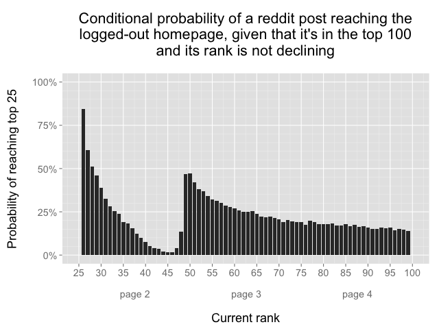
This graph shows the probability that a reddit post will eventually reach the top 25 as a function of its current rank: if a post is ranked #26, there is an 84% chance it will reach the top 25, but if a post is ranked #100, then there is only a 15% chance that it will reach the top 25. The data includes only observations where the post’s rank is not yet in decline. There’s something very strange about the low probabilities for posts ranked in the 40s, eh?
This basic analysis gave me my first answer: when the traveling salesman gif was ranked #26 and I thought it was inevitable that it would make the front page, in fact it had about an 84% chance of making the top 25. However, this graph raises at least as many questions as it answers, in particular: how could it possibly be that almost half of the posts at rank #50 will eventually make the top 25, while less than 2% of the posts at rank #45 will achieve the same result?
That seems bizarre, as I would have expected a monotonically decreasing graph. I started investigating by looking at the distribution of the best rank for each post, which showed a similar unexpected behavior, especially for posts whose best rank was on page two:

647 posts in the dataset appeared at the #1 rank, the most common best rank achieved. The strange results though are again on page two: about 3 times as many posts peaked at ranks in the low 50s compared to ranks in the mid 40s, and in general it seems like few posts achieve their best rank on page two relative to pages three and four. You might hypothesize that posts don’t peak on page two because many of the posts that make it to page two later make it to page one, but that theory is contradicted by the earlier graph which showed that posts on page two have lower conditional probabilities of making it to page one compared to posts on pages three and four.
When I looked at the distribution of scores at each rank, it turned out that posts in the 40s (the range with low top 25 probability) typically have much lower scores than posts at neighboring ranks:

All subreddits are not created equal
It turns out that a post’s score and age are not the only important determinants of where the post appears in the default overall ranking. Every post must belong to a subreddit, and the choice of subreddit can have a large impact on the post’s ranking.
At any given time there are 50 “default” subreddits which feed the default homepage. The posts in my dataset came from a total of 58 subreddits, though a handful of those had only a single post in the top 100. There were 49 subreddits with at least 10 posts in the top 100, led by r/funny, r/pics, and r/aww. Here’s a Google spreadsheet with the full listing of subreddits ordered by number of posts in the top 100.
I started looking at the distribution of observed ranks for posts from individual subreddits, which revealed some unexpected trends. For example, when I made a histogram of observed ranks for all posts in the most popular subreddit, r/funny, I found that r/funny posts simply never appear on the bottom half of page one or most of page two:

This caught me by surprise: I had thought that reddit’s front pages were determined purely based on votes and age, but clearly that wasn’t the case. I made the same graph for different subreddits, and a few patterns started to emerge. Some subreddits, especially the most popular ones, tended to look like r/funny above, but other subreddits had completely different distributions of observed ranks. Here’s the distribution of observed ranks from posts in the r/personalfinance subreddit:

Many posts from r/personalfinance appear in the 40-50 range, but very few posts made the top 25, which is consistent with the earlier graph that showed less than 2% of posts at rank #45 eventually reach the front page. Other subreddits looked different still. My traveling salesman animation was posted in r/dataisbeautiful, where the distribution of observed ranks ranks looks like this:

Not many posts in r/dataisbeautiful made it to the top of page one, but a bunch appeared on the bottom half of page one and most of page two, except for some ranks in the 40s which were dominated by subreddits like /personalfinance.
As I looked at more and more subreddits, it became apparent that there were three “types” of subreddits, represented by r/funny, r/personalfinance, and r/dataisbeautiful above. Here’s a series of histograms that show the distribution of observed ranks by subreddit. The individual subreddit labels aren’t so important, focus instead on the three different distribution shapes:
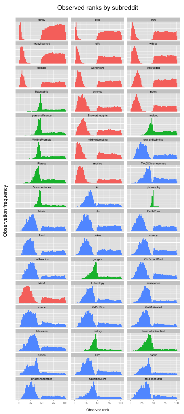
I used k-means clustering based on observed rank distributions to assign each subreddit to 1 of 3 clusters, which are color-coded in the graph above. The clusters are:
Cluster 1 (red): the most popular subreddits, a.k.a. “viral candy”
AskReddit, aww, funny, gaming, gifs, IAmA, mildlyinteresting, movies, news, pics, science, Showerthoughts, todayilearned, videos, worldnews
Cluster 2 (green): page two subreddits, often at bottom of page two, almost never on page one
Documentaries, Fitness, gadgets, history, InternetIsBeautiful, listentothis, nosleep, personalfinance, philosophy, UpliftingNews, WritingPrompts
Cluster 3 (blue): the rest
Art, askscience, books, creepy, dataisbeautiful, DIY, EarthPorn, explainlikeimfive, food, Futurology, GetMotivated, Jokes, LifeProTips, Music, nottheonion, OldSchoolCool, other, photoshopbattles, space, sports, television, tifu, TwoXChromosomes
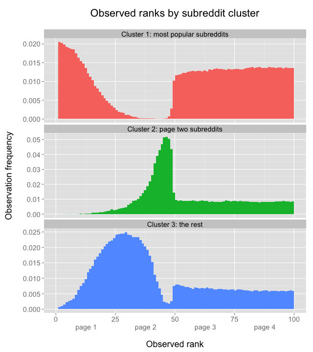
With the number of dimensions reduced from some 50 subreddits to only 3 clusters, it becomes easier to look at the differences between clusters. Here’s the distribution of ranks by cluster:
And an area chart which shows the distribution of clusters at each rank:
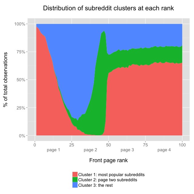
Cluster 1 represents the most popular subreddits, like r/funny, which dominate the top of page one, but almost never show up on page two. Cluster 2 contains subreddits like r/personalfinance which dominate the bottom of page two, but very rarely make it to page one. Cluster 3 contains everything else: subreddits that don’t often make it to the top of page one, but aren’t stuck in page two purgatory either; cluster 3 subreddits typically represent the majority of posts at the bottom of page one and top of page two. By the way, in the earlier interactive graph, posts from clusters 1, 2, and 3 are colored red, green, and blue, respectively.
Since these subreddit clusters behave so differently, it might make sense to recalculate the earlier graph showing the conditional probability of making the top 25 separately for each subreddit cluster:
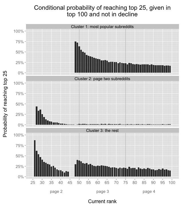
My traveling salesman animation was posted in r/dataisbeautiful, which is part of cluster 3. This newest graph shows that of posts in cluster 3 that reach the #26 rank, 87% will eventually reach the top 25, which is a bit higher than the 84% number calculated earlier based on results aggregated across all subreddits.
The new set of 3 conditional probability graphs makes more intuitive sense than the single earlier graph, which showed a large decline in probability for posts ranked in the 40s, then a big increase for posts ranked in the low 50s. We can see now that the large decline and increase were due to the shifting mixture of subreddit clusters: the ranks in the mid 40s are usually posts from cluster 2, and cluster 2 posts almost never get to the front page, hence the low aggregate conditional probabilities for ranks in the 40s.
Cluster 3’s conditional probability graph still looks a bit less satisfying because it is not monotonically decreasing. The cluster 3 conditional probabilities in the 40s are lower than the conditional probabilities on pages three and four, and there’s no obvious reason why. Maybe my subreddit clusters are not defined perfectly, or there’s something else entirely that causes the cluster 3 posts ranked in the 40s to have lower probability of making the front page than posts in the 50s.
Vote score and age
As mentioned previously, it’s a known fact that reddit incorporates vote score and age into its rankings. The rankings, however, are not a strict meritocracy based only on these two factors. Many posts in the top 100 have relatively low scores, say, under 200. Nearly all of the posts that make the top 100 despite low scores come from clusters 2 and 3, which suggests that a post in a cluster 2 or 3 subreddit needs fewer votes to appear in the top 100 compared to a post from cluster 1:

I don’t know the exact justification for this, but the preference system for clusters 2 and 3 is probably designed to keep reddit’s default top pages more varied than they would be due to votes alone. Based on anecdotal experience, upvote systems favor more easily digestible content – stuff like cute animal gifs. Sure, everybody loves cute animal gifs, but it’s also good to offer a wider variety of content, from the sublime to the ridiculous, even if it that requires overriding the direct democracy of a pure vote-based system. Looking back at the list of subreddit clusters, it seems like cluster 1 has the most fun and cheap laughs, cluster 2 contains more serious and discussion-oriented posts, and cluster 3 is a bit of a grab bag somewhere in between.
At the upper echelons, very few posts that make the top 25 have scores less than 1000, regardless of which subreddit cluster they come from:

Posts in the top 25 have to have a high score regardless of subreddit, but posts don’t need to have a high score to be on page two. Furthermore, page two excludes many of the most popular subreddits, and therefore can often take on a more informational and less “cute” vibe. On pages three and four, posts from any subreddit cluster can appear, but posts from cluster 1 subreddits have much higher scores than their counterparts from clusters 2 and 3, which again suggests that votes are graded on a curve that favors clusters 2 and 3:
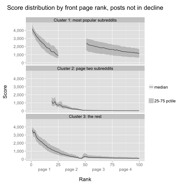
I haven’t included post age in the above graphs because graphs can only contain so many dimensions before they become indecipherable, but heat maps offer another way to visualize the relationship between score, age, and a post’s probability of making the top 25. As expected, the heat map shows that the probability of making the front page is generally highest when age is low and score is high, but so few cluster 2 posts achieve a high score that the aggregate probability of a cluster 2 post making the top 25 from the top 100 is very slim:

Imgur pageviews data
I was particularly impressed that my salesman gif received over 1.3 million pageviews on Imgur. I thought it’d be cool to measure pageviews as a function of reddit rank – my post only got to rank #14, just imagine how many pageviews the posts at #1 must receive!
Imgur is by far the most popular domain in the dataset, accounting for 43% of all posts that reached the reddit top 100. This is crucial for an analysis of pageviews, because reddit doesn’t provide pageview data for each post, but Imgur does, so while we can’t know how many views non-Imgur posts received, we can at least roughly observe the effect of reddit rank on traffic.
I grabbed pageview data for every Imgur post, grouped by best rank achieved, then calculated the 25th, 50th, and 75th percentiles, which look like this:

The median Imgur post that reaches #1 on reddit has over 2 million pageviews. Again we see a strange result that Imgur posts in the 50s actually have more pageviews than the posts in the 20s, but this can once again probably be explained by subreddits: the most popular cluster 1 subreddits get a lot of direct traffic themselves, and they’re the ones that tend to dominate the ranks in the 50s. Overall, Imgur accounts for 58% of posts in cluster 1, 0.04% of cluster 2, and 35% of cluster 3.
In conclusion… wait, what was the point of all of this?
I had always thought that reddit’s front pages operated as some kind of direct democracy, and I was surprised to learn that’s not actually the case. reddit’s codebase is largely open source, so it’s possible that the logic that reserves certain ranks for certain subreddits is completely in the open, but again I didn’t know about it, and neither did any of the redditors I asked about it.
I’d be curious to see what would happen if all subreddits were treated equally: my guess is that the reddit default top 100 would contain an even higher rate of funny pictures, but who knows, maybe there’d be some unintended side effects that would lead people to upvote more varied content.
Code and data on GitHub
The code and data are both available on GitHub. There are 3 main components of the repo:
- Ruby code to collect data from the reddit API
- R code to analyze the data
- Postgres database dump file – 25 mb compressed, fully restored it takes up about 175 mb on disk