Todd W. Schneider

The Simpsons by the Data

Analysis of 27 seasons of Simpsons data reveals the show’s most significant side characters, a pattern of patriarchy, declining TV ratings, and more

The Simpsons needs no introduction. At 27 seasons and counting, it’s the longest-running scripted series in the history of American primetime television.

The show’s longevity, and the fact that it’s animated, provides a vast and relatively unchanging universe of characters to study. It’s easier for an animated show to scale to hundreds of recurring characters; without live-action actors to grow old or move on to other projects, the denizens of Springfield remain mostly unchanged from year to year.

As a fan of the show, I present a few short analyses about Springfield, from the show’s dialogue to its TV ratings. All code used for this post is available on GitHub.

The Simpsons characters who have spoken the most words

Simpsons World provides a delightful trove of content for fans. In addition to streaming every episode, the site includes episode guides, scripts, and audio commentary. I wrote code to parse the available episode scripts and attribute every word of dialogue to a character, then ranked the characters by number of words spoken in the history of the show.

The top four are, not surprisingly, the Simpson nuclear family.

If you want to quiz yourself, pause here and try to name the next 5 biggest characters in order before looking at the answers…

characters

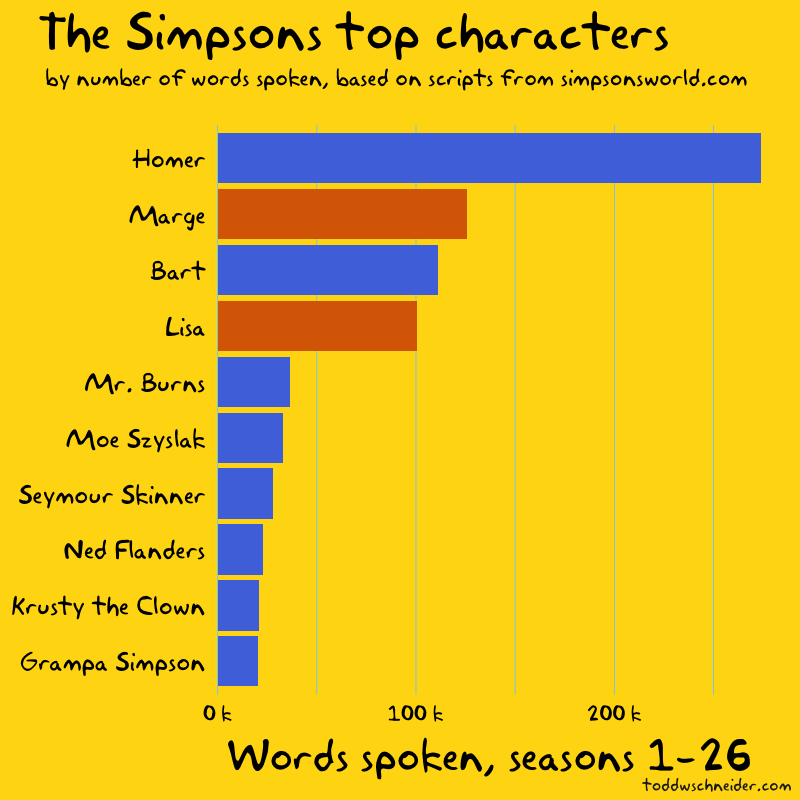
Of course Homer ranks first: he’s the undisputed most iconic character, and he accounts for 21% of the show’s 1.3 million words spoken through season 26. Marge, Bart, and Lisa—in that order—combine for another 26%, giving the Simpson family a 47% share of the show’s dialogue.

If we exclude the Simpson nuclear family and focus on the top 50 supporting characters, the results become a bit less predictable, if not exactly surprising.

supporting cast

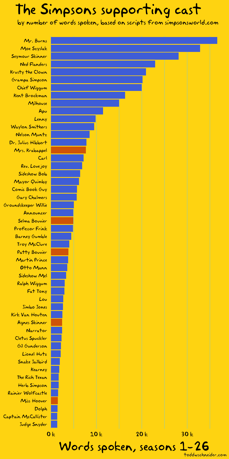
Mr. Burns speaks the most words among supporting cast members, followed by Moe, Principal Skinner, Ned Flanders, and Krusty rounding out the top 5.

Gender imbalance on The Simpsons

The colors of the bars in the above graphs represent gender: blue for male characters, red for female. If we look at the supporting cast, the 14 most prominent characters are all male before we get to the first woman, Mrs. Krabappel, and only 5 of the top 50 supporting cast members are women.

Women account for 25% of the dialogue on The Simpsons, including Marge and Lisa, two of the show’s main characters. If we remove the Simpson nuclear family, things look even more lopsided: women account for less than 10% of the supporting cast’s dialogue.

A look at the show’s list of writers reveals that 9 of the top 10 writers are male. I did not collect data on which writers wrote which episodes, but it would make for an interesting follow-up to see if the episodes written by women have a more equal distribution of dialogue between male and female characters.

Eye on Springfield

The scripts also include each scene’s setting, which I used to compute the locations with the most dialogue.

locations

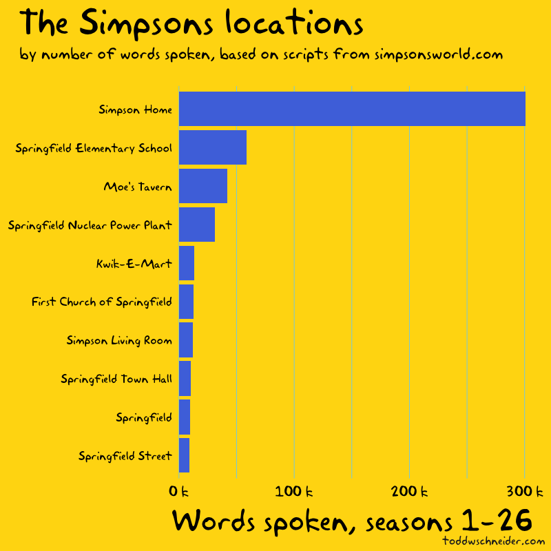
The location data is a bit messy to work with—should “Simpson Living Room” really be treated differently than “Simpson Home”—but nevertheless it paints a picture of where people spend time in Springfield: at home, school, work, and the local bar.

The Bart-to-Homer transition?

Per Wikipedia:

While later seasons would focus on Homer, Bart was the lead character in most of the first three seasons

I’ve heard this argument before, that the show was originally about Bart before switching its focus to Homer, but the actual scripts only seem to partially support it.

bart

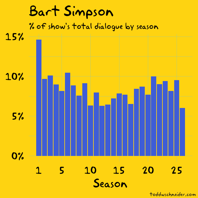
Bart accounted for a significantly larger share of the show’s dialogue in season 1 than in any future season, but Homer’s share has always been higher than Bart’s. Dialogue share might not tell the whole story about a character’s prominence, but the fact is that Homer has always been the most talkative character on the show.

The Simpsons TV ratings are in decline

Historical Nielsen ratings data is hard to come by, so I relied on Wikipedia for Simpsons episode-level television viewership data.

ratings

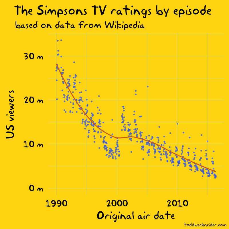
Viewership appears to jump in 2000, between seasons 11 and 12, but closer inspection reveals that’s when the Wikipedia data switches from reporting households to individuals. I don’t know the reason for the switch—it might have something to do with Nielsen’s measurement or reporting—but without any other data sources it’s difficult to confirm.

Aside from that bump, which is most likely a data artifact, not a real trend, it’s clear that the show’s ratings are trending lower. The early seasons averaged over 20 million viewers per episode, including Bart Gets an “F”, the first episode of season 2, which is still the most-watched episode in the show’s history with an estimated 33.6 million viewers. The more recent seasons have averaged less than 5 million viewers per episode, more than an 80% decline since the show’s beginnings.

ratings

Frinkiac

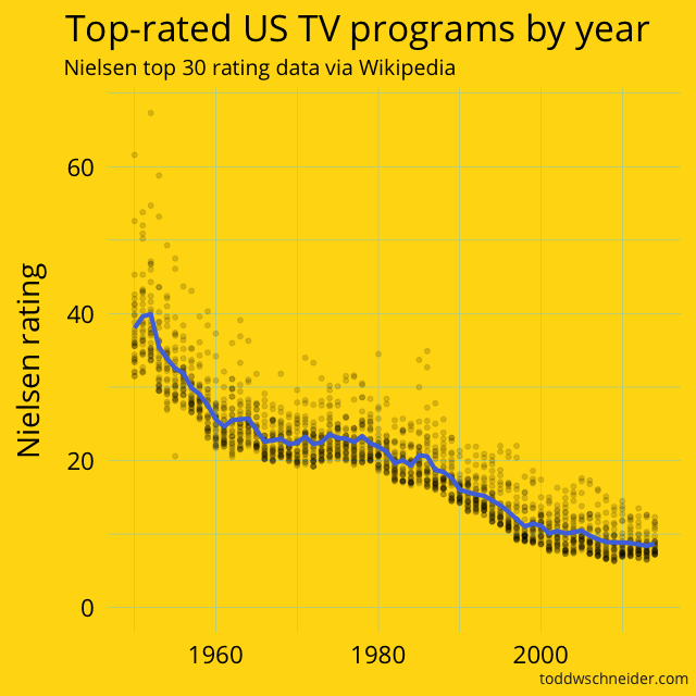
TV ratings have declined everywhere, not just on The Simpsons

Although the ratings data looks bad for The Simpsons, it doesn’t tell the whole story: TV ratings for individual shows have been broadly declining for over 60 years.

When The Simpsons came out in 1989, the highest 30 rated shows on TV averaged a 17.7 Nielsen rating, meaning that 17.7% of television-equipped households tuned in to the average top 30 show. In 2014–15, the highest 30 rated shows managed an 8.7 average rating, a decline of 50% over that 25 year span.

If we go all the way back to the 1951, the top 30 shows averaged a 38.2 rating, which is more than triple the single highest-rated program of 2014–15 (NBC’s Sunday Night Football, which averaged a 12.3 rating).

nielsen

Full data for the top 30 shows by season is available here on GitHub

I have no proof for the cause of this decline in the average Nielsen rating of a top 30 show, but intuitively it must be related to the proliferation of channels. TV viewers in the 1950s had a small handful of channels to choose from, while modern viewers have hundreds if not thousands of choices, not to mention streaming options, which present their own ratings measurement challenges.

measurement

Frinkiac

We could normalize Simpsons episode ratings by the declining top 30 curve to adjust for the fact that it’s more difficult for any one show to capture as large a share of the TV audience over time. But as mentioned earlier, the normalization would only account for about a 50% decline in ratings since 1989, while The Simpsons ratings have declined more like 80-85% over that horizon.

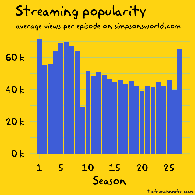
Alas, I must confess, I stopped watching the show around season 12, and Simpsons World’s episode view counts suggest that modern streaming viewers are more interested in the early seasons too, so it could just be that people are losing interest.

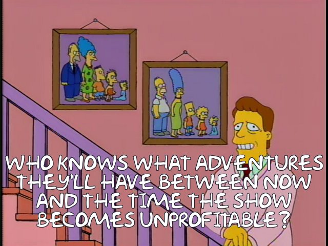
As I write this, The Simpsons is under contract to be produced for one more season, though it’s entirely possible it will be renewed. But ultimately Troy McClure said it best at the conclusion of the The Simpsons 138th Episode Spectacular, which, it’s hard to believe, now covers less than 25% of the show’s history:

troy mcclure

Frinkiac

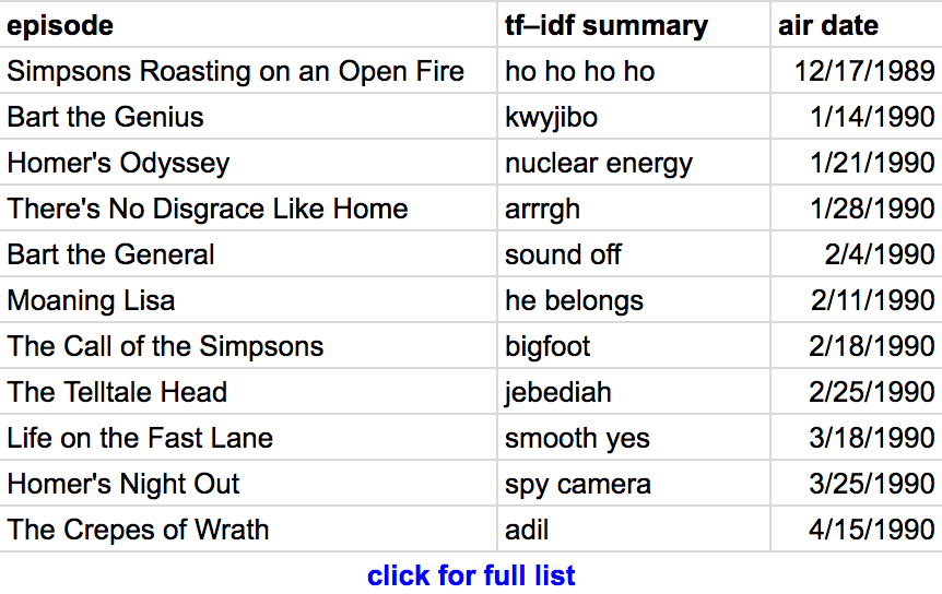
Automated episode summaries using tf–idf

Term frequency–inverse document frequency is a popular technique used to determine which words are most significant to a document that is itself part of a larger corpus. In our case, the documents are individual episode scripts, and the corpus is the collection of all scripts.

The idea behind tf–idf is to find words or phrases that occur frequently within a single document, but rarely within the overall corpus. To use a specific example from The Simpsons, the phrase “dental plan” appears 19 times in Last Exit to Springfield, but only once throughout the rest of the show, and sure enough the tf–idf algorithm identifies “dental plan” as the most relevant phrase from that episode.

I used R’s tidytext package to pull out the single word or phrase with the highest tf–idf rank for each episode; here’s the relevant section of code.

The results are pretty good, and should be at least slightly entertaining to fans of the show. Beyond “dental plan”, there are fan-favorites including “kwyjibo”, “down the well”, “monorail”, “I didn’t do it”, and “Dr. Zaius”, though to be fair, there are also some less iconic results.

You can see the full list of episodes and “most relevant phrases” here.

episode summaries

Another interesting follow-up could be to use more sophisticated techniques to write more complete episode summaries based on the scripts, but I was pleasantly surprised by the relevance of the comparatively simple tf–idf approach.

data

Frinkiac

Code on GitHub

All code used in this post is available on GitHub, and the screencaps come from the amazing Frinkiac

Taxi, Uber, and Lyft Usage in New York City

Open TLC data reveals the taxi industry’s contraction, Uber’s growth, and the scramble for market share

Update March 2019: Click here to view a new dashboard that tracks additional monthly taxi and ridehailing metrics from the TLC. This page will still update, but I recommend the new dashboard for more comprehensive up-to-date data.

The New York City Taxi & Limousine Commission publishes summary reports that include aggregate statistics about taxi, Uber, and Lyft usage. These are in addition to the trip-level data that I wrote about previously; although the summary reports contain much less detail, they’re updated more frequently, which provides a more current glimpse into the state of the cutthroat NYC taxi market.

I’ve updated the nyc-taxi-data GitHub repository with code to fetch and process the summary reports. The graphs on this page will update every month as the TLC releases more data, though since March 2019, I recommend this dashboard as the best place to see the most up-to-date metrics.

Trips Per Day in NYC: Taxi vs. Uber vs. Lyft

The summary data includes the number of trips taken by taxis and for-hire vehicles:

toddwschneider.com

This graph will continue to update as the TLC releases additional data, but at the time I wrote this in April 2016, the most recent data shows yellow taxis provided 60,000 fewer trips per day in January 2016 compared to one year earlier, while Uber provided 70,000 more trips per day over the same time horizon.

Although the Uber data only begins in 2015, if we zoom out to 2010, it’s even more apparent that yellow taxis are losing market share.

Total Vehicles on the Road

The summary reports also include the total number of vehicles dispatched by each service:

toddwschneider.com

Again this graph will update in the future when more data is available, but as of January 2016 there are just over 13,000 yellow taxis in New York, a number that is strictly regulated by the taxi medallion system. Green boro taxis account for another 6,000 vehicles. Uber has grown from 12,000 vehicles dispatched per month at the beginning of 2015 to 30,000 in January 2016, while Lyft accounts for another 10,000.

However, the Uber/Lyft numbers might not be as dramatic as they seem: the TLC’s data does not indicate how many days per week Uber/Lyft vehicles work, only the total number of trips per month and the total number of vehicles that made at least one trip.

A study by Jonathan Hall and Alan Krueger reported that 42% of UberX drivers in New York work fewer than 15 hours per week, while another 35% work 16–34 hours per week. If those numbers are true, then a very rough guess might be that about half of those 25,000 vehicles make at least one pickup on any given day.

Yellow taxi utilization rates are much higher: the TLC statistics report that the average medallion is active 29 days per month, 14 hours per day (note that multiple drivers can share a medallion).

The controversial question is whether the influx of Uber, Lyft, and other for-hire vehicles has worsened congestion problems in NYC. I’ll stay out of that kerfuffle for now, but at least the popular narrative is that the city’s study did not blame Uber for increased congestion in Manhattan.

It would be interesting to look at the trip-level taxi data to see if taxi rides from point A to point B have gotten slower over the years in various parts of the city. But even if they have, it would be difficult if not impossible to blame it on for-hire vehicles—or any other single factor—using only the trip-level taxi data.

Lyft, Via, Juno, and Gett

Lyft is probably the most well-known Uber competitor, but there are others. Via, Juno, and Gett are among the newer ridesharing services to operate in NYC, and they report data to the TLC too.

toddwschneider.com
toddwschneider.com

Update 4/26/16: apparently there was a data reporting error between Lyft and the TLC in January 2016, which has now been corrected. When I originally wrote this post, the Lyft graph looked like this. Based on the revised data, it does not appear that Lyft usage declined in early 2016.

Uber’s Revenue in NYC

Uber’s revenue numbers are not publicly disclosed, but we can piece together different bits of information to arrive at a very rough estimate for Uber’s New York revenue in 2015:

  • The TLC data reports 36.3 million Uber trips in NYC in 2015
  • Uber published average NYC UberX fares for 2012–2014. The average fare was $27 in September 2014, but fares have been decreasing since 2012. Let’s guess a $25 average fare for Uber’s NYC trips in 2015, including UberX and UberBlack
    • By comparison, the average yellow taxi fare was a bit over $14 in 2015
  • Uber takes a 20–25% commission, call it 22% on average

That gives us (36.3 * $25 * 0.22) = $200 million estimated revenue for Uber in NYC in 2015.

2016 Outlook

UberX’s recent NYC fare cut will probably increase demand for rides while lowering the average fare. Simultaneously Uber might charge higher commissions, and who knows how surge pricing trends might evolve. I doubt we’ll see too many public data points surrounding revenue, but maybe there will be enough to continue the “rough estimate” game.

It will be interesting to see what happens in 2016. Like many New Yorkers, I’ll be curious to see if Uber continues to gain market share, if yellow taxis do anything to stanch their wounds, and if Lyft—or any other newcomers—can muscle their way into the ranks of the major players.

BallR: Interactive NBA Shot Charts with R and Shiny

Make your own shot charts for any NBA player dating back to 1996, code is open-source on GitHub

The NBA’s Stats API provides data for every single shot attempted during an NBA game since 1996, including location coordinates on the court. I built a tool called BallR, using R’s Shiny framework, to explore NBA shot data at the player-level.

BallR lets you select a player and season, then creates a customizable chart that shows shot patterns across the court. Additionally, it calculates aggregate statistics like field goal percentage and points per shot attempt, and compares the selected player to league averages at different areas of the court.

Update April 2017: for some reason the NBA Stats API is not working with my hosted version of the app. The app still works if you run it locally, see instructions below.

Run the App Locally

It’s very easy to run the app on your own computer, all you have to do is paste the following lines into an R console:

1
2
3
4
packages = c("shiny", "ggplot2", "hexbin", "dplyr", "httr", "jsonlite")
install.packages(packages, repos = "https://cran.rstudio.com/")
library(shiny)
runGitHub("ballr", "toddwschneider")

Chart Types

BallR lets you choose from 3 primary chart types: hexagonal, scatter, and heat map. You can toggle between them using the radio buttons in the app’s sidebar.

Hexagonal

Hexagonal charts, popularized by Kirk Goldsberry at Grantland, group shots into hexagonal regions, then calculate aggregate statistics within each hexagon. Hexagon sizes and opacities are proportional to the number of shots taken within each hexagon, while the color scale represents a metric of your choice, which can be one of:

  • FG%
  • FG% vs. league average
  • Points per shot

For example, here’s Stephen Curry’s FG% relative to the league average within each region of the court during the 2015–16 season:

curry hexagonal

The chart confirms the obvious: Stephen Curry is a great shooter. His 3-point field goal percentage is more than 11 percentage points above the league average, and he also scores more efficiently than average when closer to the basket.

Compare to another all-time great, Kobe Bryant, who has been shooting poorly this season:

bryant hexagonal

Kobe’s shot chart shows that he’s shooting below the league average from most areas of the court, especially 3-point range (Kobe’s 2005–06 shot chart, on the other hand, looks much nicer).

Scatter

Scatter charts are the most straightforward option: they plot each shot as a single point, color-coding for whether the shot was made or missed. Here’s an example again for Stephen Curry:

curry scatter

Heat Maps

Heat maps use two-dimensional kernel density estimation to show the distribution of a player’s shot attempts across the court.

Anecdotally I’ve found that heat maps often show that most shot attempts are taken in the restricted area near the basket, even for players you might think of as outside shooters. BallR lets you apply filter to focus on specific areas of the court, and it’s sometimes more interesting to filter out restricted area shots when generating heat maps. For example here’s the heat map of Stephen Curry’s shot attempts excluding shots from within the restricted area (see here for Curry’s unfiltered heat map):

curry heat map excluding restricted area

The heat map shows that—at least when he’s not shooting from the restricted area—Curry attempts most of his shots from the “Above the break 3” zone, with a slight bias to right side of that area (confusingly, that’s his left, but the NBA Stats API calls it the “Right Center” of the court)

LeBron James even more heavily shoots from the restricted area, but when we filter out those shots, we see his favorite area is mid-range to his right:

lebron heat map excluding restricted area

Historical Analysis

I was curious if this pattern of LeBron favoring his right side has always been so pronounced, so I took all 19,000+ regular season shots he’s attempted in his career since 2003, and calculated the percentage that came from the left, right, and center of the court in each season:

lebron distribution by area

It’s a bit confusing because what the NBA Stats API calls the “right” side of the court is actually the left side of the court from LeBron’s perspective, but the data shows that in 2015–16, LeBron has taken significantly fewer shots from his left compared to previous seasons. The data also confirms that LeBron’s shooting performance in 2015–16 has been below his historical average from almost every distance:

lebron fg pct by area

The BallR app doesn’t currently have a good way to do these historical analyses on-demand, so I had to write additional R scripts, but a potential future improvement might be to create a backend that caches the shot data and exposes additional endpoints that aggregate data across seasons, teams, or maybe even the whole league.

Limitations of Shot Charts

There’s a ton of data not captured in shot charts, and it’s easy to draw unjustified conclusions when looking only at shot attempts and results. For example, you might look at a shot chart and think, “well, points per shot is highest in the restricted area, so teams should take more shots in the restricted area.”

You might even be right, but shot charts definitely don’t prove it. Passing or dribbling the ball into the restricted area probably increases the risk of a turnover, and that risk might more than offset the increase in field goal percentage compared to a longer shot, though we don’t know that based on shot charts alone.

Shot charts also don’t tell us anything about:

  • Locations of the nearest defenders
  • Probability of an offensive rebound after a miss
  • Probability that the shooter will get fouled
  • Next-best options at the time of the shot: was another player open for a higher value shot?
  • Game context: a high percentage 2-point shot is useless at the buzzer if you’re down by 3

I’d imagine that NBA analysts try to quantify all of these factors and more when analyzing decision-making, and the NBA Stats API probably even provides some helpful data at various other undocumented endpoints. It could make for another area of future improvement to incorporate whatever additional data exists into the charts.

Code on GitHub

The BallR code is all open-source, if you’d like to contribute or just take a closer look, head over to the GitHub repo.

Acknowledgments

Posts by Savvas Tjortjoglou and Eduardo Maia about making NBA shot charts in Python and R, respectively, served as useful resources. Many of Kirk Goldsberry’s charts on Grantland also served as inspiration.