I wrote an open-source app called NBA Shots DB that uses the NBA Stats API to populate a database with all 4.5 million shots attempted in NBA games since 1996. The app also processes a dataset provided by Sportradar of over 1 million NCAA men’s shot attempts since 2013 into a format that can be merged with the NBA data. Both datasets include similar information: location coordinates, player and team names, which shots went in, and so on. The merged dataset allows us to compare NBA and NCAA shot patterns on the same scale, and even allows tracking individual players as they move from college to the pros.
Shot data has some significant limitations, and we should be very wary of drawing unjustified conclusions from it, but it can also help illuminate trends that might not be otherwise obvious to the human eye.
NBA players shoot better than college players from distance, but college players appear to be more accurate closer to the rim
The NBA’s aggregate field goal percentage is slightly better than the NCAA’s, 46% to 44%. I would have guessed that NBA professionals would be better shooters than NCAA players at all distances, but it turns out that for shots under 6 feet, NCAA attempts are more likely to go in. The shot data can’t tell us why—my guess is that the NCAA has more mismatches where an offensive player is much bigger than his defender, leading to easier interior shots, but we don’t really know.
An important disclaimer: neither dataset is particularly clear about where its data comes from. The NBA data is presumably generated by the SportVU camera systems installed at NBA arenas, but I don’t know how Sportradar produces the NCAA data. It could come from cameras, manual review of game tape, or something else. If the systems that gather the data are different enough, it might make comparisons less meaningful.
For example, it seems a bit odd that the NBA data reports a much higher frequency of shots less than 1 foot from the basket. It makes me think the measurement systems might be different, and maybe what’s recorded as a “1 foot” shot in the NBA is recorded as a “3 foot” shot in the NCAA. If we restrict to all shots under 6 feet in each dataset, the NCAA still has a slightly higher FG% than the NBA (59% vs. 58%), but depending on how the recording systems work, the accuracy gap at short distances might be significantly smaller than the graph would have you believe.
Scouting the college players who shoot the best from NBA 3-point range
The college 3-point line is 3 feet closer to the basket than the NBA line in most places, though the gap narrows to 1.25 feet in the corners. But of course there’s nothing to stop a college player from shooting from NBA 3-point range, and NBA scouts might be particularly interested in how college players shoot from NBA-range as a predictor of future pro performance.
I used the Sportradar NCAA data to isolate shots that were not only 3-pointers, but would have been 3-pointers even in the NBA, then ranked college players by their NBA-range 3-point accuracy. Here’s a list of NCAA players who attempted at least 100 NBA-range 3-pointers since 2013:
Unfortunately for any aspiring scouts, it looks like this might not be a good predictor of future NBA performance. Based on the 23 players in the dataset who attempted at least 100 NBA-range 3-pointers in college and another 100 3-pointers in the NBA, there’s no strong correlation between college and pro results. Most of the players had lower accuracy in the NBA than in college, though Terry Rozier of Louisville and the Boston Celtics managed to improve his NBA-range 3-point shooting by +9%.
Adjusted for shot distance, players typically shoot worse during their NBA rookie season than they did during their final college season
There are many competing factors that might influence field goal accuracy when a player transitions from college to the pros. Players presumably get better with age in their early 20s as they mature physically, NBA players probably practice more, and have access to better training facilities and coaching, all of which suggest they might shoot better in their first professional season than they did in college. On the other hand, NBA rookies have to play against other NBA players, who are on average much better defenders than their previous college opponents.
We’ve seen anecdotally with 3-point attempts that an individual player usually shoots worse in the NBA than he did in college, but I wanted to do something at least a bit more scientific to quantify the effect. Using a dataset of 129,000 shots from 262 players who appear in both datasets, I ran a logistic regression to estimate the change in field goal accuracy associated with the transition from college to the NBA. It’s a crude model, considering shot distance, whether the player is in his final year of college or his first year in the NBA, and a player-level adjustment for each player. The model ignores any differences between positions, so if guards and centers are affected differently, the model would probably miss it.
The simple model predicts that, on average, as a player goes from his last year in college to his first year in the NBA, his field goal percentage will decline by around 4% on shots over 6 feet, and as much as 15% on shorter shots. It doesn’t say anything about why, though again I’d suspect the primary explanation is that NBA players are much better defenders.
At first glance, this result that players shoot worse when they go from college to the NBA might seem in conflict with the first chart in this post, which showed that NBA players had higher field goal percentages on longer shots than college players. The most likely explanation is that rookies are below-average shooters among all NBA players, and as rookies turn into veterans, their shooting performance improves. Note that the merged NBA/NCAA dataset has a data truncation issue: because the NCAA data only spans 2013–18, any player who was in both leagues during that period has at most 4 years of NBA experience. Over time, assuming both datasets remain publicly available, it will be interesting to see if there is an NBA experience level where a player’s shooting performance is expected to exceed his college stats.
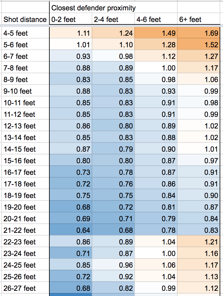
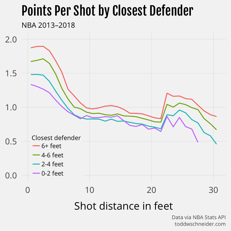
In the NBA, a wide-open mid-range 2 can be a better shot than a well-guarded 3
The NBA Stats API provides some aggregate data on shooting performance based on both the distance of the shot, and the distance of the closest defender at the time of the shot, which shows that yes, usually a 3-point attempt has a higher expected value than a long-range 2. But if the 3-pointer is tightly guarded and the long-range 2 is wide-open, then the 2-pointer can be better. For example, a wide-open 2-point shot from 20 feet on average results in 0.84 points, while a tightly-guarded 3-point attempt from 25 feet only averages 0.71 points.
The same table, in graph form:
Again, basketball is complicated and these isolated data points are not a final authority on what constitutes a good or bad shot. In the 2017-18 season, the Houston Rockets and Indiana Pacers have both been successful even though they are at opposite ends of the shooting spectrum, with the Rockets shooting the most 3s, and the Pacers shooting the most long-distance 2s. To be fair, the 3-point-happy Rockets currently have the best record in the league, but the Pacers’ success, despite taking the most supposedly “bad” mid-range 2s of any team in the league, suggests that there’s more than one way to win a basketball game.
Another important note: for unknown reasons, the aggregate stats by distance and closest defender do not match the aggregates computed from the individual shot-level data. The shot-level data includes more attempts, which makes me think that the aggregates by closest defender are somehow incomplete, but I wasn’t able to find more information about why. The difference is particularly pronounced in shots of around 4 feet, with the shot-level data reporting a significantly lower FG% than the aggregate data.
Code on GitHub, future work
The code used to compile and analyze all of the NBA and NCAA shots is available here on GitHub. The NBA Stats API has many more (mostly undocumented) endpoints, and the code could probably be expanded to capture more information that could feed into more detailed analysis.
Every so often I see a story about whether or not the hot-hand exists, and though I kind of doubt that debate will ever be settled conclusively, maybe the shot-collecting code can be of use to future researchers.
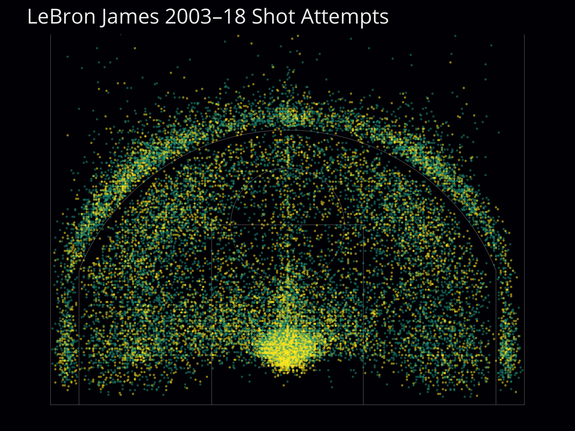
The Los Angeles Times made a nice graphic of all 30,000+ shots Kobe Bryant ever attempted in the NBA, and you could use the data in NBA Shots DB to do something similar for any NBA player since 1996. Here’s an image of every shot LeBron James has attempted during his NBA career:
Or you could do a team-level analysis, for example comparing the aforementioned Houston Rockets (lots of 3-pointers) to the Indiana Pacers (lots of mid-range 2-pointers):
These images use an adapted version of my BallR shot chart app, but a better solution would be to expose an API from the NBA Shots DB app, then have BallR connect to that API instead of hitting the NBA Stats API directly.
Over 50% of peak hour taxi trips would be faster as Citi Bike rides, and taxis are only getting slower
Every day in New York City, millions of commuters take part in a giant race to determine transportation supremacy. Cars, bikes, subways, buses, ferries, and more all compete against one another, but we never get much explicit feedback as to who “wins.” I’ve previously written about NYC’s public taxi data and Citi Bike share data, and it occurred to me that these datasets can help identify who’s fastest, at least between cars and bikes. In fact, I’ve built an interactive guide that shows when a Citi Bike is faster than a taxi, depending on the route and the time of day.
The methodology and findings will be explained more below, and all code used in this post is available open-source on GitHub.
Interactive guide to when taxis are faster or slower than Citi Bikes
Pick a starting neighborhood and a time. The map shows whether you’d expect get to each neighborhood faster with a taxi (yellow) or a Citi Bike (dark blue).
Or click the map to change neighborhoods
Weekday time window
From Midtown East, weekdays 8:00 AM–11:00 AM
Taxi vs. Citi Bike travel times to other neighborhoods
Data via NYC TLC and Citi Bike
Based on trips 7/1/2016–6/30/2017
toddwschneider.com
Hover over a neighborhood (tap on mobile) to view travel time stats
40% of weekday taxi trips—over 50% during peak hours—would be faster as Citi Bike rides
I estimate that 40% of weekday taxi trips within the Citi Bike service area would expect to be faster if switched to a Citi Bike, based on data from July 2016 to June 2017. During peak midday hours, more than 50% of taxi trips would expect to be faster as Citi Bike rides.
There are some significant caveats to this estimate. In particular, if many taxi riders simultaneously switched to Citi Bikes, the bike share system would probably hit severe capacity constraints, making it difficult to find available bikes and docks. Increased bike usage might eventually lead to fewer vehicles on the road, which could ease vehicle congestion, and potentially increase bike lane congestion. It’s important to acknowledge that when I say “40% of taxi trips would be faster if they switched to Citi Bikes”, we’re roughly considering the decision of a single able-bodied person, under the assumption that everyone else’s behavior will remain unchanged.
Heading crosstown in Manhattan? Seriously consider taking a bike instead of a car!
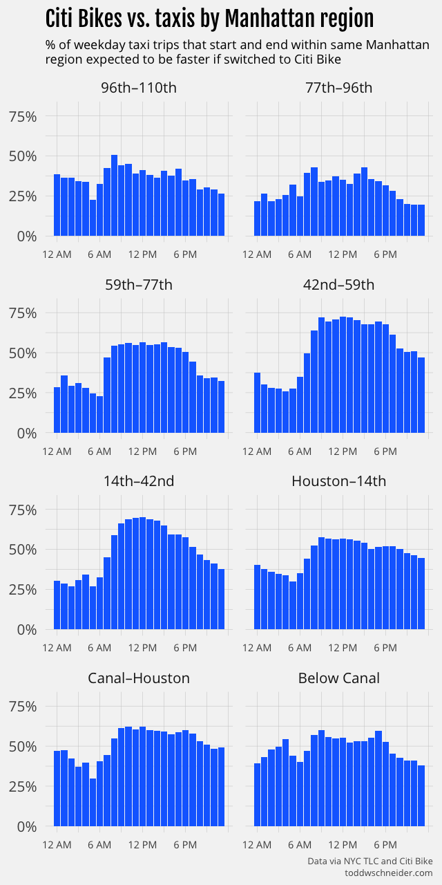
Crosstown Manhattan trips are generally regarded as more difficult than their north-south counterparts. There are fewer subways that run crosstown, and if you take a car, the narrower east-west streets often feel more congested than the broad north-south avenues with their synchronized traffic lights. Crosstown buses are so notoriously slow that they’ve been known to lose races against tricycles.
I divided Manhattan into the crosstown zones pictured above, then calculated the taxi vs. Citi Bike win rate for trips that started and ended within each zone. Taxis fare especially badly in the Manhattan central business district. If you take a midday taxi that both starts and ends between 42nd and 59th streets, there’s over a 70% chance that the trip would have been faster as a Citi Bike ride.
Keep in mind that’s for all trips between 42nd and 59th streets. For some of the longest crosstown routes, for example, from the United Nations on the far east side to Hell’s Kitchen on the west, Citi Bikes beat taxis 90% of the time during the day. It’s worth noting that taxis made 8 times as many trips as Citi Bikes between 42nd and 59th streets from July 2016 to June 2017—almost certainly there would be less total time spent in transit if some of those taxi riders took bikes instead.
Hourly graphs for all of the crosstown zones are available here, and here’s a summary table for weekday trips between 8:00 AM and 7:00 PM:
Manhattan crosstown zone
% taxis lose to Citi Bikes
96th–110th
41%
77th–96th
36%
59th–77th
54%
42nd–59th
69%
14th–42nd
64%
Houston–14th
54%
Canal–Houston
60%
Below Canal
55%
A reminder that this analysis restricts to trips that start and end within the same zone, so for example a trip from 23rd St to 57th St would be excluded because it starts and ends in different zones.
Taxis fare better for trips that stay on the east or west sides of Manhattan: 35% of daytime taxi trips that start and end west of 8th Avenue would expect to be faster as Citi Bike trips, along with 38% of taxi trips that start and end east of 3rd Avenue. Taxis also generally beat Citi Bikes on longer trips:
Taxis are losing more to Citi Bikes over time
When the Citi Bike program began in July 2013, less than half of weekday daytime taxi trips would have been faster if switched to Citi Bikes. I ran a month-by-month analysis to see how the taxi vs. Citi Bike calculus has changed over time, and discovered that taxis are getting increasingly slower compared to Citi Bikes:
Note that this month-by-month analysis restricts to the original Citi Bike service area, before the program expanded in August 2015. The initial expansion was largely into Upper Manhattan and the outer boroughs, where taxis generally fare better than bikes, and so to keep things consistent, I restricted the above graph to areas that have had Citi Bikes since 2013.
Taxis are losing more to Citi Bikes over time because taxi travel times have gotten slower, while Citi Bike travel times have remained roughly unchanged. I ran a pair of linear regressions to model travel times as a function of:
trip distance
time of day
precipitation
whether the route crosses between Manhattan and the outer boroughs
month of year
year
The regression code and output are available on GitHub: taxi, Citi Bike
As usual, I make no claim that this is a perfect model, but it does account for the basics, and if we look at the coefficients by year, it shows that, holding the other variables constant, a taxi trip in 2017 took 17% longer than the same trip in 2009. For example, a weekday morning trip from Midtown East to Union Square that took 10 minutes in 2009 would average 11:45 in 2017.
The same regression applied to Citi Bikes shows no such slowdown over time, in fact Citi Bikes got slightly faster. The regressions also show that:
Citi Bike travel times are less sensitive to time of day than taxi travel times. A peak midday taxi trip averages 40% longer than the same trip at off-peak hours, while a peak Citi Bike trip averages 15% longer than during off-peak hours.
Rainy days are associated with 2% faster Citi Bike travel times and 1% slower taxi travel times.
For taxis, fall months have the slowest travel times, but for Citi Bikes, summer has the slowest travel times. For both, January has the fastest travel times.
Taxis are more prone to very bad days
It’s one thing to say that 50% of midday taxi trips would be faster as Citi Bike rides, but how much does that vary from day to day? You could imagine there are some days with severe road closures, where more nimble bikes have an advantage getting around traffic, or other days in the dead of summer, when taxis might take advantage of the less crowded roads.
I ran a more granular analysis to measure win/loss rates for individual dates. Here’s a histogram of the taxi loss rate—the % of taxi trips we’d expect to be faster if switched to Citi Bikes—for weekday afternoon trips from July 2016 to June 2017:
Many days see a taxi loss rate of just over 50%, but there are tails on both ends, indicating that some days tilt in favor of either taxis or Citi Bikes. I was curious if we could learn anything from the outliers on each end, so I looked at individual dates to see if there were any obvious patterns.
The dates when taxis were the fastest compared to Citi Bikes look like dates that probably had less traffic than usual. The afternoon with the highest taxi win rate was Monday, October 3, 2016, which was the Jewish holiday of Rosh Hashanah, when many New Yorkers would have been home from work or school. The next 3 best days for taxis were all Mondays in August, when I’d imagine a lot of people were gone from the city on vacation.
The top 4 dates where Citi Bikes did best against taxis were all rainy days in the fall of 2016. I don’t know why rainy days make bikes faster relative to taxis, maybe rain causes traffic on the roads that disproportionately affects cars, but it’s also possible that there’s a selection bias. I’ve written previously about how the weather predicts Citi Bike ridership, and not surprisingly there are fewer riders when it rains. Maybe the folks inclined to ride bikes when it’s raining are more confident cyclists, who also pedal faster when the weather is nice. It’s also possible that rainy-day cyclists are particularly motivated to pedal faster so they can get out of the rain. I don’t know if these are really the causes, but they at least sound believable, and would explain the observed phenomenon.
When the President is in town, take a bike
June 8, 2016 was a particularly good day for Citi Bikes compared to taxis. President Obama came to town that afternoon, and brought the requisite street closures with him. I poked around a bit looking for the routes that appeared to be the most impacted by the President’s visit, and came to afternoon trips from Union Square to Murray Hill. On a typical weekday afternoon, taxis beat Citi Bikes 57% of the time from Union Square to Murray Hill, but on June 8, Citi Bikes won 90% of the time. An even more dramatic way to see the Obama effect is to look at daily median travel times:
A typical afternoon taxi takes 8 minutes, but on June 8, the median was over 21 minutes. The Citi Bike median travel time is almost always 9 minutes, including during President Obama’s visit.
The same graph shows a similar phenomenon on September 19, 2016, when the annual United Nations General Assembly shut down large swathes of Manhattan’s east side, including Murray Hill. Although the impact was not as severe as during President Obama’s visit, the taxi median time doubled on September 19, while the Citi Bike median time again remained unchanged.
The morning of June 15, 2016 offers another example, this time on the west side, when an overturned tractor trailer shut down the Lincoln Tunnel for nearly seven hours. Taxi trips from the Upper West Side to West Chelsea, which normally take 15 minutes, took over 35 minutes. Citi Bikes typically take 18 minutes along the same route, and June 15 was no exception. Taxis would normally expect to beat Citi Bikes 67% of the time on a weekday morning, but on June 15, Citi Bikes won over 92% of the time.
These are of course three hand-picked outliers, and it wouldn’t be entirely fair to extrapolate from them to say that Citi Bikes are always more resilient than taxis during extreme circumstances. The broader data shows, though, that taxis are more than twice as likely as Citi Bikes to have days when a route’s median time is at least 5 minutes slower than average, and more than 3.5 times as likely to be at least 10 minutes slower, so it really does seem that Citi Bikes are better at minimizing worst-case outcomes.
Why have taxis gotten slower since 2009?
The biggest slowdowns in taxi travel times happened in 2014 and 2015. The data and regression model have nothing to say about why taxis slowed down so much over that period, though it might be interesting to dig deeper into the data to see if there are specific regions where taxis have fared better or worse since 2009.
Uber usage took off in New York starting in 2014, reaching over 10,000 vehicles dispatched per week by the beginning of 2015. There are certainly people who blame Uber—and other ride-hailing apps like Lyft and Juno—for increasing traffic, but the city’s own 2016 traffic report did not blame Uber for increased congestion.
It’s undoubtedly very hard to do an accurate study measuring ride-hailing’s impact on traffic, and I’m especially wary of people on both sides who have strong interests in blaming or exonerating the ride-hailing companies. Nevertheless, if I had to guess the biggest reasons taxis got particularly slower in 2014 and 2015, I would start with the explosive growth of ride-hailing apps, since the timing looks to align, and the publicly available data shows that they account for tens of thousands of vehicles on the roads.
On the other hand, if ride-hailing were the biggest cause of increased congestion in 2014 and 2015, it doesn’t exactly make sense that taxi travel times have stabilized a bit in 2016 and 2017, because ride-hailing has continued to grow, and while taxi usage continues to shrink, the respective rates of growth and shrinkage are not very different in 2016–17 than they were in 2014–15. One explanation could be that starting in 2016 there was a reduction in other types of vehicles—traditional black cars, private vehicles, etc.—to offset ride-hailing growth, but I have not seen any data to support (or refute) that idea.
There are also those who blame bike lanes for worsening vehicle traffic. Again, different people have strong interests arguing both sides, but it seems like there are more data points arguing that bike lanes do not cause traffic (e.g. here, here, and here) than vice versa. I wasn’t able to find anything about the timing of NYC bike lane construction to see how closely it aligns with the 2014–15 taxi slowdown.
Lots of other factors could have contributed to worsening traffic: commuter-adjusted population growth, subway usage, decaying infrastructure, construction, and presidential residences are just a few that feel like they could be relevant. I don’t know the best way to account for all of them, but it does seem like if you want to get somewhere in New York quickly, it’s increasingly less likely that a car is your best option.
How representative are taxis and Citi Bikes of all cars and bikes?
I think it’s not a terrible assumption that taxis are representative of typical car traffic in New York. If anything, maybe taxis are faster than average cars since taxi drivers are likely more experienced—and often aggressive—than average drivers. On the other hand, taxi drivers seem anecdotally less likely to use a traffic-enabled GPS, which maybe hurts their travel times.
Citi Bikes are probably slower than privately-owned bikes. Citi Bikes are designed to be heavy and stable, which maybe makes them safer, but lowers their speeds. Plus, I’d guess that biking enthusiasts, who might be faster riders, are more likely to ride their own higher-performance bikes. Lastly, Citi Bike riders might have to spend extra time at the end of a trip looking for an available dock, whereas privately-owned bikes have more parking options.
Weighing up these factors, I would guess that if we somehow got the relevant data to analyze the broader question of all cars vs. all bikes, the results would tip a bit in favor of bikes compared to the results of the narrower taxi vs. Citi Bike analysis. It’s also worth noting that both taxis and Citi Bikes have additional time costs that aren’t accounted for in trip durations: you have to hail a taxi, and there might not be a Citi Bike station in the near vicinity of your origin or destination.
What are the implications of all this?
One thing to keep in mind is that even though the taxi and Citi Bike datasets are the most conveniently available for analysis, New Yorkers don’t limit their choices to cars and bikes. The subway, despite its poor reputation of late, carries millions of people every day, more than taxis, ride-hailing apps, and Citi Bikes combined, so it’s not like “car vs. bike” is always the most relevant question. There are also legitimate reasons to choose a car over a bike—or vice versa—that don’t depend strictly on expected travel time.
Bike usage in New York has increased dramatically over the past decade, probably in large part because people figured out on their own that biking is often the fastest option. Even with this growth, though, the data shows that a lot of people could still save precious time—and minimize their worse-case outcomes—if they switched from cars to bikes. To the extent the city can incentivize that, it strikes me as a good thing.
When L-mageddon comes, take a bike
For any readers who might be affected by the L train’s planned 2019 closure, if you only remember one thing from this post: Citi Bikes crush taxis when traveling from Williamsburg to just about anywhere in Manhattan during morning rush hour!
GitHub
The code for the taxi vs. Citi Bike analysis is available here as part of the nyc-taxi-data repo. Note that parts of the analysis also depend on loading the data from the nyc-citibike-data repo.
The data
Taxi trip data is available since January 2009, Citi Bike data since July 2013. I filtered each dataset to make the analysis closer to an apples-to-apples comparison—see the GitHub repo for a more complete description of the filtering—but in short:
Restrict both datasets to weekday trips only
Restrict Citi Bike dataset to subscribers only, i.e. no daily pass customers
Restrict taxi dataset to trips that started and ended in areas with Citi Bike stations, i.e. where taking a Citi Bike would have been a viable option
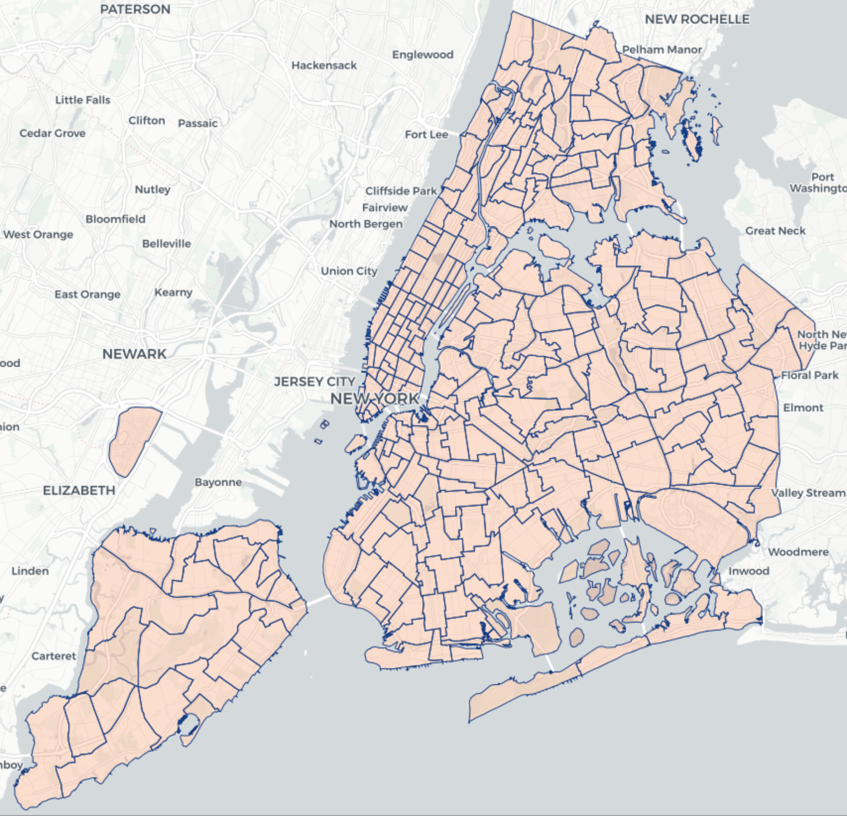
Starting in July 2016, perhaps owing to privacy concerns, the TLC stopped providing latitude and longitude coordinates for every taxi trip. Instead, the TLC now divides the city into 263 taxi zones (map), and provides the pickup and drop off zones for every trip. The analysis then makes the assumption that taxis and Citi Bikes have the same distribution of trips within a single zone, see GitHub for more.
80% of taxi trips start and end within zones that have Citi Bike stations, and the filtered dataset since July 2013 contains a total of 330 million taxi trips and 27 million Citi Bike trips. From July 1, 2016 to June 30, 2017—the most recent 12 month period of available data—the filtered dataset includes 68 million taxi trips and 9 million Citi Bike trips.
Methodology
I wrote a Monte Carlo simulation in R to calculate the probability that a Citi Bike would be faster than a taxi for a given route. Every trip is assigned to a bucket, where the buckets are picked so that trips within a single bucket are fairly comparable. The bucket definitions are flexible, and I ran many simulations with different bucket definitions, but one sensible choice might be to group trips by:
Starting zone
Ending zone
Hour of day
For example, weekday trips from the West Village to Times Square between 9:00 AM and 10:00 AM would constitute one bucket. The simulation iterates over every bucket that contains at least 5 taxi and 5 Citi Bike trips, and for each bucket, it draws 10,000 random samples, with replacement, for each of taxi and Citi Bike trips. The bucket’s estimated probability that a taxi is faster than a Citi Bike, call it the “taxi win rate”, is the fraction of samples where the taxi duration is shorter than the Citi Bike duration. You can think of this as 10,000 individual head-to-head races, with each race pitting a single taxi trip against a single Citi Bike trip.
Different bucketing and filtering schemes allow for different types of analysis. I ran simulations that bucketed by month to see how win rates have evolved over time, simulations that used only days where it rained, and others. There are undoubtedly more schemes to be considered, and the Monte Carlo methodology should be well equipped to handle them.
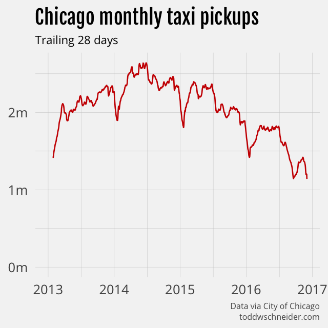
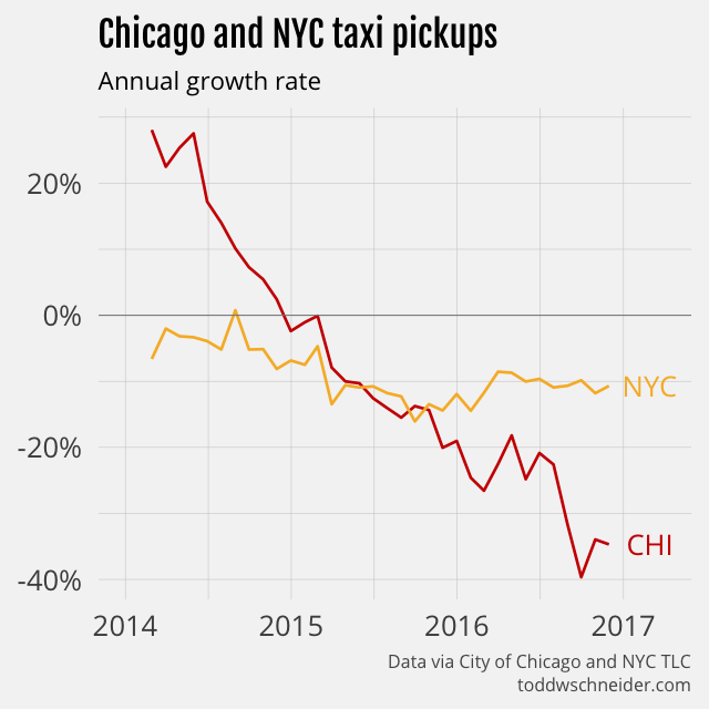
The Chicago dataset does not include data from ridesharing companies like Uber and Lyft, but the data makes clear that taxi usage in Chicago has declined dramatically since 2014. As of November 2016, Chicago taxi usage was declining at a 35% annual rate, and had fallen a cumulative 55% since peaking in June 2014.
Again, the public dataset does not include any data from ridesharing services like Uber and Lyft, but the Chicago taxi industry claims that ridesharing services caused cabs to lose 30–40% of their business in the summer of 2015.
Chicago’s taxi industry is shrinking faster than NYC’s
New York taxis have also been losing market share to ridesharing companies—NYC releases data that confirms this—but in fact Chicago taxis are losing market share even faster than their NYC counterparts. While NYC taxi usage has been declining at around 10% per year, Chicago’s declines have reached 35% year-over-year.
New York taxis make about 8 times more trips per month than Chicago taxis do, but a rescaled monthly trips index shows that Chicago has a larger cumulative decline on a percentage basis.
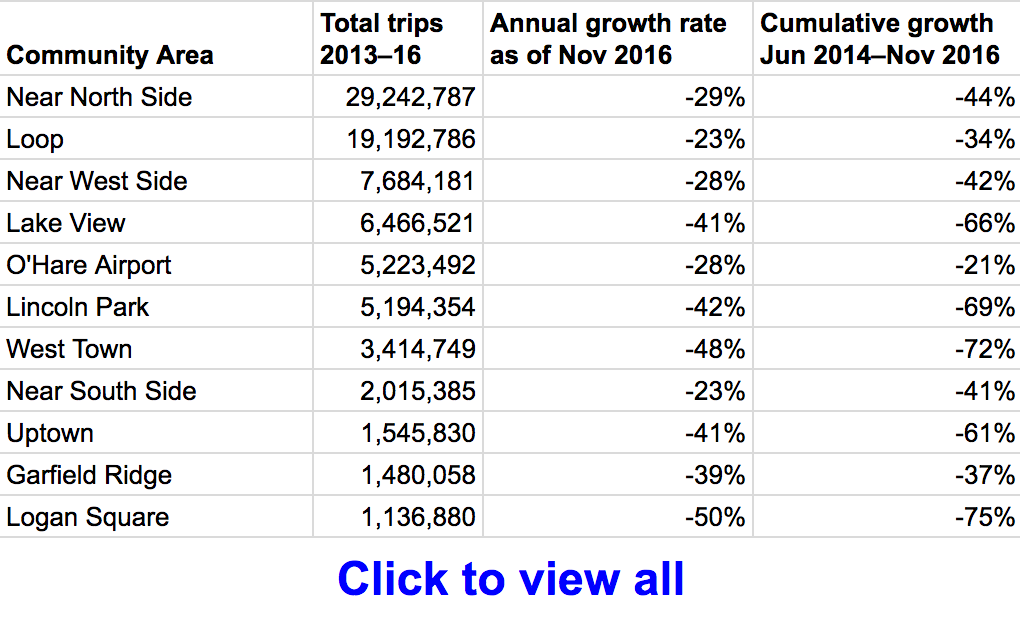
Areas closest to downtown show smaller taxi declines
Chicago’s taxi pickup declines are not evenly distributed among the city’s 77 community areas. For example, the Loop, Chicago’s central business district, shows a 23% annual decline, while Logan Square on the northwest side shows a 50% annual decline. In general, the areas located closest to the central business district show smaller declines in taxi activity.
I defined 5 particular community areas—the Loop, Near North Side, Near West Side, Near South Side, and O’Hare Airport—as the “core”, then compared pickups inside and outside of the core. As of November 2016, pickups inside the core show a 27% annual decline compared to a 42% annual decline outside of the core. On a cumulative basis, core pickups have declined 39% since June 2014, while non-core pickups have declined a whopping 65%. The smaller taxi decline near the central business district is consistent with NYC’s taxi and Uber data, where taxi share has fallen less in Manhattan than in the outer boroughs.
Data by community area is available here in spreadsheet form.
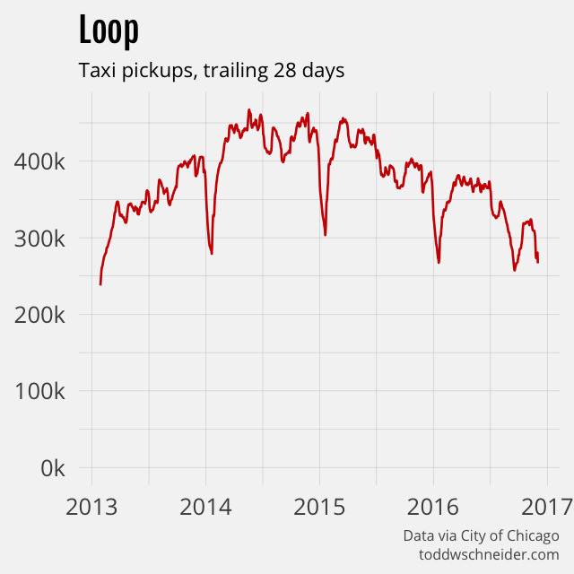
A map of the official community area definitions is available here, and you can select community areas in the menu below to view taxi pickups since 2013.
Anonymized medallion numbers
Chicago’s public taxi data, unlike New York’s, includes anonymized taxi medallion numbers for each trip. This makes it possible to do things like:
Count the number of unique taxis in service each month
Measure the distribution of trips per day for active taxis
Observe the sequence of trips made by individual taxis
The Chicago dataset is also missing some of the details provided by New York, though this is explicitly for the purpose of privacy, and is probably on the whole a good thing.
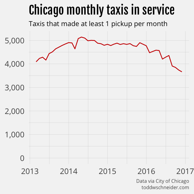
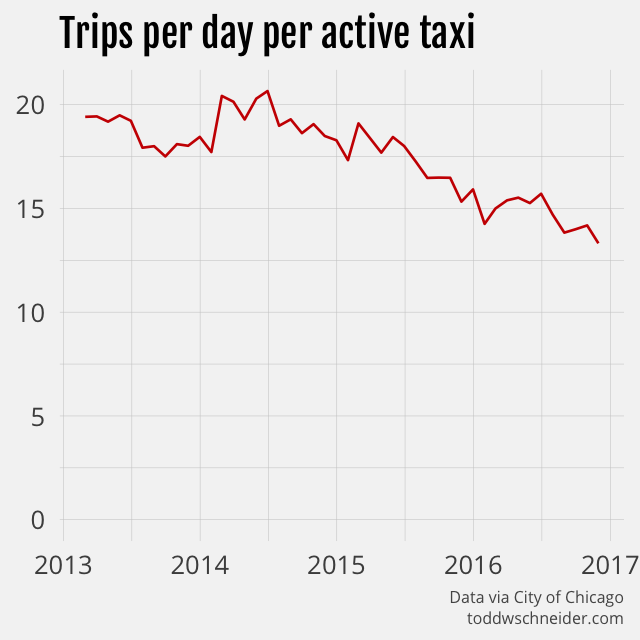
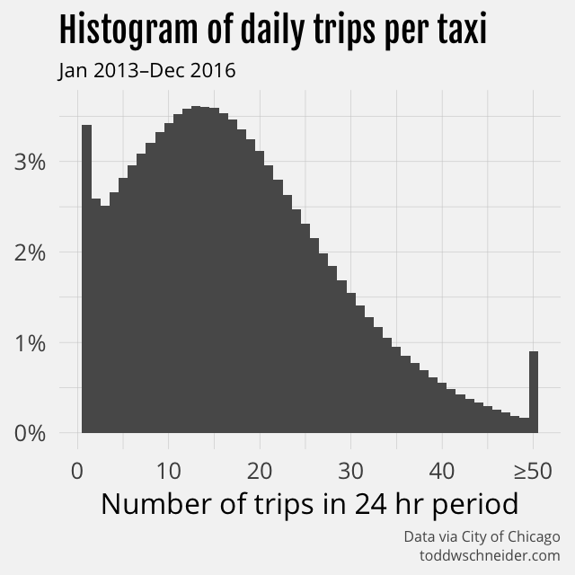
The number of taxis that make at least one pickup per month has declined nearly 30%, from a peak of over 5,000 to 3,600 more recently.
Since taxi trips have declined by 55% over a time period when unique taxis have declined by 29%, that means fewer trips per day for each active taxi. Active taxis used to average 20 trips per day, but more recently have averaged 13 trips per day.
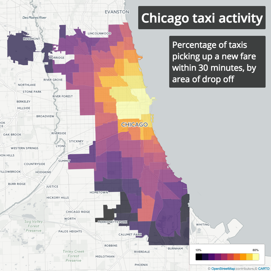
The best and worst places for a taxi to make a drop off
With anonymized medallion numbers, we can see when and where a taxi picked up its next fare after making a drop off. For each drop off, I looked at the time of the next pickup, and calculated the percentage of drop offs in each area that were followed by a new pickup within 30 minutes. For privacy reasons, trip timestamps are all rounded to 15-minute intervals, so this calculation is not exact, but it should be close enough.
Sure enough, nearly 80% of drop offs in central business districts are followed by a pickup within 30 minutes, while as little as 20% of drop offs in more remote areas, e.g. airports, are followed by pickups within 30 minutes.
Likelihood of a taxi finding a new fare within 30 minutes by drop off area
This basic analysis doesn’t necessarily imply that it’s a bad thing for a taxi to make a trip from the Loop to O’Hare. It’s true that it’s less likely for a taxi to get a new fare after dropping off at the airport, but a more thorough analysis would have to take into account that fares to the airport are higher than average, and so the question becomes whether that higher fare is enough to offset the longer wait time after drop off. Time of day and day of week might also be relevant, and should be considered in a more complete analysis.
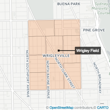
Wrigley Field and the 2016 Cubs
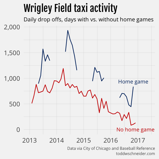
I’m not a native Chicagoan, but you don’t have to be one to know that the Cubs winning the 2016 World Series was a big deal. I grabbed the 2013–2016 Cubs home game schedules from Baseball Reference and compared taxi drop offs near Wrigley Field on game days to non-game days.
Not surprisingly, taxis do more business around Wrigley Field on game days. Total drop offs have declined since 2013—remember taxis have lost market share everywhere—but more interesting is to look at the patterns within each season. In particular the 2016 championship team generated the most taxi activity during the World Series games in October, when in previous seasons peak taxi activity had been during the mid-summer months.
Privacy measures
Chicago’s dataset is missing some of the details provided by New York, most notably:
Precise timestamps
Precise latitude/longitude coordinates
All timestamps are rounded to the nearest 15-minute interval, and instead of latitude/longitude, the data includes census tract and community area identifiers. Furthermore, census tracts are only included when there are multiple trips within the same tract over the same 15-minute interval.
The press release announcing the dataset’s publication specifically points out that these measures were taken to protect privacy, presumably of both drivers and riders. I think on the whole it’s a good thing, even if it means that there won’t be any fancy maps of the Chicago trips, frankly that’s a small price to pay.
Still, anonymizing data is a very hard problem, and it seems like the Chicago dataset has not completely eliminated the risk. If we define a “uniquely identifiable” trip as one where there was exactly one pickup or drop off in a community area over the course of an hour, then 66% of all taxis in the dataset made at least one uniquely identifiable trip.
That means, for example, if you got into a taxi in some area at some time, recorded its medallion number, then later checked the data and there was only one pick up in that area during that hour, then you could map that particular “anonymized” medallion number to the actual medallion number. It might be impractical to find the real medallion numbers for these uniquely identifiable trips—you wouldn’t know the trip was uniquely identifiable until well after the fact—but with the proliferation of cameras and computer vision technology, it’s not that far-fetched either.
Even though only 0.7% of the trips in the dataset are uniquely identifiable by my definition, taxis that made at least one uniquely identifiable trip account for nearly 98% of the total trips. Again, this isn’t to say that I or anyone else has managed to de-anonymize the data, but it’s a reminder that even when good-faith efforts are made to anonymize data, it’s extremely difficult to do it well.
Uber and New York are currently fighting over data disclosure, with the city asking for more data from Uber for planning and regulatory purposes, and Uber refusing to provide it because NYC has done a bad job protecting privacy in the past. Chicago’s privacy measures are not perfect: there might still be ways to de-anonymize the data, and just the fact that they have more detailed data means there’s a risk of accidental or malicious release. But in my mind the Chicago data strikes an appropriate balance, on the one hand enabling analysis that could lead to real insights and quality of life improvements, while simultaneously protecting the privacy of those involved. New York could do worse than adopt a similar approach.
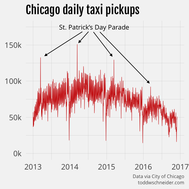
It turns out that the annual St. Patrick’s Day Parade, made famous (at least in my adolescent mind) by The Fugitive, is the day with the most taxi trips in Chicago every year since 2013. Per IMDb, director and Chicago native Andrew Davis specifically wanted to capture the parade, though part of me now thinks that Dr. Richard Kimble should have ducked out by way of taxi…


