Todd W. Schneider

Reverse Engineering Uber and Lyft Surge Pricing in Chicago

The City of Chicago now publishes trip-level data for every ride-hail trip taken since November 1, 2018. Chicago isn’t the first major US city to make ride-hailing trip data publicly available—New York has published Uber and Lyft data since 2014—but the Chicago dataset includes additional fields, most notably fare amounts, that provide new insights into the ride-hailing landscape.

In particular, although the dataset does not explicitly indicate when high-demand “surge” pricing was in effect, I used the available fields to reverse engineer the historical surge pricing map based on a robust regression model. More to come about the methodology, along with challenges and caveats. All code used in this post is available on GitHub. As I write this in March 2020, the dataset includes 129 million trips from November 1, 2018 through December 31, 2019. It is scheduled to update quarterly in the future.

You can play around with the map below to see estimated surge pricing multipliers by time and neighborhood. I’ve highlighted some notable events with elevated pickup activity and/or surge pricing, for example at the conclusion of The Rolling Stones concert at Soldier Field on June 25, 2019, when fares were 3x more expensive than usual.

chicago ride-hail surge pricing map

Click here to view map in full screen or on a mobile device

In addition to estimated surge multipliers, the map shows modified z-scores, which represent pickup activity in an area compared to the median for that time of day and day of week. Positive z-scores mean more pickups than normal. For example, the area near Soldier Field saw 154 pickups at midnight after the Stones concert, while a median Wednesday midnight sees 9 pickups with a median absolute deviation of 2.5. Those numbers produce a large modified z-score of 39, meaning way more pickups than normal. (The “modified” part in modified z-score refers to the use of the median and median absolute deviation instead of the mean and standard deviation, which reduces the impact of outliers.)

It’s often interesting to compare the map of surge multipliers to the map of modified z-scores, since Uber and Lyft both state that surge pricing goes into effect when there are more riders than drivers in an area. The dataset does not explicitly tell us how many drivers are available at any given moment, but it seems like a reasonable assumption that sudden demand spikes and higher-than-normal pickup activity would often coincide with rider demand outstripping driver supply.

Anatomy of a major surge pricing event: The Rolling Stones No Filter Tour

The conclusion of the aforementioned Rolling Stones No Filter Tour show on June 25, 2019 appears to have been one of the most severe surge pricing events in the dataset. I isolated trips that began near Soldier Field on the Near South Side, then compared surge prices to pickup counts at each 15-minute interval. The graph shows that surge prices and pickup activity both started to increase around 11:30 PM. Peak surge occurred between midnight and 12:30 AM, which coincided with the largest number of pickups.

rolling stones surge pricing

I couldn’t find the exact time they played each song on the setlist, but I’d guess that the encore of “Gimme Shelter” and “(I Can’t Get No) Satisfaction” began just before midnight, and the 11:30 PM pickups peak represents people who tried to beat the traffic and skipped the encore, while the larger 12:15 AM pickups peak includes the folks who stuck around until the very end. The 11:30 PM departures paid a significantly lower average surge of 1.7x compared to 3.2x for the 12:15 AM crowd, though with ticket prices already averaging $500, I’m not so sure that would have been a major consideration.

The June 25 show was the Stones’s second Soldier Field date; they kicked off their 2019 North American tour a few nights earlier on June 21, and the ride-hailing activity patterns look pretty much the same. The first show saw a bit more pickup activity than the second show, but a slightly lower peak surge rate of 2.9x.

The next-most severe Soldier Field surge pricing events belonged to another major concert tour, though one that perhaps catered to a different audience than the Stones. K-pop supergroup BTS played two Soldier Field dates on May 11 and 12, 2019 as part of their Love Yourself: Speak Yourself world tour. The average post-concert surge prices on night one and night two reached as high as 2.5x.

Bears games show less evidence of post-game surge pricing, but there’s a big caveat

Soldier Field is home for the NFL’s Chicago Bears, but strangely enough, Bears games do not show much evidence of surge pricing compared to The Rolling Stones and BTS concerts, even though Bears games do exhibit similar demand spikes at the conclusion of games.

Here’s a representative graph of ride-hail activity immediately following a Bears home game. (Apologies to Bears fans, but as an Eagles fan, I must confess that I look back fondly on the Double Doink.)

bears eagles surge pricing

None of the Bears home games in the dataset appear to have produced major spikes in surge pricing. The biggest post-game pickup spikes were a pair of 2019 regular season Thursday night games against the Packers and Cowboys, both of which show similar patterns to the Eagles game: a large spike in post-game pickups, but only a small corresponding increase in surge prices. The biggest post-game surge I could find occurred after a December 2019 Sunday night game against the Chiefs, but the peak surge of 1.4x was still significantly lower than the rates seen at the Stones and BTS concerts.

One possibility is that drivers are somehow more “aware” of Bears games than concerts, so they’re more likely to make themselves available in the vicinity of Soldier Field after Bears games than concerts, and the excess supply of cars prevents surge pricing from kicking in. The dataset does not provide any information on how many drivers were available in an area at a given time, so this would be a difficult idea to test, but there might be a creative way to get at it. We also don’t know how many people tried to hail a ride but then for whatever reason didn’t. For example, though pickups peaked at around 300 per 15 minutes after both the Stones concert and the Eagles game, maybe there were more people trying to hail rides after the concert.

There are plenty of theories we could come up with to explain the Bears/Stones discrepancy, but if I had to guess, the most likely explanation is a major caveat that runs throughout this entire post: it seems like most of the major surge events citywide occurred in Q2 2019—specifically between March 29 and June 30—so much so that it makes me wonder if there is an error or other hidden bias in the dataset. If there is a Q2 2019 bias, then regardless of whether it’s a data error, a change in surge pricing algorithms, or something else, the May/June concerts might have more severe surge pricing than the September–January Bears games due to a hidden variable, not an underlying truth that concerts produce higher surge prices than football games.

The United Center tells a similar story. Located on the Near West Side, it hosts the NBA’s Bulls and NHL’s Blackhawks, a number of major concerts from Ariana Grande to Travis Scott, and other one-off events like UFC 238 and a Michelle Obama book reading. Much like at Soldier Field, the highest surge pricing rates seem to come at the conclusion of concerts, but again I’m concerned about the Q2 2019 bias.

Neither the Bulls nor the Blackhawks made their respective leagues’ playoffs in 2019, so there weren’t many NBA/NHL games that took place in April/May/June. The few games that took place in April 2019 did show some significant surge pricing compared to games that took place in other months. For example, the Bulls hosted the Knicks on both April 9, 2019, and November 12, 2019. Both games were on Tuesday nights, both saw similar numbers of post-game pickups, yet only the April 9 game had significant surge pricing.

The two biggest United Center concerts, as measured by spikes in total pickups, belonged to Mumford & Sons on March 29, 2019, and Travis Scott on December 6, 2018. Both concerts had similar-sized spikes in pickups, but post-Mumford & Sons surge pricing reached 2.7x, while post-Travis Scott peaked at a more mild 1.4x. Again though, March 29 was the beginning of the 3-month period of elevated surge pricing citywide, so it’s possible that some hidden bias accounts for the elevated surge.

Of course I’ve cherry-picked these examples to fit a narrative, but you can head over to GitHub to see surge pricing graphs for every date on the United Center events calendar.

Geographically widespread surge pricing events

Concerts and sporting events are obvious candidates for surge pricing because they involve large groups of people trying to leave the same place at the same time, which could easily overwhelm the supply of available drivers. But there are also examples of more geographically diffuse surge pricing events, often coinciding with holidays or inclement weather.

One of the biggest citywide surge incidents occurred on the morning of Monday, April 29, 2019. It rained heavily that morning, and by 6:00 AM, surge prices reached 2x across most of the city’s North Side. As rush hour peaked around 8:00 AM, riders stretching from Lake View to Hyde Park were paying 2-3 times their normal fares. By 9:30 AM, the surge had died down and fares were back to normal.

If you look at the map of z-scores during the April 29 surge, demand was somewhat elevated compared to a typical Monday morning, but not dramatically so, and certainly not as severely as after a big concert. Again, we don’t know exactly how many drivers were available that morning. It’s possible that the bad weather initially made drivers less inclined to work, which led to high surge prices to incentivize more drivers to become available.

Other events that caused elevated demand across the entire city include New Year’s Eve, Super Bowl LIII, Saint Patrick’s Day Parade, Pride Parade, and the late night hours of Thanksgiving Eve—the unfortunately-titled “Blackout Wednesday.” Of that list, the 2019 Pride Parade looks to have generated the highest surge pricing, but again it occurred during the Q2 2019 era of generally elevated surge pricing, so it could be an artifact of that as opposed to something more meaningful.

Surge pricing seasonality by location and time of week

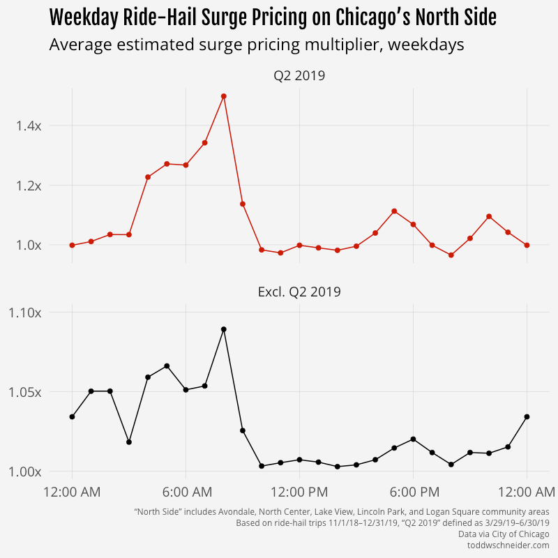
The unexplained Q2 2019 discrepancy makes it difficult to say anything meaningful about general surge pricing trends, but it seems like there are some patterns when you look at certain regions by time of week. For example, on the North Side—a generally affluent area with high rider demand on weekday mornings as people commute into Central Chicago—weekday surge prices tend to be highest in the morning. The magnitude is more severe during the Q2 2019 period, but the 8:00 AM–9:00 AM hour appears to be the most expensive throughout the year.
north side

The North Side also sees a lot of pickups on weekday afternoons, but surge prices are significantly lower during afternoons compared to mornings. One possibility is that there are more cars available in the afternoon. The weekday afternoon route from Central Chicago to the North Side is very common, so maybe that produces a surplus of available drivers on the North Side, which in turn drives down fares for afternoon riders getting picked up on the North Side. I didn’t dig into that idea any deeper, but it could make for an interesting follow up.

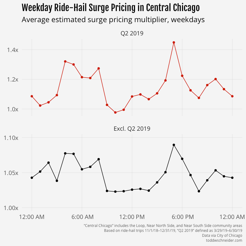
In Central Chicago, where demand is highest on weekday afternoons as people head home after work, surge prices are highest during afternoon rush hour.
central chicago

And on the West Side, where demand is generally highest on weekend evenings, surge prices are highest in the late night weekend hours.

west side

Robust regression methodology to estimate historical surge prices

The dataset does not explicitly tell us when surge pricing was in effect, but it provides fields that allow us to estimate: trip distance, travel time, and fare amount. Uber and Lyft do not say exactly how they determine fares, but they both indicate on their websites [Uber, Lyft] that fares are based on a combination of distance and time.

I first calibrated a robust regression model of fare as a linear combination of distance and time, then estimated the surge multiplier for each trip as its actual fare divided by the baseline predicted fare. For example, if a 4-mile, 15-minute trip had an actual fare of $15, but the baseline model predicted it should have been a $10 fare, then the estimated surge multiplier for that trip is 1.5x.

After I estimated multipliers for each trip, I bucketed by pickup census tract and timestamp rounded to 15 minutes, and took the simple unweighted average of all surge multipliers within each bucket. In some cases, when tract-level info wasn’t available, I aggregated by the larger community area geographies.

The naive temptation for the baseline model might be to fit a linear regression via ordinary least squares, for example using R’s lm() function. However, in this case I don’t think that’s the right way to fit the baseline model, because an OLS linear regression will find parameters that make the average predicted fare equal to the average actual fare. But we don’t want to fit our baseline model against all fares, rather we want to fit it against some notion of “typical” fares, excluding surge and other pricing abnormalities like discounts. This presents a circular logic problem:

  • We want to establish a baseline fare model so that we can figure out which fares differ from the baseline
  • We want to exclude abnormal fares when determining the baseline model
  • We don’t know which fares are abnormal until we’ve established the baseline model

Robust regression methods are designed to address this circular problem. I chose the rlm() function from R’s MASS package with the “MM” option, which uses an iterative process to find coefficients of a linear model, determine outliers based on those coefficients, downweight or even remove the outliers entirely, find new coefficients, and repeat until some convergence criteria are met.

I found that the coefficients from the robust model implied base fares were 12% lower than implied by the OLS model during the Q2 2019 period, and 3% lower in other periods. The robust coefficients also aligned more closely with the indicative rate cards posted on Uber and Lyft’s websites, which provides some reassurance that the robust methodology is a reasonable estimate of non-surge fares.

Why were surge prices so high in Q2 2019?

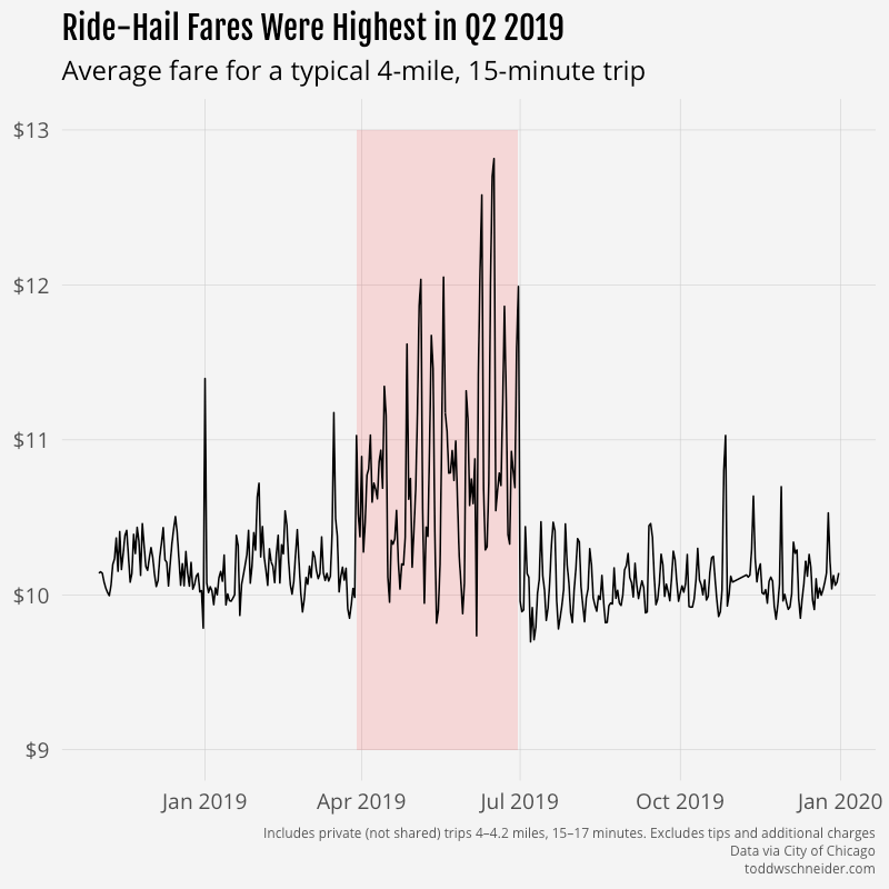
The period from March 29, 2019 through June 30, 2019 appears to contain a disproportionate number of major surge pricing events compared to the rest of the dataset.

avg surge by date

avg typical fare by date

My first thought was that maybe Uber and/or Lyft changed their base fare rates during that time period, so I split the dataset into three pricing regimes—before, during, and after Q2—and calibrated separate robust regression models for each regime. Here are the resulting model coefficients:

Time period Intercept Fare per mile Fare per minute
Before 3/29/19 $1.81 $0.82 $0.28
3/19/19–6/30/19 $2.13 $0.82 $0.27
After 6/30/19 $1.87 $0.82 $0.27

The coefficients on distance and time were nearly identical in all 3 regimes: 82 cents per mile, plus 27–28 cents per minute. The intercept for the Q2 regime was around 30 cents higher than for the other periods, which amounts to a bit over 2% of the average $13 fare.

The fact that the robust regression coefficients from Q2 are not drastically different than the periods before and after argues, but does not prove, that base fare rates were not different during the Q2 period. My best guess is that one or both of Uber and Lyft made some changes that resulted in more aggressive surge pricing in Q2 2019, but then reverted those changes on or around July 1. I’m still wary though that there could be a data reporting error; it will be interesting to see what happens as more trip data is published in the future.

There are other possibilities to consider, e.g. maybe there’s a spring seasonal effect, perhaps due to elevated rider demand following the long, cold winter. Unfortunately it’s hard to know much about time-of-year seasonality since there’s only one year of data available. The particularly abrupt apparent surge pricing decrease on July 1 argues against a seasonal effect, and to me suggests something like an algorithm change or a data reporting error.

There was a story from May 2019 about drivers in Washington, D.C. attempting to manipulate surge pricing algorithms by simultaneously turning off their apps to create the appearance of a driver shortage. I have no particular insight into the strategy’s existence, effectiveness, or presence in Chicago, but I suppose it’s possible that the story led to Uber and Lyft changing their surge pricing algorithms.

I’m not sure how we could confirm an algorithm change, as Uber and Lyft don’t seem likely to reveal their secret sauce anytime soon. For what it’s worth, March 29, 2019—the first day of elevated surge estimates—was also Lyft’s first day as a publicly-traded company. Uber’s IPO followed a few weeks later on May 10. I suppose it’s as least possible that they increased their surge rates around then in an effort to demonstrate revenue growth to Wall Street, but it strikes me as unlikely given all of the coordination required.

Additional caveats and challenges

Surge pricing is one of many factors beyond time and distance that can impact a single trip’s fare. The dataset does not provide explicit info about these additional factors, so I made some oversimplifications and assumptions and that are worth noting.

Uber and Lyft both offer an array of vehicle classes—standard, luxury, SUV, etc.—each of which has a different base rate. The dataset does not include the vehicle class for each trip, so the model assumes that all fares have the same base rate, which we know isn’t true. The robust regression model will tend to fit the baseline against the most “typical” fares, which might include only the standard vehicle tier. If that’s the case, and, say, trips from the central business district are more likely to request luxury vehicles, then it could appear that the CBD has higher “surge prices”, when in reality the higher prices are driven at least in part by corporate riders’ tendency to request more luxurious vehicles.

Surge pricing makes fares more expensive than normal, but Uber and Lyft sometimes offer promotional discounts that make fares cheaper than normal. I’m hopeful that the robust regression methodology handles discounts roughly correctly by identifying them as outliers and downweighting them, but there’s no easy way to confirm. There have been some reports that both companies are trying to cut back on discounts, which could make it appear that surge pricing is increasing over time, even though the underlying reality is a decrease in discounts as opposed to an increase in surge pricing.

Uber and Lyft both provide upfront prices based on expected time and distance, which in turn are presumably based on routing algorithms that take into account factors like traffic and weather. If a trip’s actual time and distance end up differing from the expectations baked into the upfront price, my methodology might incorrectly interpret the fare as either a surge or a discount. Both companies say that they revise upfront fares for trips that materially deviate from expectation, so hopefully that mitigates some of this concern.

We could try to control for some of these hidden factors in the baseline model, for example by adding explanatory variables based on geography and time of week, but without any actual data that isolates the effects of surge pricing, discounts, vehicle class, and upfront pricing, I’d worry that the results would end up as a mishmash of all of them, which is essentially what the existing baseline model already is.

The City of Chicago takes some measures to protect rider, driver, and company privacy in the data. I very much support the privacy measures overall, but they do make it somewhat harder to estimate surge pricing. In particular, the dataset has the following privacy-oriented limitations:

Fares are rounded to the nearest multiple of $2.50. This reduces the precision on surge multiplier estimates, especially for smaller fares. For example, if a trip’s baseline expected fare is $4.00, but a surge of 1.5x is in effect so the actual fare is $6.00, that surge will never show up in the data because both $4.00 and $6.00 will round to $5.00. I attempted to control for this by excluding shorter trips when calculating average surge multipliers. Specifically, I restricted to fares that were at least 1.5 miles or 8 minutes. One nice reassurance is that my baseline model coefficients happen to align closely with the standard vehicle rates posted on Uber and Lyft’s websites.

Pickup and drop off timestamps are rounded to 15-minute intervals. If we’re looking at trips in an area between 12:00:00 PM and 12:14:59 PM, we won’t know which ones were at 12:00, 12:01, 12:02, etc. If surge pricing went into effect for just 2 minutes, the surge trips would get averaged in with trips from the other 13 minutes of the interval, resulting in a smoothed-out average surge multiplier. Additionally, the timestamps refer only to the time of pickup, but it might be relevant to know the timestamp when each rider submitted their ride request, as I’d imagine that’s a trigger for surge pricing algorithms.

Pickup and drop off geographies are imprecise, and sometimes redacted. Surge pricing can go into effect in very localized regions, as small as a few city blocks. But the Chicago dataset only provides pickup and drop off locations by census tract. Census tracts vary in size, but are almost always larger than a few city blocks, so if a surge goes into effect for a subregion of a tract, the tract-level aggregate will be smoothed-out. Additionally, census tracts are deliberately dropped in some cases where there are not enough pickups or drop offs over a 15-minute window. In such cases, locations are aggregated up to the community area level, which further reduces the precision of surge pricing estimates. Census tract-level data is available for about 75% of the trips in the dataset, the other 25% use community areas.

There are more general caveats beyond the potential hidden factors and privacy measures described above. Some trip records contain obvious junk data, e.g. a $1,000 fare for a 3-minute, 1-mile trip. I applied some heuristics to remove rows where I thought the data was an error, see GitHub for the exact logic.

The dataset does not provide info on which ride-hail company provided each trip, so there’s no obvious way to tell if Uber and Lyft have significantly different surge pricing behavior. As of March 2020 there are three companies registered to do business in Chicago: Uber, Lyft, and Via. A third party estimates their market shares as of November 2019 as 72% Uber, 27% Lyft, and 1% Via, which is not too far off from the known market shares in New York. (Of note, the New York dataset does include the company associated with each trip, but NYC does not provide fare info, so there’s no way to estimate surge pricing in NYC.)

In addition to the fare amount for each trip, the dataset also includes tips and “additional charges”, which cover taxes, fees, and tolls. I made the assumption that surge multipliers affect only the fare component, which seems consistent with the data, though I doubt the results would change much if I had used [fare + additional charges] as the dependent variable instead of fare only. Chicago added a new ride-hail tax in early 2020, which is not yet reflected in the data, but it will be interesting to see what happens as the dataset grows.

A note on shared rides

Shared rides present another challenge, because it’s not as clear how to establish a baseline fare. A more inconvenient route for a shared trip will increase both the time and distance, but it might make the fare cheaper since the rider might need an incentive to accept the longer route. About a third of shared trip requests don’t get matched, which is another important factor in determining the fare. I calibrated robust regressions for share-requested fares using time, distance, and whether the trip was matched, but it might make more sense to use “expected time/distance if following the most direct route” instead of actuals. I would want to do more research and investigation before feeling more confident about shared trip pricing. Making matters more confusing, it seems like there was a change in the way shared trip distances are reported starting in November 2019, when the average shared trip distance increased dramatically.

For the purposes of this post, I excluded trips with share requests when estimating surge multipliers, but I included trips with share requests when measuring rider demand, e.g. modified z-scores and pickup counts in the various graphs.

About 20% of trips in the dataset include a share request. Of those, about 68% get pooled into a shared trip, with the other 32% going unmatched. It seems like shared trips have become less popular over time; the months toward the beginning of the dataset have a higher percentage of share requests (~27%) and a higher match rate (~72%), but as of Q4 2019, only 15% of trips include a share request, with 60% of share requests get matched. See the shared trips section of the ride-hailing dashboard for the latest data.

Future work, and what about a surge pricing model?

There’s a lot of interesting work that could be done comparing Chicago’s public taxi and ride-hail datasets. As of December 2019, baseline private ride-hail trips are cheaper than taxis, and it looks like the “breakeven” surge is around 1.2x, meaning thax ride-hail trips are cheaper than taxis as long as the surge rate is 1.2x or lower. If you take tips into account, the breakeven is closer to 1.4x, since 95% of taxi trips but only 22% of private ride-hail trips include a tip. The city instituted a new ride-hail tax in January 2020, which will presumably lower the breakeven, and it will be interesting to see if rider preferences shift at all in favor of taxis.

I experimented a bit with some regression models to predict surge pricing as a combination of modified z-scores, sudden demand spikes, and other variables. The resulting models didn’t fit the data particularly well, and they didn’t feel “useful”, because many of the independent variables wouldn’t be known by anybody in real time. There might be some clever additional variables to include, in particular maybe there’s a way to estimate the supply of drivers over time. An agent-based approach that takes into account rider, driver, and company incentives strikes me as potentially the most satisfying option, but would also be much harder to formulate and calibrate.

Appendix: robust regression simulation and intuition

As something of a sanity check on the robust regression methodology, I simulated 1,000 trips with the following assumptions:

  1. Trip distance distributed uniformly between 1 and 10 miles
  2. Average speed distributed uniformly between 10 and 30 miles per hour, which implies a travel time in minutes
  3. Base fare = $1.87 + $0.82 * miles + $0.27 * minutes
  4. 20% chance of surge pricing. If surge pricing applies, the multiplier is distributed uniformly between 1.1 and 3
  5. 20% chance of a discount. If discount applies, it is uniform between 10% and 20%, subject to a max of $6
  6. Actual fare = [Base fare] * [Surge multiplier] - [Discount]

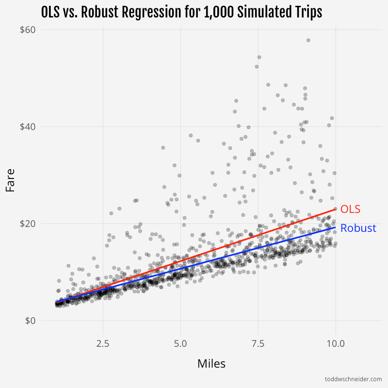
I then fit linear models of actual fare as a function of distance and time via ordinary least squares and robust methods. The robust model “recovered” the exact base fare parameters of $1.87, $0.82, and $0.27, while the OLS model fit parameters of $1.56, $1.00, and $0.35.

For the average simulated trip of 5.5 miles and 16.5 minutes, the OLS model predicts a fare of $12.79, 18% higher than the $10.84 fare predicted by the robust model. In some circumstances, the OLS model might be more useful. For example, if all you knew was that you were about to take a 5.5-mile, 16.5-minute trip in this simulated world, the OLS model represents the expected value of what you’re going to pay. But if you’re trying to decompose your payment into a base fare, surge multiplier, and discount, then the robust model is closer to the underlying truth. (Of course in this case we know the underlying truth because we created it; in real life we don’t have that luxury.)

You can see from the trendlines that the OLS model is “pulled” up by the outlier surge prices:
ols vs robust regression

If you want to generate similar simulated data on your own, here’s some R code:

1
2
3
4
5
6
7
8
9
10
11
12
13
14
15
16
17
18
19
20
21
library(tidyverse)
set.seed(1738)
num_trips = 1000

simulated_trips = tibble(
  miles = runif(num_trips, 1, 10),
  mph = runif(num_trips, 10, 30),
  minutes = miles / mph * 60,
  base_fare = 1.87 + 0.82 * miles + 0.27 * minutes,
  has_surge = runif(num_trips) < 0.2,
  has_discount = runif(num_trips) < 0.2,
  surge_multiplier = 1 + has_surge * runif(num_trips, 0.1, 2),
  discount_dollars = pmin(has_discount * runif(num_trips, 0.1, 0.2) * base_fare * surge_multiplier, 6),
  fare = base_fare * surge_multiplier - discount_dollars
)

ols_model = lm(fare ~ minutes + miles, data = simulated_trips)
robust_model = MASS::rlm(fare ~ minutes + miles, data = simulated_trips, method = "MM", init = "lts")

broom::tidy(ols_model)
broom::tidy(robust_model)

And again, all code used in this post is available on GitHub.

Mapping Motor Vehicle Collisions in New York City

Interactive heatmap of 1.4 million collisions highlights dangerous areas for motorists, cyclists, and pedestrians

The New York Police Department provides data for every motor vehicle collision in NYC since July 2012. Each record includes location coordinates and other metadata, most notably the number of injuries and fatalities, segmented further by motorists, cyclists, and pedestrians.

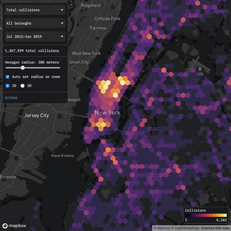
I wrote some code to process the raw data, and built an interactive heatmap of 1.4 million collisions between July 2012 and January 2019. By default the color intensity represents the number of collisions in each area, but you can customize it to reflect injuries or fatalities.

nyc motor vehicle collisions map

Click here to view map in full screen or on a mobile device

Note that the raw data does not identify each collision with pinpoint accuracy, rather collisions are typically rounded to the nearest intersection, which makes some areas look artificially better or worse than they really are. For example, there are a number of collisions at both ends of the Verrazzano Bridge, but apparently none in between. In reality those collisions are likely spread more evenly across the bridge’s span, but the dataset rounds them to either the Brooklyn or Staten Island base.

Dangerous areas

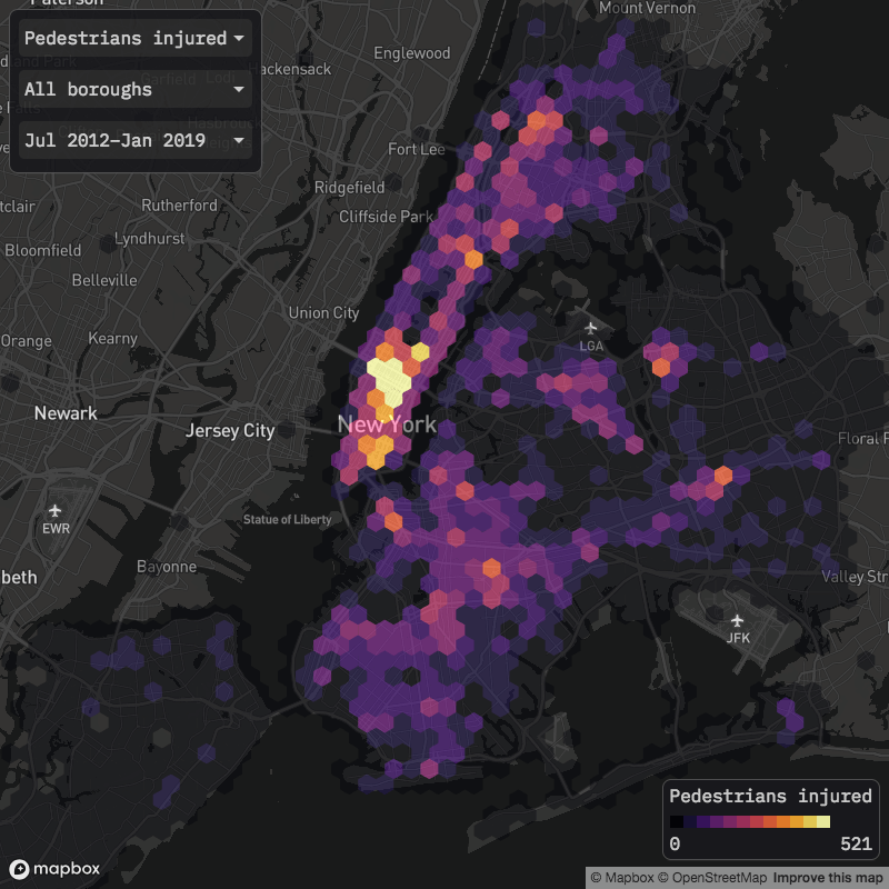
The map shows the areas with the most injuries and fatalities, but I’m hesitant to use the phrase “most dangerous”, as the collisions data does not tell us how many motorists, cyclists, and pedestrians traveled through each area without injury. For example, more pedestrians are injured by motor vehicles in Times Square than in any other area, but Times Square probably has the most total pedestrians, so it’s possible that “pedestrian injuries per mile walked” is higher elsewhere. It might make for interesting further analysis to estimate total vehicle, bicycle, and pedestrian travel in each area, then attempt to calculate the areas with the highest probability of injury or fatality per unit of distance traveled.

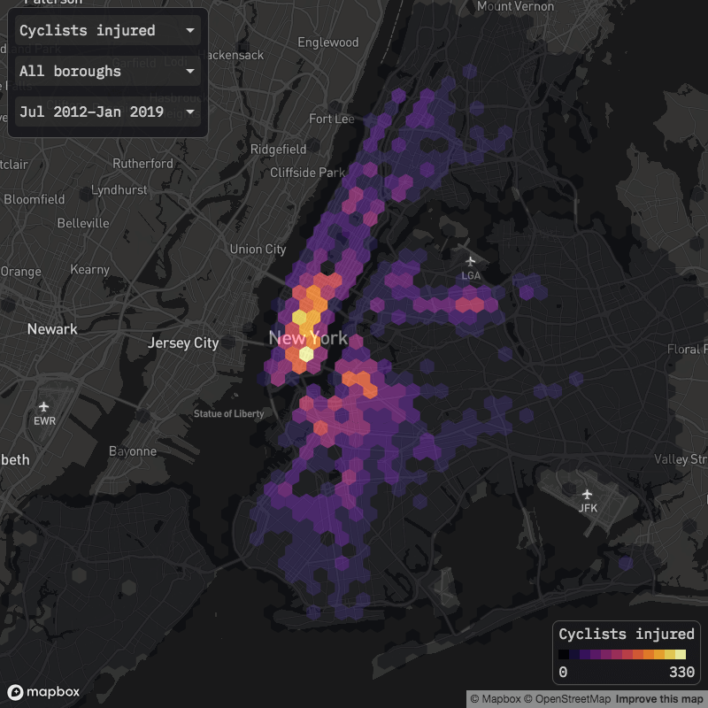
Cyclist injuries

cyclists injured

Delancey Street on Manhattan’s Lower East Side accounts for the most cyclist injuries of any area. In November 2018, the city installed a new protected bike lane from the Williamsburg Bridge to Chrystie Street, and it will be interesting to see how effective it is in reducing future cyclist injuries. If the L train shutdown—in whatever form it ends up taking—causes more people to bike across the bridge, accidents and injuries might well increase, so as noted above, it will be important to adjust for total usage. The Manhattan base of the Queensboro Bridge also accounts for a significant number of cyclist injuries, and much like at the Williamsburg Bridge, there is an attempt underway to improve cycling conditions.

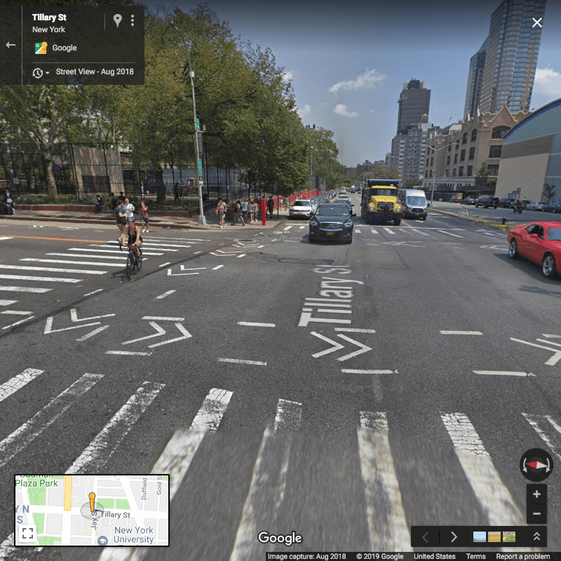
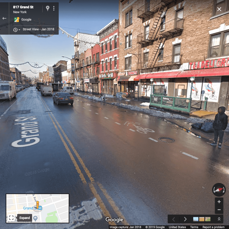
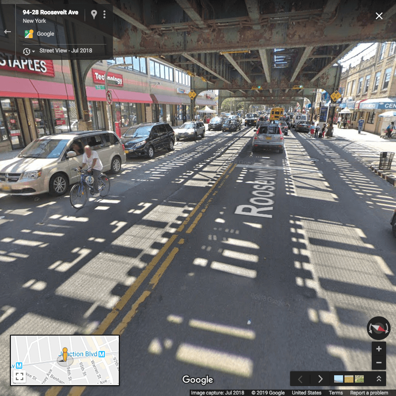
In Brooklyn, the areas with the most cyclist injuries include Grand Street between Union and Bushwick avenues in Williamsburg, and the section of Tillary Street between Adams and Jay streets downtown. In Queens, stretches of Roosevelt Avenue in Jackson Heights appear particularly dangerous. From Google Maps it appears that none of these three outer borough areas had fully protected bike lanes historically, though at least Grand Street’s bike lane was improved somewhat in the fall of 2018.

Google Street View illustrates some of the challenges cyclists face in these areas, including cars parked in bike lanes:

Tillary & Jay streets, Brooklyn

tillary st and jay st

While I was working on this post, I happened to walk by Tillary & Jay streets one evening with some friends, one of whom captured this video of cyclists contending with a double-decker tour bus:

Video: Edwin Morris

Grand Street & Bushwick Avenue, Brooklyn

grand st

Roosevelt Avenue & 94th Street, Queens

roosevelt ave

I did not do any extensive investigation of the relationship between bike lanes and cyclist injuries, but it would make for interesting further analysis. The Department of Transportation publishes a city bike map along with a shapefile, and provides lists of active and past projects dedicated to bicycle safety, all of which could potentially be used to better understand the relationship between bike lane development and cyclist safety. At a minimum, it’s good to see that some of the areas with the most cyclist injuries have already been targeted for bike lane improvements.

Pedestrian injuries

pedestrians injured

As mentioned earlier, Times Square accounts for the most pedestrian injuries. Beyond Times Square and the Manhattan central business district more broadly, it looks like there might be a correlation between public transportation stations and pedestrian injuries. Outside of central Manhattan, several of the areas with the most pedestrian injuries are located near subway or rail stations, including:

I’d imagine that areas immediately surrounding subway stops have some of the highest rates of foot traffic, so it could be simply that more pedestrians equals more injuries. Or maybe subway stops tend to be located on busier, wider roads that are more dangerous to cross. It would be interesting to know if there are particular subway stations that have high or low pedestrian collision rates compared to their total usage, and if so, what features might distinguish them from other stations.

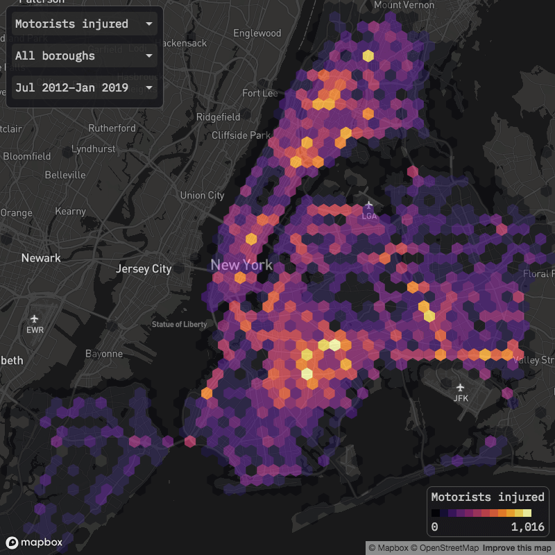
Motorist injuries

motorists injured

Motorist injuries are more geographically spread out than cyclist and pedestrian injuries, I would guess due to more vehicle travel at higher speeds in the outer boroughs compared to Manhattan. Highways look to account for many of the areas with the most motorist injuries: in the Bronx, sections of the Cross Bronx Expressway and Bronx River Parkway, along with the Van Wyck Expressway and Belt Parkway in Queens, and the western terminus of the Jackie Robinson Parkway in Brooklyn.

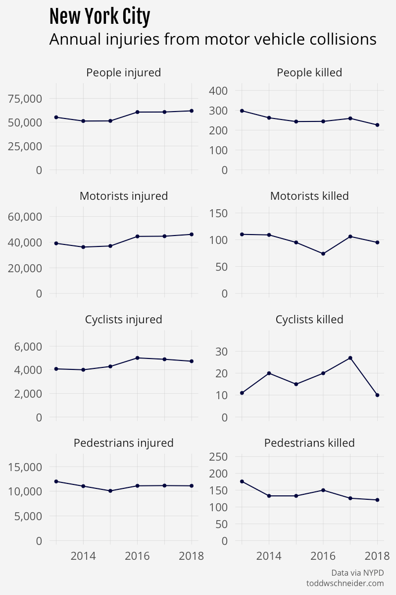
The city’s Vision Zero plan has the stated goal of eliminating all traffic deaths by the year 2024, and in general, traffic fatalities have been declining since 2012. One piece of confusion: the city recently announced that there were 200 traffic deaths city-wide in 2018, but the NYPD dataset reports 226 deaths in 2018. I’m not sure why those numbers are so different, but either way the trend still points toward decreasing fatalities.

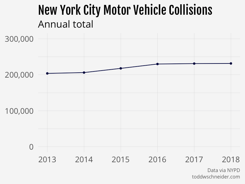
The number of injuries per year has increased, though, and there are individual neighborhoods that have seen improving or worsening trends. To cherry-pick a few examples: Union Square, Chinatown, and East Harlem have seen some of the bigger reductions in injuries since 2012, while University Heights, Mott Haven, and East New York have seen injuries increase.

You can view trends city-wide, by borough, or by neighborhood (map) using the inputs below:

nyc collisions

nyc collision injuries

Note that the borough totals won’t necessarily add up to the city-wide total because about 5% of collisions are missing location data. The earlier data is more likely to be missing location data, which means that the graphs by borough are probably slightly pessimistic, and in reality the earlier years have a few more collisions and injuries relative to the recent years than otherwise stated. See this spreadsheet for a table of counts by borough and year, including collisions with unknown geography.

Contributing factors, vehicle types, and further work

I’ve already noted a few potential topics for future work: population-adjusted collision rates and the impact of bike lanes/subway stations, but the dataset could be useful for many other analyses. Especially in the context of my previous post about taxi and Citi Bike travel times, I wonder about the relationship between increasing road congestion, slower average vehicle speeds, and fewer traffic-related fatalities.

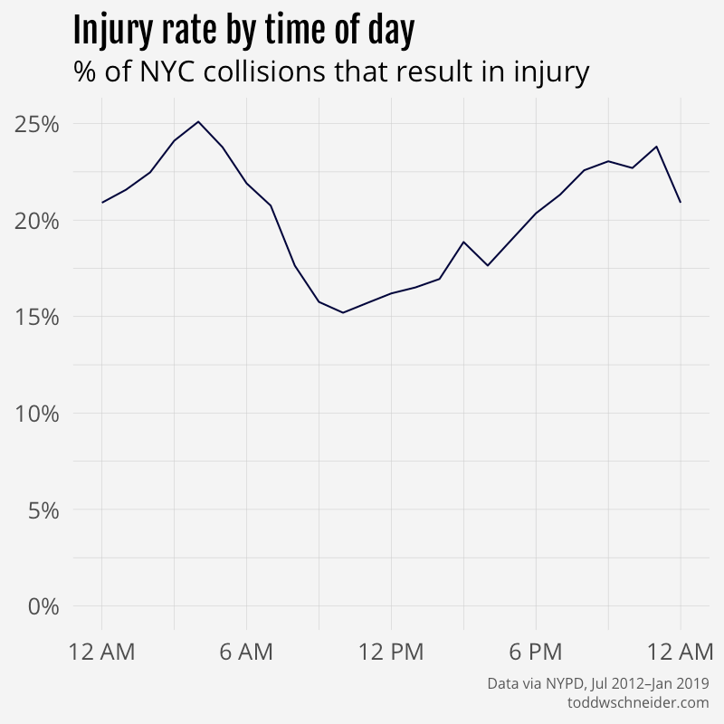
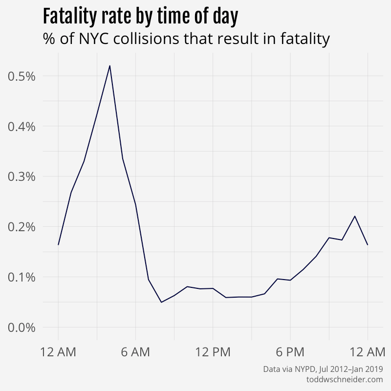
Collisions are most common during daytime hours, when congestion is at its worst, but the likelihood of a collision resulting in an injury or fatality is highest during the late night/early morning hours. The dataset does not include detailed information about speed at the time of collision, but it seems likely that vehicles would be traveling faster at off-peak hours when there is less traffic. Darkness could also be an important factor, with differing effects on each of motorists, cyclists, and pedestrians.

injury rate by hour

fatality rate by hour

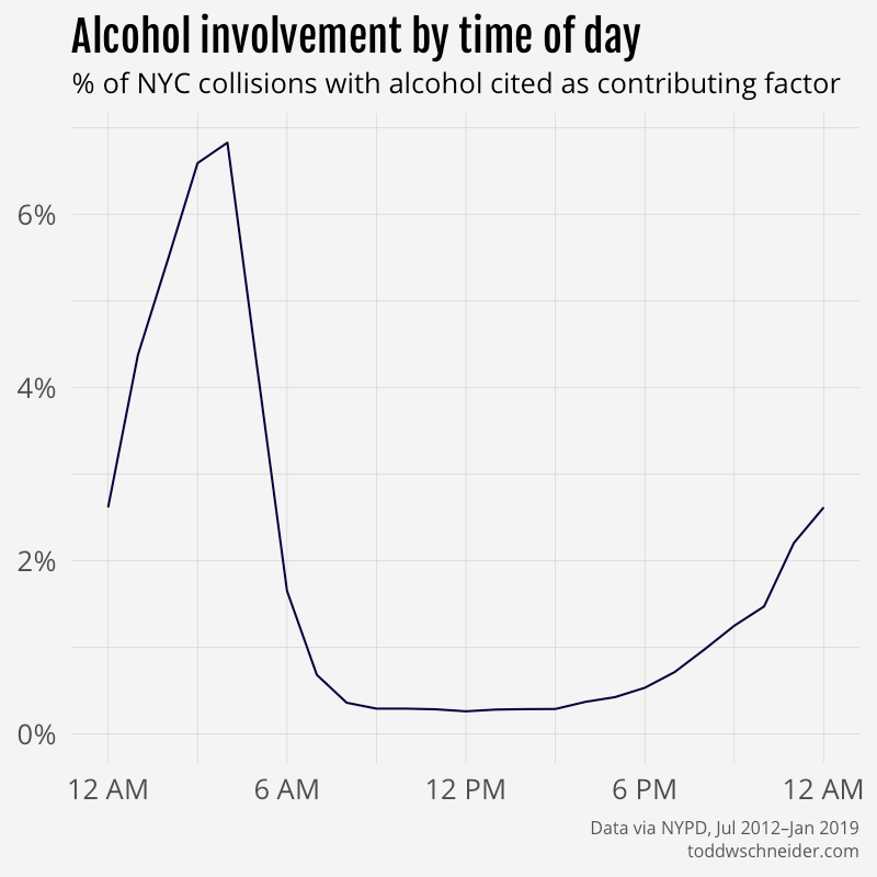
The fatality rate is highest at 4 AM, which is last call for alcohol at NYC bars. The dataset includes contributing factors for each collision—albeit in a somewhat messy format—and sure enough the percentage of collisions involving alcohol also spikes at 4 AM:

alcohol involvement by hour

Among collisions where alcohol is cited as a contributing factor, 30% result in an injury and 0.4% result in a fatality, compared to 19% and 0.1%, respectively, for collisions where alcohol is not cited. Many “correlation does not imply causation” caveats apply, including that alcohol involvement might be correlated with other factors that impact likelihood of injury, or there could be a bias in reporting alcohol as a factor given that the collision resulted in an injury or fatality.

I experimented a bit with regularized logistic regressions to model probability of injury and fatality as a function of several variables, including time of day, street type (avenue, street, highway, etc.), contributing factors, vehicle types, and more. The models consistently report a positive association between alcohol involvement and likelihood of injury and fatality, though in both cases the effect is not as strong as other factors like “unsafe speed” and “traffic control disregarded”. The model reports that collisions involving bicycles are the most likely to result in injuries, while collisions involving motorcycles are the most likely to result in fatalities. It will be interesting to see what happens if new vehicle types like electric scooters gain more widespread adoption.

Again the regression model cannot prove causation, but it’s still interesting to see which factors are most associated with injuries. The relevant code is available here on GitHub if you want to poke around more.

Population growth, gentrification, Citi Bike’s expansion, and various other traffic control mechanisms (speed limits, crosswalks, traffic lights, etc.) all come to mind as possible areas for further study, and kudos to the City of New York for making so much of the data publicly available.

Technical notes, code on GitHub

The code used to collect and process the collisions data is available here on GitHub.

The interactive map is built with deck.gl and Mapbox.

The map embedded and linked in this post uses pre-aggregated data, which helps performance, but limits the number of filters available. If you want to go a bit deeper, there is a similar version of the map available here that aggregates on the fly, and therefore allows a few extra filters: time of day, number of vehicles involved, and injury status. Note though that this “on the fly” version is much slower to load, and likely will not work on mobile devices.

Using Countdown Clock Data to Understand the New York City Subway

Ranking the lines by reliability, the anatomy of a delay, and a case for the $19 billion subway plan

If you’ve been on a New York City subway platform since January 2018, you should have noticed a countdown clock that displayed an estimate of when the next train would arrive. Although there’s no official record of when trains actually stopped at each station, the countdown clock data can be used to approximate. Over the past 5 months, I’ve collected and processed some 24 million stops’ worth of this data to try to make sense of New York’s vast and troubled subway system. The code is all available on GitHub.

Which NYC subway lines have the longest wait times?

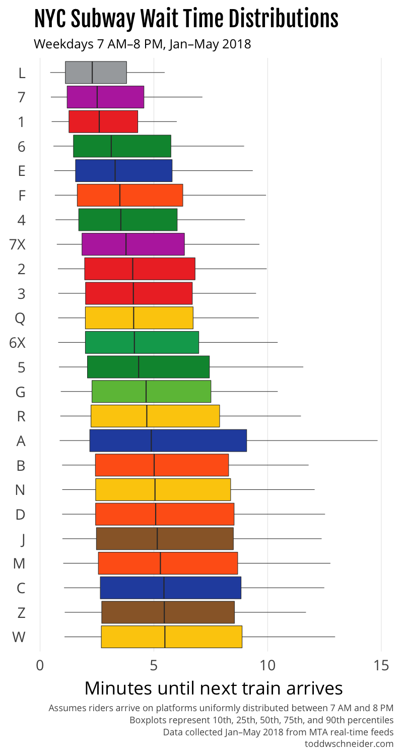
The chart below shows how long you should expect to wait for each train line, assuming you arrive on the platform at a random time on a weekday between 7:00 AM and 8:00 PM.

subway wait times

The top four trains with the shortest waits—the L, 7, 1, and 6—are the only trains that run on dedicated tracks, which presumably helps avoid delays due to trains from other lines merging in and out on different schedules. The L train is also the only line that uses modern communications-based train control (CBTC), which allows trains to operate in a more automated fashion. The 7 train, the second most reliable according to my data, is currently running “partial” CBTC, and is slated for full CBTC in 2018.

Systemwide CBTC is the cornerstone of the recently announced ambitious plan to fix the subways. I’ll have a bit more to say on that in a moment…

(Note that expected wait time is different from time between trains. See the appendix for a more mathematical treatment on converting between time between trains and expected wait time. Note also that in some cases, different lines can serve as substitutes. For example, if you’re traveling from Union Square to Grand Central, the 4, 5, and 6 lines will all get you there, so your effective wait time would be shorter than if you had to rely on one specific line.)

How long will you have to wait for your train?

The above graph is restricted to weekdays between 7:00 AM and 8:00 PM, but wait times vary from hour to hour. In general, wait times are shortest during morning and evening rush hours, though keep in mind that the data doesn’t know about cases where trains might be too crowded to board, forcing you to wait for the next train.

Choose your line below, and you can see how long you should expect to wait for a train by time of day, based on weekday performance from January to May 2018.

wait time

How crowded should you want the platform to be when you arrive?

Most New Yorkers intuitively understand that when they get to a subway platform, they don’t want it to be too empty or too crowded. An empty platform means that you probably just missed the last train, so it’s unlikely another one will be arriving very soon. Even worse, an extremely crowded platform means that something is probably wrong, and maybe the train will never arrive. There’s a Goldilocks zone in the middle: a healthy amount of crowding that suggests it’s been a few minutes since the last train, but not so long that things must be screwed up.

I used the same data to compute conditional wait time distributions: given that it’s been N minutes since the last train, how much longer should you expect to wait? In most cases, the shortest conditional wait time occurs when it’s been 5 to 8 minutes since the last train.

Choose your line to view conditional wait times.

conditional wait time

In general when you arrive on the platform, you can’t directly observe when the last train departed, but you can make a guess based on the number of people who are waiting. First you would have to estimate—or maybe even measure from the MTA’s public turnstile data—the number of people who arrive on the platform each minute. Then, if you know the shortest conditional wait occurs when it’s been 6 minutes since the last train, and you estimated that, say, 20 people arrive on the platform each minute, you should hope to see 120 people on the platform when you arrive. Of course these parameters vary by platform and time of day, so make sure to take that into account when making your own estimates!

A back-of-the-envelope economic case for subway upgrades (that you shouldn’t take too seriously)

The recently released Fast Forward plan from Andy Byford, president of the NYC Transit Authority, proposes that it will take 10 years to implement CBTC across most of the system. The NYT further reports an estimated price tag of $19 billion.

If every line were as efficient as the CBTC-equipped L, I estimate that the average wait time would be around 3 minutes shorter. At 5.7 million riders per weekday, that’s potentially 285,000 hours of time saved per weekday. Reasonable people might disagree about the economic value of deadweight subway waiting time, but $20 per hour doesn’t strike me as crazy, and would imply a savings of $5.7 million per weekday. Weekends have about half as many riders as weekdays, and time is probably worth less, so let’s value a weekend day’s savings at 25% of a weekday’s.

Overall that would imply a total savings of over $1.6 billion per year, and that’s before accounting for the fact that CBTC-equipped trains also probably travel faster from station to station, so time savings would come from more than reduced platform wait times. And if people had more confidence in the system, they wouldn’t have to budget so much extra travel time as a safety buffer. Other potential benefits could come from lower operating and repair costs, and less above-ground traffic congestion if people switched from cars to the presumably more efficient subway.

To be fair, there are all kinds of things that could push in the other direction too: maybe it’s unrealistic that other lines would be as efficient as the L, since the L has the benefit of being on its own dedicated track that it doesn’t share with any other crisscrossing lines, or maybe the better subway would be a victim of its own success, causing overcrowding and other capacity problems. And perhaps the most obvious criticism: that the plan will end up taking longer than 10 years and costing more than $19 billion.

I don’t think this quick back-of-the-envelope calculation should be taken too seriously when there are so many variables to consider, but I do think it’s not hard to get to a few billion dollars a year in economic value, assuming some reasonable parameters. Reasonable people might again argue about discount rates and amortization schedules, but a total cost in the neighborhood of $19 billion over 10 years strikes me as eminently worth it.

Anatomy of a subway delay

The NYT recently published a great interactive story that demonstrated via simulation how a single train delay can cause cascading problems behind it. The week after that story was published, I was (un)fortunate enough to participate in a real-life demonstration of the phenomenon. On May 16, 2018, I found myself on a downtown F train from Midtown. Around 10:00 AM at 34th Street, the conductor made an announcement that there was a stalled train in front of us at W 4th Street, and that we’d be delayed. The delay lasted about 30 minutes, and then the train carried on as normal.

Here’s a graphical representation of downtown F trains that morning, with major delays highlighted in red. My train was the second train in the major delay on the right-center of the graph.

downtown f train delays

Although I wasn’t on the train that had mechanical problems at W 4th Street, my train and the two trains behind it were forced to wait for the problem train. Further back, the train dispatcher switched a few F trains to the express tracks from 47-50 Sts–Rockefeller Center to W 4th Street, which is why you see a few steeper line segments in the graph that appear to cut through the delay. The empty diagonal gash in the graph below the delay shows that riders felt the effects all the way down the line. If you were waiting for an F train at 2nd Avenue just after 10:00 AM, you would have had to wait a full 30 minutes, compared to only a few minutes if you had arrived on the platform at 9:55 AM.

I’m a bit surprised that the MTA didn’t deliberately slow down some of the trains in front of the delay. It’s well-known that even spacing is a key to minimizing system-wide wait time, the MTA once even made a video about it, but in this case it appears they didn’t practice what they preach. Slowing down a train in front of a delay will make some riders worse off, namely the ones at future stops who would have made the train had it not been slowed down. But it will also make some riders much better off: the ones who would have missed the train had it not been slowed down, and then had to suffer an abnormally long wait for the delayed train itself.

You can use the graph to convince yourself that slowing down the train ahead of the delay would have been a good thing. Downtown F trains stopped at 2nd Avenue at 9:58 and 10:00 AM. If the 10:00 AM train had been intentionally delayed 10 minutes to 10:10 AM, all of the people who arrived on the platform between 10:00 and 10:10 would have been saved from waiting until 10:30, an average 20 minute savings per person. On the other hand, the folks who arrived between 9:58 and 10:00 would have been penalized an average of 10 minutes per person. But there were likely five times as many people in the 10:00–10:10 range than there were in the 9:58–10:00 range, so the weighted average tells us we just saved an average of 15 minutes per person.

Compare the W 4th Street delay to the delay earlier that morning at 7:40 AM at 57th Street, highlighted on the left side of the graph. That delay, although shorter, also caused a lasting gap between trains. However, the gap was later mitigated when the train in front of the delayed train slowed down a bit between York and Jay streets. I suspect that slowdown was unintentional, but it was probably beneficial, and had it happened further up the line, say between 42nd and 34th streets, it would have produced more even spacing throughout the line, and likely lowered total rider wait time.

In fairness to the MTA, in real life it’s not as simple as “always slow down the train in front of the delay” because there are other considerations—dispatchers don’t know how long the delay will last, not every platform is equally popular, and there other options like rerouting trains to other tracks—but a healthier system could have dealt with this delay better.

Subway performance over time

The subway’s deteriorating performance has been covered at great length by many outlets. I’d recommend the NYT’s coverage in particular, but it seems like there are so many people writing about the subway recently that there’s no shortage of stories to choose from.

In addition to the dataset I collected starting in January 2018, the MTA makes some real-time snapshots available going back to September 2014. These snapshots are only available for the 1, 2, 3, 4, 5, 6, and L trains, and they’re in 5-minute increments as opposed to the 1-minute increments of my tracker. Additionally, there is a gap in historical coverage from November 2015 until January 2017.

The historical data shows that expected wait times have remained fairly unchanged since 2014, but travel times from station to station have gotten a bit slower, at least on the 2, 3, 4, and 5 trains, where a weekday daytime trip in 2018 takes 3-5% longer on average than the same trip in 2014. The 1 and 6 trains have not experienced similar slowdowns, and the L is somewhere in the middle.

historical subway performance

On a 15-minute trip, 3-5% is an average of 30-45 seconds slower, which doesn’t sound particularly catastrophic, but there are plenty of other issues not reflected in these numbers that might make the subway “better” or “worse” over time. I’ve tried to exclude scheduled maintenance windows from the expected wait time calculations, but in reality scheduled maintenance and station closures can be a huge nuisance. The MTA data also doesn’t tell us anything about when trains are so crowded that they can’t pick up new passengers, when air conditioning systems are broken, and other general quality-of-ride characteristics.

It’s also possible that the 1-6 and L lines—the ones with historical data—happen to have deteriorated less than the other lettered lines, and if we had full historical data for the other lines, we’d see more dramatic effects over time. There’s no question that the popular narrative is that the subway has gotten worse in recent years, though part of me can’t help but wonder if the feedback loop provided by nonstop media coverage might be a contributing factor…

The NYC subway as a directed graph

I used the igraph package in R to construct a weighted directed graph of the subway system, where the nodes are the 472 subway stations, the edges are the various subway lines and transfers that connect them, and the weights are the expected travel times along each edge. For train edges, the weight is calculated as the median wait time on the platform plus the median travel time from station to station, and for transfer edges, the weight is taken from estimates provided by the MTA—typically 3 minutes if you have to change platforms, 0 if you don’t.

With the graph in hand, we can answer a host of fun (and maybe informative) questions, as igraph does the heavy lifting to calculate shortest possible paths from station to station across the system.

I used the directed graph to find the “center” of the subway system, defined as the station that has the closest farthest-away station. That honor goes to the Chambers Street–World Trade Center/Park Place station, from where you can expect to reach any other subway station in 75 minutes or less. Here’s a map highlighting the Chambers Street station, plus the routes you could take to the farthest reaches of Manhattan, Brooklyn, Queens, and the Bronx.

chambers street subway

The directed graph might even be a good real estate planning tool. You might not care about the outer extremities of the city, but if you provide a list of neighborhoods you do frequent, the graph can tell you the most central station where you can minimize your worst-case travel times.

For example, if your personal version of NYC stretches from the Upper West Side to the north, Park Slope to the south, and Bushwick to the east, then the graph suggests W 4th Street in Greenwich Village as your subway center: you can get to all of your neighborhoods in a maximum of 26 minutes.

w 4th street subway

The graph can be used to calculate all sorts of other fun routes. I’ve seen attempts to find the longest possible subway trip that doesn’t involve any backtracking, which is all well and good, but what about finding the longest trip from A to B with the constraint that it’s also the fastest subway-only trip from A to B? Based on my calculations, the longest possible such trip stretches from Wakefield–241st Street in the Bronx to Far Rockaway–Beach 116th Street in Queens via the 2, 5, A, and Rockaway Park Shuttle. It would take a median time of 2:28—about as long as it takes the Acela to travel from Penn Station to Baltimore.

wakefield to far rockaway

The fastest way to hit all 4 subway boroughs is from 138th St–Grand Concourse in the South Bronx to Greenpoint Avenue in North Brooklyn: 41 minutes via the 6, 4, E, and G trains. And the “centers” of each borough:

  • Manhattan: 59th Street–Columbus Circle, 35 minutes max to any other stop in Manhattan
  • Brooklyn: Jay Street–MetroTech, 45 minutes max to any other stop in Brooklyn
  • Bronx: 149th Street–Grand Concourse, 41 minutes max to any other stop in the Bronx
  • Queens: Halsey Street, 66 minutes max to any other stop in Queens

Further work

The directed graph is a bit silly: in many cases it wouldn’t make sense to rely only on the subway when other transportation options would be more sensible. I’ve written previously about taxi vs. Citi Bike travel times, and a logical extension would be to expand the edges of the directed graph to take into account more transportation options.

Of course, a more practical idea might be to use Google Maps travel time estimates, which already do some of the work combining subways, bikes, ferries, buses, cars, and walking. Still, there’s something nice about estimating travel times based on historical trips that actually happened, as opposed to using posted schedules.

There’s probably something interesting to learn by combining the MTA’s public turnstile data with the train location data. For example, the turnstiles might provide insights into when dispatchers should be more aggressive about maintaining even train spacing following delays. As the tracker collects more data, it might be interesting to see how weather affects subway performance, perhaps segmenting by routes that are above or below ground.

All eyes will be on the subway system in the months and years to come, as people wait to see how the current “fix the subway” drama unfolds. Hopefully the MTA’s real-time data can serve as a resource to measure progress along the way.

The code and how it works

Although there’s no official record of when trains actually stopped at each station, the MTA provides a public API of the real-time data that powers the countdown clocks, which can be used to estimate train performance.

Starting in January 2018, I’ve been collecting the countdown clock information every minute for every line in the NYC subway system, then calculating my best guesses as to when each train stopped at each station. Between January and May 2018, I observed some 900,000 trains that collectively made 24 million stops. The MTA’s data is very messy, and occasionally makes no sense at all, so I spent a considerable amount of time trying to clean up the data as best possible. For more technical details, including all of the code used in this post to collect and analyze the data, head over to GitHub.

The countdown clock system uses bluetooth receivers installed on trains and in stations: when a train passes through a station, it notifies the system of its most recent stop. The MTA has acknowledged the system’s less than perfect accuracy, but it’s much better than the status quo from only a few years ago when we really had no idea where the trains were.

Appendix: converting from “time between trains” to “expected wait time”

Putting aside messy data issues, the MTA’s real-time feeds tell us the amount of time between trains. But riders probably care more about how long they should expect to wait when they arrive at the platform, and those two quantities can be different.

As a hypothetical example, imagine a system where trains arrive exactly every 10 minutes on the 0s: 12:00, 12:10, etc. In that world, riders who arrive on the platform at 12:01 will wait 9 minutes for the next train, riders who arrive at 12:02 will wait 8 minutes, and so on down to riders who arrive at 12:09 who will wait 1 minute. If we assume a continuous uniform distribution of arrival times for people on the platform, the average person’s wait time will be one half of the time between trains, 5 minutes in this example.

Now imagine trains arrive alternating 5 and 15 minutes apart, e.g. 12:00, 12:05, 12:20, 12:25, etc., while people still arrive following a uniform distribution. The people who happen to arrive during one of the 5-minute gaps will average a 2.5 minute wait, while the people who arrive during one of the 15-minute gaps will average a 7.5 minute wait. The catch is that only 25% of all people will arrive during a 5-minute window while the other 75% will arrive during a 15-minute window, which means the global average wait time is now (2.5 * 0.25) + (7.5 * 0.75) = 6.25 minutes. That’s 1.25 minutes worse than the first scenario where trains were evenly spaced, even though in both scenarios the average time between trains is 10 minutes.

If you work out the math for the general case, you should find that average wait time is proportional to the sum of the squares of each individual gap between trains.

wait time math

This means that given an average gap time, expected wait time will be minimized when the gaps are all identical. In practice, it very well could be worth increasing average gap time if it means you can minimize gap time variance. Looking back to our toy example, not only is the average of 52 and 152 greater than 102, it’s greater than 112, which means that trains spaced evenly every 11 minutes will produce less average wait time than trains alternating every 5 and 15 minutes, even though the latter scenario would have a shorter average gap between trains. For another take on this, I’d recommend Erik Bernhardsson’s NYC subway math post from 2016.

Often we want more than the expected wait time, we want the distribution of wait times, so that we can calculate percentile outcomes. Normally this is where I’d say something like “just write a Monte Carlo simulation”, but I think in this particular case it’s actually easier and more useful to do the empirical calculation.

Let’s say you have a list of the times at which trains stopped at a particular station, and you’d like to calculate the empirical distribution of rider wait times, assuming riders arrive at the platform following a uniform distribution. I’d reframe that problem as drawing balls out of a box, following the process below:

  1. Start with an empty box
  2. For each train, add N balls to the box, labeled 1 to N, where N is the number of seconds the train arrived after the train in front of it

Once you’ve done that, you’re pretty much done, as your box is now full of balls with numbers on them, and the probability of a rider having to wait some specific number of seconds t is equal to the number of balls labeled t divided by the total number of balls in the box. Note that you might want to filter trains by day of week or time of day, both because train schedules vary, and people don’t actually arrive on platforms uniformly, but if you restrict to within narrow enough time intervals, it’s probably close enough.

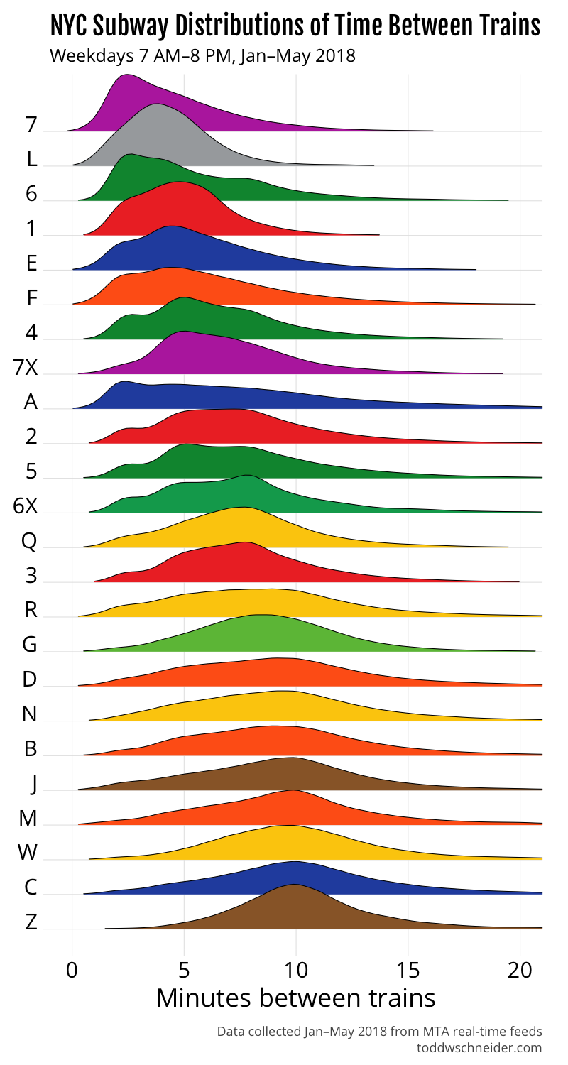
In terms of the actual NYC subway lines during weekdays between 7:00 AM and 8:00 PM, the 7 train has the shortest median time between trains, but the L does a better job at minimizing the occasional long gaps between trains, which is why we saw earlier that the L has shorter average wait times than the 7.

The A train has a notably flat and wide distribution, which explains why the first graph in this post showed that the A had the worst 75th and 90th percentile outcomes, even though its median performance is middle-of-the-pack.

time between trains