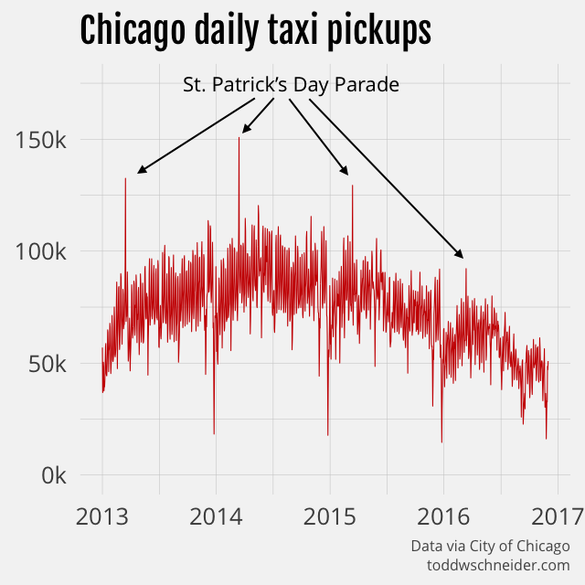
The City of Chicago has released a public dataset containing over 100 million taxi rides since 2013. I adapted my analysis of the similar New York City dataset to process the Chicago data, and created a GitHub repository with the relevant code.
The Chicago dataset does not include data from ridesharing companies like Uber and Lyft, but the data makes clear that taxi usage in Chicago has declined dramatically since 2014. As of November 2016, Chicago taxi usage was declining at a 35% annual rate, and had fallen a cumulative 55% since peaking in June 2014.
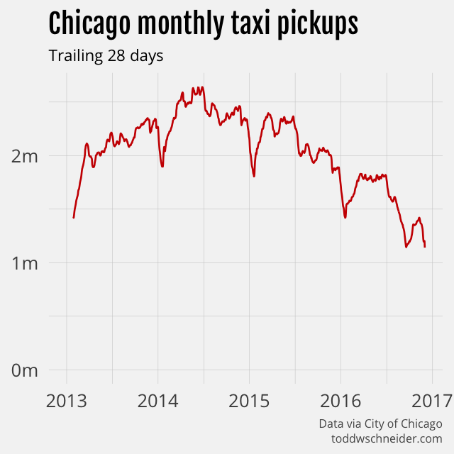
Again, the public dataset does not include any data from ridesharing services like Uber and Lyft, but the Chicago taxi industry claims that ridesharing services caused cabs to lose 30–40% of their business in the summer of 2015.
Chicago’s taxi industry is shrinking faster than NYC’s
New York taxis have also been losing market share to ridesharing companies—NYC releases data that confirms this—but in fact Chicago taxis are losing market share even faster than their NYC counterparts. While NYC taxi usage has been declining at around 10% per year, Chicago’s declines have reached 35% year-over-year.
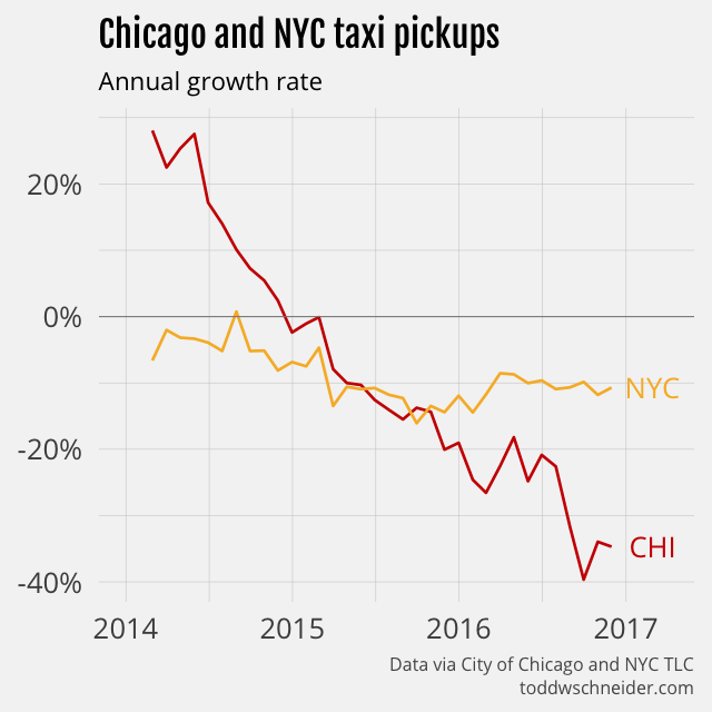
New York taxis make about 8 times more trips per month than Chicago taxis do, but a rescaled monthly trips index shows that Chicago has a larger cumulative decline on a percentage basis.
Areas closest to downtown show smaller taxi declines
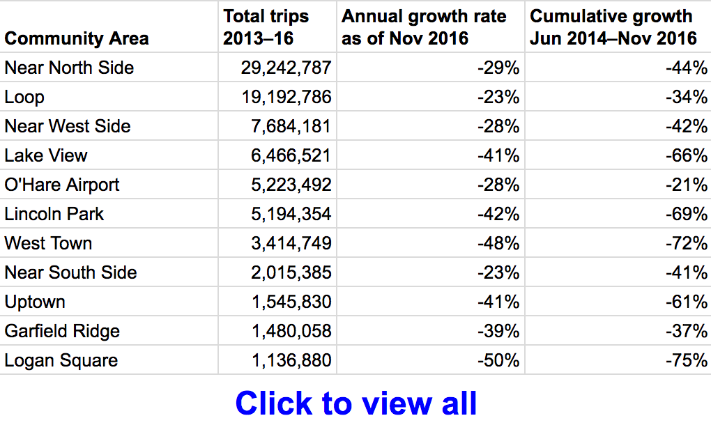
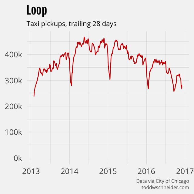
Chicago’s taxi pickup declines are not evenly distributed among the city’s 77 community areas. For example, the Loop, Chicago’s central business district, shows a 23% annual decline, while Logan Square on the northwest side shows a 50% annual decline. In general, the areas located closest to the central business district show smaller declines in taxi activity.
I defined 5 particular community areas—the Loop, Near North Side, Near West Side, Near South Side, and O’Hare Airport—as the “core”, then compared pickups inside and outside of the core. As of November 2016, pickups inside the core show a 27% annual decline compared to a 42% annual decline outside of the core. On a cumulative basis, core pickups have declined 39% since June 2014, while non-core pickups have declined a whopping 65%. The smaller taxi decline near the central business district is consistent with NYC’s taxi and Uber data, where taxi share has fallen less in Manhattan than in the outer boroughs.
Data by community area is available here in spreadsheet form.
A map of the official community area definitions is available here, and you can select community areas in the menu below to view taxi pickups since 2013.
Anonymized medallion numbers
Chicago’s public taxi data, unlike New York’s, includes anonymized taxi medallion numbers for each trip. This makes it possible to do things like:
- Count the number of unique taxis in service each month
- Measure the distribution of trips per day for active taxis
- Observe the sequence of trips made by individual taxis
The Chicago dataset is also missing some of the details provided by New York, though this is explicitly for the purpose of privacy, and is probably on the whole a good thing.
The number of taxis that make at least one pickup per month has declined nearly 30%, from a peak of over 5,000 to 3,600 more recently.
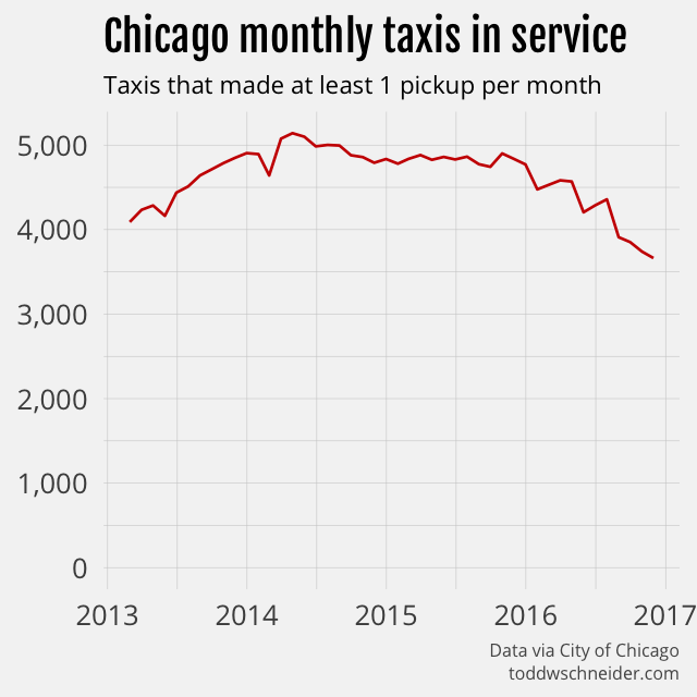
Since taxi trips have declined by 55% over a time period when unique taxis have declined by 29%, that means fewer trips per day for each active taxi. Active taxis used to average 20 trips per day, but more recently have averaged 13 trips per day.
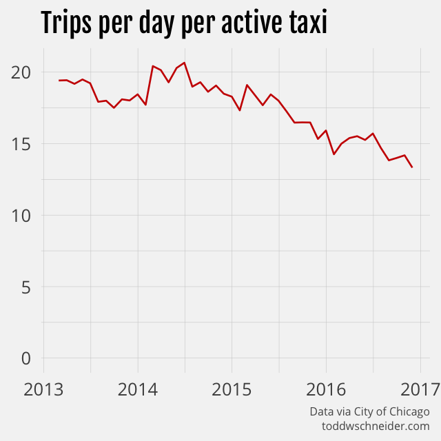
A histogram of daily trips per taxi shows a bit of a right skew, with a mean of 18 and median of 16 trips per day over the entire dataset. On the plus side for taxis, average fares have increased over time, at least partially due to a 15% fare increase in early 2016, and so the decline in total fares collected per taxi per day is not as large.
The best and worst places for a taxi to make a drop off
With anonymized medallion numbers, we can see when and where a taxi picked up its next fare after making a drop off. For each drop off, I looked at the time of the next pickup, and calculated the percentage of drop offs in each area that were followed by a new pickup within 30 minutes. For privacy reasons, trip timestamps are all rounded to 15-minute intervals, so this calculation is not exact, but it should be close enough.
Sure enough, nearly 80% of drop offs in central business districts are followed by a pickup within 30 minutes, while as little as 20% of drop offs in more remote areas, e.g. airports, are followed by pickups within 30 minutes.
Likelihood of a taxi finding a new fare within 30 minutes by drop off area
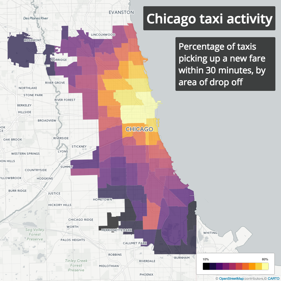
This basic analysis doesn’t necessarily imply that it’s a bad thing for a taxi to make a trip from the Loop to O’Hare. It’s true that it’s less likely for a taxi to get a new fare after dropping off at the airport, but a more thorough analysis would have to take into account that fares to the airport are higher than average, and so the question becomes whether that higher fare is enough to offset the longer wait time after drop off. Time of day and day of week might also be relevant, and should be considered in a more complete analysis.
Wrigley Field and the 2016 Cubs
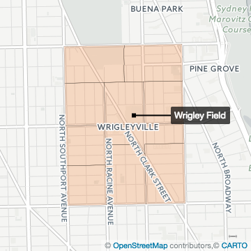
I’m not a native Chicagoan, but you don’t have to be one to know that the Cubs winning the 2016 World Series was a big deal. I grabbed the 2013–2016 Cubs home game schedules from Baseball Reference and compared taxi drop offs near Wrigley Field on game days to non-game days.
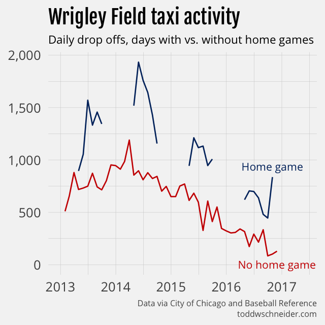
Not surprisingly, taxis do more business around Wrigley Field on game days. Total drop offs have declined since 2013—remember taxis have lost market share everywhere—but more interesting is to look at the patterns within each season. In particular the 2016 championship team generated the most taxi activity during the World Series games in October, when in previous seasons peak taxi activity had been during the mid-summer months.
Privacy measures
Chicago’s dataset is missing some of the details provided by New York, most notably:
- Precise timestamps
- Precise latitude/longitude coordinates
All timestamps are rounded to the nearest 15-minute interval, and instead of latitude/longitude, the data includes census tract and community area identifiers. Furthermore, census tracts are only included when there are multiple trips within the same tract over the same 15-minute interval.
The press release announcing the dataset’s publication specifically points out that these measures were taken to protect privacy, presumably of both drivers and riders. I think on the whole it’s a good thing, even if it means that there won’t be any fancy maps of the Chicago trips, frankly that’s a small price to pay.
Still, anonymizing data is a very hard problem, and it seems like the Chicago dataset has not completely eliminated the risk. If we define a “uniquely identifiable” trip as one where there was exactly one pickup or drop off in a community area over the course of an hour, then 66% of all taxis in the dataset made at least one uniquely identifiable trip.
That means, for example, if you got into a taxi in some area at some time, recorded its medallion number, then later checked the data and there was only one pick up in that area during that hour, then you could map that particular “anonymized” medallion number to the actual medallion number. It might be impractical to find the real medallion numbers for these uniquely identifiable trips—you wouldn’t know the trip was uniquely identifiable until well after the fact—but with the proliferation of cameras and computer vision technology, it’s not that far-fetched either.
Even though only 0.7% of the trips in the dataset are uniquely identifiable by my definition, taxis that made at least one uniquely identifiable trip account for nearly 98% of the total trips. Again, this isn’t to say that I or anyone else has managed to de-anonymize the data, but it’s a reminder that even when good-faith efforts are made to anonymize data, it’s extremely difficult to do it well.
Uber and New York are currently fighting over data disclosure, with the city asking for more data from Uber for planning and regulatory purposes, and Uber refusing to provide it because NYC has done a bad job protecting privacy in the past. Chicago’s privacy measures are not perfect: there might still be ways to de-anonymize the data, and just the fact that they have more detailed data means there’s a risk of accidental or malicious release. But in my mind the Chicago data strikes an appropriate balance, on the one hand enabling analysis that could lead to real insights and quality of life improvements, while simultaneously protecting the privacy of those involved. New York could do worse than adopt a similar approach.
Code on GitHub
All code used in this post is available on GitHub.
“If they can dye the river green today, why can’t they dye it blue the other 364 days of the year?”
It turns out that the annual St. Patrick’s Day Parade, made famous (at least in my adolescent mind) by The Fugitive, is the day with the most taxi trips in Chicago every year since 2013. Per IMDb, director and Chicago native Andrew Davis specifically wanted to capture the parade, though part of me now thinks that Dr. Richard Kimble should have ducked out by way of taxi…
