Introducing Gambletron2000.com, a tool that uses live in-game gambling data to quantify excitement in sports, write automated game recaps, finally settle the debate about whether the first half of NBA games is even worth watching—and much, much more
Using R to Solve a Geography Puzzle
The puzzle: find two points inside the United States such that:
- Both points are in the same state
- The straight line segment (shortest great circle) connecting them crosses the largest number of distinct states
This came up during a recent road trip through Pennsylvania, Maryland, West Virginia, and Virginia, where I noticed that it’s possible to draw a straight line that has both endpoints in West Virginia, and along the way crosses each of PA, MD, and VA, for a total of 4 states:

Are there any states where you can do better than 4 total? To help find the answer, I wrote an R script that analyzes state-level spatial data to determine where else we could draw line segments that start and end in the same state, and might cross more than 4 states. It turns out that there are two such states, although one of them gets an asterisk…
How does the algorithm find the best line segments?
To start, I make the claim that we only have to check line segments that start and end on a state border. If we have a segment that starts or ends in the interior of a state, we can always extend the segment in each direction until it reaches a border, and we can be guaranteed that this extended segment touches at least as many states as the unextended segment, because the points along the unextended segment are a subset of the points along the extended segment.
With that insight, we can perform a simple brute force search for each state that checks every segment connecting two boundary points of that state. We enumerate every possible pair of boundary points defined by the spatial data, calculate the great circle that connects those two points, and count up the number of states that include at least one point along the great circle. Here’s an animation of the calculation for West Virginia (this animation doesn’t enumerate every pair of border points, but you can see the process):

It turns out that it’s computationally impractical to do a complete brute force search, so we simplify the problem a bit by removing boundary points that are sufficiently close together. New York, for example, is defined by just over 40,000 boundary points. There would be more than (40,000 * 39,999) / 2 = 799.98 million pairs of points to check if we wanted to check all of them. Applying a little common sense suggests that this would be overkill: most of the boundary points are along the jagged coast of Long Island, where every little nook and cranny requires its own definition. If we simplify the boundaries of New York by checking only boundary points that are at least, say, 10 kilometers from the previous point we checked, then we cut down the total number of points to 226, leaving us a far more manageable 35,000 pairs to check – a speed improvement of more than 20,000 times!
One downside of this simplification is that we increase the chance that we’ll miss the globally optimal line segment, but after experimenting with various boundary-simplification schemes, 10 kilometers seemed like a reasonable approach. It’s worth noting that even without simplifying the boundaries, we still might miss the global optimum, because the globally optimal segment might have an endpoint that falls on the interpolated segment connecting two of the defined boundary points (imagine a state with relatively simple borders like Colorado: it requires far fewer boundary points than New York!).
The Results
With the R script in hand, we can let it crunch through the various states and see what it finds.
There are many states that contain line segments crossing 4 states, including some surprises (at least to me!).
The Kentucky Bend plays a role for all of Kentucky, Missouri, and Tennessee.</p>
Kentucky:

Missouri:

Tennessee:

Arkansas sneaks in 4, touching Missouri, Tennessee, and Mississippi:

Nebraska’s border along the Missouri River touches South Dakota, Iowa, and Missouri:

Illinois benefits from having its borders officially include large portions of the Great Lakes:

West Virginia, the original inspiration for this exploration:

Virginia (including Washington, DC):

And the winner is…
Of course, even before I wrote the program, both my fellow roadtripper and I guessed that New York would be the answer, traveling from the eastern end of Long Island to the northeastern corner bordering Vermont and Quebec, but we weren’t sure exactly which states we’d cross in between. Connecticut, Massachusetts, and Vermont seemed like a given, but would the line segment catch any of Rhode Island? What about New Hampshire?
It turns out the best you can do is 5 states, including New Hampshire but excluding Rhode Island:

And so New York is the top dog with a total of five states crossed: NY, CT, MA, NH, and VT, but there’s another 5-spot out there: Maryland also gets 5, but with an asterisk because one of them is Washington, D.C., and well there is that whole “taxation without representation” thing.

In Conclusion
If we had to summarize the results into something a bit more general, we could say:
- Look for states with borders that are defined by bodies of water. The Mississippi River in particular accounts for many of the surprising cases in the midwestern states, largely owing to the Kentucky Bend. The Missouri and Potomac Rivers, Long Island Sound, and Chesapeake Bay all have some contribution as well. This is pretty intuitive in retrospect, since the irregular, meandering borders defined by bodies of water have more opportunities for crossings compared to simpler borders defined along parallels and meridians
- The smaller eastern states fare better than their larger western counterparts. That might be partially due to bodies of water, but it also helps that smaller states are closer together, so even though New York is among the largest of the eastern states, it is surrounded by many smaller states
Where’s the code?
You can run all the of the code for yourself; the code, software, and data are all freely available. Some suggested ideas that might be fun to explore: what about the same problem applied to countries of the world, instead of US states? How could we make an algorithm faster/more intelligent than a brute force search?
If you just want the highlights, the innermost loop of the code is only 3 lines. Given two points p1 and p2, calculate the number of states crossed by the connecting great circle:
1 2 3 4 5 | |
When Harvard Met Sally: N-gram Analysis of the New York Times Weddings Section
The New York Times’s wedding section is a perfect natural experiment designed to answer the question: What do the world’s most self-important people think is important?
Introducing WeddingCrunchers.com, a searchable database of nearly 60,000 NYT wedding announcements from 1981 through 2016. Plot n-gram frequency and visualize trends across 30+ years of yuppie nuptials
There has never been a shortage of hora-chair commentary on the New York Times Weddings & Celebrations section, and it’s not hard to see why: New York is the status-consciousness capital of our status-conscious culture, and this makes the Times’s wedding section a perfect natural experiment designed to answer the question, What do the world’s most self-important people think is important?
The neat thing about these announcements is that they’re fairly structured—if you read a bunch of them, you’ll notice patterns in the way couples are introduced and how their basic “stats” are phrased. This makes it possible to test our intuitions about trends like:
- The decline of debutante culture
- When exactly Wall Street hit its period of peak decadence
- How the average age of well-to-do brides changes over time
- Whether Princeton’s stricter grading standards have resulted in the “nightmare scenario” envisioned by a concerned student in the Times itself
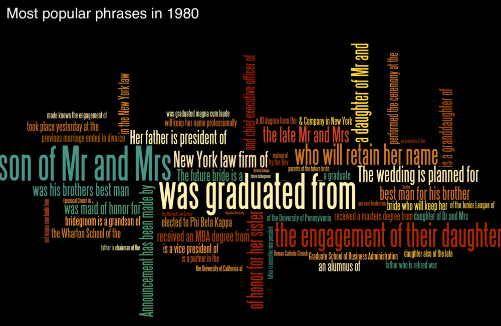
This is why we built WeddingCrunchers.com, a searchable database of about 60,000 Times wedding announcements published between 1981 and 2013. Specifically, Wedding Crunchers lets you measure the frequency of specific words and phrases in these announcements. When you search for a phrase (technically called an n-gram), you get back a graph displaying how usage of that phrase fluctuated over time.
Let’s see what we can find out with this powerful tool at our disposal.
Age Ain’t Nothing but a Number
As most young professionals (and every parent of a young professional) in New York could tell you, “the average age of people getting married is on the rise.” Why, I’d have to check, but there might have even been a few NYT Most E-Mailed articles on the very subject…
But is this popular conception borne out by the data?
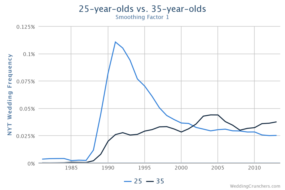
The graph shows how frequently the terms “25” and “35” appeared in New York Times wedding announcements from 1980 to today.
When the Weddings column started including ages in the early 1990s, you were more than four times as likely to see a 25-year-old in an announcement than you were a 35-year-old, but by the early 2000s, 35-year-olds had completely closed the gap. Today you’re slightly more likely to see a 35-year-old than a 25-year old! Brides tend to be a bit younger than grooms, but the trends are similar for both sexes.
Let’s get a broader pictures of how ages have changed in the past two decades of wedding announcements:

Notice how the peak starts well to the left side of the graph in 1990 but then flattens and shifts to the right throughout the 2000s. Interestingly, it looks like the trend might have reversed itself by a small amount in the most recent years, but overall the distribution has clearly shifted to the right.
“Republicans buy sneakers, too”
—Michael Jordan (maybe), on his decision not to endorse Democrat Harvey Gantt in the 1990 North Carolina Senate race
The Times has a famously liberal editorial board. Have its wedded couples trended in the same political direction? Let’s search Wedding Crunchers for mentions of Democrats and Republicans—you know, stuff like “the groom’s father, a Democrat, is a senator from New Jersey”:

Back in the early Reagan days, you were actually more likely to see a Republican mentioned in the weddings section than a Democrat, but as the metropolitan area has become progressively more blue and Rockefeller Republicans have joined the list of endangered species, the political affiliation of the staffers, children of politicians, and politicians themselves getting hitched has reflected the surging Democratic tide of New York.
The Demographics Of Times Wedding Announcements They Are a-Changin’
Let’s not kid ourselves—the Times’s weddings column is indelibly associated with two demographics: Jews and WASPs. As it turns out, though, the wedding announcements have become more diverse over the past 30 years, perhaps deliberately on the part of the Times’s editors, organically on the part of New York’s evolving population, or some combination of both.
It’s hard to ferret out a WASP directly, but there are plenty of excellent proxies we can look at—traditional WASPy institutions like boarding schools, suffixes, and Fairfield County, Connecticut. Let’s see how those are doing:


So we see that references to famous boarding schools are all on the decline, although that appears to be part of a broader trend toward excluding high school credentials from the announcements. There are fewer “III” suffixes, and the traditional, affluent towns of Connecticut’s Gold Coast are also referenced less frequently. These data points are by no means conclusive, but they all support the notion that the weddings section has shed at least some of its aristocratic roots. Perhaps though the strongest indicator of the decline of the weddings section’s blue-bloodedness can be seen in the following chart:

Meanwhile, the words “Muslim”, “Buddhist”, and “Sikh” have all seen small increases, but “Hindu” has really exploded:
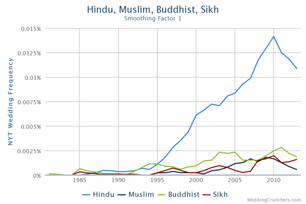
This seems consistent with demographic trends, namely that the city’s Indian population increased by 118% from 1990 to 2000, while the city’s overall population grew by 9%.
That might not be the whole story, though. The NYT and other media outlets have reported on South Asians’ growing presence on Wall Street, and if you believe that the wedding announcements largely reflect people on Wall Street (more on that later), and there are more Indians on Wall Street, then you would expect to see more Indians in the weddings section.
Another way to consider diversity over the years is to examine sets of surnames commonly associated with certain ethnicities:
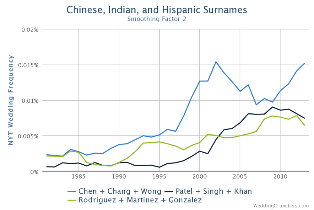
From this graph we can see that Chinese, Indian, and Hispanic names have all become more frequent, with the Chinese making the largest increase. The increase in Indian names has been more recent, and the increase in Hispanic names has been the most gradual.
Now let’s compare those names to the single most popular Jewish surname, Cohen:
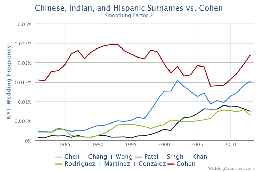
Hmm, ok, so while the Cohens haven’t seen an increase, they’re still ahead of the top 3 for the other ethnicities all by themselves! If we add in other common Jewish surnames like Goldberg and Rosenberg, the gap is even more dramatic.
So we can see that some things change less than others. Nowhere is that clearer than in… the Ivy League.
“To those of you who received honors, awards, and distinctions, I say, ‘Well done.’ To the ‘C’ students, I say, ‘You, too, can be president of the United States!’
—President George W. Bush, to Yale’s graduating class of 2001

Columbia is the most mentioned of the Ivies, followed closely by Harvard. Dartmouth is consistently the least mentioned, and the rest are bunched in the middle. Remember, though, that the Ivies vary widely in total student enrollment, particularly in the number of graduate students.
Dartmouth is the smallest of the Ivies as measured by total student enrollment, so in some sense it’s only natural that it would be the least mentioned. It’s also the farthest from New York, which might mean that its alumni are less likely to live in the city, and therefore less likely to appear in the Times when they get married. By the same token, Columbia is in New York, so it probably has the highest percentage of its graduates living or working in the city.
Let’s compare the total enrollment of each school to its representation in the Times weddings section:

It appears that after adjusting for student population, Princeton is the most overrepresented of the Ivies, while Cornell is the most underrepresented. Take this with a grain of salt though, because the table doesn’t account for changes in enrollment over time, what percentages of each school’s graduates move to New York City, and the relative propensity for undergraduate alumni to be in the weddings section compared to graduate students (to say nothing of the stratification within graduate schools, namely among professional, doctorate, and other master’s degree programs).
You can’t talk Ivies in the Times without taking a look at Latin honors. Some Princeton students have expressed dismay that they are graded more strictly than their Yale counterparts, while Harvard embarked on its own quest a few years ago to crack down on the ease with which it handed out Latin honors. What does the Wedding Crunchers data say? We can used the advanced query feature to calculate the percentage of each school’s mentions that are preceded by the phrase “cum laude”:
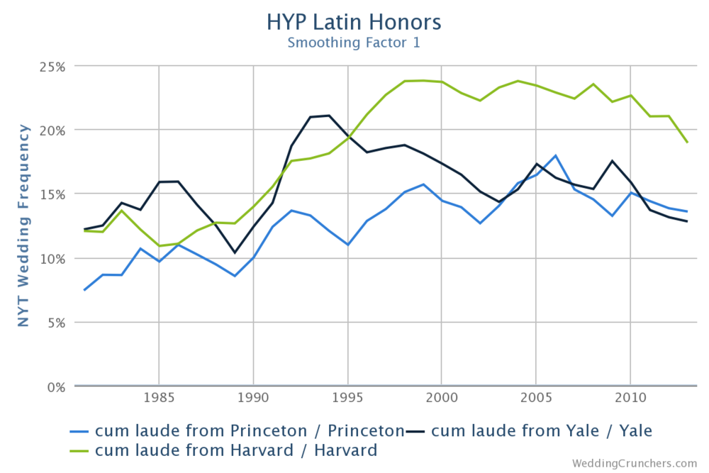
Sure enough, Harvard appears to have the highest rate of graduates with Latin honors, while Yale and Princeton look comparable. Again, though, we should consider graduate programs: many of them don’t offer Latin honors, so graduate students might be contributing to the denominators in the above data without counting toward the numerators, lowering the overall ratios. Harvard is nearly ⅔ graduate students, Yale is closer to 50/50, while Princeton is about ⅔ undergraduates, so it might well be that all of the ratios should be higher by some degree, with a bigger relative increase for Harvard and a smaller increase for Princeton.
But no matter which Ivy League school you attended, you’re going to have trouble name-dropping Phi Beta Kappa in your wedding announcement:

This is because in 1999 the NYT officially stopped allowing people to list Phi Beta Kappa honors in their announcements!
All of the Ivies have been co-ed for quite some time. We can see that the Seven Sisters colleges used to be mentioned quite frequently, but have experienced significant declines, especially the ones that haven’t gone co-ed themselves:

Are there any other colleges that can compete with the Ivies for total popularity in the weddings section?

This list is by no means conclusive, but NYU fares very well, while Duke and Stanford have also crept into the realm of the less frequently mentioned Ivies.
Which brings us to a riddle: what do nearly all elite colleges have in common? The answer, of course, is: kids who want to work on Wall Street.
To Have and to Goldman
They used to say, “As G.M. goes, so goes the nation.” Today they might as well replace “G.M.” with “Goldman Sachs,” and “the nation” with “the salesmen at Ferrari & Maserati of New York.”
Let’s look at some of the bigger names on the street:

You’ll notice that Merrill Lynch used to be way more cited than it is today. Wait a minute: does Merrill even exist anymore? Ah yes: It was bought by Bank of America at the depths of the financial crisis, or maybe BofA was forced to buy it by the Federal Reserve, but either way, it’s not quite as popular to include in wedding announcements anymore.
What about the banks that didn’t make it at all? Come to think of it, don’t Wall Street firms have this weird propensity to blow themselves up every few years, with long enough gaps in between that everyone forgets and gets all shocked when it happens again?

And out of the ashes, the hedge funds rise:

Perhaps it’s a coincidence, but it’s worth noting that the usage of “hedge fund” in wedding announcements peaked in 2007, the same year that many high-profile funds suffered unprecedented losses as the financial crisis swung into high gear.
Of course, not to be outdone by Wall Street, Big Law has its foot pretty firmly in the Times wedding scene door, to say nothing of the aspiring doctors and consultants of the world. Let’s do a quick professional school analysis:

Overall it looks like the lawyers win, with the business students in the middle (and trending down), while the doctors are in third, but apparently riding an upward trend. One thing lawyers, doctors, and bankers share in common, though: they all have to live somewhere, and it better be somewhere nice!
“Everybody tells you they hate the Upper East Side. They wanna live on the West Side. But believe me, when it’s resale time, the East Side moves all the time. I mean what do you got on the West Side? Sean and Madonna?”
—Sylvia Miles, Wall Street (1987)
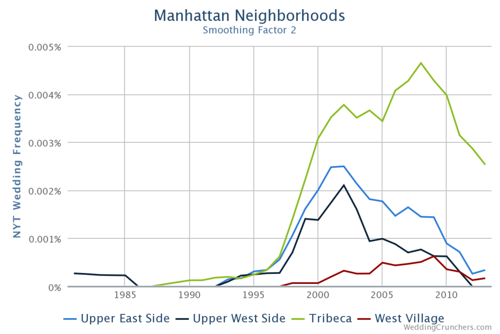
The Times’s wedding announcements didn’t include references to specific neighborhoods until the late 1990s, but now that they do, it would appear that Tribeca is all the rage. Closer examination, though, reveals that many of the Tribeca references are actually wedding venues, in particular the Tribeca Grand Hotel and the Tribeca Rooftop event space.
Let’s give venues a closer look:
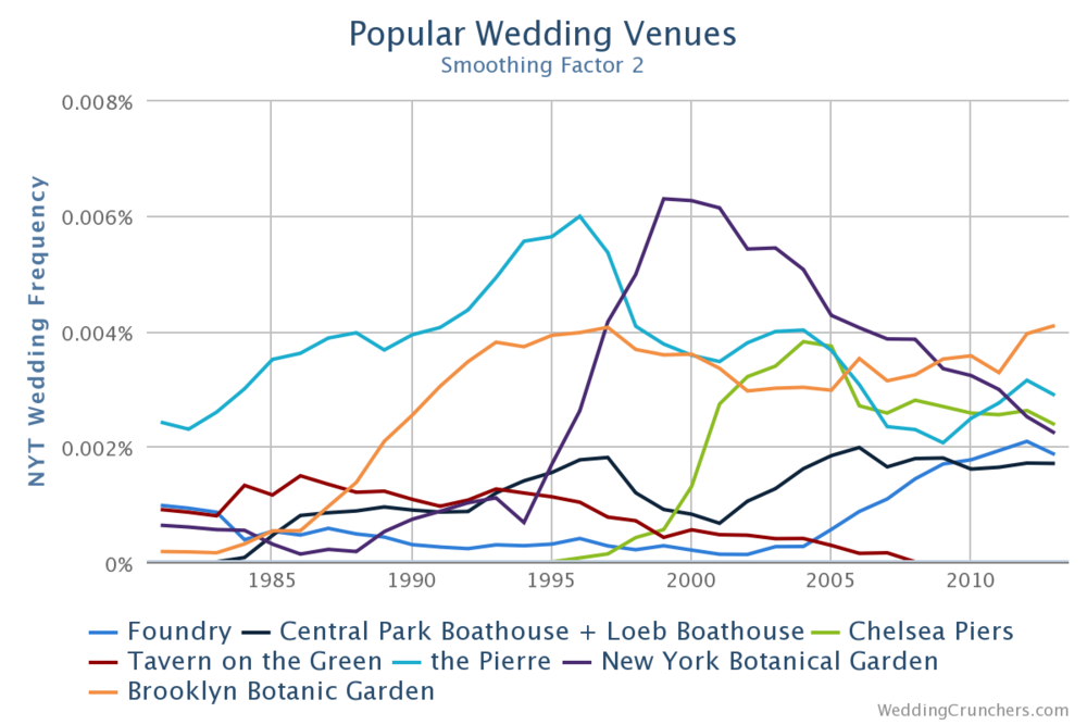
The Brooklyn Botanic Garden has recently surpassed the New York Botanical Garden (the one in the Bronx) and the Pierre as the top venue. Perhaps it’s part of some heretofore unexplored trend toward a cooler, hipper Brooklyn?
“Helen Hillson. She’s a lawyer. She’s keeping her name.”
There are infinitely many more questions we could analyze, including but not limited to:
- The rate at which women are “keeping their names”
- Same-sex weddings
- Mentions of online dating sites and social media
but at this point, if you’re still here, it might be best to set you free and let you run your own searches at WeddingCrunchers.com. Enjoy, and be sure to share any interesting results that you discover!
5/31/2016 update: I wrote another article about the weddings section for Vox