And an attempt to predict gender based on trivia knowledge
LearnedLeague bills itself as “the greatest web-based trivia league in all of civilized earth.” Having been fortunate enough to partake in the past 3 seasons, I’m inclined to agree.
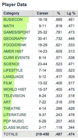
LearnedLeague players, known as “LLamas”, answer trivia questions drawn from 18 assorted categories, and one of the many neat things about LearnedLeague is that it provides detailed statistics into your performance by category. Personally I was surprised at how quickly my own stats began to paint a startlingly accurate picture of my trivia knowledge: strength in math, business, sports, and geography, coupled with weakness in classical music, art, and literature. Here are my stats through 3 seasons of LearnedLeague play:
My personal category stats through 3 seasons of LearnedLeague. The “Lg%” column represents the average correct % for all LearnedLeague players, who are known colloquially as “LLamas”
It stands to reason that performance in some of these categories should be correlated. For example, people who are good at TV trivia are probably likely to be better than average at movie trivia, so we’d expect a positive correlation between performance in the TV and film categories. It’s harder to guess at what categories might be negatively correlated. Maybe some of the more scholarly pursuits, like art and literature, would be negatively correlated with some of the more, er, plebeian categories like popular music and food/drink?
With the LearnedLeague Commissioner’s approval, I collected aggregate category stats for all recently active LLamas so that I could investigate correlations between category performance and look for other interesting trends. My dataset and code are all available on GitHub, though profile names have been anonymized.
Correlated categories
I analyzed a total of 2,689 players, representing active LLamas who have answered at least 400 total questions. Each player has 19 associated numbers: a correct rate for each of the 18 categories, plus an overall correct rate. For each of the 153 pairs of categories, I calculated the correlation coefficient between player performance in those categories.
The pairs with the highest correlation were:
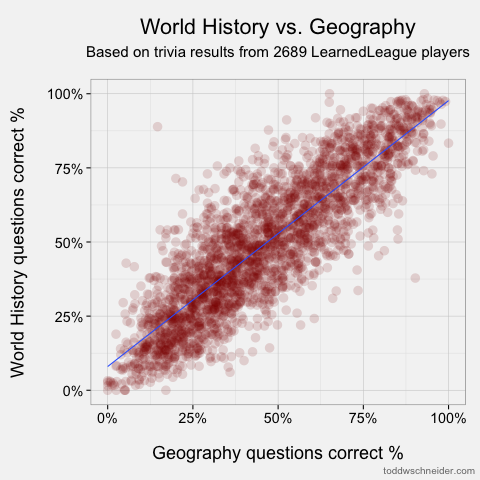
Geography & World History, ρ = 0.860
Film & Television, ρ = 0.803
American History & World History, ρ = 0.802
Art & Literature, ρ = 0.795
Geography & Language, ρ = 0.773
And the categories with the lowest correlation:
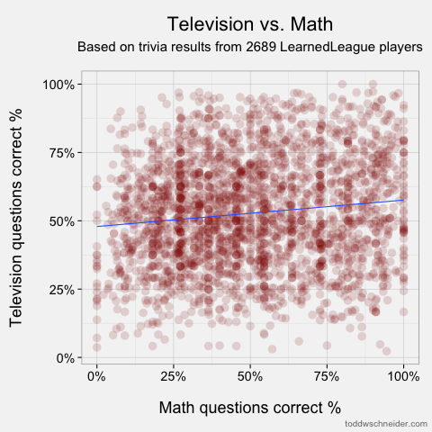
Math & Television, ρ = 0.126
Math & Theatre, ρ = 0.135
Math & Pop Music, ρ = 0.137
Math & Film, ρ = 0.148
Math & Art, ρ = 0.256
The scatterplots of the most and least correlated pairs look as follows. Each dot represents one player, and I’ve added linear regression trendlines:
Most correlated: geography and world history
Least correlated: math and television
The full list of 153 correlations is available in this Google spreadsheet. At first I was a bit surprised to see that every category pair showed a positive correlation, but upon further reflection it shouldn’t be that surprising: some people are just better at trivia, and they’ll tend to do well in all categories (none other than Ken Jennings himself is an active LLama!).
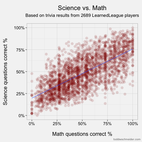
The most correlated pairs make some intuitive sense, though we should always be wary of hindsight bias. Still, it’s pretty easy to tell believable stories about the highest correlations: people who know a lot about world history probably know where places are (i.e. geography), people who watch TV also watch movies, and so on. I must say, though, that the low correlation between knowledge of math and the pop culture categories of TV, theatre, pop music, and film doesn’t do much to dispel mathematicians’ reclusive images! The only category that math shows an above-average correlation to is science, so perhaps it’s true that mathematicians just live off in their own world?
You can view a scatterplot for any pair of categories by selecting them from the menus below. There’s also a bar graph that ranks the other categories by their correlation to your chosen category:
Predicting gender from trivia category performance
LLamas optionally provide a bit of demographic information, including gender, location, and college(s) attended. It’s not lost on me that my category performance is pretty stereotypically “male.” For better or worse, my top 3 categories—business, math, and sports—are often thought of as male-dominated fields. That got me to wondering: does performance across categories predict gender?
It’s important to note that LearnedLeague members are a highly self-selected bunch, and in no way representative of the population at large. It would be wrong to extrapolate from LearnedLeague results to make a broader statement about how men and women differ in their trivia knowledge. At the same time, predictive analysis can be fun, so I used R’s rpart package to train a recursive partitioning decision tree model which predicts a player’s gender based on category statistics. Recursive partitioning trees are known to have a tendency to overfit data, so I used R’s prune() function to snip off some of the less important splits from the full tree model:
The labels on each leaf node report the actual fraction of the predicted gender in that bucket. For example, following from the top of the tree to the right: of the players who got at least 42% of their games/sport questions correct, and less than 66% of their theatre questions correct, 85% were male
The decision tree uses only 4 of the 18 categories available to it: games/sport, theatre, math, and food/drink, suggesting that these are the most important categories for predicting gender. Better performance in games/sport and math makes a player more likely to be male, while better performance in theatre and food/drink makes a player more likely to be female.
How accurate is the decision tree model?
The dataset includes 2,093 males and 595 females, and the model correctly categorizes gender for 2,060 of them, giving an overall accuracy rate of 77%. Note that there are more males in the dataset than there are correct predictions from the model, so in fact the ultra-naive model of “always guess male” would actually achieve a higher overall accuracy rate than the decision tree. However, as noted in this review of decision trees, “such a model would be literally accurate but practically worthless.” In order to avoid this pitfall, I manually assigned prior probabilities of 50% each to male and female. This ensures that the decision tree makes an equal effort to predict male and female genders, rather than spending most of its effort getting all of the males correct, which would maximize the number of total correct predictions.
With the equal priors assigned, the model correctly predicts gender for 75% of the males and 82% of the females. Here’s the table of actual and predicted gender counts:
Predicted Male
Predicted Female
Total
Actual Male
1,570
523
2,093
Actual Female
105
490
595
Total
1,675
1,013
2,688
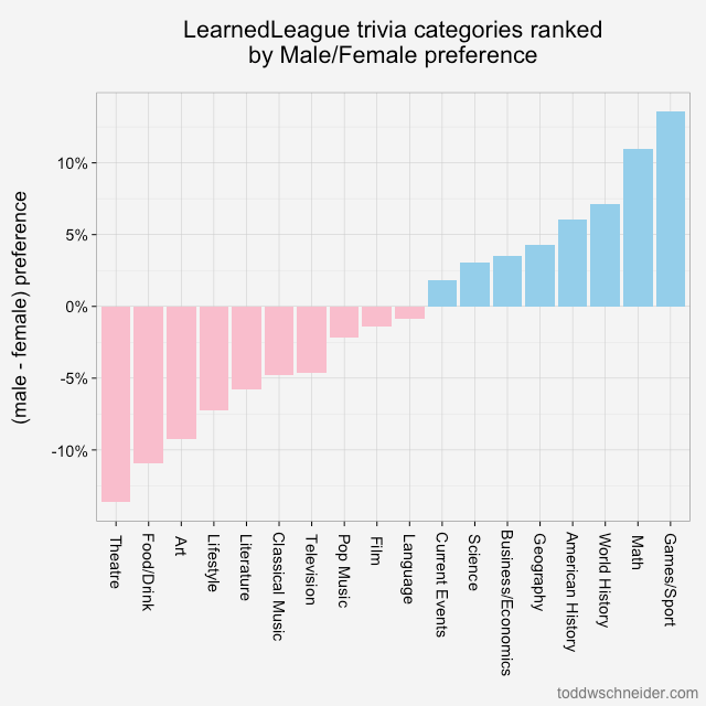
Ranking the categories by gender preference
Another way to think about the categories’ relationship with gender is to calculate what I’ll call a “gender preference” for each category. The methodology for a single category is:
Take each player’s performance in that category and adjust it by the player’s overall correct rate
E.g. the % of math questions I get correct minus the % of all questions I get correct
Calculate the average of this value for each gender
Take the difference between the male average and the female average
The result is the category’s (male-female) preference, where a positive number indicates male preference, and a negative number indicates female preference
Calculating this number for each category produces a relatively easy to interpret graph that ranks categories from most “feminine” to “masculine”:
The chart shows the difference between men and women’s average relative performance for each category. For example, women average 8.1% higher correct rate in theatre compared to their overall correct rate, and men average 5.5% worse correct rate in theatre compared to their overall average, so the difference is (-5.5 - 8.1) = -13.6%
Similar to the results from the decision tree, this methodology shows that theatre and food/drink are most indicative of female players, while games/sport and math are most associated with male players.
[M]ortgages were acknowledged to be the most mathematically complex securities in the marketplace. The complexity arose entirely out of the option the homeowner has to prepay his loan; it was poetic that the single financial complexity contributed to the marketplace by the common man was the Gordian knot giving the best brains on Wall Street a run for their money. Ranieri’s instincts that had led him to build an enormous research department had been right: Mortgages were about math.
The money was made, therefore, with ever more refined tools of analysis.
Fannie Mae and Freddie Mac began reporting loan-level credit performance data in 2013 at the direction of their regulator, the Federal Housing Finance Agency. The stated purpose of releasing the data was to “increase transparency, which helps investors build more accurate credit performance models in support of potential risk-sharing initiatives.”
The so-called government-sponsored enterprises went through a nearly $200 billion government bailout during the financial crisis, motivated in large part by losses on loans that they guaranteed, so I figured there must be something interesting in the loan-level data. I decided to dig in with some geographic analysis, an attempt to identify the loan-level characteristics most predictive of default rates, and more. As part of my efforts, I wrote code to transform the raw data into a more useful PostgreSQL database format, and some R scripts for analysis. The code for processing and analyzing the data is all available on GitHub.
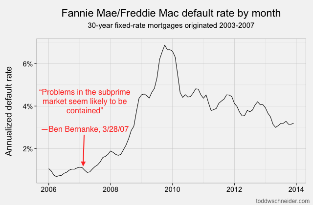
At the time of Chairman Bernanke’s statement, it really did seem like agency loans were unaffected by the problems observed in subprime loans, which were expected to have higher default rates. About a year later, defaults on Fannie and Freddie loans increased dramatically, and the government was forced to bail out both companies to the tune of nearly $200 billion
The “medium data” revolution
It should not be overlooked that in the not-so-distant past, i.e. when I worked as a mortgage analyst, an analysis of loan-level mortgage data would have cost a lot of money. Between licensing data and paying for expensive computers to analyze it, you could have easily incurred costs north of a million dollars per year. Today, in addition to Fannie and Freddie making their data freely available, we’re in the midst of what I might call the “medium data” revolution: personal computers are so powerful that my MacBook Air is capable of analyzing the entire 215 GB of data, representing some 38 million loans, 1.6 billion observations, and over $7.1 trillion of origination volume. Furthermore, I did everything with free, open-source software. I chose PostgreSQL and R, but there are plenty of other free options you could choose for storage and analysis.
Both agencies released data for 30-year, fully amortizing, fixed-rate mortgages, which are considered standard in the U.S. mortgage market. Each loan has some static characteristics which never change for the life of the loan, e.g. geographic information, the amount of the loan, and a few dozen others. Each loan also has a series of monthly observations, with values that can change from one month to the next, e.g. the loan’s balance, its delinquency status, and whether it prepaid in full.
The PostgreSQL schema then is split into 2 main tables, called loans and monthly_observations. Beyond the data provided by Fannie and Freddie, I also found it helpful to pull in some external data sources, most notably the FHFA’s home price indexes and Freddie Mac’s mortgage rate survey data.
A fuller glossary of the data is available in an appendix at the bottom of this post.
What can we learn from the loan-level data?
I started by calculating simple cumulative default rates for each origination year, defining a “defaulted” loan as one that became at least 60 days delinquent at some point in its life. Note that not all 60+ day delinquent loans actually turn into foreclosures where the borrower has to leave the house, but missing at least 2 payments typically indicates a serious level of distress.
Loans originated from 2005-2008 performed dramatically worse than loans that came before them! That should be an extraordinarily unsurprising statement to anyone who was even slightly aware of the U.S. mortgage crisis that began in 2007:
About 4% of loans originated from 1999 to 2003 became seriously delinquent at some point in their lives. The 2004 vintage showed some performance deterioration, and then the vintages from 2005 through 2008 show significantly worse performance: more than 15% of all loans originated in those years became distressed.
From 2009 through present, the performance has been much better, with fewer than 2% of loans defaulting. Of course part of that is that it takes time for a loan to default, so the most recent vintages will tend to have lower cumulative default rates while their loans are still young. But as we’ll see later, there was also a dramatic shift in lending standards so that the loans made since 2009 have been much higher credit quality.
Geographic performance
Default rates increased everywhere during the bubble years, but some states fared far worse than others. I took every loan originated between 2005 and 2007, broadly considered to be the height of reckless mortgage lending, bucketed loans by state, and calculated the cumulative default rate of loans in each state. Mouse over the map to see individual state data:
4 states in particular jump out as the worst performers: California, Florida, Arizona, and Nevada. Just about every state experienced significantly higher than normal default rates during the mortgage crisis, but these 4 states, often labeled the “sand states”, experienced the worst of it.
I also used the data to make more specific maps at the county-level; default rates within different metropolitan areas can show quite a bit of variation. California jumps out as having the most interesting map: the highest default rates in California came from inland counties, most notably in the Central Valley and Inland Empire regions. These exurban areas, like Stockton, Modesto, and Riverside, experienced the largest increases in home prices leading up to the crisis, and subsequently the largest collapses.
The map clearly shows the central parts of California with the highest default rates, and the coastal parts with generally better default rates:
The major California metropolitan areas with the highest default rates in were:
And the major metropolitan areas with the lowest default rates:
San Francisco - 4.3%
San Jose - 7.6%
Santa Ana-Anaheim-Irvine (Orange County) - 11%
It’s less than 100 miles from San Francisco to Modesto and Stockton, and only 35 miles from Anaheim to Riverside, yet we see such dramatically different default rates between the inland regions and their relatively more affluent coastal counterparts.
The inland cities, with more land available to allow expansion, experienced the most overbuilding, the most aggressive lenders, the highest levels of speculators looking to get rich quick by flipping houses, and so perhaps it’s not that surprising that when the housing market turned south, they also experienced the highest default rates. Not coincidentally, California has also led the nation in “housing bubble” searches on Google Trends every year since 2004.
The county-level map of Florida does not show as much variation as the California map:
Although the regions in the panhandle had somewhat lower default rates than central and south Florida, there were also significantly fewer loans originated in the panhandle. The Tampa, Orlando, and Miami/Fort Lauderdale/West Palm Beach metropolitan areas made up the bulk of Florida mortgage originations, and all had very high default rates. The worst performing metropolitan areas in Florida were:
Miami - 40%
Port St. Lucie - 39%
Cape Coral/Fort Myers - 38%
Arizona and Nevada have very few counties, so their maps don’t look very interesting, and each state is dominated by a single metropolitan area: Phoenix experienced a 31% cumulative default rate, and Las Vegas a 42% cumulative default rate.
Modeling mortgage defaults
The dataset includes lots of variables for each individual loan beyond geographic location, and many of these variables seem like they should correlate to mortgage performance. Perhaps most obviously, credit scores were developed specifically for the purpose of assessing default risk, so it would be awfully surprising if credit scores weren’t correlated to default rates.
Some of the additional variables include the amount of the loan, the interest rate, the loan-to-value ratio (LTV), debt-to-income ratio (DTI), the purpose of the loan (purchase, refinance), the type of property, and whether the loan was originated directly by a lender or by a third party. All of these things seem like they might have some predictive value for modeling default rates.
We can also combine loan data with other data sources to calculate additional variables. In particular, we can use the FHFA’s home price data to calculate current loan-to-value ratios for every loan in the dataset. For example, say a loan started at an 80 LTV, but the home’s value has since declined by 25%. If the balance on the loan has remained unchanged, then the new current LTV would be 0.8 / (1 - 0.25) = 106.7. An LTV over 100 means the borrower is “underwater” – the value of the house is now less than the amount owed on the loan. If the borrower does not believe that home prices will recover for a long time, the borrower might rationally decide to “walk away” from the loan.
Another calculated variable is called spread at origination (SATO), which is the difference between the loan’s interest rate, and the prevailing market rate at the time of origination. Typically borrowers with weaker credit get higher rates, so we’d expect a larger value of SATO to correlate to higher default rates.
Even before formulating any specific model, I find it helpful to look at graphs of aggregated data. I took every monthly observation from 2009-11, bucketed along several dimensions, and calculated default rates. Note that we’re now looking at transition rates from current to defaulted, as opposed to the cumulative default rates in the previous section. Transition rates are a more natural quantity to model, since when we make future projections we have to predict not only how many loans will default, but when they’ll default.
Here are graphs of annualized default rates as a function of credit score and current LTV:
The above graph shows FICO credit score on the x-axis, and annualized default rate on the y-axis. For example, loans with FICO score 650 defaulted at a rate of about 12% per year, while loans with FICO 750 defaulted around 4.5% per year
Clearly both of these variables are highly correlated with default rates, and in the directions we would expect: higher credit scores correlate to lower default rates, and higher loan-to-value ratios correlate to higher default rates.
The dataset cannot tell us why any borrowers defaulted. Some probably came upon financial hardship due to the economic recession and were unable to pay their bills. Others might have been taken advantage of by unscrupulous mortgage brokers, and could never afford their monthly payments. And, yes, some also “strategically” defaulted – meaning they could have paid their mortgages, but chose not to.
The fact that current LTV is so highly correlated to default rates leads me to suspect that strategic defaults were fairly common in the depths of the recession. But why might some people walk away from loans that they’re capable of paying?
As an example, say a borrower has a $300,000 loan at a 6% interest rate against a home that had since declined in value to $200,000, for an LTV of 150. The monthly payment on such a mortgage is $1,800. Assuming a price/rent ratio of 18, approximately the national average, then the borrower could rent a similar home for $925 per month, a savings of over $10,000 per year. Of course strategically defaulting would greatly damage the borrower’s credit, making it potentially much more difficult to get new loans in the future, but for such a large monthly savings, the borrower might reasonably decide not to pay.
A Cox proportional hazards model helps give us a sense of which variables have the largest relative impact on default rates. The model assumes that there’s a baseline default rate (the “hazard rate”), and that the independent variables have a multiplicative effect on that baseline rate. I calibrated a Cox model on a random subset of loans using R’s coxph() function:
12345678
library(survival)

formula = Surv(loan_age - 1, loan_age, defaulted) ~
          credit_score + ccltv + dti + loan_purpose + channel + sato

cox_model = coxph(formula, data = monthly_default_data)

summary(cox_model)
The categorical variables, loan_purpose and channel, are the easiest to interpret because we can just look at the exp(coef) column to see their effect. In the case of loan_purpose, loans that were made for refinances multiply the default rate by 1.593 compared to loans that were made for purchases. For channel, loans that were made by third party originators, e.g. mortgage brokers, increase the hazard rate by 17% compared to loans that were originated directly by lenders.
The coefficients for the continuous variables are harder to compare because they each have their own independent scales: credit scores range from roughly 600 to 800, LTVs from 30 to 150, DTIs from 20 to 60, and SATO from -1 to 1. Again I find graphs the easiest way to interpret. We can use R’s predict() function to generate hazard rate multipliers for each independent variable, while holding all the other variables constant:
Remember that the y-axis here shows a multiplier of the base default rate, not the default rate itself. So, for example, the average current LTV in the dataset is 82, which has a multiplier of 1. If we were looking at two loans, one of which had current LTV 82, the other a current LTV of 125, then the model predicts that the latter loan’s monthly default rate is 2.65 times the default rate of the former.
All of the variables behave directionally as we’d expect: higher LTV, DTI, and SATO are all associated with higher hazard rates, while higher credit scores are associated with lower hazard rates. The graph of hazard rate multipliers shows that current LTV and credit score have larger magnitude impact on defaults than DTI and SATO. Again the model tells us nothing about why borrowers default, but it does suggest that home price-adjusted LTVs and credit scores are the most important predictors of default rates.
There is plenty of opportunity to develop more advanced default models. Many techniques, including Cox proportional hazards models and logistic regression, are popular because they have relatively simple functional forms that behave well mathematically, and there are existing software packages that make it easy to calibrate parameters. On the other hand, these models can fall short because they have no meaningful connection to the actual underlying dynamics of mortgage borrowers.
So-called agent-based models attempt to model the behavior of individual borrowers at the micro-level, then simulate many agents interacting and making individual decisions, before aggregating into a final prediction. The agent-based approach can be computationally much more complicated, but at least in my opinion it seems like a model based on traditional statistical techniques will never explain phenomena like the housing bubble and financial crisis, whereas a well-formulated agent-based model at least has a fighting chance.
Why are defaults so much lower today?
We saw earlier that recently originated loans have defaulted at a much lower rate than loans originated during the bubble years. For one thing, home prices bottomed out sometime around 2012 and have rebounded some since then. The partial home price recovery causes current LTVs to decline, which as we’ve seen already, should correlate to lower default rates.
Perhaps more importantly, though, it appears that Fannie and Freddie have adopted significantly stricter lending standards starting in 2009. The average FICO score used to be 720, but since 2009 it has been more like 765. Furthermore, if we look 2 standard deviations from the mean, we see that the low end of the FICO spectrum used to reach down to about 600, but since 2009 there have been very few loans with FICO less than 680.
Tighter agency standards, coupled with a complete shutdown in the non-agency mortgage market, including both subprime and Alt-A lending, mean that there is very little credit available to borrowers with low credit scores (a far more difficult question is whether this is a good or bad thing!).
Since 2009, Fannie and Freddie have made significantly fewer loans to borrowers with credit scores below 680. There is some discussion about when, if ever, Fannie and Freddie will begin to loosen their credit standards and provide more loans to borrowers with lower credit scores
What next?
There are many more things we could study in the dataset. Long before investors worried about default rates on agency mortgages, they worried about voluntary prepayments due to refinancing and housing turnover. When interest rates go down, many mortgage borrowers refinance their loans to lower their monthly payments. For mortgage investors, investment returns can depend heavily on how well they project prepayments.
I’m sure some astronomical number of human-hours have been spent modeling prepayments, dating back to the 1970s when mortgage securitization started to become a big industry. Historically the models were calibrated against aggregated pool-level data, which was okay, but does not offer as much potential as loan-level data. With more loan-level data available, and faster computers to process it, I’d imagine that many on Wall Street are already hard at work using this relatively new data to refine their prepayment models.
Fannie and Freddie continue to improve their datasets, recently adding data for actual losses suffered on defaulted loans. In other words, when the bank has to foreclose and sell a house, how much money do the agencies typically lose? This loss severity number is itself a function of many variables, including home prices, maintenance costs, legal costs, and others. Severity will also be extremely important for mortgage investors in the proposed new world where Fannie and Freddie might no longer provide full guarantees against loss of principal.
Beyond Wall Street, I’d hope that the open-source nature of the data helps provide a better “early detection” system than we saw in the most recent crisis. A lot of people were probably generally aware that the mortgage market was in trouble as early as 2007, but unless you had access to specialized data and systems to analyze it, there was no way for most people to really know what was going on.
There’s still room for improvement: Fannie and Freddie could expand their datasets to include more than just 30-year fixed-rate loans. There are plenty of other types of loans, including 15-year terms and loans with adjustable interest rates. 30-year fixed-rate loans continue to be the standard of the U.S. mortgage market, but it would still be good to release data for all of Fannie and Freddie’s loans.
It’d also be nice if Fannie and Freddie released the data in a more timely manner instead of lagged by several months to a year. The lag before releasing the data reduces its effectiveness as a tool for monitoring the general health of the economy, but again it’s much better than only a few years ago when there was no readily available data at all. In the end, the trend toward free and open data, combined with the ever-increasing availability of computing power, will hopefully provide a clearer picture of the mortgage market, and possibly even prevent another financial crisis.
Each loan has an origination record, which includes static data that will never change for the life of the loan. Each loan also has a set of monthly observations, which record values at every month of the loan’s life. The PostgreSQL database has 2 main tables: loans and monthly_observations.
Beyond the data provided by Fannie and Freddie, I found it helpful to add columns to the loans table for what we might call calculated characteristics. For example, I found that it was helpful to have a column on the loans table called first_serious_dq_date. This column would be populated with the first month in which a loan was 60 days delinquent, or null if the loan has never been 60 days delinquent. There’s no new information added by the column, but it’s convenient to have it available in the loans table as opposed to the monthly_observations table because loans is a significantly smaller table, and so if we can avoid database joins to monthly_observations for some analysis then that makes things faster and easier.
original_upb, short for original unpaid balance; the amount of the loan
oltv and ocltv, short for original (combined) loan-to-value ratio. Amount of the loan divided by the value of the home at origination, expressed as a percentage. Combined loan-to-value includes and additional liens on the property
dti, debt-to-income ratio. From Freddie Mac’s documentation: the sum of the borrower’s monthly debt payments […] divided by the total monthly income used to underwrite the borrower
sato, short for spread at origination, the difference between the loan’s interest rate and the prevailing market rate at the time the loan was made
property_state
msa, metropolitan statistical area
hpi_index_id, references the FHFA home price index (HPI) data. If the loan’s metropolitan statistical area has its own home price index, use the MSA index, otherwise use the state-level index. Additionally if the FHFA provides a purchase-only index, use purchase-only, otherwise use purchase and refi
occupancy_status (owner, investor, second home)
channel (retail, broker, correspondent)
loan_purpose (purchase, refinance)
mip, mortgage insurance premium
first_serious_dq_date, the first date on which the loan was observed to be at least 60 days delinquent. Null if the loan was never observed to be delinquent
id and loan_sequence_number, loan_sequence_number are the unique string IDs assigned by Fannie and Freddie, id is a unique integer designed to save space in the monthly_observations table
Selected columns from the monthly_observations table:
loan_id, for joining against the loans table, loans.id = monthly_observations.loan_id
date
current_upb, current unpaid balance
previous_upb, the unpaid balance in the previous month
I was curious what the FiveThirtyEight graph would look like if every team didn’t begin every game at 50% win probability, so I took all of the NBA in-game gambling odds from Gambletron 2000 for the 2014-15 regular season, and produced a similar interactive visual. Gamblers of course take into account all available information when determining a team’s win probability, including team quality, injuries, motivation, and anything else they think is relevant:
The x-axis in the above graph is time in the game, and the y-axis is the average win probability for each team at that point of the game, according to in-game gambling odds
Most series in this gambling data graph are much flatter compared to the FiveThirtyEight graph, where every team starts at 50% before fanning out to its final winning percentage. The flatter gambling graph makes sense because gamblers do a pretty good job of figuring out pregame win probabilities – if they didn’t, it’d be easy to make a lot of money gambling, which, spoiler, it isn’t!
Nevertheless, there are some teams that deviate substantially from the expected winning percentages implied by gambling odds. Here’s a scatterplot that shows each team’s expected pregame winning percentage on the x-axis, and actual winning percentage on the y-axis. The teams that are above the diagonal line are the ones that are outperforming gamblers’ expectations, whereas the ones below the diagnoal line are performing worse than gamblers expected (hover over the points to see the data):
The Atlanta Hawks led the league in “wins above gamblers’ expectations”, with an actual winning percentage of 73.2% compared to an expected winning rate of 61.8%. The Houston Rockets and Golden State Warriors have also both performed significantly above gamblers’ expectations. The lowly Minnesota Timberwolves, in addition to having the worst absolute record in the league, are performing the worst relative to gamblers’ expectations. The Timberwolves were expected to win 26.7% of their games, and yet have only managed to win 19.5%.
NFL, MLB data
Since Gambletron 2000 tracks more than just the NBA, I generated the same graphs based on in-game gambling data from the 2014-15 NFL season and the 2014 MLB season. Here are the NFL graphs:
The Arizona Cardinals, Dallas Cowboys, and New England Patriots performed the best relative to gamblers’ expectations, while Tennessee Titans, Tampa Bay Buccaneers, and New Orleans Saints all won significantly fewer games than expected.
The MLB graphs are notable for how much closer together the teams are in expected win probability. In both the NBA and NFL, expected pregame win probabilities range from roughly 25% to 75%, but in baseball all of the teams fall between 40% and 60% pregame win probability:
The Kansas City Royals and Baltimore Orioles outperformed the most, while the Colorado Rockies, Arizona Diamondbacks, and Oakland Athletics fell shortest of gamblers’ expectations. The A’s are also interesting because gamblers gave them the highest expected win probability of any team, and yet they fell well short of expectations.
N.B. the MLB data includes only about 65% of all games because gambling markets are declared invalid if the previously announced pitchers don’t start as expected. Accordingly, the actual winning percentages might not match up to the full 162-game records.