<?xml version="1.0" encoding="utf-8"?>
<feed xmlns="http://www.w3.org/2005/Atom">

  <title><![CDATA[Category: R | Todd W. Schneider]]></title>
  <link href="https://toddwschneider.com/categories/r/atom.xml" rel="self"/>
  <link href="https://toddwschneider.com/"/>
  <updated>2025-04-24T14:57:57-04:00</updated>
  <id>https://toddwschneider.com/</id>
  <author>
    <name><![CDATA[Todd Schneider]]></name>
    
  </author>
  <generator uri="http://octopress.org/">Octopress</generator>

  
  <entry>
    <title type="html"><![CDATA[Using Countdown Clock Data to Understand the New York City Subway]]></title>
    <link href="https://toddwschneider.com/posts/nyc-subway-data-analysis/"/>
    <updated>2018-06-06T06:00:00-04:00</updated>
    <id>https://toddwschneider.com/posts/nyc-subway-data-analysis</id>
    <content type="html"><![CDATA[<p>If you’ve been on a New York City subway platform since January 2018, you should have noticed a <a href="https://www.nydailynews.com/new-york/mta-finally-adds-countdown-clocks-subway-stations-article-1.3730326?outputType=amp">countdown clock</a> that displayed an estimate of when the next train would arrive. Although there’s no official record of when trains actually stopped at each station, the countdown clock data can be used to approximate. Over the past 5 months, I’ve collected and processed some 24 million stops’ worth of this data to try to make sense of New York’s vast and troubled subway system. The code is all <a href="https://github.com/toddwschneider/nyc-subway-data">available on GitHub</a>.</p>

<h2 id="which-nyc-subway-lines-have-the-longest-wait-times">Which NYC subway lines have the longest wait times?</h2>

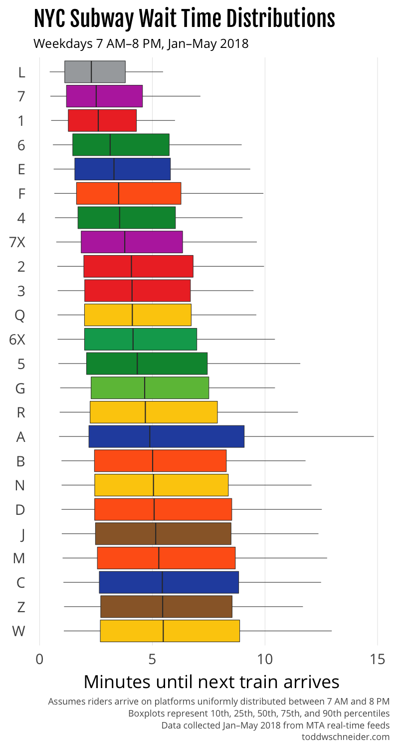
<p>The chart below shows how long you should expect to wait for each train line, assuming you arrive on the platform at a random time on a weekday between 7:00 AM and 8:00 PM.</p>

<p><img src="https://cdn.toddwschneider.com/subway/expected_wait_times.png" alt="subway wait times" /></p>

<p>The top four trains with the shortest waits—the L, 7, 1, and 6—are the only trains that <a href="https://cityroom.blogs.nytimes.com/2010/10/06/trains-with-dedicated-tracks-top-subway-rankings/">run on dedicated tracks</a>, which presumably helps avoid delays due to trains from other lines merging in and out on different schedules. The L train is also the only line that uses modern <a href="https://en.wikipedia.org/wiki/Signaling_of_the_New_York_City_Subway#CBTC_test_cases">communications-based train control</a> (CBTC), which allows trains to operate in a <a href="https://www.railwayage.com/cs/mta-l-line-trains-go-to-full-cbtc/">more automated fashion</a>. The 7 train, the second most reliable according to my data, is currently running “partial” CBTC, and is <a href="https://www.amny.com/transit/7-train-upgrades-are-delayed-again-1.15419603">slated for full CBTC in 2018</a>.</p>

<p>Systemwide CBTC is the cornerstone of the recently announced ambitious <a href="https://www.nytimes.com/2018/05/22/nyregion/nyc-subway-byford-proposal.html">plan to fix the subways</a>. I’ll have a bit more to say on that <a href="#economic-case-for-subway-upgrades" data-notab="true">in a moment…</a></p>

<p>(Note that <em>expected wait time</em> is different from <em>time between trains</em>. <a href="#appendix-subway-wait-time-math" data-notab="true">See the appendix</a> for a more mathematical treatment on converting between <em>time between trains</em> and <em>expected wait time</em>. Note also that in some cases, different lines can serve as substitutes. For example, if you’re traveling from Union Square to Grand Central, the 4, 5, and 6 lines will all get you there, so your effective wait time would be shorter than if you had to rely on one specific line.)</p>

<h2 id="how-long-will-you-have-to-wait-for-your-train">How long will you have to wait for <em>your</em> train?</h2>

<p>The above graph is restricted to weekdays between 7:00 AM and 8:00 PM, but wait times vary from hour to hour. In general, wait times are shortest during morning and evening rush hours, though keep in mind that the data doesn’t know about cases where trains might be too crowded to board, forcing you to wait for the next train.</p>

<p>Choose your line below, and you can see how long you should expect to wait for a train by time of day, based on weekday performance from January to May 2018.</p>

<p class="nyc-subway-select-container" style="display: none">
  <label for="nyc-subway-wait-time-by-hour" style="padding-right: 8px; font-weight: bold; font-size: 1em">
    Subway line
  </label>

  <select id="nyc-subway-wait-time-by-hour" style="font-size: 1em">
    <option value="1" selected="">&nbsp;&nbsp;1</option>
    <option value="2">&nbsp;&nbsp;2</option>
    <option value="3">&nbsp;&nbsp;3</option>
    <option value="4">&nbsp;&nbsp;4</option>
    <option value="5">&nbsp;&nbsp;5</option>
    <option value="6">&nbsp;&nbsp;6</option>
    <option value="6X">&nbsp;6X</option>
    <option value="7">&nbsp;&nbsp;7</option>
    <option value="7X">&nbsp;7X</option>
    <option value="A">&nbsp;&nbsp;A</option>
    <option value="B">&nbsp;&nbsp;B</option>
    <option value="C">&nbsp;&nbsp;C</option>
    <option value="D">&nbsp;&nbsp;D</option>
    <option value="E">&nbsp;&nbsp;E</option>
    <option value="F">&nbsp;&nbsp;F</option>
    <option value="G">&nbsp;&nbsp;G</option>
    <option value="J">&nbsp;&nbsp;J</option>
    <option value="L">&nbsp;&nbsp;L</option>
    <option value="M">&nbsp;&nbsp;M</option>
    <option value="N">&nbsp;&nbsp;N</option>
    <option value="Q">&nbsp;&nbsp;Q</option>
    <option value="R">&nbsp;&nbsp;R</option>
    <option value="W">&nbsp;&nbsp;W</option>
    <option value="Z">&nbsp;&nbsp;Z</option>
  </select>
</p>

<p>
  <img src="https://cdn.toddwschneider.com/subway/1_train_wait_time_by_hour.png" class="subway-line-wait-time" alt="wait time" />
</p>

<noscript>
  <p>Turn on javascript (or click through from RSS) to view all subway lines.</p>
</noscript>

<h2 id="how-crowded-should-you-want-the-platform-to-be-when-you-arrive">How crowded should you want the platform to be when you arrive?</h2>

<p>Most New Yorkers intuitively understand that when they get to a subway platform, they don’t want it to be too empty or too crowded. An empty platform means that you probably just missed the last train, so it’s unlikely another one will be arriving very soon. Even worse, an extremely crowded platform means that something is probably wrong, and maybe the train will never arrive. There’s a Goldilocks zone in the middle: a healthy amount of crowding that suggests it’s been a few minutes since the last train, but not so long that things must be screwed up.</p>

<p>I used the same data to compute conditional wait time distributions: given that it’s been N minutes since the last train, how much longer should you expect to wait? In most cases, the shortest conditional wait time occurs when it’s been 5 to 8 minutes since the last train.</p>

<p>Choose your line to view conditional wait times.</p>

<p class="nyc-subway-select-container" style="display: none">
  <label for="nyc-subway-conditional-wait-time" style="padding-right: 8px; font-weight: bold; font-size: 1em">
    Subway line
  </label>

  <select id="nyc-subway-conditional-wait-time" style="font-size: 1em">
    <option value="1" selected="">&nbsp;&nbsp;1</option>
    <option value="2">&nbsp;&nbsp;2</option>
    <option value="3">&nbsp;&nbsp;3</option>
    <option value="4">&nbsp;&nbsp;4</option>
    <option value="5">&nbsp;&nbsp;5</option>
    <option value="6">&nbsp;&nbsp;6</option>
    <option value="6X">&nbsp;6X</option>
    <option value="7">&nbsp;&nbsp;7</option>
    <option value="7X">&nbsp;7X</option>
    <option value="A">&nbsp;&nbsp;A</option>
    <option value="B">&nbsp;&nbsp;B</option>
    <option value="C">&nbsp;&nbsp;C</option>
    <option value="D">&nbsp;&nbsp;D</option>
    <option value="E">&nbsp;&nbsp;E</option>
    <option value="F">&nbsp;&nbsp;F</option>
    <option value="G">&nbsp;&nbsp;G</option>
    <option value="J">&nbsp;&nbsp;J</option>
    <option value="L">&nbsp;&nbsp;L</option>
    <option value="M">&nbsp;&nbsp;M</option>
    <option value="N">&nbsp;&nbsp;N</option>
    <option value="Q">&nbsp;&nbsp;Q</option>
    <option value="R">&nbsp;&nbsp;R</option>
    <option value="W">&nbsp;&nbsp;W</option>
    <option value="Z">&nbsp;&nbsp;Z</option>
  </select>
</p>

<p>
  <img src="https://cdn.toddwschneider.com/subway/1_train_conditional_wait_time.png" class="subway-line-conditional-wait-time" alt="conditional wait time" />
</p>

<noscript>
  <p>Turn on javascript (or click through from RSS) to view all subway lines.</p>
</noscript>

<p>In general when you arrive on the platform, you can’t directly observe when the last train departed, but you can make a guess based on the number of people who are waiting. First you would have to estimate—or maybe even measure from the <a href="http://web.mta.info/developers/turnstile.html">MTA’s public turnstile data</a>—the number of people who arrive on the platform each minute. Then, if you know the shortest conditional wait occurs when it’s been 6 minutes since the last train, and you estimated that, say, 20 people arrive on the platform each minute, you should hope to see 120 people on the platform when you arrive. Of course these parameters vary by platform and time of day, so make sure to take that into account when making your own estimates!</p>

<h2 id="economic-case-for-subway-upgrades">
  A back-of-the-envelope economic case for subway upgrades (that you shouldn’t take too seriously)
</h2>

<p>The recently released <a href="http://www.mta.info/sites/default/files/mtaimgs/fast_forward_the_plan_to_modernize_nyct.pdf">Fast Forward plan</a> from Andy Byford, president of the NYC Transit Authority, proposes that it will take 10 years to implement CBTC across most of the system. The NYT further reports an <a href="https://www.nytimes.com/2018/05/22/nyregion/nyc-subway-byford-proposal.html">estimated price tag of $19 billion</a>.</p>

<p>If every line were as efficient as the CBTC-equipped L, I estimate that the average wait time would be around 3 minutes shorter. At <a href="http://web.mta.info/nyct/facts/ridership/">5.7 million riders per weekday</a>, that’s potentially 285,000 hours of time saved per weekday. Reasonable people might disagree about the economic value of deadweight subway waiting time, but $20 per hour doesn’t strike me as crazy, and would imply a savings of $5.7 million per weekday. Weekends have about half as many riders as weekdays, and time is probably worth less, so let’s value a weekend day’s savings at 25% of a weekday’s.</p>

<p>Overall that would imply a total savings of over $1.6 billion per year, and that’s before accounting for the fact that CBTC-equipped trains also probably travel faster from station to station, so time savings would come from more than reduced platform wait times. And if people had more confidence in the system, they wouldn’t have to <a href="https://www.nytimes.com/2018/04/06/nyregion/subway-late-early-new-york.html">budget so much extra travel time</a> as a safety buffer. Other potential benefits could come from lower operating and repair costs, and less above-ground traffic congestion if people switched from cars to the presumably more efficient subway.</p>

<p>To be fair, there are all kinds of things that could push in the other direction too: maybe it’s unrealistic that other lines would be as efficient as the L, since the L has the benefit of being on its own dedicated track that it doesn’t share with any other crisscrossing lines, or maybe the better subway would be a victim of its own success, causing overcrowding and other capacity problems. And perhaps the most obvious criticism: that the plan will end up taking longer than 10 years and costing more than $19 billion.</p>

<p>I don’t think this quick back-of-the-envelope calculation should be taken too seriously when there are so many variables to consider, but I do think it’s not hard to get to a few billion dollars a year in economic value, assuming some reasonable parameters. Reasonable people might again argue about discount rates and amortization schedules, but a total cost in the neighborhood of $19 billion over 10 years strikes me as eminently worth it.</p>

<h2 id="anatomy-of-a-subway-delay">Anatomy of a subway delay</h2>

<p>The NYT recently published a great interactive story that demonstrated via simulation how a single train delay can <a href="https://www.nytimes.com/interactive/2018/05/09/nyregion/subway-crisis-mta-decisions-signals-rules.html">cause cascading problems</a> behind it. The week after that story was published, I was (un)fortunate enough to participate in a real-life demonstration of the phenomenon. On May 16, 2018, I found myself on a downtown F train from Midtown. Around 10:00 AM at 34th Street, the conductor made an announcement that there was a <a href="https://twitter.com/NYCTSubway/status/996757441084903424">stalled train in front of us at W 4th Street</a>, and that we’d be delayed. The delay lasted about 30 minutes, and then the train carried on as normal.</p>

<p>Here’s a graphical representation of downtown F trains that morning, with major delays highlighted in red. My train was the second train in the major delay on the right-center of the graph.</p>

<p><img src="https://cdn.toddwschneider.com/subway/f_train_delays_20180516.png" alt="downtown f train delays" /></p>

<p>Although I wasn’t on the train that had mechanical problems at W 4th Street, my train and the two trains behind it were forced to wait for the problem train. Further back, the train dispatcher switched a few F trains to the express tracks from 47-50 Sts–Rockefeller Center to W 4th Street, which is why you see a few steeper line segments in the graph that appear to cut through the delay. The empty diagonal gash in the graph below the delay shows that riders felt the effects all the way down the line. If you were waiting for an F train at 2nd Avenue just after 10:00 AM, you would have had to wait a full 30 minutes, compared to only a few minutes if you had arrived on the platform at 9:55 AM.</p>

<p>I’m a bit surprised that the MTA didn’t deliberately slow down some of the trains <em>in front</em> of the delay. It’s well-known that <a href="https://erikbern.com/2016/07/09/waiting-time-math.html">even spacing is a key to minimizing system-wide wait time</a>, the MTA once even <a href="https://www.popsci.com/how-delaying-subway-train-fixes-subway-delay-video">made a video about it</a>, but in this case it appears they didn’t practice what they preach. Slowing down a train in front of a delay will make some riders worse off, namely the ones at future stops who would have made the train had it not been slowed down. But it will also make some riders <em>much</em> better off: the ones who would have missed the train had it not been slowed down, and then had to suffer an abnormally long wait for the delayed train itself.</p>

<p>You can use the graph to convince yourself that slowing down the train ahead of the delay would have been a good thing. Downtown F trains stopped at 2nd Avenue at 9:58 and 10:00 AM. If the 10:00 AM train had been intentionally delayed 10 minutes to 10:10 AM, all of the people who arrived on the platform between 10:00 and 10:10 would have been saved from waiting until 10:30, an average 20 minute savings per person. On the other hand, the folks who arrived between 9:58 and 10:00 would have been penalized an average of 10 minutes per person. But there were likely five times as many people in the 10:00–10:10 range than there were in the 9:58–10:00 range, so the weighted average tells us we just saved an average of 15 minutes per person.</p>

<p>Compare the W 4th Street delay to the delay earlier that morning <a href="https://twitter.com/NYCTSubway/status/996720936064901122">at 7:40 AM at 57th Street</a>, highlighted on the left side of the graph. That delay, although shorter, also caused a lasting gap between trains. However, the gap was later mitigated when the train in front of the delayed train slowed down a bit between York and Jay streets. I suspect that slowdown was unintentional, but it was probably beneficial, and had it happened further up the line, say between 42nd and 34th streets, it would have produced more even spacing throughout the line, and likely lowered total rider wait time.</p>

<p>In fairness to the MTA, in real life it’s not as simple as “always slow down the train in front of the delay” because there are other considerations—dispatchers don’t know how long the delay will last, not every platform is equally popular, and there other options like rerouting trains to other tracks—but a healthier system could have dealt with this delay better.</p>

<h2 id="subway-performance-over-time">Subway performance over time</h2>

<p>The subway’s deteriorating performance has been covered at great length by many outlets. I’d recommend the <a href="https://www.nytimes.com/2018/01/03/magazine/subway-new-york-city-public-transportation-wealth-inequality.html">NYT’s coverage</a> in particular, but it seems like there are so many people <a href="https://www.villagevoice.com/2018/03/13/the-trains-are-slower-because-they-slowed-the-trains-down/">writing about the subway</a> recently that there’s no shortage of <a href="https://www.vox.com/policy-and-politics/2017/7/11/15949284/new-york-subway-crisis">stories to choose from</a>.</p>

<p>In addition to the dataset I collected starting in January 2018, the <a href="http://web.mta.info/developers/MTA-Subway-Time-historical-data.html">MTA makes some real-time snapshots available</a> going back to September 2014. These snapshots are only available for the 1, 2, 3, 4, 5, 6, and L trains, and they’re in 5-minute increments as opposed to the 1-minute increments of my tracker. Additionally, there is a gap in historical coverage from November 2015 until January 2017.</p>

<p>The historical data shows that expected wait times have remained fairly unchanged since 2014, but travel times from station to station have gotten a bit slower, at least on the 2, 3, 4, and 5 trains, where a weekday daytime trip in 2018 takes 3-5% longer on average than the same trip in 2014. The 1 and 6 trains have not experienced similar slowdowns, and the L is somewhere in the middle.</p>

<p><img src="https://cdn.toddwschneider.com/subway/historical_travel_times.png" alt="historical subway performance" /></p>

<p>On a 15-minute trip, 3-5% is an average of 30-45 seconds slower, which doesn’t sound particularly catastrophic, but there are plenty of other issues not reflected in these numbers that might make the subway “better” or “worse” over time. I’ve tried to exclude scheduled maintenance windows from the expected wait time calculations, but in reality scheduled maintenance and station closures can be a huge nuisance. The MTA data also doesn’t tell us anything about when trains are so crowded that they can’t pick up new passengers, when air conditioning systems are broken, and other general quality-of-ride characteristics.</p>

<p>It’s also possible that the 1-6 and L lines—the ones with historical data—happen to have deteriorated less than the other lettered lines, and if we had full historical data for the other lines, we’d see more dramatic effects over time. There’s no question that the popular narrative is that the subway has gotten worse in recent years, though part of me can’t help but wonder if the feedback loop <a href="https://www.wsj.com/articles/worst-job-in-america-responding-to-irate-tweets-from-new-york-city-subway-riders-1525790473">provided by nonstop media coverage</a> might be a contributing factor…</p>

<h2 id="the-nyc-subway-as-a-directed-graph">The NYC subway as a directed graph</h2>

<p>I used the <a href="https://igraph.org/">igraph package</a> in R to construct a weighted <a href="https://en.wikipedia.org/wiki/Directed_graph">directed graph</a> of the subway system, where the nodes are the 472 subway stations, the edges are the various subway lines and transfers that connect them, and the weights are the expected travel times along each edge. For train edges, the weight is calculated as the median wait time on the platform plus the median travel time from station to station, and for transfer edges, the weight is taken from estimates provided by the MTA—typically 3 minutes if you have to change platforms, 0 if you don’t.</p>

<p>With the graph in hand, we can answer a host of fun (and maybe informative) questions, as igraph does the heavy lifting to calculate shortest possible paths from station to station across the system.</p>

<p>I used the directed graph to find the “center” of the subway system, defined as the station that has the closest farthest-away station. That honor goes to the <a href="https://en.wikipedia.org/wiki/Chambers_Street%E2%80%93World_Trade_Center/Park_Place_(New_York_City_Subway)">Chambers Street–World Trade Center/Park Place station</a>, from where you can expect to reach any other subway station in 75 minutes or less. Here’s a map highlighting the Chambers Street station, plus the routes you could take to the farthest reaches of Manhattan, Brooklyn, Queens, and the Bronx.</p>

<p><img src="https://toddwschneiderdotcom.twscontent.com/subway/chambers_st.png" alt="chambers street subway" /></p>

<p>The directed graph might even be a good real estate planning tool. You might not care about the outer extremities of the city, but if you provide a list of neighborhoods you do frequent, the graph can tell you the most central station where you can minimize your worst-case travel times.</p>

<p>For example, if your personal version of NYC stretches from the Upper West Side to the north, Park Slope to the south, and Bushwick to the east, then the graph suggests W 4th Street in Greenwich Village as your subway center: you can get to all of your neighborhoods in a maximum of 26 minutes.</p>

<p><img src="https://toddwschneiderdotcom.twscontent.com/subway/w4_st.png" alt="w 4th street subway" /></p>

<p>The graph can be used to calculate all sorts of other fun routes. I’ve seen attempts to find the <a href="https://www.citylab.com/life/2015/09/a-man-rode-the-longest-nyc-subway-ride-so-you-dont-have-to/403924/">longest possible subway trip</a> that doesn’t involve any backtracking, which is all well and good, but what about finding the longest trip from A to B with the constraint that it’s also the <em>fastest</em> subway-only trip from A to B? Based on my calculations, the longest possible such trip stretches from Wakefield–241st Street in the Bronx to Far Rockaway–Beach 116th Street in Queens via the 2, 5, A, and Rockaway Park Shuttle. It would take a median time of 2:28—about as long as it takes the Acela to travel from Penn Station to Baltimore.</p>

<p><img src="https://toddwschneiderdotcom.twscontent.com/subway/wakefield_to_far_rockaway.png" alt="wakefield to far rockaway" /></p>

<p>The fastest way to hit all 4 subway boroughs is from 138th St–Grand Concourse in the South Bronx to Greenpoint Avenue in North Brooklyn: 41 minutes via the <a href="https://toddwschneiderdotcom.twscontent.com/subway/four_boroughs.png">6, 4, E, and G trains</a>. And the “centers” of each borough:</p>

<ul>
  <li>Manhattan: 59th Street–Columbus Circle, 35 minutes max to any other stop in Manhattan</li>
  <li>Brooklyn: Jay Street–MetroTech, 45 minutes max to any other stop in Brooklyn</li>
  <li>Bronx: 149th Street–Grand Concourse, 41 minutes max to any other stop in the Bronx</li>
  <li>Queens: Halsey Street, 66 minutes max to any other stop in Queens</li>
</ul>

<h2 id="further-work">Further work</h2>

<p>The directed graph is a bit silly: in many cases it wouldn’t make sense to rely only on the subway when other transportation options would be more sensible. I’ve written previously about <a href="https://toddwschneider.com/posts/taxi-vs-citi-bike-nyc/">taxi vs. Citi Bike travel times</a>, and a logical extension would be to expand the edges of the directed graph to take into account more transportation options.</p>

<p>Of course, a more practical idea might be to use Google Maps travel time estimates, which already do some of the work combining subways, bikes, ferries, buses, cars, and walking. Still, there’s something nice about estimating travel times based on historical trips that actually happened, as opposed to using posted schedules.</p>

<p>There’s probably something interesting to learn by combining the MTA’s <a href="http://web.mta.info/developers/turnstile.html">public turnstile data</a> with the train location data. For example, the turnstiles might provide insights into when dispatchers should be more aggressive about maintaining even train spacing following delays.  As the tracker collects more data, it might be interesting to see how weather affects subway performance, perhaps segmenting by routes that are above or below ground.</p>

<p>All eyes will be on the subway system in the months and years to come, as people wait to see how the current “fix the subway” drama unfolds. Hopefully the MTA’s real-time data can serve as a resource to measure progress along the way.</p>

<h2 id="the-code-and-how-it-works">The code and how it works</h2>

<p>Although there’s no official record of when trains actually stopped at each station, the MTA provides a <a href="http://datamine.mta.info/">public API</a> of the real-time data that powers the countdown clocks, which can be used to estimate train performance.</p>

<p>Starting in January 2018, I’ve been collecting the countdown clock information every minute for every line in the NYC subway system, then calculating my best guesses as to when each train stopped at each station. Between January and May 2018, I observed some 900,000 trains that collectively made 24 million stops. The MTA’s data is very messy, and occasionally makes no sense at all, so I spent a considerable amount of time trying to clean up the data as best possible. For more technical details, including all of the code used in this post to collect and analyze the data, <a href="https://github.com/toddwschneider/nyc-subway-data">head over to GitHub</a>.</p>

<p>The countdown clock system <a href="https://www.nytimes.com/2017/08/07/nyregion/new-york-today-new-subway-clocks.html">uses bluetooth receivers</a> installed on trains and in stations: when a train passes through a station, it notifies the system of its most recent stop. The MTA has acknowledged the system’s <a href="https://www.amny.com/transit/subway-countdown-clock-complaints-1.15351692">less than perfect accuracy</a>, but it’s much better than the status quo from only a few years ago when we <em>really</em> had <a href="https://www.theatlantic.com/technology/archive/2015/11/why-dont-we-know-where-all-the-trains-are/415152/">no idea where the trains were</a>.</p>

<h2 id="appendix-subway-wait-time-math">
  Appendix: converting from “time between trains” to “expected wait time”
</h2>

<p>Putting aside messy data issues, the MTA’s real-time feeds tell us the amount of time between trains. But riders probably care more about how long they should expect to wait when they arrive at the platform, and those two quantities can be different.</p>

<p>As a hypothetical example, imagine a system where trains arrive exactly every 10 minutes on the 0s: 12:00, 12:10, etc. In that world, riders who arrive on the platform at 12:01 will wait 9 minutes for the next train, riders who arrive at 12:02 will wait 8 minutes, and so on down to riders who arrive at 12:09 who will wait 1 minute. If we assume a continuous uniform distribution of arrival times for people on the platform, the average person’s wait time will be one half of the time between trains, 5 minutes in this example.</p>

<p>Now imagine trains arrive alternating 5 and 15 minutes apart, e.g. 12:00, 12:05, 12:20, 12:25, etc., while people still arrive following a uniform distribution. The people who happen to arrive during one of the 5-minute gaps will average a 2.5 minute wait, while the people who arrive during one of the 15-minute gaps will average a 7.5 minute wait. The catch is that only 25% of all people will arrive during a 5-minute window while the other 75% will arrive during a 15-minute window, which means the global average wait time is now (2.5 * 0.25) + (7.5 * 0.75) = 6.25 minutes. That’s 1.25 minutes worse than the first scenario where trains were evenly spaced, even though in both scenarios the average time between trains is 10 minutes.</p>

<p>If you work out the math for the general case, you should find that average wait time is proportional to the sum of the squares of each individual gap between trains.</p>

<p><img src="https://cdn.toddwschneider.com/subway/expected_wait_time_math.jpg" alt="wait time math" /></p>

<p>This means that given an average gap time, expected wait time will be minimized when the gaps are all identical. In practice, it very well could be worth <em>increasing</em> average gap time if it means you can minimize gap time variance. Looking back to our toy example, not only is the average of 5<sup>2</sup> and 15<sup>2</sup> greater than 10<sup>2</sup>, it’s greater than 11<sup>2</sup>, which means that trains spaced evenly every 11 minutes will produce less average wait time than trains alternating every 5 and 15 minutes, even though the latter scenario would have a shorter average gap between trains. For another take on this, I’d recommend Erik Bernhardsson’s <a href="https://erikbern.com/2016/04/04/nyc-subway-math.html">NYC subway math post</a> from 2016.</p>

<p>Often we want more than the expected wait time, we want the <em>distribution</em> of wait times, so that we can calculate percentile outcomes. Normally this is where I’d say something like “<a href="https://toddwschneider.com/posts/taxi-vs-citi-bike-nyc/#methodology">just write a Monte Carlo simulation</a>”, but I think in this particular case it’s actually easier and more useful to do the empirical calculation.</p>

<p>Let’s say you have a list of the times at which trains stopped at a particular station, and you’d like to calculate the empirical distribution of rider wait times, assuming riders arrive at the platform following a uniform distribution. I’d reframe that problem as drawing balls out of a box, following the process below:</p>

<ol>
  <li>Start with an empty box</li>
  <li>For each train, add N balls to the box, labeled 1 to N, where N is the number of seconds the train arrived after the train in front of it</li>
</ol>

<p>Once you’ve done that, you’re pretty much done, as your box is now full of balls with numbers on them, and the probability of a rider having to wait some specific number of seconds t is equal to the number of balls labeled t divided by the total number of balls in the box. Note that you might want to filter trains by day of week or time of day, both because train schedules vary, and people don’t actually arrive on platforms uniformly, but if you restrict to within narrow enough time intervals, it’s probably close enough.</p>

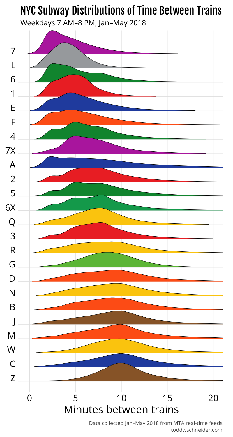
<p>In terms of the actual NYC subway lines during weekdays between 7:00 AM and 8:00 PM, the 7 train has the shortest median time between trains, but the L does a better job at minimizing the occasional long gaps between trains, which is why we saw earlier that the L has shorter average wait times than the 7.</p>

<p>The A train has a notably flat and wide distribution, which explains why the first graph in this post showed that the A had the worst 75th and 90th percentile outcomes, even though its median performance is middle-of-the-pack.</p>

<p><img src="https://cdn.toddwschneider.com/subway/time_between_trains.png" alt="time between trains" /></p>

<script>
$(function() {
  $(".nyc-subway-select-container").show();
  var cdn_host = "https://cdn.toddwschneider.com/subway/";

  var update_graphs = function(train) {
    var hourly = cdn_host + train + "_train_wait_time_by_hour.png";
    var conditional = cdn_host + train + "_train_conditional_wait_time.png";
    $(".subway-line-wait-time").attr("src", hourly);
    $(".subway-line-conditional-wait-time").attr("src", conditional);
  }

  $("#nyc-subway-wait-time-by-hour").on("change", function() {
    var train = $(this).val();
    update_graphs(train);
    $("#nyc-subway-conditional-wait-time").val(train);
  });

  $("#nyc-subway-conditional-wait-time").on("change", function() {
    var train = $(this).val();
    update_graphs(train);
    $("#nyc-subway-wait-time-by-hour").val(train);
  });
});
</script>

]]></content>
  </entry>
  
  <entry>
    <title type="html"><![CDATA[Assessing Shooting Performance in NBA and NCAA Basketball]]></title>
    <link href="https://toddwschneider.com/posts/nba-vs-ncaa-basketball-shooting-performance/"/>
    <updated>2018-04-02T06:00:00-04:00</updated>
    <id>https://toddwschneider.com/posts/nba-vs-ncaa-basketball-shooting-performance</id>
    <content type="html"><![CDATA[<p>I wrote an open-source app called <a href="https://github.com/toddwschneider/nba-shots-db">NBA Shots DB</a> that uses the <a href="https://stats.nba.com/">NBA Stats API</a> to populate a database with all 4.5 million shots attempted in NBA games since 1996. The app also processes a dataset <a href="https://console.cloud.google.com/launcher/details/ncaa-bb-public/ncaa-basketball">provided by Sportradar</a> of over 1 million NCAA men’s shot attempts since 2013 into a format that can be merged with the NBA data. Both datasets include similar information: location coordinates, player and team names, which shots went in, and so on. The merged dataset allows us to compare NBA and NCAA shot patterns on the same scale, and even allows tracking individual players as they move from college to the pros.</p>

<p><a href="https://toddwschneider.com/posts/ballr-interactive-nba-shot-charts-with-r-and-shiny/#limitations-of-shot-charts">Shot data has some significant limitations</a>, and we should be very wary of drawing unjustified conclusions from it, but it can also help illuminate trends that might not be otherwise obvious to the human eye.</p>

<h2 id="nba-players-shoot-better-than-college-players-from-distance-but-college-players-appear-to-be-more-accurate-closer-to-the-rim">NBA players shoot better than college players from distance, but college players appear to be more accurate closer to the rim</h2>

<p>The NBA’s aggregate field goal percentage is slightly better than the NCAA’s, 46% to 44%. I would have guessed that NBA professionals would be better shooters than NCAA players at all distances, but it turns out that for shots under 6 feet, NCAA attempts are <em>more</em> likely to go in. The shot data can’t tell us why—my guess is that the NCAA has more mismatches where an offensive player is much bigger than his defender, leading to easier interior shots, but we don’t really know.</p>

<div id="fgb-by-distance"></div>

<p><img src="https://cdn.toddwschneider.com/basketball/fgp_by_distance.png" alt="fgp by distance" /></p>

<p>An important disclaimer: neither dataset is particularly clear about where its data comes from. The NBA data is presumably generated by the <a href="http://grantland.com/features/the-toronto-raptors-sportvu-cameras-nba-analytical-revolution/">SportVU camera systems</a> installed at NBA arenas, but I don’t know how Sportradar produces the NCAA data. It could come from cameras, manual review of game tape, or something else. If the systems that gather the data are different enough, it might make comparisons less meaningful.</p>

<p>For example, it seems a bit odd that the NBA data reports a <a href="https://cdn.toddwschneider.com/basketball/fga_by_distance.png">much higher frequency of shots less than 1 foot from the basket</a>. It makes me think the measurement systems might be different, and maybe what’s recorded as a “1 foot” shot in the NBA is recorded as a “3 foot” shot in the NCAA. If we restrict to all shots under 6 feet in each dataset, the NCAA still has a slightly higher FG% than the NBA (59% vs. 58%), but depending on how the recording systems work, the accuracy gap at short distances might be significantly smaller than the graph would have you believe.</p>

<h2 id="scouting-the-college-players-who-shoot-the-best-from-nba-3-point-range">Scouting the college players who shoot the best from NBA 3-point range</h2>

<p>The college 3-point line is 3 feet closer to the basket than the NBA line in most places, though the gap narrows to 1.25 feet in the corners. But of course there’s nothing to stop a college player from shooting from NBA 3-point range, and NBA scouts might be particularly interested in how college players shoot from NBA-range as a predictor of future pro performance.</p>

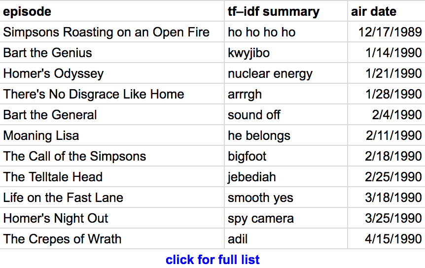
<p>I used the Sportradar NCAA data to isolate shots that were not only 3-pointers, but would have been 3-pointers even in the NBA, then ranked college players by their NBA-range 3-point accuracy. <a href="https://docs.google.com/spreadsheets/d/1g4O80Uk2rXOnmzF92LKhLraMjgnNvhmmoaflkDpyR9E/edit#gid=0">Here’s a list</a> of NCAA players who attempted at least 100 NBA-range 3-pointers since 2013:</p>

<p style="text-align: center" class="iframe-embed-1">
  <a href="https://docs.google.com/spreadsheets/d/1g4O80Uk2rXOnmzF92LKhLraMjgnNvhmmoaflkDpyR9E/edit#gid=0">
    <img alt="nba-range 3-pointers" src="https://cdn.toddwschneider.com/basketball/nba_vs_ncaa_3s_table.png" />
  </a>

  <a href="https://docs.google.com/spreadsheets/d/1g4O80Uk2rXOnmzF92LKhLraMjgnNvhmmoaflkDpyR9E/edit#gid=0">
    Click here for full list
  </a>
</p>

<p>Unfortunately for any aspiring scouts, it looks like this might not be a good predictor of future NBA performance. Based on the <a href="https://docs.google.com/spreadsheets/d/1g4O80Uk2rXOnmzF92LKhLraMjgnNvhmmoaflkDpyR9E/edit#gid=1958477200">23 players in the dataset</a> who attempted at least 100 NBA-range 3-pointers in college and another 100 3-pointers in the NBA, there’s no strong correlation between college and pro results. Most of the players had lower accuracy in the NBA than in college, though Terry Rozier of Louisville and the Boston Celtics managed to improve his NBA-range 3-point shooting by +9%.</p>

<p style="text-align: center" class="iframe-embed-2">
  <a href="https://docs.google.com/spreadsheets/d/1g4O80Uk2rXOnmzF92LKhLraMjgnNvhmmoaflkDpyR9E/edit#gid=1958477200">
    <img alt="ncaa vs nba 3s" src="https://cdn.toddwschneider.com/basketball/nba_range_table.png" />
  </a>

  <a href="https://docs.google.com/spreadsheets/d/1g4O80Uk2rXOnmzF92LKhLraMjgnNvhmmoaflkDpyR9E/edit#gid=1958477200">
    Click here for full list
  </a>
</p>

<h2 id="adjusted-for-shot-distance-players-typically-shoot-worse-during-their-nba-rookie-season-than-they-did-during-their-final-college-season">Adjusted for shot distance, players typically shoot worse during their NBA rookie season than they did during their final college season</h2>

<p>There are many competing factors that might influence field goal accuracy when a player transitions from college to the pros. Players presumably get better with age in their early 20s as they mature physically, NBA players probably practice more, and have access to better training facilities and coaching, all of which suggest they might shoot better in their first professional season than they did in college. On the other hand, NBA rookies have to play against other NBA players, who are on average much better defenders than their previous college opponents.</p>

<p>We’ve seen anecdotally with 3-point attempts that an individual player usually shoots worse in the NBA than he did in college, but I wanted to do something at least a bit more scientific to quantify the effect. Using a dataset of 129,000 shots from 262 players who appear in both datasets, I <a href="https://github.com/toddwschneider/nba-shots-db/blob/master/app/lib/analysis/analysis.R#L408-L428">ran a logistic regression</a> to estimate the change in field goal accuracy associated with the transition from college to the NBA. It’s a crude model, considering shot distance, whether the player is in his final year of college or his first year in the NBA, and a player-level adjustment for each player. The model ignores any differences between positions, so if guards and centers are affected differently, the model would probably miss it.</p>

<p>The simple model predicts that, on average, as a player goes from his last year in college to his first year in the NBA, his field goal percentage will decline by around 4% on shots over 6 feet, and as much as 15% on shorter shots. It doesn’t say anything about why, though again I’d suspect the primary explanation is that NBA players are much better defenders.</p>

<p><img src="https://cdn.toddwschneider.com/basketball/predicted_fgp_by_distance.png" alt="predicted fgp by distance" /></p>

<p>At first glance, this result that players shoot worse when they go from college to the NBA might seem in conflict with the <a href="#fgb-by-distance" data-notab="true">first chart</a> in this post, which showed that NBA players had <em>higher</em> field goal percentages on longer shots than college players. The most likely explanation is that rookies are below-average shooters among all NBA players, and as rookies turn into veterans, their shooting performance improves. Note that the merged NBA/NCAA dataset has a <a href="https://en.wikipedia.org/wiki/Truncation_(statistics)">data truncation</a> issue: because the NCAA data only spans 2013–18, any player who was in both leagues during that period has at most 4 years of NBA experience. Over time, assuming both datasets remain publicly available, it will be interesting to see if there is an NBA experience level where a player’s shooting performance is expected to exceed his college stats.</p>

<h2 id="in-the-nba-a-wide-open-mid-range-2-can-be-a-better-shot-than-a-well-guarded-3">In the NBA, a wide-open mid-range 2 can be a better shot than a well-guarded 3</h2>

<p>Even the most casual basketball fan probably knows by now that <a href="https://www.nytimes.com/2016/01/21/sports/basketball/how-the-nba-3-point-shot-went-from-gimmick-to-game-changer.html">3-point attempts have exploded in popularity</a>, while mid-range 2-point attempts are in decline. It’s gotten to the point where there are <a href="https://www.wsj.com/articles/the-mid-range-jumper-is-the-nbas-worst-shot-except-for-the-golden-state-warriors-1521557144">some signs of blowback</a>, but overall the trend continues.</p>

<p><img src="https://cdn.toddwschneider.com/basketball/twos_vs_threes.png" alt="twos vs threes" /></p>

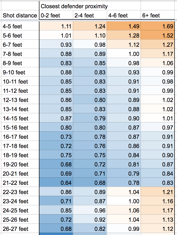
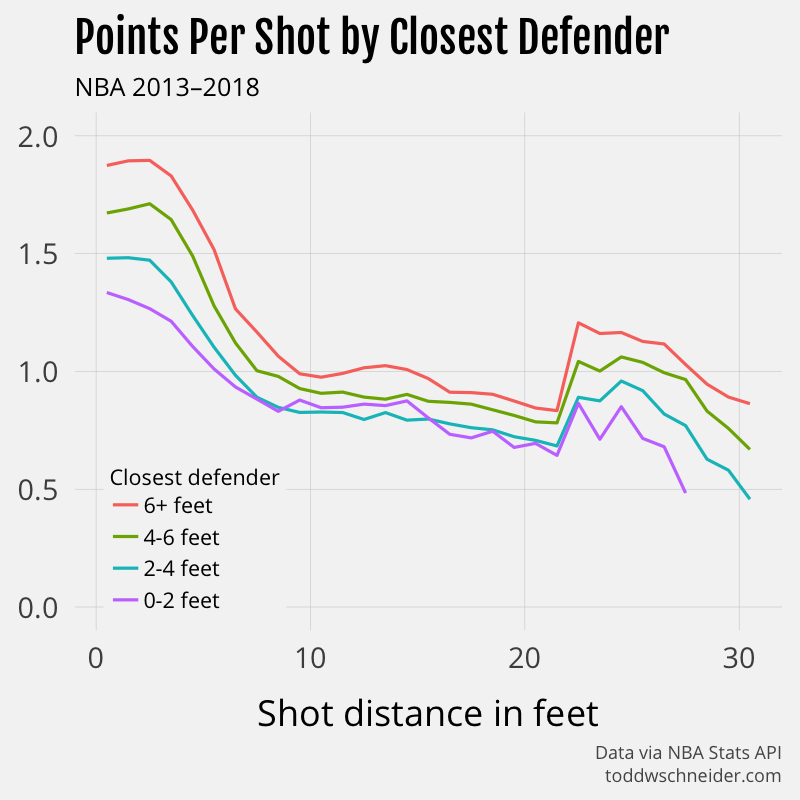
<p>The NBA Stats API provides some aggregate data on shooting performance based on both the distance of the shot, and the distance of the closest defender at the time of the shot, which shows that yes, usually a 3-point attempt has a higher expected value than a long-range 2. But if the 3-pointer is tightly guarded and the long-range 2 is wide-open, then the 2-pointer can be better. For example, a wide-open 2-point shot from 20 feet on average results in 0.84 points, while a tightly-guarded 3-point attempt from 25 feet only averages 0.71 points.</p>

<p style="text-align: center" class="iframe-embed-3">
  <a href="https://docs.google.com/spreadsheets/d/1kQenDoPQaIJAikFpNBMXM9gZzbD-UAuP8I3fXpn9YTw/edit#gid=107310430">
    <img alt="points per shot table" src="https://cdn.toddwschneider.com/basketball/points_per_shot_table.png" />
  </a>
</p>

<p>The same table, in graph form:</p>

<p><img src="https://cdn.toddwschneider.com/basketball/closest_defenders_pps.png" alt="points per shot" /></p>

<p>Again, basketball is complicated and these isolated data points are not a final authority on what constitutes a good or bad shot. In the 2017-18 season, the Houston Rockets and Indiana Pacers have both been successful even though they are at opposite ends of the shooting spectrum, with the Rockets shooting the most 3s, and the Pacers shooting the most long-distance 2s. To be fair, the 3-point-happy Rockets currently have the best record in the league, but the Pacers’ success, despite taking the most supposedly “bad” mid-range 2s of any team in the league, suggests that there’s more than one way to win a basketball game.</p>

<p>Another important note: for unknown reasons, the aggregate stats by distance and closest defender do not match the aggregates computed from the individual shot-level data. The shot-level data includes more attempts, which makes me think that the aggregates by closest defender are somehow incomplete, but I wasn’t able to find more information about why. The difference is particularly pronounced in shots of around 4 feet, with the shot-level data reporting a significantly lower FG% than the aggregate data.</p>

<h2 id="code-on-github-future-work">Code on GitHub, future work</h2>

<p>The code used to compile and analyze all of the NBA and NCAA shots is <a href="https://github.com/toddwschneider/nba-shots-db">available here on GitHub</a>. The NBA Stats API has many more (<a href="https://github.com/seemethere/nba_py/wiki/stats.nba.com-Endpoint-Documentation">mostly undocumented</a>) endpoints, and the code could probably be expanded to capture more information that could feed into more detailed analysis.</p>

<p>Every so often I see a story about <a href="https://en.wikipedia.org/wiki/Hot-hand_fallacy#Recent_research_in_support_of_hot_hand">whether or not the hot-hand exists</a>, and though I kind of doubt that debate will ever be settled conclusively, maybe the shot-collecting code can be of use to future researchers.</p>

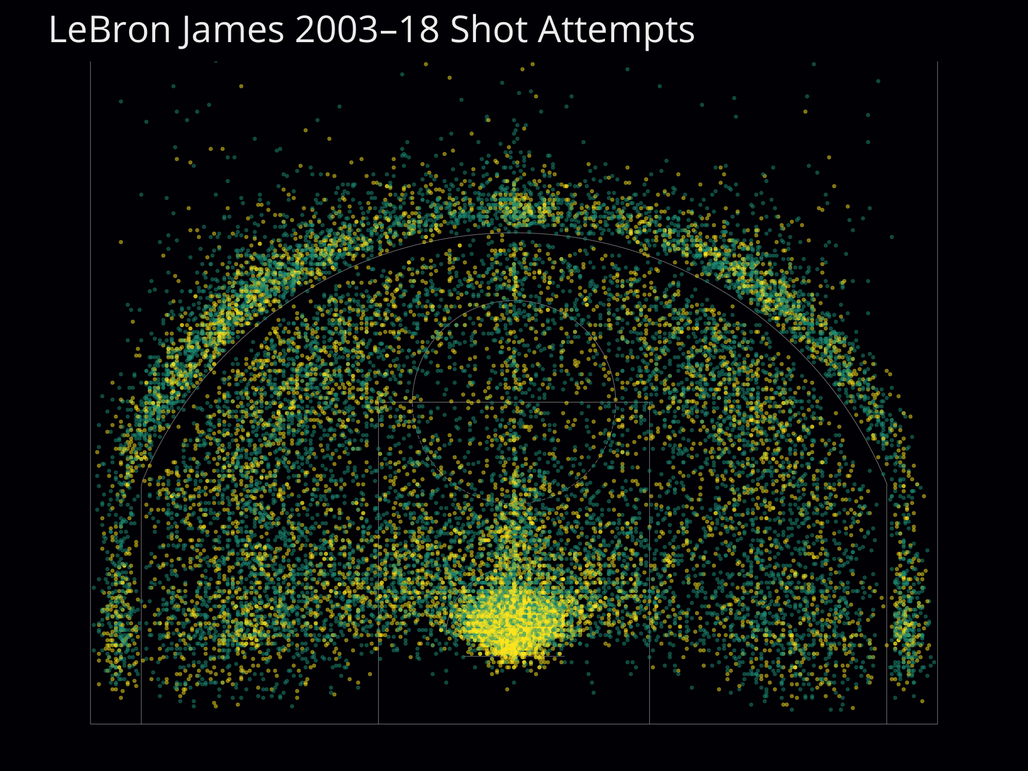
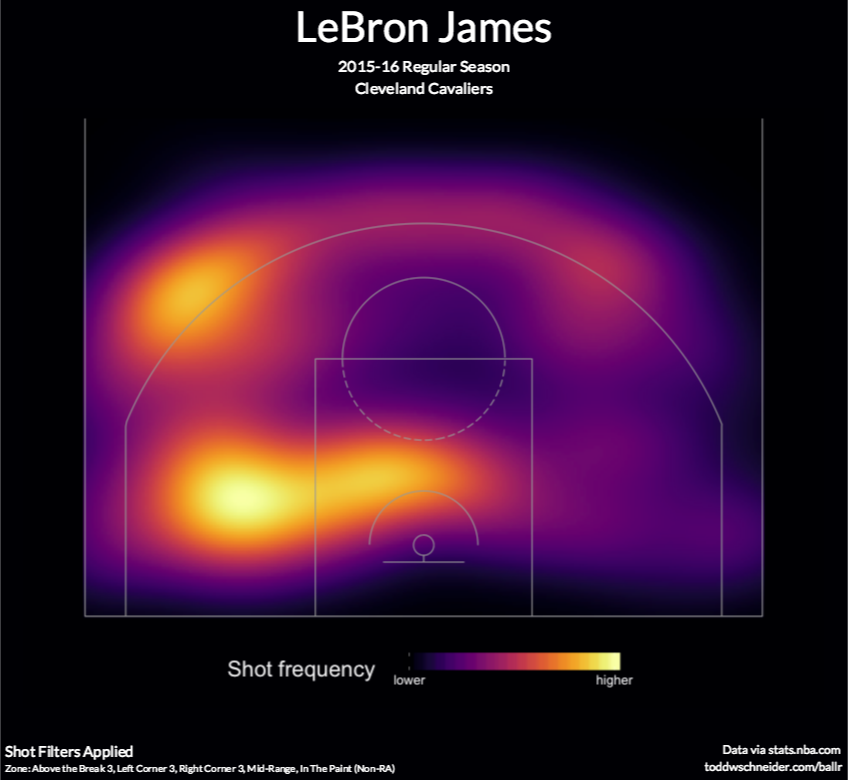
<p>The <em>Los Angeles Times</em> made a nice graphic of <a href="http://graphics.latimes.com/kobe-every-shot-ever/">all 30,000+ shots Kobe Bryant ever attempted</a> in the NBA, and you could use the data in NBA Shots DB to do something similar for any NBA player since 1996. Here’s an image of every shot LeBron James has attempted during his NBA career:</p>

<p>
  <a href="https://cdn.toddwschneider.com/basketball/lebron_shot_map.png">
    <img alt="lebron career shot map" src="https://cdn.toddwschneider.com/basketball/lebron_shot_map.png" />
  </a>
</p>

<p>Or you could do a team-level analysis, for example comparing the aforementioned Houston Rockets (lots of 3-pointers) to the Indiana Pacers (lots of mid-range 2-pointers):</p>

<p>
  <a href="https://cdn.toddwschneider.com/basketball/rockets_shot_map.png">
    <img alt="rockets shot map" src="https://cdn.toddwschneider.com/basketball/rockets_shot_map.png" />
  </a>
</p>

<p>
  <a href="https://cdn.toddwschneider.com/basketball/pacers_shot_map.png">
    <img alt="pacers shot map" src="https://cdn.toddwschneider.com/basketball/pacers_shot_map.png" />
  </a>
</p>

<p>These images use an adapted version of my <a href="https://github.com/toddwschneider/ballr">BallR shot chart app</a>, but a better solution would be to expose an API from the NBA Shots DB app, then have BallR connect to that API instead of hitting the NBA Stats API directly.</p>

<script>
$(function() {
  if (mobileDevice()) return;

  $(".iframe-embed-1").html('<iframe style="width: 100%; height: 400px" src="https://docs.google.com/spreadsheets/d/e/2PACX-1vSqYjPwmfydyYn5d28A0FoilapSsDI7Zs1Oz5_1tO7E7VOUvOHI2n9lItv47KAG1lmdLFntncq6EBKX/pubhtml?gid=0&amp;single=true&amp;widget=true&amp;headers=false"></iframe>');

  $(".iframe-embed-2").html('<iframe style="width: 100%; height: 400px" src="https://docs.google.com/spreadsheets/d/e/2PACX-1vSqYjPwmfydyYn5d28A0FoilapSsDI7Zs1Oz5_1tO7E7VOUvOHI2n9lItv47KAG1lmdLFntncq6EBKX/pubhtml?gid=1958477200&amp;single=true&amp;widget=true&amp;headers=false"></iframe>');

  $(".iframe-embed-3").html('<iframe style="width: 100%; max-width: 440px; height: 780px" src="https://docs.google.com/spreadsheets/d/e/2PACX-1vSAbsJAlAe85wGR63YNGZ0muwvY0SrdXH_infkFHYnJj2kHab41wzO2xhbcI9OCXq9dmuoGrk8ZLF6j/pubhtml?widget=true&amp;headers=false"></iframe>');
});
</script>

]]></content>
  </entry>
  
  <entry>
    <title type="html"><![CDATA[When Are Citi Bikes Faster Than Taxis in New York City?]]></title>
    <link href="https://toddwschneider.com/posts/taxi-vs-citi-bike-nyc/"/>
    <updated>2017-09-26T06:00:00-04:00</updated>
    <id>https://toddwschneider.com/posts/taxi-vs-citi-bike-nyc</id>
    <content type="html"><![CDATA[<p>Every day in New York City, millions of commuters take part in a giant race to determine transportation supremacy. Cars, bikes, subways, buses, ferries, and more all compete against one another, but we never get much explicit feedback as to who “wins.” I’ve previously written about NYC’s public <a href="https://toddwschneider.com/posts/analyzing-1-1-billion-nyc-taxi-and-uber-trips-with-a-vengeance/">taxi data</a> and <a href="https://toddwschneider.com/posts/a-tale-of-twenty-two-million-citi-bikes-analyzing-the-nyc-bike-share-system/">Citi Bike share data</a>, and it occurred to me that these datasets can help identify who’s fastest, at least between cars and bikes. In fact, I’ve built an interactive guide that shows when a Citi Bike is faster than a taxi, depending on the route and the time of day.</p>

<p>The <a href="#data-and-methodology" data-notab="true">methodology</a> and findings will be explained more below, and all code used in this post is available open-source <a href="https://github.com/toddwschneider/nyc-taxi-data/tree/master/citibike_comparison">on GitHub</a>.</p>

<h2 id="interactive-guide-to-when-taxis-are-faster-or-slower-than-citi-bikes">Interactive guide to when taxis are faster or slower than Citi Bikes</h2>

<p>Pick a starting neighborhood and a time. The map shows whether you’d expect get to each neighborhood faster with a taxi (yellow) or a Citi Bike (dark blue).</p>

<div id="nyc-taxi-vs-citi-select-container" style="display: none">
  <div style="margin-bottom: 1em">
    <div class="input-header">
      <label for="nyc-taxi-vs-citi-select">Starting neighborhood</label>
    </div>

    <select id="nyc-taxi-vs-citi-select">
      <optgroup label="Manhattan">
        <option value="Alphabet City">Alphabet City</option>
        <option value="Battery Park">Battery Park</option>
        <option value="Battery Park City">Battery Park City</option>
        <option value="Bloomingdale">Bloomingdale</option>
        <option value="Central Park">Central Park</option>
        <option value="Chinatown">Chinatown</option>
        <option value="Clinton East">Clinton East</option>
        <option value="Clinton West">Clinton West</option>
        <option value="East Chelsea">East Chelsea</option>
        <option value="East Harlem South">East Harlem South</option>
        <option value="East Village">East Village</option>
        <option value="Financial District North">Financial District North</option>
        <option value="Financial District South">Financial District South</option>
        <option value="Flatiron">Flatiron</option>
        <option value="Garment District">Garment District</option>
        <option value="Gramercy">Gramercy</option>
        <option value="Greenwich Village North">Greenwich Village North</option>
        <option value="Greenwich Village South">Greenwich Village South</option>
        <option value="Hudson Sq">Hudson Sq</option>
        <option value="Kips Bay">Kips Bay</option>
        <option value="Lenox Hill East">Lenox Hill East</option>
        <option value="Lenox Hill West">Lenox Hill West</option>
        <option value="Lincoln Square East">Lincoln Square East</option>
        <option value="Lincoln Square West">Lincoln Square West</option>
        <option value="Little Italy/NoLiTa">Little Italy/NoLiTa</option>
        <option value="Lower East Side">Lower East Side</option>
        <option value="Manhattan Valley">Manhattan Valley</option>
        <option value="Meatpacking/West Village West">Meatpacking/West Village West</option>
        <option value="Midtown Center">Midtown Center</option>
        <option selected="" value="Midtown East">Midtown East</option>
        <option value="Midtown North">Midtown North</option>
        <option value="Midtown South">Midtown South</option>
        <option value="Murray Hill">Murray Hill</option>
        <option value="Penn Station/Madison Sq West">Penn Station/Madison Sq West</option>
        <option value="Seaport">Seaport</option>
        <option value="SoHo">SoHo</option>
        <option value="Stuy Town/Peter Cooper Village">Stuy Town/Peter Cooper Village</option>
        <option value="Sutton Place/Turtle Bay North">Sutton Place/Turtle Bay North</option>
        <option value="Times Sq/Theatre District">Times Sq/Theatre District</option>
        <option value="TriBeCa/Civic Center">TriBeCa/Civic Center</option>
        <option value="Two Bridges/Seward Park">Two Bridges/Seward Park</option>
        <option value="UN/Turtle Bay South">UN/Turtle Bay South</option>
        <option value="Union Sq">Union Sq</option>
        <option value="Upper East Side North">Upper East Side North</option>
        <option value="Upper East Side South">Upper East Side South</option>
        <option value="Upper West Side North">Upper West Side North</option>
        <option value="Upper West Side South">Upper West Side South</option>
        <option value="West Chelsea/Hudson Yards">West Chelsea/Hudson Yards</option>
        <option value="West Village">West Village</option>
        <option value="World Trade Center">World Trade Center</option>
        <option value="Yorkville East">Yorkville East</option>
        <option value="Yorkville West">Yorkville West</option>
      </optgroup>

      <optgroup label="Brooklyn">
        <option value="Bedford">Bedford</option>
        <option value="Boerum Hill">Boerum Hill</option>
        <option value="Brooklyn Heights">Brooklyn Heights</option>
        <option value="Brooklyn Navy Yard">Brooklyn Navy Yard</option>
        <option value="Bushwick South">Bushwick South</option>
        <option value="Carroll Gardens">Carroll Gardens</option>
        <option value="Clinton Hill">Clinton Hill</option>
        <option value="Cobble Hill">Cobble Hill</option>
        <option value="Columbia Street">Columbia Street</option>
        <option value="Crown Heights North">Crown Heights North</option>
        <option value="Downtown Brooklyn/MetroTech">Downtown Brooklyn/MetroTech</option>
        <option value="DUMBO/Vinegar Hill">DUMBO/Vinegar Hill</option>
        <option value="East Williamsburg">East Williamsburg</option>
        <option value="Fort Greene">Fort Greene</option>
        <option value="Gowanus">Gowanus</option>
        <option value="Greenpoint">Greenpoint</option>
        <option value="Park Slope">Park Slope</option>
        <option value="Prospect Heights">Prospect Heights</option>
        <option value="Prospect Park">Prospect Park</option>
        <option value="Red Hook">Red Hook</option>
        <option value="South Williamsburg">South Williamsburg</option>
        <option value="Stuyvesant Heights">Stuyvesant Heights</option>
        <option value="Sunset Park West">Sunset Park West</option>
        <option value="Williamsburg (North Side)">Williamsburg (North Side)</option>
        <option value="Williamsburg (South Side)">Williamsburg (South Side)</option>
      </optgroup>

      <optgroup label="Queens">
        <option value="Long Island City/Hunters Point">Long Island City/Hunters Point</option>
        <option value="Long Island City/Queens Plaza">Long Island City/Queens Plaza</option>
        <option value="Queensbridge/Ravenswood">Queensbridge/Ravenswood</option>
        <option value="Sunnyside">Sunnyside</option>
      </optgroup>
    </select>

    <div style="display: none; font-size: 70%" class="map-click-instructions">
      <em>Or click the map to change neighborhoods</em>
    </div>
  </div>

  <div>
    <div class="input-header">
      Weekday time window
    </div>

    <div class="radio-container">
      <input id="nyc-taxi-vs-citi-time-1" type="radio" name="nyc-taxi-vs-citi-time" value="8:00 AM–11:00 AM" checked="" />
      <label for="nyc-taxi-vs-citi-time-1">8:00 AM–11:00 AM</label>
    </div>

    <div class="radio-container">
      <input id="nyc-taxi-vs-citi-time-2" type="radio" name="nyc-taxi-vs-citi-time" value="11:00 AM–4:00 PM" />
      <label for="nyc-taxi-vs-citi-time-2">11:00 AM–4:00 PM</label>
    </div>

    <div class="radio-container">
      <input id="nyc-taxi-vs-citi-time-3" type="radio" name="nyc-taxi-vs-citi-time" value="4:00 PM–7:00 PM" />
      <label for="nyc-taxi-vs-citi-time-3">4:00 PM–7:00 PM</label>
    </div>

    <div class="radio-container">
      <input id="nyc-taxi-vs-citi-time-4" type="radio" name="nyc-taxi-vs-citi-time" value="7:00 PM–10:00 PM" />
      <label for="nyc-taxi-vs-citi-time-4">7:00 PM–10:00 PM</label>
    </div>

    <div class="radio-container">
      <input id="nyc-taxi-vs-citi-time-5" type="radio" name="nyc-taxi-vs-citi-time" value="10:00 PM–8:00 AM" />
      <label for="nyc-taxi-vs-citi-time-5">10:00 PM–8:00 AM</label>
    </div>
  </div>
</div>

<h2 class="taxi-vs-citi-map-title">
  From Midtown East, weekdays 8:00 AM–11:00 AM
</h2>

<p class="taxi-vs-citi-map-subtitle">
  Taxi vs. Citi Bike travel times to other neighborhoods
</p>

<noscript>
  <p>Turn on javascript (or click through from RSS) to view the interactive taxi vs. Citi Bike map.</p>

  <p><img src="https://cdn.toddwschneider.com/taxi_vs_citibike/midtown_east.png" alt="midtown east" /></p>
</noscript>

<div class="nyc-taxi-zones-map-wrapper">
  <div id="nyc-taxi-zones-map"></div>

  <div class="nyc-taxi-zones-credits">
    Data via NYC TLC and Citi Bike
    <br />Based on trips 7/1/2016–6/30/2017
    <br />toddwschneider.com
  </div>

  <p class="map-hover-instructions">
    <em>Hover over a neighborhood (tap on mobile) to view travel time stats</em>
  </p>
</div>

<h2 id="of-weekday-taxi-tripsover-50-during-peak-hourswould-be-faster-as-citi-bike-rides">40% of weekday taxi trips—over 50% during peak hours—would be faster as Citi Bike rides</h2>

<p>I estimate that 40% of weekday taxi trips within the Citi Bike service area would expect to be faster if switched to a Citi Bike, based on data from July 2016 to June 2017. During peak midday hours, more than 50% of taxi trips would expect to be faster as Citi Bike rides.</p>

<p><img src="https://cdn.toddwschneider.com/taxi_vs_citibike/hourly_taxi_win_rate.png" alt="hourly win rate" /></p>

<p>There are some significant caveats to this estimate. In particular, if many taxi riders simultaneously switched to Citi Bikes, the bike share system would probably hit severe <a href="https://www.wnyc.org/story/citi-bike-deserts/">capacity constraints</a>, making it difficult to find available bikes and docks. Increased bike usage might eventually lead to fewer vehicles on the road, which could ease vehicle congestion, and potentially increase bike lane congestion. It’s important to acknowledge that when I say “40% of taxi trips would be faster if they switched to Citi Bikes”, we’re roughly considering the decision of a single able-bodied person, under the assumption that everyone else’s behavior will remain unchanged.</p>

<h2 id="heading-crosstown-in-manhattan-seriously-consider-taking-a-bike-instead-of-a-car">Heading crosstown in Manhattan? Seriously consider taking a bike instead of a car!</h2>

<p>Crosstown Manhattan trips are generally regarded as more difficult than their north-south counterparts. There are fewer subways that run crosstown, and if you take a car, the narrower east-west streets often feel more congested than the broad north-south avenues with their synchronized traffic lights. Crosstown buses are so notoriously slow that they’ve been known to <a href="https://gothamist.com/2011/04/06/video_man_riding_big_wheel_trike_be.php">lose races against tricycles</a>.</p>

<p style="text-align: center">
  <img src="https://cdn.toddwschneider.com/taxi_vs_citibike/crosstown_zones.png" alt="crosstown and uptown zones" />
</p>

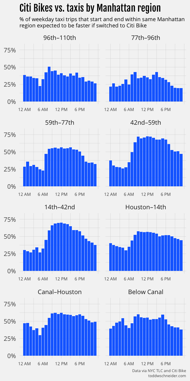
<p>I divided Manhattan into the crosstown zones pictured above, then calculated the taxi vs. Citi Bike win rate for trips that started and ended within each zone. Taxis fare especially badly in the Manhattan central business district. <strong>If you take a midday taxi that both starts and ends between 42nd and 59th streets, there’s over a 70% chance that the trip would have been faster as a Citi Bike ride.</strong></p>

<p><img src="https://cdn.toddwschneider.com/taxi_vs_citibike/hourly_results_by_xtown_42_59.png" alt="42nd-59th" /></p>

<p>Keep in mind that’s for <em>all</em> trips between 42nd and 59th streets. For some of the longest crosstown routes, for example, from the United Nations on the far east side to Hell’s Kitchen on the west, Citi Bikes beat taxis 90% of the time during the day. It’s worth noting that taxis made 8 times as many trips as Citi Bikes between 42nd and 59th streets from July 2016 to June 2017—almost certainly there would be less total time spent in transit if some of those taxi riders took bikes instead.</p>

<p>Hourly graphs for all of the crosstown zones are <a href="https://cdn.toddwschneider.com/taxi_vs_citibike/hourly_results_by_xtown_bucket.png">available here</a>, and here’s a summary table for weekday trips between 8:00 AM and 7:00 PM:</p>

<table>
  <thead>
    <tr>
      <th>Manhattan crosstown zone</th>
      <th>% taxis lose to Citi Bikes</th>
    </tr>
  </thead>

  <tbody>
    <tr>
      <td>96th–110th</td>
      <td>41%</td>
    </tr>
    <tr>
      <td>77th–96th</td>
      <td>36%</td>
    </tr>
    <tr>
      <td>59th–77th</td>
      <td>54%</td>
    </tr>
    <tr>
      <td>42nd–59th</td>
      <td>69%</td>
    </tr>
    <tr>
      <td>14th–42nd</td>
      <td>64%</td>
    </tr>
    <tr>
      <td>Houston–14th</td>
      <td>54%</td>
    </tr>
    <tr>
      <td>Canal–Houston</td>
      <td>60%</td>
    </tr>
    <tr>
      <td>Below Canal</td>
      <td>55%</td>
    </tr>
  </tbody>
</table>

<p>A reminder that this analysis restricts to trips that start and end within the same zone, so for example a trip from 23rd St to 57th St would be excluded because it starts and ends in different zones.</p>

<p>Taxis fare better for trips that stay on the east or west sides of Manhattan: 35% of daytime taxi trips that start and end west of 8th Avenue would expect to be faster as Citi Bike trips, along with 38% of taxi trips that start and end east of 3rd Avenue. Taxis also generally beat Citi Bikes on longer trips:</p>

<p><img src="https://cdn.toddwschneider.com/taxi_vs_citibike/win_rate_by_distance.png" alt="taxi vs. citi bike by trip length" /></p>

<h2 id="taxis-are-losing-more-to-citi-bikes-over-time">Taxis are losing more to Citi Bikes over time</h2>

<p>When the Citi Bike program began in July 2013, less than half of weekday daytime taxi trips would have been faster if switched to Citi Bikes. I ran a month-by-month analysis to see how the taxi vs. Citi Bike calculus has changed over time, and discovered that taxis are getting increasingly slower compared to Citi Bikes:</p>

<p><img src="https://cdn.toddwschneider.com/taxi_vs_citibike/taxi_vs_citibike_by_month.png" alt="taxi vs. Citi Bike by month" /></p>

<p>Note that this month-by-month analysis restricts to the original Citi Bike service area, before the program <a href="https://gothamist.com/2015/07/24/citi_bikes_spreading.php">expanded in August 2015</a>. The initial expansion was largely into Upper Manhattan and the outer boroughs, where taxis generally fare better than bikes, and so to keep things consistent, I restricted the above graph to areas that have had Citi Bikes since 2013.</p>

<p>Taxis are losing more to Citi Bikes over time because taxi travel times have gotten slower, while Citi Bike travel times have remained roughly unchanged. I ran a pair of linear regressions to model travel times as a function of:</p>

<ul>
  <li>trip distance</li>
  <li>time of day</li>
  <li>precipitation</li>
  <li>whether the route crosses between Manhattan and the outer boroughs</li>
  <li>month of year</li>
  <li>year</li>
</ul>

<p>The regression code and output are available on GitHub: <a href="https://github.com/toddwschneider/nyc-taxi-data/tree/master/citibike_comparison/analysis/traffic_analysis.R#L41-L94">taxi</a>, <a href="https://github.com/toddwschneider/nyc-taxi-data/tree/master/citibike_comparison/analysis/traffic_analysis.R#L179-L228">Citi Bike</a></p>

<p>As usual, I make no claim that this is a perfect model, but it does account for the basics, and if we look at the coefficients by year, it shows that, holding the other variables constant, <strong>a taxi trip in 2017 took 17% longer than the same trip in 2009</strong>. For example, a weekday morning trip from Midtown East to Union Square that took 10 minutes in 2009 would average 11:45 in 2017.</p>

<p><img src="https://cdn.toddwschneider.com/taxi_vs_citibike/taxi_traffic_multipliers_by_year.png" alt="taxi multipliers" /></p>

<p>The same regression applied to Citi Bikes shows no such slowdown over time, in fact <a href="https://cdn.toddwschneider.com/taxi_vs_citibike/citi_traffic_multipliers_by_year.png">Citi Bikes got slightly faster</a>. The regressions also show that:</p>

<ol>
  <li>Citi Bike travel times are less sensitive to time of day than taxi travel times. A peak midday taxi trip averages 40% longer than the same trip at off-peak hours, while a peak Citi Bike trip averages 15% longer than during off-peak hours.</li>
  <li>Rainy days are associated with 2% faster Citi Bike travel times and 1% slower taxi travel times.</li>
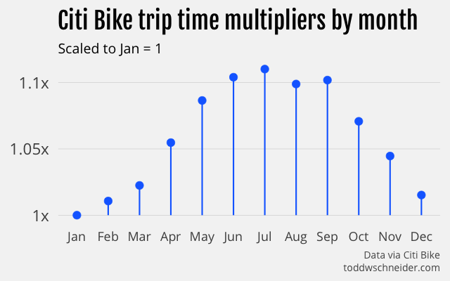
  <li>For taxis, <a href="https://cdn.toddwschneider.com/taxi_vs_citibike/taxi_traffic_multipliers_by_month.png">fall months</a> have the slowest travel times, but for Citi Bikes, <a href="https://cdn.toddwschneider.com/taxi_vs_citibike/citi_traffic_multipliers_by_month.png">summer</a> has the slowest travel times. For both, January has the fastest travel times.</li>
</ol>

<h2 id="taxis-are-more-prone-to-very-bad-days">Taxis are more prone to very bad days</h2>

<p>It’s one thing to say that 50% of midday taxi trips would be faster as Citi Bike rides, but how much does that vary from day to day? You could imagine there are some days with severe road closures, where more nimble bikes have an advantage getting around traffic, or other days in the dead of summer, when taxis might take advantage of the less crowded roads.</p>

<p>I ran a more granular analysis to measure win/loss rates for individual dates. Here’s a histogram of the taxi loss rate—the % of taxi trips we’d expect to be faster if switched to Citi Bikes—for weekday afternoon trips from July 2016 to June 2017:</p>

<p><img src="https://cdn.toddwschneider.com/taxi_vs_citibike/weekday_taxi_loss_rate_histogram.png" alt="histogram" /></p>

<p>Many days see a taxi loss rate of just over 50%, but there are tails on both ends, indicating that some days tilt in favor of either taxis or Citi Bikes. I was curious if we could learn anything from the outliers on each end, so I looked at individual dates to see if there were any obvious patterns.</p>

<p>The dates when taxis were the fastest compared to Citi Bikes look like dates that probably had less traffic than usual. The afternoon with the highest taxi win rate was Monday, October 3, 2016, which was the Jewish holiday of Rosh Hashanah, when many New Yorkers would have been home from work or school. The next 3 best days for taxis were all Mondays in August, when I’d imagine a lot of people were gone from the city on vacation.</p>

<p>The top 4 dates where Citi Bikes did best against taxis were all rainy days in the fall of 2016. I don’t know why rainy days make bikes faster relative to taxis, maybe rain causes traffic on the roads that disproportionately affects cars, but it’s also possible that there’s a selection bias. I’ve written previously about <a href="https://toddwschneider.com/posts/a-tale-of-twenty-two-million-citi-bikes-analyzing-the-nyc-bike-share-system/#citibike-weather">how the weather predicts Citi Bike ridership</a>, and not surprisingly there are fewer riders when it rains. Maybe the folks inclined to ride bikes when it’s raining are more confident cyclists, who also pedal faster when the weather is nice. It’s also possible that rainy-day cyclists are particularly motivated to pedal faster so they can get out of the rain. I don’t know if these are really the causes, but they at least sound believable, and would explain the observed phenomenon.</p>

<h2 id="when-the-president-is-in-town-take-a-bike">When the President is in town, take a bike</h2>

<p>June 8, 2016 was a particularly good day for Citi Bikes compared to taxis. <a href="http://www.fox5ny.com/news/155418523-story">President Obama came to town</a> that afternoon, and brought the requisite <a href="http://bedfordandbowery.com/2016/06/thanks-obama-cooper-square-locked-down-as-prez-rolls-through/">street closures</a> with him. I poked around a bit looking for the routes that appeared to be the most impacted by the President’s visit, and came to afternoon trips from <a href="https://www.google.com/maps/dir/Union+Square,+New+York,+NY/Murray+Hill,+New+York,+NY/@40.7407686,-73.9947469,15z">Union Square to Murray Hill</a>. On a typical weekday afternoon, taxis beat Citi Bikes 57% of the time from Union Square to Murray Hill, but on June 8, Citi Bikes won 90% of the time. An even more dramatic way to see the Obama effect is to look at daily median travel times:</p>

<p><img src="https://cdn.toddwschneider.com/taxi_vs_citibike/union_sq_murray_hill_afternoon_medians_annotated.png" alt="Obama effect" /></p>

<p>A typical afternoon taxi takes 8 minutes, but on June 8, the median was over 21 minutes. The Citi Bike median travel time is almost always 9 minutes, including during President Obama’s visit.</p>

<p>The same graph shows a similar phenomenon on September 19, 2016, when the annual United Nations General Assembly <a href="https://www.dnainfo.com/new-york/20160913/murray-hill/un-general-assembly-traffic-what-streets-closed-nyc-manhattan">shut down large swathes</a> of Manhattan’s east side, including Murray Hill. Although the impact was not as severe as during President Obama’s visit, the taxi median time doubled on September 19, while the Citi Bike median time again remained unchanged.</p>

<p>The morning of June 15, 2016 offers another example, this time on the west side, when an overturned tractor trailer <a href="https://www.amny.com/transit/traffic-snarled-at-lincoln-tunnel-after-tractor-trailer-overturns-port-authority-says-1.11918034">shut down the Lincoln Tunnel</a> for nearly seven hours. Taxi trips from the <a href="https://www.google.com/maps/dir/Upper+West+Side,+New+York,+NY/Hudson+Yards,+New+York,+NY/@40.7709764,-74.0052047,14z">Upper West Side to West Chelsea</a>, which normally take 15 minutes, took over 35 minutes. Citi Bikes typically take 18 minutes along the same route, and June 15 was no exception. Taxis would normally expect to beat Citi Bikes 67% of the time on a weekday morning, but on June 15, Citi Bikes won over 92% of the time.</p>

<p><img src="https://cdn.toddwschneider.com/taxi_vs_citibike/uws_west_chelsea_morning_medians_annotated.png" alt="Lincoln Tunnel" /></p>

<p>These are of course three hand-picked outliers, and it wouldn’t be entirely fair to extrapolate from them to say that Citi Bikes are always more resilient than taxis during extreme circumstances. The broader data shows, though, that taxis are more than twice as likely as Citi Bikes to have days when a route’s median time is at least 5 minutes slower than average, and more than 3.5 times as likely to be at least 10 minutes slower, so it really does seem that Citi Bikes are better at minimizing worst-case outcomes.</p>

<h2 id="why-have-taxis-gotten-slower-since-2009">Why have taxis gotten slower since 2009?</h2>

<p>The biggest slowdowns in taxi travel times happened in 2014 and 2015. The data and regression model have nothing to say about <em>why</em> taxis slowed down so much over that period, though it might be interesting to dig deeper into the data to see if there are specific regions where taxis have fared better or worse since 2009.</p>

<p>Uber usage took off in New York starting in 2014, reaching over <a href="https://toddwschneider.com/posts/taxi-uber-lyft-usage-new-york-city/#total-vehicles-on-the-road">10,000 vehicles dispatched per week</a> by the beginning of 2015. There are certainly people who <a href="https://nyc.streetsblog.org/2017/02/27/its-settled-uber-is-making-nyc-gridlock-worse/">blame Uber</a>—and other ride-hailing apps like Lyft and Juno—for increasing traffic, but the city’s own 2016 traffic report <a href="https://www.nytimes.com/2016/01/16/nyregion/uber-not-to-blame-for-rise-in-manhattan-traffic-congestion-report-says.html">did not blame Uber</a> for increased congestion.</p>

<p>It’s undoubtedly very hard to do an accurate study measuring ride-hailing’s impact on traffic, and I’m especially wary of people on both sides who have strong interests in blaming or exonerating the ride-hailing companies. Nevertheless, if I had to guess the biggest reasons taxis got particularly slower in 2014 and 2015, I would start with the explosive growth of ride-hailing apps, since the timing looks to align, and the publicly available data shows that they account for tens of thousands of vehicles on the roads.</p>

<p>On the other hand, if ride-hailing were the biggest cause of increased congestion in 2014 and 2015, it doesn’t exactly make sense that taxi travel times have stabilized a bit in 2016 and 2017, because ride-hailing has <a href="https://toddwschneider.com/dashboards/nyc-taxi-ridehailing-uber-lyft-data/">continued to grow</a>, and while taxi usage continues to shrink, the respective rates of growth and shrinkage are not very different in 2016–17 than they were in 2014–15. One explanation could be that starting in 2016 there was a reduction in <em>other</em> types of vehicles—traditional black cars, private vehicles, etc.—to offset ride-hailing growth, but I have not seen any data to support (or refute) that idea.</p>

<p>There are also <a href="https://www.nytimes.com/2010/11/23/nyregion/23bicycle.html">those</a> who <a href="https://newyork.cbslocal.com/2017/05/02/nyc-bike-lane-problems/">blame</a> bike lanes for worsening vehicle traffic. Again, different people have strong interests arguing both sides, but it seems like there are more data points arguing that bike lanes do not cause traffic (e.g. <a href="https://www.citylab.com/solutions/2014/09/when-adding-bike-lanes-actually-reduces-traffic-delays/379623/">here</a>,  <a href="https://www.nytimes.com/2013/09/05/nyregion/in-bloombergs-city-of-bike-lanes-data-show-cabs-gain-a-little-speed.html">here</a>, and <a href="https://fivethirtyeight.com/features/bike-lanes-dont-cause-traffic-jams-if-youre-smart-about-where-you-build-them/">here</a>) than vice versa. I wasn’t able to find anything about the timing of NYC bike lane construction to see how closely it aligns with the 2014–15 taxi slowdown.</p>

<p>Lots of other factors could have contributed to worsening traffic: <a href="https://www.citylab.com/transportation/2013/05/most-important-population-statistic-hardly-ever-gets-talked-about/5747/">commuter-adjusted</a> population growth, <a href="https://www.nytimes.com/2017/02/23/nyregion/new-york-city-subway-ridership.html">subway usage</a>, <a href="https://www.theguardian.com/world/2014/mar/14/new-yorks-dangerously-old-public-infrastructures">decaying infrastructure</a>, <a href="https://nypost.com/2014/11/24/construction-delays-and-overruns-enrage-new-yorkers/">construction</a>, and <a href="https://gothamist.com/2016/11/10/here_have_more_nightmares.php">presidential residences</a> are just a few that feel like they could be relevant. I don’t know the best way to account for all of them, but it does seem like if you want to get somewhere in New York quickly, it’s increasingly less likely that a car is your best option.</p>

<h2 id="how-representative-are-taxis-and-citi-bikes-of-all-cars-and-bikes">How representative are taxis and Citi Bikes of <em>all</em> cars and bikes?</h2>

<p>I think it’s not a terrible assumption that taxis are representative of typical car traffic in New York. If anything, maybe taxis are faster than average cars since taxi drivers are likely more experienced—and often aggressive—than average drivers. On the other hand, taxi drivers seem anecdotally less likely to use a traffic-enabled GPS, which maybe hurts their travel times.</p>
<p>Citi Bikes are probably slower than privately-owned bikes. Citi Bikes are <a href="https://www.thevillager.com/2013/05/citi-bikes-not-fast-and-furious-but-slow-stable/">designed to be heavy and stable</a>, which maybe <a href="https://www.citylab.com/transportation/2016/04/why-bike-share-is-really-very-safe/476316/">makes them safer</a>, but lowers their speeds. Plus, I’d guess that biking enthusiasts, who might be faster riders, are more likely to ride their own higher-performance bikes. Lastly, Citi Bike riders might have to spend extra time at the end of a trip looking for an available dock, whereas privately-owned bikes have more parking options.</p>

<p>Weighing up these factors, I would guess that if we somehow got the relevant data to analyze the broader question of all cars vs. all bikes, the results would tip a bit in favor of bikes compared to the results of the narrower taxi vs. Citi Bike analysis. It’s also worth noting that both taxis and Citi Bikes have additional time costs that aren’t accounted for in trip durations: you have to hail a taxi, and there might not be a Citi Bike station in the near vicinity of your origin or destination.</p>

<h2 id="what-are-the-implications-of-all-this">What are the implications of all this?</h2>

<p>One thing to keep in mind is that even though the taxi and Citi Bike datasets are the most conveniently available for analysis, New Yorkers don’t limit their choices to cars and bikes. The subway, despite its <a href="https://www.nytimes.com/interactive/2017/06/28/nyregion/subway-delays-overcrowding.html">poor reputation</a> of late, <a href="http://web.mta.info/nyct/facts/ridership/">carries millions of people</a> every day, more than taxis, ride-hailing apps, and Citi Bikes combined, so it’s not like “car vs. bike” is always the most relevant question. There are also legitimate reasons to choose a car over a bike—or vice versa—that don’t depend strictly on expected travel time.</p>

<p>Bike usage in New York has <a href="https://www.nytimes.com/2017/07/30/nyregion/new-yorkers-bike-lanes-commuting.html">increased dramatically</a> over the past decade, probably in large part because people figured out on their own that biking is often the fastest option. Even with this growth, though, the data shows that a lot of people could still save precious time—and minimize their worse-case outcomes—if they switched from cars to bikes. To the extent the city can incentivize that, it strikes me as a good thing.</p>

<h2 id="when-l-mageddon-comes-take-a-bike">When L-mageddon comes, take a bike</h2>

<p>For any readers who might be affected by the L train’s <a href="https://www.nytimes.com/2017/04/03/nyregion/mta-l-train-shutdown-15-months.html">planned 2019 closure</a>, if you only remember one thing from this post: Citi Bikes crush taxis when <a href="#nyc-taxi-vs-citi-select-container" data-notab="true" class="williamsburg-link">traveling from Williamsburg</a> to just about anywhere in Manhattan during morning rush hour!</p>

<p><img src="https://cdn.toddwschneider.com/taxi_vs_citibike/williamsburg.png" alt="Williamsburg" /></p>

<h2 id="github">GitHub</h2>

<p>The code for the taxi vs. Citi Bike analysis is <a href="https://github.com/toddwschneider/nyc-taxi-data/tree/master/citibike_comparison">available here</a> as part of the nyc-taxi-data repo. Note that parts of the analysis also depend on loading the data from the <a href="https://github.com/toddwschneider/nyc-citibike-data">nyc-citibike-data</a> repo.</p>

<h2 id="data-and-methodology">
  The data
</h2>

<p><a href="https://www.nyc.gov/site/tlc/about/tlc-trip-record-data.page">Taxi trip data</a> is available since January 2009, <a href="https://www.citibikenyc.com/system-data">Citi Bike data</a> since July 2013. I filtered each dataset to make the analysis closer to an apples-to-apples comparison—see the GitHub repo for a more complete <a href="https://github.com/toddwschneider/nyc-taxi-data/tree/master/citibike_comparison#data-filtering">description of the filtering</a>—but in short:</p>

<ul>
  <li>Restrict both datasets to weekday trips only</li>
  <li>Restrict Citi Bike dataset to subscribers only, i.e. no daily pass customers</li>
  <li>Restrict taxi dataset to trips that started and ended in <a href="https://member.citibikenyc.com/map/">areas with Citi Bike stations</a>, i.e. where taking a Citi Bike would have been a viable option</li>
</ul>

<p>Starting in July 2016, perhaps owing to <a href="https://toddwschneider.com/posts/analyzing-1-1-billion-nyc-taxi-and-uber-trips-with-a-vengeance/#data-privacy-concerns">privacy concerns</a>, the TLC stopped providing latitude and longitude coordinates for every taxi trip. Instead, the TLC now divides the city into 263 taxi zones (<a href="/data/taxi/nyc_taxi_zones.png">map</a>), and provides the pickup and drop off zones for every trip. The analysis then makes the assumption that taxis and Citi Bikes have the same distribution of trips within a single zone, <a href="https://github.com/toddwschneider/nyc-taxi-data/tree/master/citibike_comparison#taxi-zones">see GitHub</a> for more.</p>

<p>80% of taxi trips start and end within zones that have Citi Bike stations, and the filtered dataset since July 2013 contains a total of 330 million taxi trips and 27 million Citi Bike trips. From July 1, 2016 to June 30, 2017—the most recent 12 month period of available data—the filtered dataset includes 68 million taxi trips and 9 million Citi Bike trips.</p>

<h2 id="methodology">Methodology</h2>

<p>I wrote a <a href="https://en.wikipedia.org/wiki/Monte_Carlo_method">Monte Carlo simulation</a> in R to calculate the probability that a Citi Bike would be faster than a taxi for a given route. Every trip is assigned to a bucket, where the buckets are picked so that trips within a single bucket are fairly comparable. The bucket definitions are flexible, and I ran many simulations with different bucket definitions, but one sensible choice might be to group trips by:</p>

<ol>
  <li>Starting zone</li>
  <li>Ending zone</li>
  <li>Hour of day</li>
</ol>

<p>For example, weekday trips from the West Village to Times Square between 9:00 AM and 10:00 AM would constitute one bucket. The simulation iterates over every bucket that contains at least 5 taxi and 5 Citi Bike trips, and for each bucket, it draws 10,000 random samples, with replacement, for each of taxi and Citi Bike trips. The bucket’s estimated probability that a taxi is faster than a Citi Bike, call it the “taxi win rate”, is the fraction of samples where the taxi duration is shorter than the Citi Bike duration. You can think of this as 10,000 individual head-to-head races, with each race pitting a single taxi trip against a single Citi Bike trip.</p>

<p>Different bucketing and filtering schemes allow for different types of analysis. I ran simulations that bucketed by month to see how win rates have evolved over time, simulations that used only days where it rained, and others. There are undoubtedly more schemes to be considered, and the Monte Carlo methodology should be well equipped to handle them.</p>

<script src="https://cdnjs.cloudflare.com/ajax/libs/vega/3.0.2/vega.min.js"></script>

<script>
$(function() {
  var desktop = !mobileDevice();

  var selected_location_click_handler = [];

  var tooltip_x_handlers = [
    {
      events: "@taxi_zone_marks:mouseover",
      update: "x() - 100 < 10 ? 10 : (x() - 100 > width - 240 ? width - 240 : x() - 100)"
    },
    {
      events: "@taxi_zone_marks:mouseout",
      update: "-999"
    }
  ]

  if (desktop) {
    $(".map-click-instructions").show();

    selected_location_click_handler = [
      {
        events: "@taxi_zone_marks:click",
        update: "datum.properties.zone"
      },
      {
        events: "@taxi_zone_base_marks:click",
        update: "datum.properties.zone"
      }
    ];

    tooltip_x_handlers.push({
      events: "@taxi_zone_marks:click",
      update: "-999"
    });
  }

  if (window.screen && window.screen.width < 450) {
    var map_width = window.screen.width;
    var map_height = 520;
    var map_center = [-73.854, 40.737];
    var map_scale = 155000;

    $("#nyc-taxi-zones-map").css({"margin-left": "-12px", "width": "100vw"});
  } else {
    var map_width = 450;
    var map_height = 640;
    var map_center = [-73.889, 40.75];
    var map_scale = 192000;
  }

  var vega_spec = {
    $schema: "https://vega.github.io/schema/vega/v3.0.json",
    width: map_width,
    height: map_height,
    autosize: "none",
    signals: [
      {
        name: "selected_location",
        bind: {
          input: "select",
          options: ['Alphabet City', 'Battery Park', 'Battery Park City', 'Bedford', 'Bloomingdale', 'Boerum Hill', 'Brooklyn Heights', 'Brooklyn Navy Yard', 'Bushwick South', 'Carroll Gardens', 'Central Park', 'Chinatown', 'Clinton East', 'Clinton Hill', 'Clinton West', 'Cobble Hill', 'Columbia Street', 'Crown Heights North', 'Downtown Brooklyn/MetroTech', 'DUMBO/Vinegar Hill', 'East Chelsea', 'East Harlem South', 'East Village', 'East Williamsburg', 'Financial District North', 'Financial District South', 'Flatiron', 'Fort Greene', 'Garment District', 'Gowanus', 'Gramercy', 'Greenpoint', 'Greenwich Village North', 'Greenwich Village South', 'Hudson Sq', 'Kips Bay', 'Lenox Hill East', 'Lenox Hill West', 'Lincoln Square East', 'Lincoln Square West', 'Little Italy/NoLiTa', 'Long Island City/Hunters Point', 'Long Island City/Queens Plaza', 'Lower East Side', 'Manhattan Valley', 'Meatpacking/West Village West', 'Midtown Center', 'Midtown East', 'Midtown North', 'Midtown South', 'Murray Hill', 'Park Slope', 'Penn Station/Madison Sq West', 'Prospect Heights', 'Prospect Park', 'Queensbridge/Ravenswood', 'Red Hook', 'Seaport', 'SoHo', 'South Williamsburg', 'Stuy Town/Peter Cooper Village', 'Stuyvesant Heights', 'Sunnyside', 'Sunset Park West', 'Sutton Place/Turtle Bay North', 'Times Sq/Theatre District', 'TriBeCa/Civic Center', 'Two Bridges/Seward Park', 'UN/Turtle Bay South', 'Union Sq', 'Upper East Side North', 'Upper East Side South', 'Upper West Side North', 'Upper West Side South', 'West Chelsea/Hudson Yards', 'West Village', 'Williamsburg (North Side)', 'Williamsburg (South Side)', 'World Trade Center', 'Yorkville East', 'Yorkville West']
        },
        value: "Midtown East",
        on: selected_location_click_handler
      },
      {
        name: "time_of_day",
        bind: {
          input: "radio",
          options: ["8:00 AM–11:00 AM", "11:00 AM–4:00 PM", "4:00 PM–7:00 PM", "7:00 PM–10:00 PM", "10:00 PM–8:00 AM"]
        },
        value: "8:00 AM–11:00 AM"
      },
      {
        name: "hover_area",
        value: null,
        on: [
          {
            events: "@taxi_zone_marks:mouseover",
            update: "datum"
          },
          {
            events: "@taxi_zone_marks:mouseout",
            update: "null"
          }
        ]
      },
      {
        name: "tooltip_title",
        value: null,
        update: "hover_area ? selected_location + ' to ' + hover_area.properties.zone : ''"
      },
      {
        name: "tooltip_from",
        value: null,
        update: "hover_area ? 'From ' + selected_location : ''"
      },
      {
        name: "tooltip_to",
        value: null,
        update: "hover_area ? 'to ' + hover_area.properties.zone : ''"
      },
      {
        name: "tooltip_time_of_day",
        value: null,
        update: "hover_area ? 'Weekdays ' + time_of_day : ''"
      },
      {
        name: "tooltip_message",
        value: null,
        update: "hover_area ? (hover_area.taxi_win_rate > 0.5 ? 'Taxis' : 'Citi Bikes') + ' beat ' + (hover_area.taxi_win_rate > 0.5 ? 'Citi Bikes' : 'taxis') + ' ' + format((hover_area.taxi_win_rate > 0.5 ? hover_area.taxi_win_rate : 1 - hover_area.taxi_win_rate), '0.0%') + ' of the time' : ''"
      },
      {
        name: "tooltip_taxi_median",
        value: null,
        update: "hover_area ? 'Taxi median: ' + timeFormat(1000 * hover_area.taxi_median, '%-M:%S') : ''"
      },
      {
        name: "tooltip_citi_median",
        value: null,
        update: "hover_area ? 'Citi Bike median: ' + timeFormat(1000 * hover_area.citi_median, '%-M:%S') : ''"
      },
      {
        name: "tooltip_x",
        value: -999,
        on: tooltip_x_handlers
      },
      {
        name: "tooltip_y",
        on: [
          {
            events: "@taxi_zone_marks:mouseover",
            update: "y() - 145 < 15 ? y() + 50 : y() - 145"
          }
        ]
      }
    ],
    data: [
      {
        name: "simulation_results",
        url: "https://cdn.toddwschneider.com/taxi_vs_citibike/simulation_results.csv",
        format: {type: "csv", parse: "auto"},
        transform: [
          {
            type: "filter",
            expr: "datum.time_bucket == time_of_day && datum.start_zone == selected_location"
          }
        ]
      },
      {
        name: "east_river_bridges",
        url: "https://cdn.toddwschneider.com/taxi_vs_citibike/east_river_bridges.json",
        format: {type: "topojson", feature: "bridges"}
      },
      {
        name: "taxi_zones",
        url: "https://cdn.toddwschneider.com/taxi_vs_citibike/taxi_zones_bmq.json",
        format: {type: "topojson", feature: "trimmed_taxi_zones_geojson"},
        transform: [
          {
            type: "lookup",
            from: "simulation_results",
            key: "end_taxi_zone_id",
            fields: ["properties.locationid"],
            values: ["taxi_win_rate", "taxi_median", "citi_median"],
            as: ["taxi_win_rate", "taxi_median", "citi_median"]
          }
        ]
      },
      {
        name: "taxi_zones_with_data",
        source: "taxi_zones",
        transform: [
          {
            type: "filter",
            expr: "datum.taxi_win_rate"
          }
        ]
      },
      {
        name: "selected_taxi_zone_origin",
        source: "taxi_zones",
        transform: [
          {
            type: "filter",
            expr: "datum.properties.zone == selected_location"
          }
        ]
      }
    ],
    projections: [
      {
        name: "projection",
        type: "mercator",
        center: map_center,
        scale: map_scale
      }
    ],
    scales: [
      {
        name: "color",
        type: "sequential",
        domain: [0.05, 0.95],
        range: {scheme: "viridis"}
      }
    ],
    legends: [
      {
        fill: "color",
        orient: "bottom-right",
        title: "Taxi win %",
        format: "0%",
        type: "gradient",
        encode: {
          gradient: {
            update: {
              width: {value: 150}
            }
          },
          title: {
            enter: {
              fontSize: {value: 16}
            }
          },
          labels: {
            enter: {
              text: {value: ""}
            }
          }
        }
      }
    ],
    marks: [
      {
        type: "shape",
        name: "taxi_zone_base_marks",
        from: {data: "taxi_zones"},
        encode: {
          update: {
            fill: {value: "#f4f4f4"},
            fillOpacity: {value: 0.5},
            stroke: {value: "#aaa"},
            strokeWidth: {value: 0.2},
            zindex: {value: 0}
          },
        },
        transform: [
          {type: "geoshape", projection: "projection"}
        ]
      },
      {
        type: "shape",
        name: "east_river_bridges_marks",
        from: {data: "east_river_bridges"},
        encode: {
          update: {
            stroke: {value: "#777"},
            strokeWidth: {value: 2}
          }
        },
        transform: [
          {type: "geoshape", projection: "projection"}
        ]
      },
      {
        type: "shape",
        name: "taxi_zone_marks",
        from: {data: "taxi_zones_with_data"},
        encode: {
          update: {
            fill: {
              scale: "color",
              field: "taxi_win_rate"
            },
            fillOpacity: {value: 1},
            stroke: {value: "#777"},
            strokeWidth: {value: 0.2},
            zindex: {value: 10}
          },
          hover: {
            fillOpacity: {value: 0.8},
            stroke: {value: "#222"},
            strokeWidth: {value: 2},
            zindex: {value: 100}
          }
        },
        transform: [
          {type: "geoshape", projection: "projection"}
        ]
      },
      {
        type: "shape",
        name: "selected_taxi_zone_marks",
        from: {data: "selected_taxi_zone_origin"},
        encode: {
          update: {
            fill: {value: "#f00"},
            fillOpacity: {value: 1},
            stroke: {value: "#222"},
            strokeWidth: {value: 2},
            zindex: {value: 1000}
          }
        },
        transform: [
          {type: "geoshape", projection: "projection"}
        ]
      },
      {
        type: "rect",
        interactive: false,
        encode: {
          update: {
            width: {value: 243},
            height: {value: 127},
            fill: {value: "#fff"},
            fillOpacity: {value: 0.9},
            stroke: {value: "#777"},
            strokeWidth: {value: 2},
            cornerRadius: {value: 2},
            x: {signal: "tooltip_x - 5"},
            y: {signal: "tooltip_y - 15"}
          }
        }
      },
      {
        type: "text",
        interactive: false,
        encode: {
          update: {
            x: {signal: "tooltip_x"},
            y: {signal: "tooltip_y"},
            fontSize: {value: 14},
            text: {
              signal: "tooltip_from"
            }
          }
        }
      },
      {
        type: "text",
        interactive: false,
        encode: {
          update: {
            x: {signal: "tooltip_x"},
            y: {signal: "tooltip_y + 16"},
            fontSize: {value: 14},
            text: {
              signal: "tooltip_to"
            }
          }
        }
      },
      {
        type: "text",
        interactive: false,
        encode: {
          update: {
            x: {signal: "tooltip_x"},
            y: {signal: "tooltip_y + 40"},
            fontSize: {value: 14},
            text: {
              signal: "tooltip_time_of_day"
            }
          }
        }
      },
      {
        type: "text",
        interactive: false,
        encode: {
          update: {
            x: {signal: "tooltip_x"},
            y: {signal: "tooltip_y + 66"},
            fontSize: {value: 14},
            text: {
              signal: "tooltip_taxi_median"
            }
          }
        }
      },
      {
        type: "text",
        interactive: false,
        encode: {
          update: {
            x: {signal: "tooltip_x"},
            y: {signal: "tooltip_y + 82"},
            fontSize: {value: 14},
            text: {
              signal: "tooltip_citi_median"
            }
          }
        }
      },
      {
        type: "text",
        interactive: false,
        encode: {
          update: {
            x: {signal: "tooltip_x"},
            y: {signal: "tooltip_y + 106"},
            fontSize: {value: 14},
            text: {
              signal: "tooltip_message"
            }
          }
        }
      },
      {
        type: "text",
        description: "hack to get the legend labels to work",
        interactive: false,
        encode: {
          update: {
            x: {value: map_width - 168},
            y: {value: map_height - 15},
            text: {value: "0%" + vega.repeat(" ", 39) + "100%"}
          }
        }
      }
    ]
  };

  var vega_opts = {
    loader: vega.loader(),
    logLevel: vega.Warn,
    renderer: 'canvas'
  };

  var view = new vega.View(vega.parse(vega_spec), vega_opts).
    initialize('#nyc-taxi-zones-map').
    hover().
    run();

  $("#nyc-taxi-vs-citi-select-container").show();

  $(".map-hover-instructions").show();

  $("#nyc-taxi-vs-citi-select").on("change", function() {
    view.signal("selected_location", $(this).val()).run();
    set_title();
  });

  $("input[name='nyc-taxi-vs-citi-time']").on("change", function() {
    view.signal("time_of_day", $(this).val()).run();
    set_title();
  });

  $(".williamsburg-link").on("click", function() {
    $("#nyc-taxi-vs-citi-select").val("Williamsburg (North Side)");
    view.signal("selected_location", "Williamsburg (North Side)").run();
    set_title();
  });

  var $title = $(".taxi-vs-citi-map-title");

  var set_title = function() {
    var new_title = "From " + $("#nyc-taxi-vs-citi-select").val() + ", weekdays " + $("input[name='nyc-taxi-vs-citi-time']:checked").val();
    $title.html(new_title);
  };

  if (desktop) {
    $("#nyc-taxi-zones-map").on("click", function() {
      vega_val = $("select[name='selected_location']").val();
      outer_select = $("#nyc-taxi-vs-citi-select");
      outer_val = outer_select.val();

      if (vega_val !== outer_val) {
        outer_select.val(vega_val);
        set_title();
      }
    });
  }
});
</script>

]]></content>
  </entry>
  
  <entry>
    <title type="html"><![CDATA[The Simpsons by the Data]]></title>
    <link href="https://toddwschneider.com/posts/the-simpsons-by-the-data/"/>
    <updated>2016-09-28T06:00:00-04:00</updated>
    <id>https://toddwschneider.com/posts/the-simpsons-by-the-data</id>
    <content type="html"><![CDATA[<p><em>The Simpsons</em> needs no introduction. At 27 seasons and counting, it’s the longest-running scripted series in the history of American primetime television.</p>

<p>The show’s longevity, and the fact that it’s animated, provides a vast and relatively unchanging universe of characters to study. It’s easier for an animated show to scale to hundreds of recurring characters; without live-action actors to grow old or move on to other projects, the denizens of Springfield remain mostly unchanged from year to year.</p>

<p>As a <a href="https://frinkiac.com/img/S08E14/686368.jpg">fan of the show</a>, I present a few short analyses about Springfield, from the show’s dialogue to its TV ratings. All code used for this post is <a href="https://github.com/toddwschneider/flim-springfield">available on GitHub</a>.</p>

<h2 id="the-simpsons-characters-who-have-spoken-the-most-words">The Simpsons characters who have spoken the most words</h2>

<p><a href="https://www.simpsonsworld.com/">Simpsons World</a> provides a delightful trove of content for fans. In addition to streaming every episode, the site includes episode guides, scripts, and audio commentary. I wrote code to parse the available episode scripts and attribute every word of dialogue to a character, then ranked the characters by number of words spoken in the history of the show.</p>

<p>The top four are, not surprisingly, the Simpson nuclear family.</p>

<p><em>If you want to quiz yourself, pause here and try to name the next 5 biggest characters in order before looking at the answers…</em></p>

<div style="height:160px"></div>

<p class="tws-image-800">
  <img alt="characters" src="https://toddwschneider.com/data/simpsons/word_count.png" />
</p>

<p>Of course Homer ranks first: he’s the undisputed most iconic character, and he accounts for 21% of the show’s 1.3 million words spoken through season 26. Marge, Bart, and Lisa—in that order—combine for another 26%, giving the Simpson family a 47% share of the show’s dialogue.</p>

<p>If we exclude the Simpson nuclear family and focus on the top 50 supporting characters, the results become a bit less predictable, if not exactly surprising.</p>

<p class="tws-image-800">
  <img alt="supporting cast" src="https://toddwschneider.com/data/simpsons/supporting_cast_word_count.png" />
</p>

<p>Mr. Burns speaks the most words among supporting cast members, followed by Moe, Principal Skinner, Ned Flanders, and Krusty rounding out the top 5.</p>

<h2 id="gender-imbalance-on-the-simpsons">Gender imbalance on The Simpsons</h2>

<p>The colors of the bars in the above graphs represent gender: blue for male characters, red for female. If we look at the supporting cast, the 14 most prominent characters are all male before we get to the first woman, Mrs. Krabappel, and only 5 of the top 50 supporting cast members are women.</p>

<p>Women account for 25% of the dialogue on <em>The Simpsons</em>, including Marge and Lisa, two of the show’s main characters. If we remove the Simpson nuclear family, things look even more lopsided: <strong>women account for less than 10% of the supporting cast’s dialogue.</strong></p>

<p>A look at the show’s <a href="https://en.wikipedia.org/wiki/List_of_The_Simpsons_writers">list of writers</a> reveals that 9 of the top 10 writers are male. I did not collect data on which writers wrote which episodes, but it would make for an interesting follow-up to see if the episodes written by women have a more equal distribution of dialogue between male and female characters.</p>

<h2 id="eye-on-springfield">Eye on Springfield</h2>

<p>The scripts also include each scene’s setting, which I used to compute the locations with the most dialogue.</p>

<p class="tws-image-800">
  <img alt="locations" src="https://toddwschneider.com/data/simpsons/words_by_location.png" />
</p>

<p>The location data is a bit messy to work with—should “Simpson Living Room” really be treated differently than “Simpson Home”—but nevertheless it paints a picture of where people spend time in Springfield: at home, school, work, and the local bar.</p>

<h2 id="the-bart-to-homer-transition">The Bart-to-Homer transition?</h2>

<p>Per <a href="https://en.wikipedia.org/wiki/The_Simpsons">Wikipedia</a>:</p>

<blockquote>
  <p>While later seasons would focus on Homer, Bart was the lead character in most of the first three seasons</p>
</blockquote>

<p>I’ve heard this argument before, that the show was originally about Bart before switching its focus to Homer, but the actual scripts only seem to partially support it.</p>

<p><img src="/data/simpsons/03_bart_simpson.png" alt="bart" /></p>

<p>Bart accounted for a significantly larger share of the show’s dialogue in season 1 than in any future season, but <a href="/data/simpsons/01_homer_simpson.png">Homer’s share has always been higher</a> than Bart’s. Dialogue share might not tell the whole story about a character’s prominence, but the fact is that Homer has always been the most talkative character on the show.</p>

<h2 id="the-simpsons-tv-ratings-are-in-decline">The Simpsons TV ratings are in decline</h2>

<p>Historical Nielsen ratings data is hard to come by, so I relied on Wikipedia for Simpsons episode-level <a href="https://en.wikipedia.org/wiki/List_of_The_Simpsons_episodes">television viewership data</a>.</p>

<p class="simpsons-episodes-chart-placeholder">
  <img alt="ratings" src="https://toddwschneider.com/data/simpsons/tv_ratings.png" />
</p>

<p>Viewership appears to jump in 2000, between seasons 11 and 12, but closer inspection reveals that’s when the Wikipedia data switches from reporting households to individuals. I don’t know the reason for the switch—it might have something to do with Nielsen’s measurement or reporting—but without any other data sources it’s difficult to confirm.</p>

<p>Aside from that bump, which is most likely a data artifact, not a real trend, it’s clear that the show’s ratings are trending lower. The early seasons averaged over 20 million viewers per episode, including <em><a href="https://en.wikipedia.org/wiki/Bart_Gets_an_%22F%22">Bart Gets an “F”</a></em>, the first episode of season 2, which is still the most-watched episode in the show’s history with an estimated 33.6 million viewers. The more recent seasons have averaged less than 5 million viewers per episode, more than an 80% decline since the show’s beginnings. </p>

<p><img src="/data/simpsons/frinkiac_lightning.jpg" alt="ratings" /></p>

<p class="frinkiac-caption">
  <a href="https://frinkiac.com/meme/S08E14/119735/m/V0hBVCBIQVBQRU5FRCBIRVJFPwpMSUdIVE5JTkcgSElUIFRIRQpUUkFOU01JVFRFUj8=">Frinkiac</a>
</p>

<h2 id="tv-ratings-have-declined-everywhere-not-just-on-the-simpsons">TV ratings have declined everywhere, not just on The Simpsons</h2>

<p>Although the ratings data looks bad for <em>The Simpsons</em>, it doesn’t tell the whole story: TV ratings for individual shows have been broadly declining for over 60 years.</p>

<p>When <em>The Simpsons</em> came out in 1989, the <a href="https://en.wikipedia.org/wiki/Top-rated_United_States_television_programs_of_1989%E2%80%9390">highest 30 rated shows</a> on TV averaged a 17.7 Nielsen rating, meaning that 17.7% of television-equipped households tuned in to the average top 30 show. In 2014–15, <a href="https://en.wikipedia.org/wiki/Top-rated_United_States_television_programs_of_2014%E2%80%9315">the highest 30 rated shows</a> managed an 8.7 average rating, a decline of 50% over that 25 year span.</p>

<p>If we go all the way back to the 1951, the top 30 shows <em>averaged</em> a 38.2 rating, which is more than triple the single highest-rated program of 2014–15 (NBC’s <em>Sunday Night Football</em>, which averaged a 12.3 rating).</p>

<p><img src="/data/simpsons/nielsen.png" alt="nielsen" /></p>

<p><em>Full data for the top 30 shows by season is <a href="https://github.com/toddwschneider/flim-springfield/blob/master/analysis/data/nielsen_ratings.csv">available here on GitHub</a></em></p>

<p>I have no proof for the cause of this decline in the average Nielsen rating of a top 30 show, but intuitively it must be related to the proliferation of channels. TV viewers in the 1950s had a small handful of channels to choose from, while modern viewers have hundreds if not thousands of choices, not to mention streaming options, which present their own <a href="https://www.nytimes.com/2016/02/03/business/media/nielsen-playing-catch-up-as-tv-viewing-habits-change-and-digital-rivals-spring-up.html">ratings measurement challenges</a>.</p>

<p><img src="/data/simpsons/frinkiac_nasa.jpg" alt="measurement" /></p>

<p class="frinkiac-caption">
  <a href="https://frinkiac.com/meme/S05E15/896127/m/CkFORCBIT1cnUyBUSEUgU1BBQ0VDUkFGVApET0lORz8KCgpJIERPTidUIEtOT1cuIEFMTCBUSElTCkVRVUlQTUVOVCBJUyBKVVNUIFVTRUQgVE8KTUVBU1VSRSBUViBSQVRJTkdTCgoKCg==">Frinkiac</a>
</p>

<p>We could normalize Simpsons episode ratings by the declining top 30 curve to adjust for the fact that it’s more difficult for any one show to capture as large a share of the TV audience over time. But as mentioned earlier, the normalization would only account for about a 50% decline in ratings since 1989, while <em>The Simpsons</em> ratings have declined more like 80-85% over that horizon.</p>

<p>Alas, I must confess, I stopped watching the show around season 12, and <a href="/data/simpsons/avg_simpsons_world_views_by_season.png">Simpsons World’s episode view counts</a> suggest that modern streaming viewers are more interested in the early seasons too, so it could just be that people are losing interest.</p>

<p>As I write this, <em>The Simpsons</em> is under contract to be produced for one more season, though it’s entirely possible it will be renewed. But ultimately Troy McClure said it best at the conclusion of the <em>The Simpsons 138th Episode Spectacular</em>, which, it’s hard to believe, now covers less than 25% of the show’s history:</p>

<p><img src="/data/simpsons/frinkiac_troy_mcclure.jpg" alt="troy mcclure" /></p>

<p class="frinkiac-caption">
  <a href="https://frinkiac.com/meme/S07E10/1303751/m/V2hvIGtub3dzIHdoYXQgYWR2ZW50dXJlcwp0aGV5J2xsIGhhdmUgYmV0d2VlbiBub3cKYW5kIHRoZSB0aW1lIHRoZSBzaG93CmJlY29tZXMgdW5wcm9maXRhYmxlPw==">Frinkiac</a>
</p>

<h2 id="automated-episode-summaries-using-tfidf">Automated episode summaries using tf–idf</h2>

<p><a href="https://en.wikipedia.org/wiki/Tf%E2%80%93idf">Term frequency–inverse document frequency</a> is a popular technique used to determine which words are most significant to a document that is itself part of a larger corpus. In our case, the documents are individual episode scripts, and the corpus is the collection of all scripts.</p>

<p>The idea behind tf–idf is to find words or phrases that occur frequently within a single document, but rarely within the overall corpus. To use a specific example from <em>The Simpsons</em>, the phrase “dental plan” appears 19 times in <em><a href="https://en.wikipedia.org/wiki/Last_Exit_to_Springfield">Last Exit to Springfield</a></em>, but only once throughout the rest of the show, and sure enough the tf–idf algorithm identifies “dental plan” as the most relevant phrase from that episode.</p>

<p>I used R’s <a href="https://cran.r-project.org/web/packages/tidytext/vignettes/tidytext.html">tidytext</a> package to pull out the single word or phrase with the highest tf–idf rank for each episode; <a href="https://github.com/toddwschneider/flim-springfield/blob/master/analysis/analysis.R#L212-L243">here’s</a> the relevant section of code.</p>

<p>The results are pretty good, and should be at least slightly entertaining to fans of the show. Beyond “dental plan”, there are fan-favorites including <a href="https://en.wikipedia.org/wiki/Bart_the_Genius">“kwyjibo”</a>, <a href="https://en.wikipedia.org/wiki/Radio_Bart">“down the well”</a>, <a href="https://en.wikipedia.org/wiki/Marge_vs._the_Monorail">“monorail”</a>, <a href="https://en.wikipedia.org/wiki/Bart_Gets_Famous">“I didn’t do it”</a>, and <a href="https://en.wikipedia.org/wiki/A_Fish_Called_Selma">“Dr. Zaius”</a>, though to be fair, there are also some less iconic results.</p>

<p>You can see the full list of episodes and “most relevant phrases” <a href="https://docs.google.com/spreadsheets/d/1XETUC97k1AvVPwqGnPuSPnWVtMrk2YhO8aHbo53RcoU/pubhtml?gid=0&amp;single=true">here</a>.</p>

<p class="episode-summaries-embed">
  <a href="https://docs.google.com/spreadsheets/d/1XETUC97k1AvVPwqGnPuSPnWVtMrk2YhO8aHbo53RcoU/pubhtml?gid=0&amp;single=true">
    <img alt="episode summaries" src="https://toddwschneider.com/data/simpsons/simpsons_tf_idf_preview.png" />
  </a>
</p>

<p>Another interesting follow-up could be to use <a href="https://research.googleblog.com/2016/08/text-summarization-with-tensorflow.html">more sophisticated techniques</a> to write more complete episode summaries based on the scripts, but I was pleasantly surprised by the relevance of the comparatively simple tf–idf approach.</p>

<p><img src="https://frinkiac.com/meme/S03E14/265282.jpg?b64lines=IEFmdGVyIGV2YWx1YXRpbmcgbWlsbGlvbnMKIG9mIHBpZWNlcyBvZiBkYXRhIGluIHRoZQogYmxpbmsgb2YgYW4gZXllLi4u" alt="data" /></p>

<p class="frinkiac-caption">
  <a href="https://frinkiac.com/meme/S03E14/265282/m/IEFmdGVyIGV2YWx1YXRpbmcgbWlsbGlvbnMKIG9mIHBpZWNlcyBvZiBkYXRhIGluIHRoZQogYmxpbmsgb2YgYW4gZXllLi4u">Frinkiac</a>
</p>

<h2 id="code-on-github">Code on GitHub</h2>

<p>All code used in this post is <a href="https://github.com/toddwschneider/flim-springfield">available on GitHub</a>, and the screencaps come from the amazing <a href="https://frinkiac.com/">Frinkiac</a></p>

<style>
#simpsons-episodes-chart { height: 640px; }

#simpsons-episodes-chart .highcharts-tooltip > span {
  top: 0px !important;
  left: 0px !important;
  white-space: normal !important;
}

.frinkiac-caption {
  text-align: right;
  margin-top: -1.5em;
}

@font-face {
  font-family: 'Akbar';
  font-style: normal;
  font-weight: 400;
  src: url(https://toddwschneider.com/data/fonts/akbar.ttf) format('ttf');
}
</style>

<script src="https://toddwschneider.com/javascripts/highcharts.js"></script>

<script>
$(function() {
  if (mobileDeviceExIpad()) {
    return false;
  }

  $(".episode-summaries-embed").replaceWith('<p><iframe width="100%" height="500px" src="https://docs.google.com/spreadsheets/d/1XETUC97k1AvVPwqGnPuSPnWVtMrk2YhO8aHbo53RcoU/pubhtml?gid=0&amp;single=true&amp;widget=true&amp;headers=false"></iframe></p>');

  var $placeholder = $(".simpsons-episodes-chart-placeholder");
  $placeholder.after('<div id="simpsons-episodes-chart" style="margin-bottom: 20px"></div>');
  $placeholder.remove();
  $("#simpsons-episodes-chart").after("<p><em>Hover to view individual episode data, click and drag to zoom</em></p>");

  $.get("/data/simpsons/episodes.json", function(episodes) {
    new Highcharts.Chart({
      chart: {
        renderTo: 'simpsons-episodes-chart',
        type: 'scatter',
        zoomType: 'x',
        backgroundColor: '#ffd90f',
        style: { fontFamily: 'Akbar, Verdana, Arial, sans-serif' }
      },
      series: [{data: episodes}],
      title: {
        text: 'The Simpsons TV ratings by episode',
        style: { fontSize: '36px' }
      },
      subtitle: {
        text: 'data via Wikipedia',
        style: { fontSize: '24px' }
      },
      xAxis: {
        type: 'datetime',
        min: 567993600000,
        lineWidth: 0,
        gridLineWidth: 0.4,
        gridLineColor: '#70d1ff',
        labels: {
          style: { fontSize: '20px' }
        },
        title: {
          text: 'Original air date',
          margin: 25,
          style: { fontSize: '28px' }
        }
      },
      yAxis: {
        min: 0,
        gridLineWidth: 0.4,
        gridLineColor: '#70d1ff',
        labels: {
          style: { fontSize: '20px' }
        },
        title: {
          text: 'US viewers in millions',
          margin: 25,
          style: { fontSize: '28px' }
        }
      },
      legend: { enabled: false },
      plotOptions: {
        series: {
          animation: false,
          color: 'rgba(79, 118, 223, 0.6)',
          stickyTracking: false
        },
      },
      tooltip: {
        enabled: true,
        snap: 10,
        useHTML: true,
        animation: false,
        borderColor: '#70d1ff',
        borderWidth: 3,
        style: {
          padding: 0
        },
        formatter: function() {
          return '<div style="width: 240px; padding: 1px">' +
                   '<div style="width: 240px; height: 135px; background-image: url(' + this.point.image_url + '); background-position: center; background-size: contain"></div>' +
                   '<div style="width: 224px; padding: 8px; font-size: 16px">' +
                     '<div style="color: #777; font-size: 12px; margin-bottom: 12px">' +
                       Highcharts.dateFormat('%b %e, %Y', this.x) +
                       ', S' + this.point.season + ' E' + this.point.number_in_season +
                     '</div>' +
                     '<p style="margin-bottom: 12px">' + this.point.name + '</p>' +
                     '<div>' + this.y + ' million US viewers</div>' +
                   '</div>' +
                 '</div>';
        }
      },
      credits: {
        text: 'toddwschneider.com',
        href: '#simpsons-episodes-chart',
        style: { fontSize: '14px' }
      }
    });
  });
});
</script>

]]></content>
  </entry>
  
  <entry>
    <title type="html"><![CDATA[BallR: Interactive NBA Shot Charts with R and Shiny]]></title>
    <link href="https://toddwschneider.com/posts/ballr-interactive-nba-shot-charts-with-r-and-shiny/"/>
    <updated>2016-03-08T06:00:00-05:00</updated>
    <id>https://toddwschneider.com/posts/ballr-interactive-nba-shot-charts-with-r-and-shiny</id>
    <content type="html"><![CDATA[<p>The NBA’s <a href="https://stats.nba.com/">Stats API</a> provides data for every single shot attempted during an NBA game since 1996, including location coordinates on the court. I built a tool called <a href="https://github.com/toddwschneider/ballr">BallR</a>, using R’s <a href="https://shiny.rstudio.com/">Shiny</a> framework, to explore NBA shot data at the player-level.</p>

<p>BallR lets you select a player and season, then creates a customizable chart that shows shot patterns across the court. Additionally, it calculates aggregate statistics like field goal percentage and points per shot attempt, and compares the selected player to league averages at different areas of the court.</p>

<p><strong>Update April 2017:</strong> for some reason the NBA Stats API is not working with my hosted version of the app. The app still works if you run it locally, see instructions below.</p>

<h2 id="run-the-app-locally">Run the App Locally</h2>

<p>It’s very easy to run the app on your own computer, all you have to do is paste the following lines into an <a href="https://cloud.r-project.org/">R console</a>:</p>

<p><div class='bogus-wrapper'><notextile><figure class='code'><div class="highlight"><table><tr><td class="gutter"><pre class="line-numbers"><span class='line-number'>1</span>
<span class='line-number'>2</span>
<span class='line-number'>3</span>
<span class='line-number'>4</span>
</pre></td><td class='code'><pre><code class=''><span class='line'>packages = c(“shiny”, “ggplot2”, “hexbin”, “dplyr”, “httr”, “jsonlite”)
</span><span class='line'>install.packages(packages, repos = “https://cran.rstudio.com/”)
</span><span class='line'>library(shiny)
</span><span class='line'>runGitHub(“ballr”, “toddwschneider”)</span></code></pre></td></tr></table></div></figure></notextile></div></p>

<h2 id="chart-types">Chart Types</h2>

<p>BallR lets you choose from 3 primary chart types: hexagonal, scatter, and heat map. You can toggle between them using the radio buttons in the app’s sidebar.</p>

<h3 id="hexagonal">Hexagonal</h3>

<p>Hexagonal charts, popularized by <a href="https://grantland.com/contributors/kirk-goldsberry/">Kirk Goldsberry at Grantland</a>, group shots into hexagonal regions, then calculate aggregate statistics within each hexagon. Hexagon sizes and opacities are proportional to the number of shots taken within each hexagon, while the color scale represents a metric of your choice, which can be one of:</p>

<ul>
  <li>FG%</li>
  <li>FG% vs. league average</li>
  <li>Points per shot</li>
</ul>

<p>For example, here’s Stephen Curry’s FG% relative to the league average within each region of the court during the 2015–16 season:</p>

<p><img src="/data/ballr/stephen-curry-2015-16-shot-chart-hexagonal.png" alt="curry hexagonal" /></p>

<p>The chart confirms the obvious: Stephen Curry is a great shooter. His 3-point field goal percentage is more than 11 percentage points above the league average, and he also scores more efficiently than average when closer to the basket.</p>

<p>Compare to another all-time great, Kobe Bryant, who has been shooting poorly this season:</p>

<p><img src="/data/ballr/kobe-bryant-2015-16-shot-chart-hexagonal.png" alt="bryant hexagonal" /></p>

<p>Kobe’s shot chart shows that he’s shooting below the league average from most areas of the court, especially 3-point range (Kobe’s <a href="/data/ballr/kobe-bryant-2005-06-shot-chart-hexagonal.png">2005–06 shot chart</a>, on the other hand, looks much nicer).</p>

<h3 id="scatter">Scatter</h3>

<p>Scatter charts are the most straightforward option: they plot each shot as a single point, color-coding for whether the shot was made or missed. Here’s an example again for Stephen Curry:</p>

<p><img src="https://cloud.githubusercontent.com/assets/70271/13382173/dfae7f46-de3b-11e5-9ca6-1e2740904b60.png" alt="curry scatter" /></p>

<h3 id="heat-maps">Heat Maps</h3>

<p>Heat maps use <a href="https://en.wikipedia.org/wiki/Multivariate_kernel_density_estimation">two-dimensional kernel density estimation</a> to show the distribution of a player’s shot attempts across the court.</p>

<p>Anecdotally I’ve found that heat maps often show that most shot attempts are taken in the restricted area near the basket, even for players you might think of as outside shooters. BallR lets you apply filter to focus on specific areas of the court, and it’s sometimes more interesting to filter out restricted area shots when generating heat maps. For example here’s the heat map of Stephen Curry’s shot attempts <strong>excluding shots from within the restricted area</strong> (<a href="/data/ballr/stephen-curry-2015-16-shot-chart-heat-map.png">see here</a> for Curry’s unfiltered heat map):</p>

<p><img src="/data/ballr/stephen-curry-2015-16-shot-chart-heat-map-ex-restricted-area.png" alt="curry heat map excluding restricted area" /></p>

<p>The heat map shows that—at least when he’s not shooting from the restricted area—Curry attempts most of his shots from the “Above the break 3” zone, with a slight bias to right side of that area (confusingly, that’s his left, but the NBA Stats API calls it the “Right Center” of the court)</p>

<p>LeBron James even more heavily shoots <a href="/data/ballr/lebron-james-2015-16-shot-chart-heat-map.png">from the restricted area</a>, but when we filter out those shots, we see his favorite area is mid-range to his right:</p>

<p><img src="/data/ballr/lebron-james-2015-16-shot-chart-heat-map-ex-restricted-area.png" alt="lebron heat map excluding restricted area" /></p>

<h2 id="historical-analysis">Historical Analysis</h2>

<p>I was curious if this pattern of LeBron favoring his right side has always been so pronounced, so I took all 19,000+ regular season shots he’s attempted in his career since 2003, and calculated the percentage that came from the left, right, and center of the court in each season:</p>

<p><img src="/data/ballr/lebron_by_area.png" alt="lebron distribution by area" /></p>

<p>It’s a bit confusing because what the NBA Stats API calls the “right” side of the court is actually the left side of the court from LeBron’s perspective, but the data shows that in 2015–16, LeBron has taken significantly fewer shots from his left compared to previous seasons. The data also confirms that LeBron’s shooting performance in 2015–16 has been <a href="https://fivethirtyeight.com/features/lebrons-3-point-shot-has-abandoned-him/">below his historical average</a> from almost every distance:</p>

<p><img src="/data/ballr/lebron_fgp_by_distance.png" alt="lebron fg pct by area" /></p>

<p>The BallR app doesn’t currently have a good way to do these historical analyses on-demand, so I had to write <a href="https://github.com/toddwschneider/ballr/blob/master/lebron.R">additional R scripts</a>, but a potential future improvement might be to create a backend that caches the shot data and exposes additional endpoints that aggregate data across seasons, teams, or maybe even the whole league.</p>

<h2 id="limitations-of-shot-charts">Limitations of Shot Charts</h2>

<p>There’s a ton of data not captured in shot charts, and it’s easy to draw unjustified conclusions when looking only at shot attempts and results. For example, you might look at a shot chart and think, “well, points per shot is highest in the restricted area, so teams should take more shots in the restricted area.”</p>

<p>You might even be right, but shot charts definitely don’t prove it. Passing or dribbling the ball into the restricted area probably increases the risk of a turnover, and that risk might more than offset the increase in field goal percentage compared to a longer shot, though we don’t know that based on shot charts alone.</p>

<p>Shot charts also don’t tell us anything about:</p>

<ul>
  <li>Locations of the nearest defenders</li>
  <li>Probability of an offensive rebound after a miss</li>
  <li>Probability that the shooter will get fouled</li>
  <li>Next-best options at the time of the shot: was another player open for a higher value shot?</li>
  <li>Game context: a high percentage 2-point shot is useless at the buzzer if you’re down by 3</li>
</ul>

<p>I’d imagine that NBA analysts try to quantify all of these factors and more when analyzing decision-making, and the NBA Stats API probably even provides some helpful data at various other undocumented endpoints. It could make for another area of future improvement to incorporate whatever additional data exists into the charts.</p>

<h2 id="code-on-github">Code on GitHub</h2>

<p>The BallR code is all open-source, if you’d like to contribute or just take a closer look, <a href="https://github.com/toddwschneider/ballr">head over to the GitHub repo</a>.</p>

<h2 id="acknowledgments">Acknowledgments</h2>

<p>Posts by <a href="http://savvastjortjoglou.com/nba-shot-sharts.html">Savvas Tjortjoglou</a> and <a href="https://thedatagame.com.au/2015/09/27/how-to-create-nba-shot-charts-in-r/">Eduardo Maia</a> about making NBA shot charts in Python and R, respectively, served as useful resources. Many of <a href="https://grantland.com/contributors/kirk-goldsberry/">Kirk Goldsberry’s charts on Grantland</a> also served as inspiration.</p>

<script>
$(function() {
  var embed_app = !mobileDeviceExIpad();
  var app_url = "https://todd.shinyapps.io/ballr/";
  var content;

  if (embed_app) {
    content = "<iframe src='" + app_url + "' id='shiny-ballr-frame'></iframe>";
  } else {
    content = "<p class='ballr-mobile-prompt'>If you're on a mobile device, <a href='" + app_url + "''>tap here to use the interactive BallR app</a></p><p><a href='" + app_url + "'><img src='https://cloud.githubusercontent.com/assets/70271/13547819/b74dca58-e2ae-11e5-8f00-7c3c768e77e3.png' alt='curry'></a></p>"
  }

  $(".embed-placeholder").replaceWith(content);
});
</script>

]]></content>
  </entry>
  
</feed>