The New York Police Department provides data for every motor vehicle collision in NYC since July 2012. Each record includes location coordinates and other metadata, most notably the number of injuries and fatalities, segmented further by motorists, cyclists, and pedestrians.
I wrote some code to process the raw data, and built an interactive heatmap of 1.4 million collisions between July 2012 and January 2019. By default the color intensity represents the number of collisions in each area, but you can customize it to reflect injuries or fatalities.
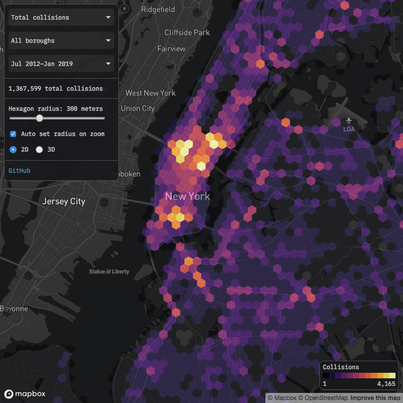
Click here to view map in full screen or on a mobile device
Note that the raw data does not identify each collision with pinpoint accuracy, rather collisions are typically rounded to the nearest intersection, which makes some areas look artificially better or worse than they really are. For example, there are a number of collisions at both ends of the Verrazzano Bridge, but apparently none in between. In reality those collisions are likely spread more evenly across the bridge’s span, but the dataset rounds them to either the Brooklyn or Staten Island base.
Dangerous areas
The map shows the areas with the most injuries and fatalities, but I’m hesitant to use the phrase “most dangerous”, as the collisions data does not tell us how many motorists, cyclists, and pedestrians traveled through each area without injury. For example, more pedestrians are injured by motor vehicles in Times Square than in any other area, but Times Square probably has the most total pedestrians, so it’s possible that “pedestrian injuries per mile walked” is higher elsewhere. It might make for interesting further analysis to estimate total vehicle, bicycle, and pedestrian travel in each area, then attempt to calculate the areas with the highest probability of injury or fatality per unit of distance traveled.
Cyclist injuries
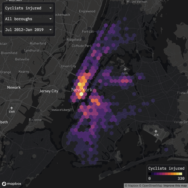
Delancey Street on Manhattan’s Lower East Side accounts for the most cyclist injuries of any area. In November 2018, the city installed a new protected bike lane from the Williamsburg Bridge to Chrystie Street, and it will be interesting to see how effective it is in reducing future cyclist injuries. If the L train shutdown—in whatever form it ends up taking—causes more people to bike across the bridge, accidents and injuries might well increase, so as noted above, it will be important to adjust for total usage. The Manhattan base of the Queensboro Bridge also accounts for a significant number of cyclist injuries, and much like at the Williamsburg Bridge, there is an attempt underway to improve cycling conditions.
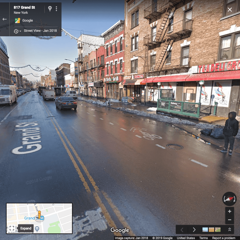
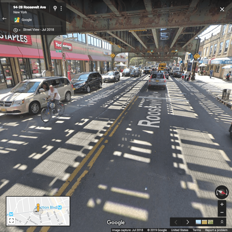
In Brooklyn, the areas with the most cyclist injuries include Grand Street between Union and Bushwick avenues in Williamsburg, and the section of Tillary Street between Adams and Jay streets downtown. In Queens, stretches of Roosevelt Avenue in Jackson Heights appear particularly dangerous. From Google Maps it appears that none of these three outer borough areas had fully protected bike lanes historically, though at least Grand Street’s bike lane was improved somewhat in the fall of 2018.
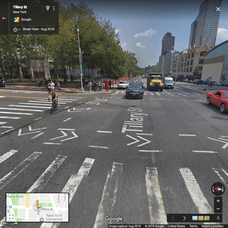
Google Street View illustrates some of the challenges cyclists face in these areas, including cars parked in bike lanes:
Tillary & Jay streets, Brooklyn
While I was working on this post, I happened to walk by Tillary & Jay streets one evening with some friends, one of whom captured this video of cyclists contending with a double-decker tour bus:
Video: Edwin Morris
Grand Street & Bushwick Avenue, Brooklyn
Roosevelt Avenue & 94th Street, Queens
I did not do any extensive investigation of the relationship between bike lanes and cyclist injuries, but it would make for interesting further analysis. The Department of Transportation publishes a city bike map along with a shapefile, and provides lists of active and past projects dedicated to bicycle safety, all of which could potentially be used to better understand the relationship between bike lane development and cyclist safety. At a minimum, it’s good to see that some of the areas with the most cyclist injuries have already been targeted for bike lane improvements.
Pedestrian injuries
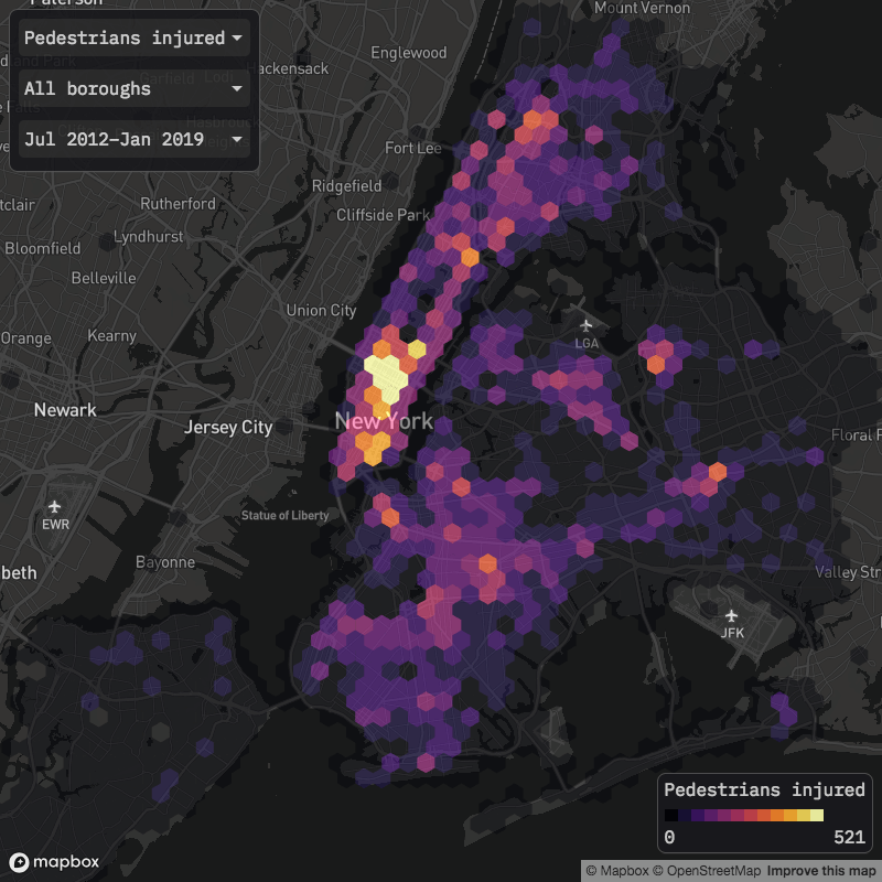
As mentioned earlier, Times Square accounts for the most pedestrian injuries. Beyond Times Square and the Manhattan central business district more broadly, it looks like there might be a correlation between public transportation stations and pedestrian injuries. Outside of central Manhattan, several of the areas with the most pedestrian injuries are located near subway or rail stations, including:
- Lexington Avenue & E 125th Street in Harlem, Manhattan (4/5/6 trains)
- Eastern Parkway & Utica Avenue in Crown Heights, Brooklyn (3/4/5 trains)
- Atlantic & Nostrand avenues in Bed–Stuy, Brooklyn (Long Island Rail Road)
- Flushing Avenue & Broadway in South Williamsburg, Brooklyn (J/M trains)
- Roosevelt Avenue & Main Street in Flushing, Queens (7 train)
- Fordham Road & Jerome Avenue in the Bronx (4 train)
I’d imagine that areas immediately surrounding subway stops have some of the highest rates of foot traffic, so it could be simply that more pedestrians equals more injuries. Or maybe subway stops tend to be located on busier, wider roads that are more dangerous to cross. It would be interesting to know if there are particular subway stations that have high or low pedestrian collision rates compared to their total usage, and if so, what features might distinguish them from other stations.
Motorist injuries
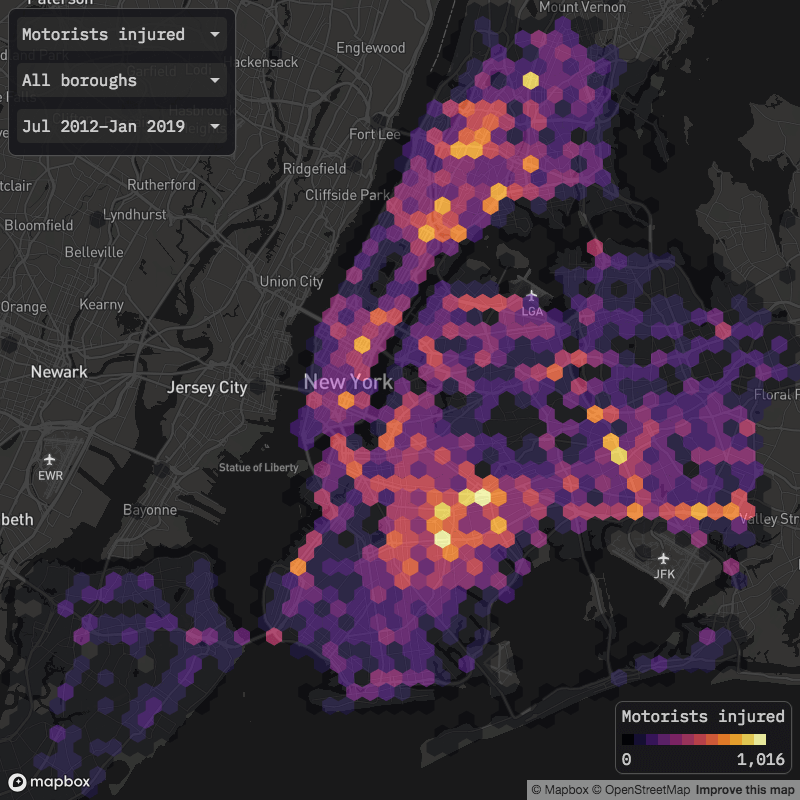
Motorist injuries are more geographically spread out than cyclist and pedestrian injuries, I would guess due to more vehicle travel at higher speeds in the outer boroughs compared to Manhattan. Highways look to account for many of the areas with the most motorist injuries: in the Bronx, sections of the Cross Bronx Expressway and Bronx River Parkway, along with the Van Wyck Expressway and Belt Parkway in Queens, and the western terminus of the Jackie Robinson Parkway in Brooklyn.
Trends by borough and neighborhood
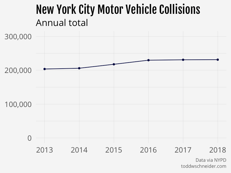
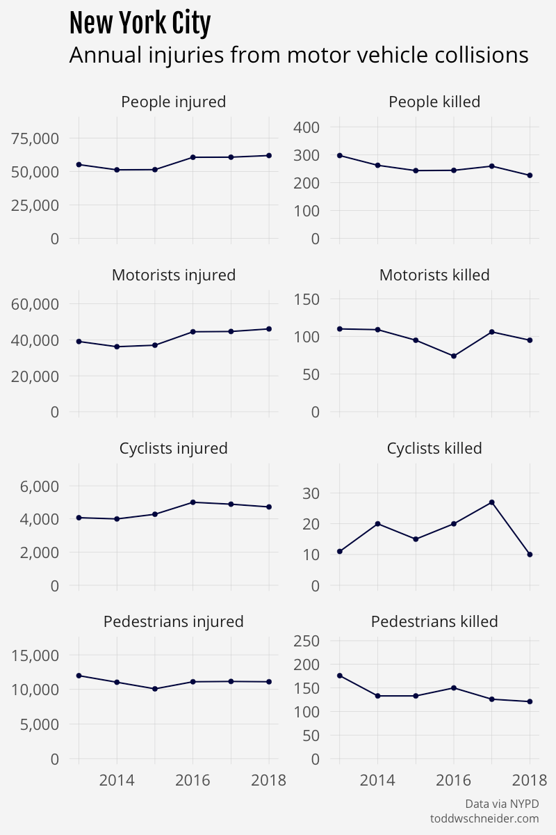
The city’s Vision Zero plan has the stated goal of eliminating all traffic deaths by the year 2024, and in general, traffic fatalities have been declining since 2012. One piece of confusion: the city recently announced that there were 200 traffic deaths city-wide in 2018, but the NYPD dataset reports 226 deaths in 2018. I’m not sure why those numbers are so different, but either way the trend still points toward decreasing fatalities.
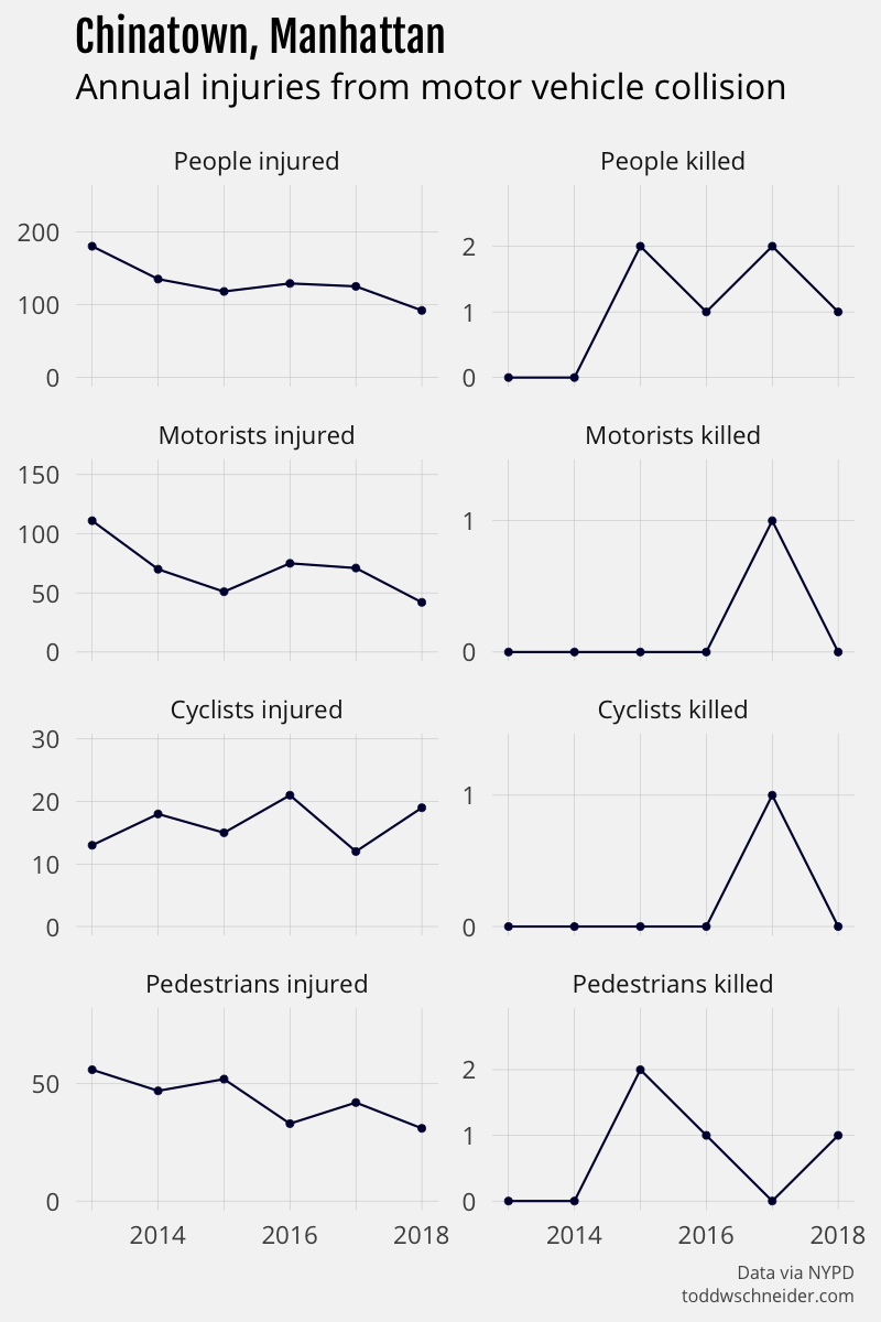
The number of injuries per year has increased, though, and there are individual neighborhoods that have seen improving or worsening trends. To cherry-pick a few examples: Union Square, Chinatown, and East Harlem have seen some of the bigger reductions in injuries since 2012, while University Heights, Mott Haven, and East New York have seen injuries increase.
You can view trends city-wide, by borough, or by neighborhood (map) using the inputs below:
Note that the borough totals won’t necessarily add up to the city-wide total because about 5% of collisions are missing location data. The earlier data is more likely to be missing location data, which means that the graphs by borough are probably slightly pessimistic, and in reality the earlier years have a few more collisions and injuries relative to the recent years than otherwise stated. See this spreadsheet for a table of counts by borough and year, including collisions with unknown geography.
Contributing factors, vehicle types, and further work
I’ve already noted a few potential topics for future work: population-adjusted collision rates and the impact of bike lanes/subway stations, but the dataset could be useful for many other analyses. Especially in the context of my previous post about taxi and Citi Bike travel times, I wonder about the relationship between increasing road congestion, slower average vehicle speeds, and fewer traffic-related fatalities.
Collisions are most common during daytime hours, when congestion is at its worst, but the likelihood of a collision resulting in an injury or fatality is highest during the late night/early morning hours. The dataset does not include detailed information about speed at the time of collision, but it seems likely that vehicles would be traveling faster at off-peak hours when there is less traffic. Darkness could also be an important factor, with differing effects on each of motorists, cyclists, and pedestrians.
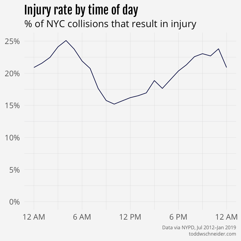
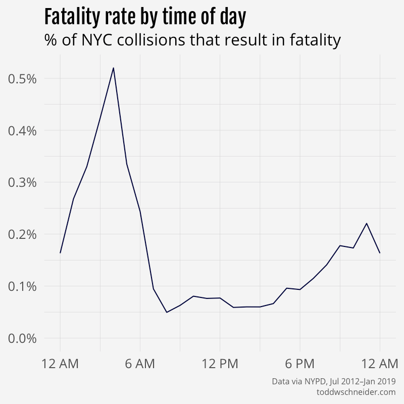
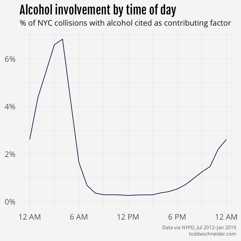
The fatality rate is highest at 4 AM, which is last call for alcohol at NYC bars. The dataset includes contributing factors for each collision—albeit in a somewhat messy format—and sure enough the percentage of collisions involving alcohol also spikes at 4 AM:
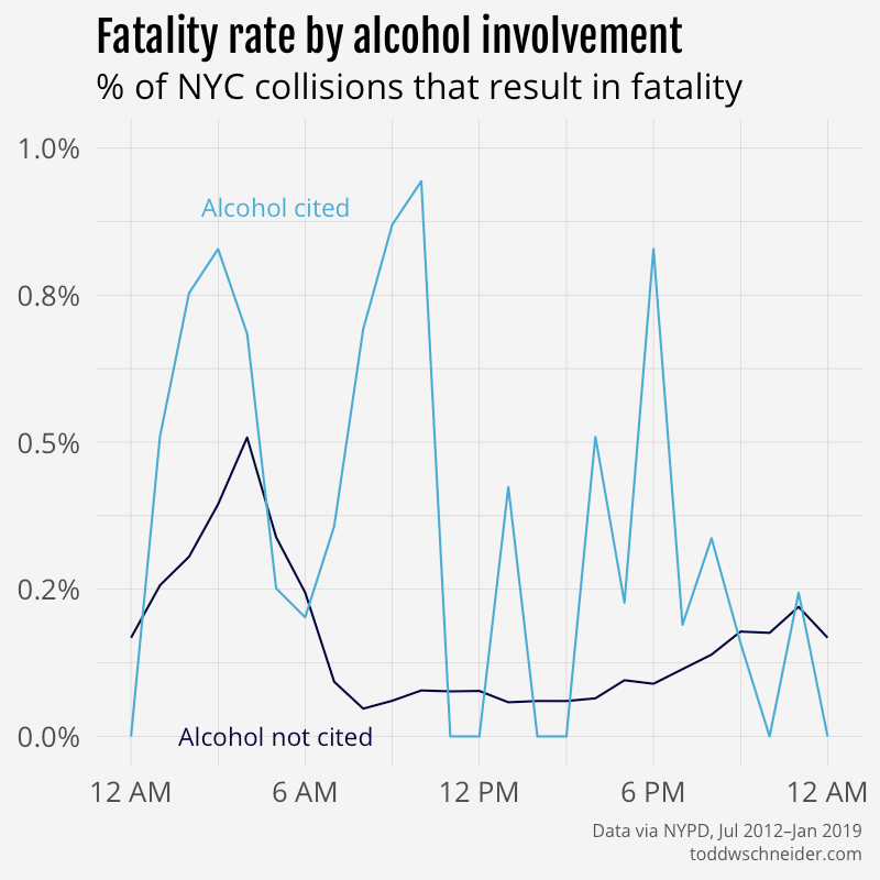
Among collisions where alcohol is cited as a contributing factor, 30% result in an injury and 0.4% result in a fatality, compared to 19% and 0.1%, respectively, for collisions where alcohol is not cited. Many “correlation does not imply causation” caveats apply, including that alcohol involvement might be correlated with other factors that impact likelihood of injury, or there could be a bias in reporting alcohol as a factor given that the collision resulted in an injury or fatality.
I experimented a bit with regularized logistic regressions to model probability of injury and fatality as a function of several variables, including time of day, street type (avenue, street, highway, etc.), contributing factors, vehicle types, and more. The models consistently report a positive association between alcohol involvement and likelihood of injury and fatality, though in both cases the effect is not as strong as other factors like “unsafe speed” and “traffic control disregarded”. The model reports that collisions involving bicycles are the most likely to result in injuries, while collisions involving motorcycles are the most likely to result in fatalities. It will be interesting to see what happens if new vehicle types like electric scooters gain more widespread adoption.
Again the regression model cannot prove causation, but it’s still interesting to see which factors are most associated with injuries. The relevant code is available here on GitHub if you want to poke around more.
Population growth, gentrification, Citi Bike’s expansion, and various other traffic control mechanisms (speed limits, crosswalks, traffic lights, etc.) all come to mind as possible areas for further study, and kudos to the City of New York for making so much of the data publicly available.
Technical notes, code on GitHub
The code used to collect and process the collisions data is available here on GitHub.
The interactive map is built with deck.gl and Mapbox.
The map embedded and linked in this post uses pre-aggregated data, which helps performance, but limits the number of filters available. If you want to go a bit deeper, there is a similar version of the map available here that aggregates on the fly, and therefore allows a few extra filters: time of day, number of vehicles involved, and injury status. Note though that this “on the fly” version is much slower to load, and likely will not work on mobile devices.