The NBA’s Stats API provides data for every single shot attempted during an NBA game since 1996, including location coordinates on the court. I built a tool called BallR, using R’s Shiny framework, to explore NBA shot data at the player-level.
BallR lets you select a player and season, then creates a customizable chart that shows shot patterns across the court. Additionally, it calculates aggregate statistics like field goal percentage and points per shot attempt, and compares the selected player to league averages at different areas of the court.
Update April 2017: for some reason the NBA Stats API is not working with my hosted version of the app. The app still works if you run it locally, see instructions below.
Run the App Locally
It’s very easy to run the app on your own computer, all you have to do is paste the following lines into an R console:
1 2 3 4 | |
Chart Types
BallR lets you choose from 3 primary chart types: hexagonal, scatter, and heat map. You can toggle between them using the radio buttons in the app’s sidebar.
Hexagonal
Hexagonal charts, popularized by Kirk Goldsberry at Grantland, group shots into hexagonal regions, then calculate aggregate statistics within each hexagon. Hexagon sizes and opacities are proportional to the number of shots taken within each hexagon, while the color scale represents a metric of your choice, which can be one of:
- FG%
- FG% vs. league average
- Points per shot
For example, here’s Stephen Curry’s FG% relative to the league average within each region of the court during the 2015–16 season:
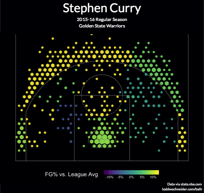
The chart confirms the obvious: Stephen Curry is a great shooter. His 3-point field goal percentage is more than 11 percentage points above the league average, and he also scores more efficiently than average when closer to the basket.
Compare to another all-time great, Kobe Bryant, who has been shooting poorly this season:
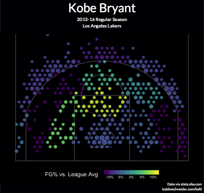
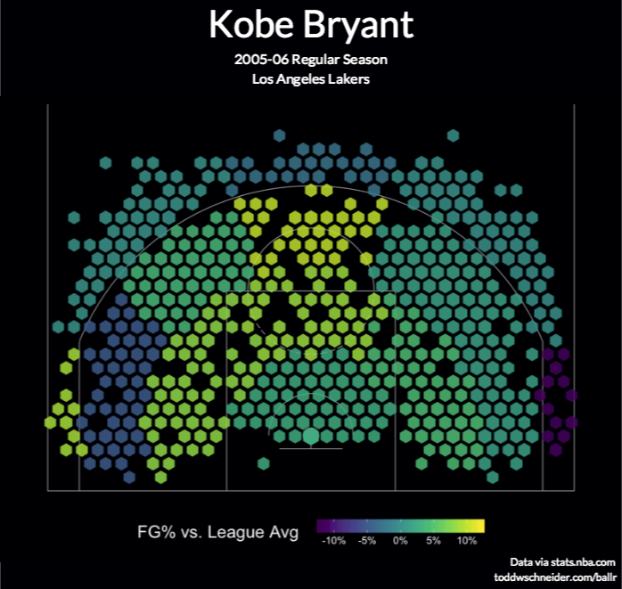
Kobe’s shot chart shows that he’s shooting below the league average from most areas of the court, especially 3-point range (Kobe’s 2005–06 shot chart, on the other hand, looks much nicer).
Scatter
Scatter charts are the most straightforward option: they plot each shot as a single point, color-coding for whether the shot was made or missed. Here’s an example again for Stephen Curry:

Heat Maps
Heat maps use two-dimensional kernel density estimation to show the distribution of a player’s shot attempts across the court.
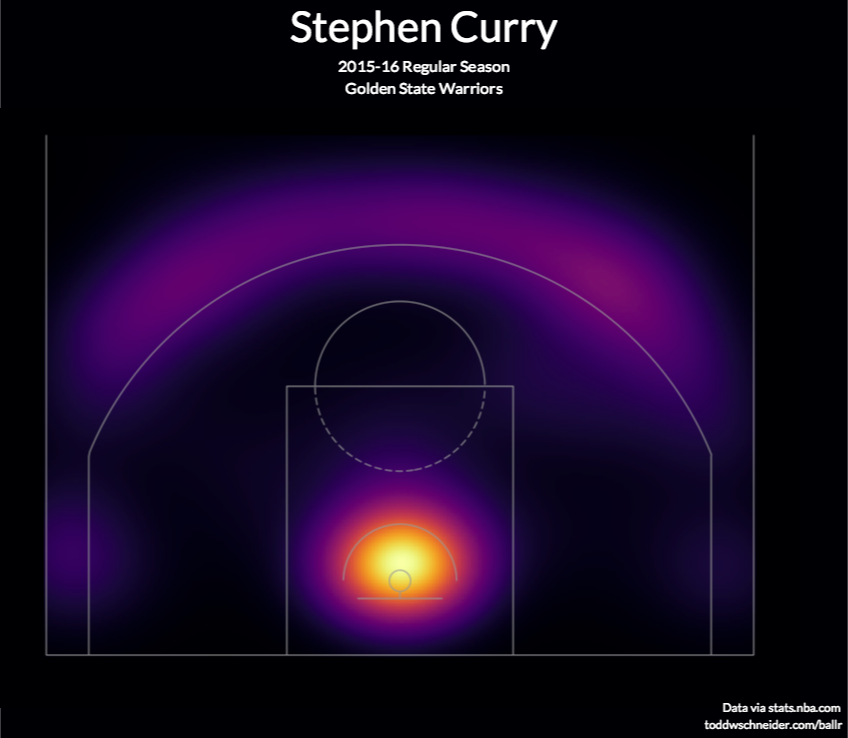
Anecdotally I’ve found that heat maps often show that most shot attempts are taken in the restricted area near the basket, even for players you might think of as outside shooters. BallR lets you apply filter to focus on specific areas of the court, and it’s sometimes more interesting to filter out restricted area shots when generating heat maps. For example here’s the heat map of Stephen Curry’s shot attempts excluding shots from within the restricted area (see here for Curry’s unfiltered heat map):
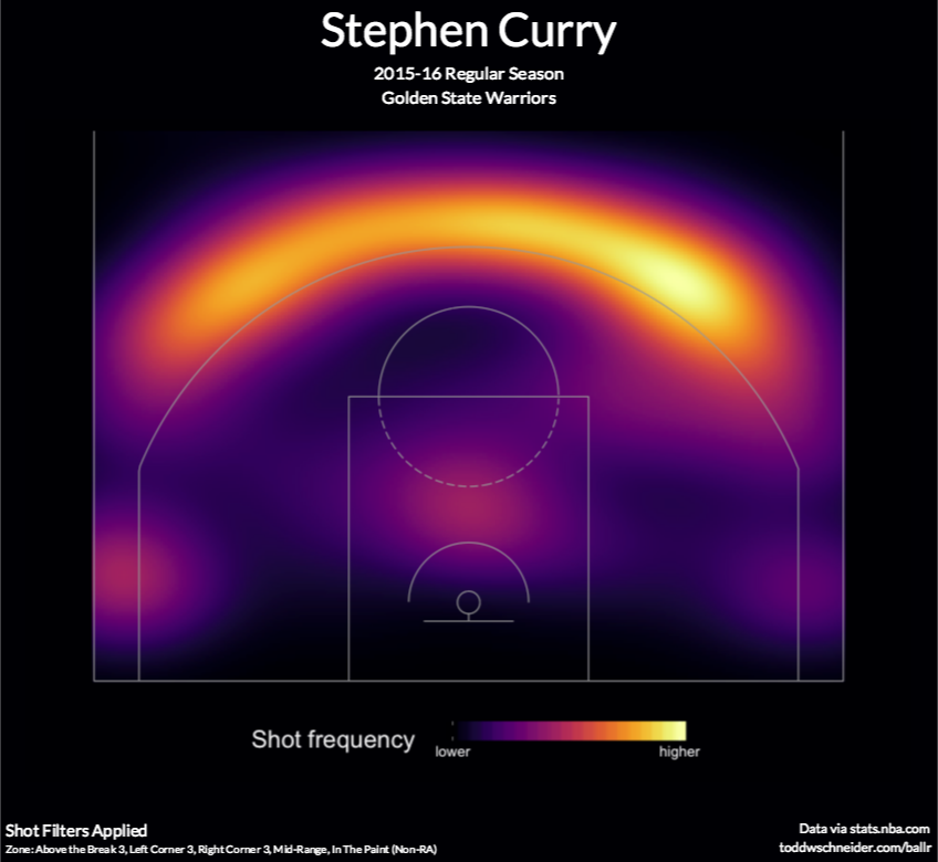
The heat map shows that—at least when he’s not shooting from the restricted area—Curry attempts most of his shots from the “Above the break 3” zone, with a slight bias to right side of that area (confusingly, that’s his left, but the NBA Stats API calls it the “Right Center” of the court)
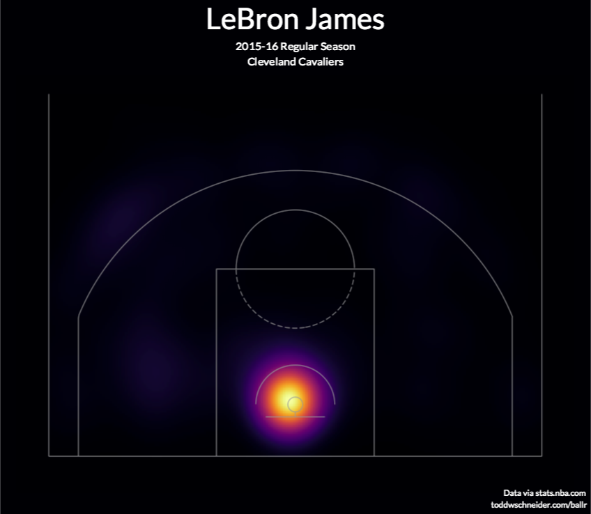
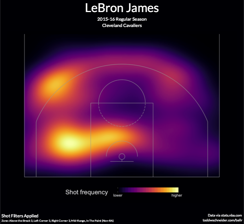
LeBron James even more heavily shoots from the restricted area, but when we filter out those shots, we see his favorite area is mid-range to his right:
Historical Analysis
I was curious if this pattern of LeBron favoring his right side has always been so pronounced, so I took all 19,000+ regular season shots he’s attempted in his career since 2003, and calculated the percentage that came from the left, right, and center of the court in each season:
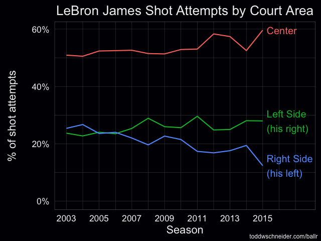
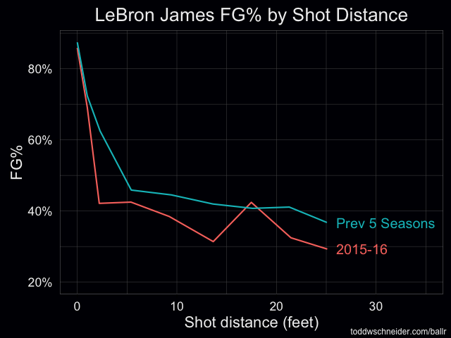
It’s a bit confusing because what the NBA Stats API calls the “right” side of the court is actually the left side of the court from LeBron’s perspective, but the data shows that in 2015–16, LeBron has taken significantly fewer shots from his left compared to previous seasons. The data also confirms that LeBron’s shooting performance in 2015–16 has been below his historical average from almost every distance:
The BallR app doesn’t currently have a good way to do these historical analyses on-demand, so I had to write additional R scripts, but a potential future improvement might be to create a backend that caches the shot data and exposes additional endpoints that aggregate data across seasons, teams, or maybe even the whole league.
Limitations of Shot Charts
There’s a ton of data not captured in shot charts, and it’s easy to draw unjustified conclusions when looking only at shot attempts and results. For example, you might look at a shot chart and think, “well, points per shot is highest in the restricted area, so teams should take more shots in the restricted area.”
You might even be right, but shot charts definitely don’t prove it. Passing or dribbling the ball into the restricted area probably increases the risk of a turnover, and that risk might more than offset the increase in field goal percentage compared to a longer shot, though we don’t know that based on shot charts alone.
Shot charts also don’t tell us anything about:
- Locations of the nearest defenders
- Probability of an offensive rebound after a miss
- Probability that the shooter will get fouled
- Next-best options at the time of the shot: was another player open for a higher value shot?
- Game context: a high percentage 2-point shot is useless at the buzzer if you’re down by 3
I’d imagine that NBA analysts try to quantify all of these factors and more when analyzing decision-making, and the NBA Stats API probably even provides some helpful data at various other undocumented endpoints. It could make for another area of future improvement to incorporate whatever additional data exists into the charts.
Code on GitHub
The BallR code is all open-source, if you’d like to contribute or just take a closer look, head over to the GitHub repo.
Acknowledgments
Posts by Savvas Tjortjoglou and Eduardo Maia about making NBA shot charts in Python and R, respectively, served as useful resources. Many of Kirk Goldsberry’s charts on Grantland also served as inspiration.