Note: this post was originally written in November 2015, and was expanded with updates in September 2016 and March 2018. There is also a dashboard available here that updates monthly with the latest taxi, Uber, and Lyft aggregate stats.
The New York City Taxi & Limousine Commission has released a staggeringly detailed historical dataset covering over 1.1 billion individual taxi trips in the city from January 2009 through June 2015. Taken as a whole, the detailed trip-level data is more than just a vast list of taxi pickup and drop off coordinates: it’s a story of New York. How bad is the rush hour traffic from Midtown to JFK? Where does the Bridge and Tunnel crowd hang out on Saturday nights? What time do investment bankers get to work? How has Uber changed the landscape for taxis? And could Bruce Willis and Samuel L. Jackson have made it from 72nd and Broadway to Wall Street in less than 30 minutes? The dataset addresses all of these questions and many more.
I mapped the coordinates of every trip to local census tracts and neighborhoods, then set about in an attempt to extract stories and meaning from the data. This post covers a lot, but for those who want to pursue more analysis on their own: everything in this post—the data, software, and code—is freely available. Full instructions to download and analyze the data for yourself are available on GitHub.
Table of Contents
- Maps
- The Data
- Borough Trends, and the Rise of Uber
- Airport Traffic
- On the Realism of Die Hard 3
- How Does Weather Affect Taxi and Uber Ridership?
- NYC Late Night Taxi Index
- The Bridge and Tunnel Crowd
- Northside Williamsburg
- Privacy Concerns
- Investment Bankers
- Parting Thoughts
- 2016 Update
- 2017 Update
Maps
I’m certainly not the first person to use the public taxi data to make maps, but I hadn’t previously seen a map that includes the entire dataset of pickups and drop offs since 2009 for both yellow and green taxis. You can click the maps to view high resolution versions:


These maps show every taxi pickup and drop off, respectively, in New York City from 2009–2015. The maps are made up of tiny dots, where brighter regions indicate more taxi activity. The green tinted regions represent activity by green boro taxis, which can only pick up passengers in upper Manhattan and the outer boroughs. Notice how pickups are more heavily concentrated in Manhattan, while drop offs extend further into the outer boroughs.
If you think these are pretty, I recommend checking out the high resolution images of pickups and drop offs.
NYC Taxi Data
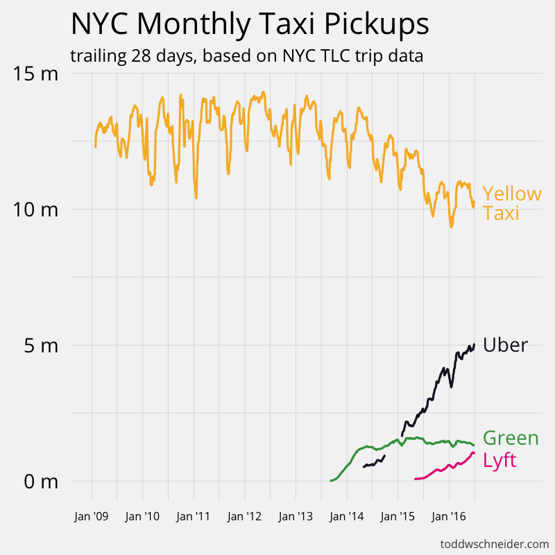
The official TLC trip record dataset contains data for over 1.1 billion taxi trips from January 2009 through June 2015, covering both yellow and green taxis. Each individual trip record contains precise location coordinates for where the trip started and ended, timestamps for when the trip started and ended, plus a few other variables including fare amount, payment method, and distance traveled.
I used PostgreSQL to store the data and PostGIS to perform geographic calculations, including the heavy lifting of mapping latitude/longitude coordinates to NYC census tracts and neighborhoods. The full dataset takes up 267 GB on disk, before adding any indexes. For more detailed information on the database schema and geographic calculations, take a look at the GitHub repository.
Uber Data
Thanks to the folks at FiveThirtyEight, there is also some publicly available data covering nearly 19 million Uber rides in NYC from April–September 2014 and January–June 2015, which I’ve incorporated into the dataset. The Uber data is not as detailed as the taxi data, in particular Uber provides time and location for pickups only, not drop offs, but I wanted to provide a unified dataset including all available taxi and Uber data. Each trip in the dataset has a cab_type_id, which indicates whether the trip was in a yellow taxi, green taxi, or Uber car.
Borough Trends, and the Rise of Uber
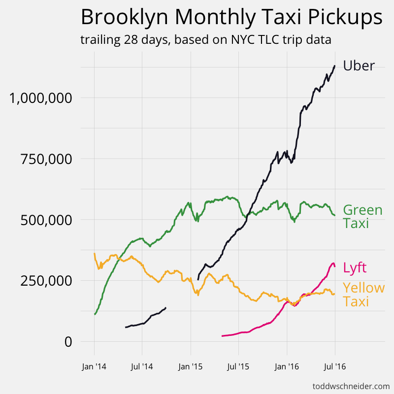
The introduction of the green boro taxi program in August 2013 dramatically increased the amount of taxi activity in the outer boroughs. Here’s a graph of taxi pickups in Brooklyn, the most populous borough, split by cab type:
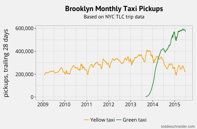
From 2009–2013, a period during which migration from Manhattan to Brooklyn generally increased, yellow taxis nearly doubled the number of pickups they made in Brooklyn.
Once boro taxis appeared on the scene, though, the green taxis quickly overtook yellow taxis so that as of June 2015, green taxis accounted for 70% of Brooklyn’s 850,000 monthly taxi pickups, while yellow taxis have decreased Brooklyn pickups back to their 2009 rate. Yellow taxis still account for more drop offs in Brooklyn, since many people continue to take taxis from Manhattan to Brooklyn, but even in drop offs, the green taxis are closing the gap.
Let’s add Uber into the mix. I live in Brooklyn, and although I sometimes take taxis, an anecdotal review of my credit card statements suggests that I take about four times as many Ubers as I do taxis. It turns out I’m not alone: between June 2014 and June 2015, the number of Uber pickups in Brooklyn grew by 525%! As of June 2015, the most recent data available when I wrote this, Uber accounts for more than twice as many pickups in Brooklyn compared to yellow taxis, and is rapidly approaching the popularity of green taxis:
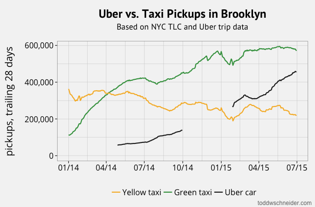
Note that Uber data is only available from Apr 2014–Sep 2014, then from Jan 2015–Jun 2015, hence the gap in the graph
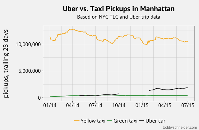
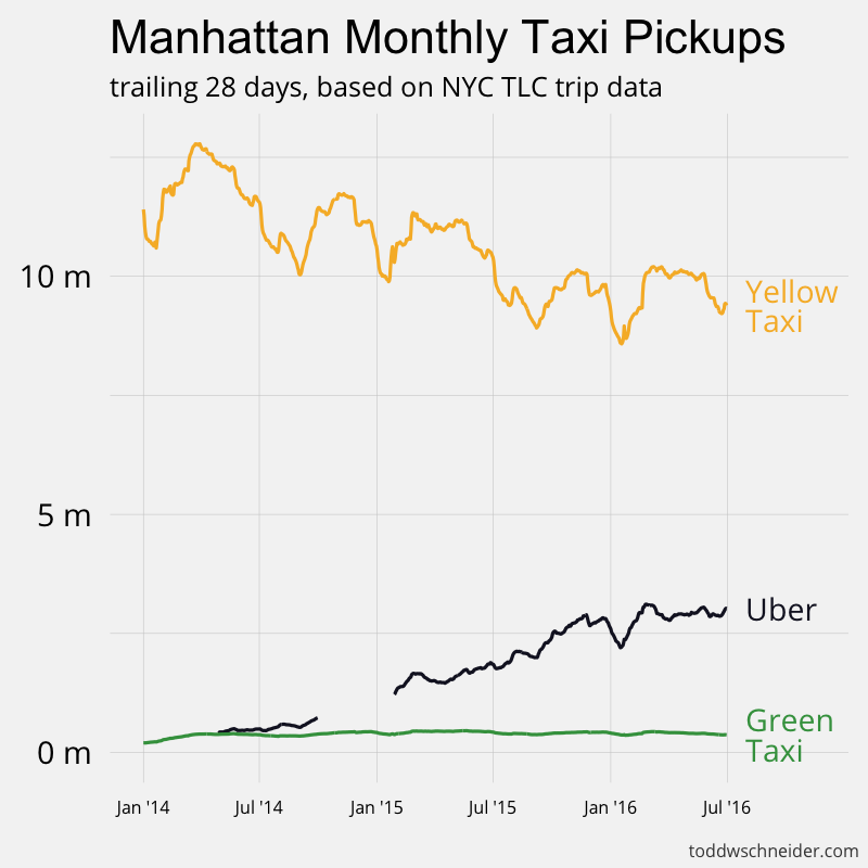
Manhattan, not surprisingly, accounts for by far the largest number of taxi pickups of any borough. In any given month, around 85% of all NYC taxi pickups occur in Manhattan, and most of those are made by yellow taxis. Even though green taxis are allowed to operate in upper Manhattan, they account for barely a fraction of yellow taxi activity:

Uber has grown dramatically in Manhattan as well, notching a 275% increase in pickups from June 2014 to June 2015, while taxi pickups declined by 9% over the same period. Uber made 1.4 million more Manhattan pickups in June 2015 than it did in June 2014, while taxis made 1.1 million fewer pickups. However, even though Uber picked up nearly 2 million Manhattan passengers in June 2015, Uber still accounts for less than 15% of total Manhattan pickups:
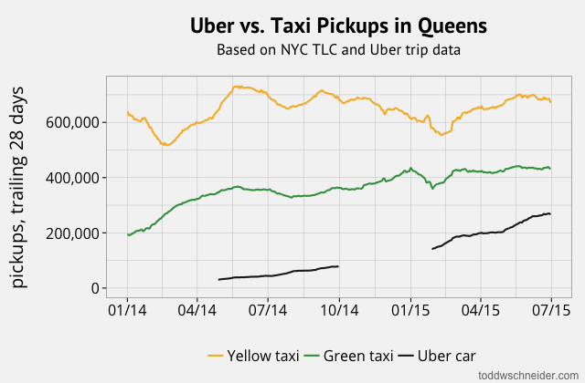
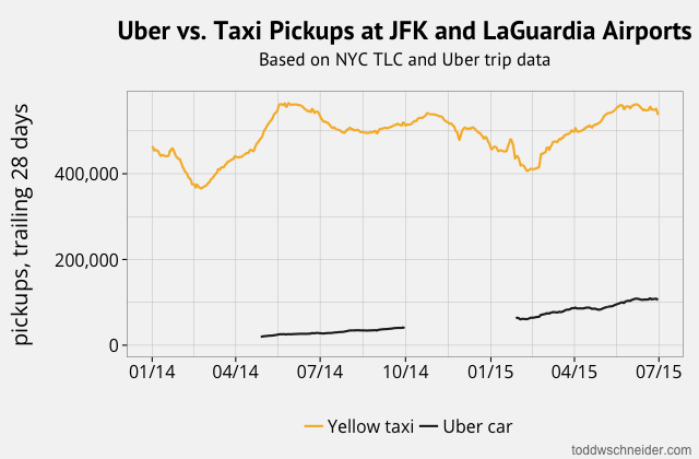
Queens still has more yellow taxi pickups than green taxi pickups, but that’s entirely because LaGuardia and JFK airports are both in Queens, and they are heavily served by yellow taxis. And although Uber has experienced nearly Brooklyn-like growth in Queens, it still lags behind yellow and green taxis, though again the yellow taxis are heavily influenced by airport pickups:
If we restrict to pickups at LaGuardia and JFK Airports, we can see that Uber has grown to over 100,000 monthly pickups, but yellow cabs still shuttle over 80% of car-hailing airport passengers back into the city:
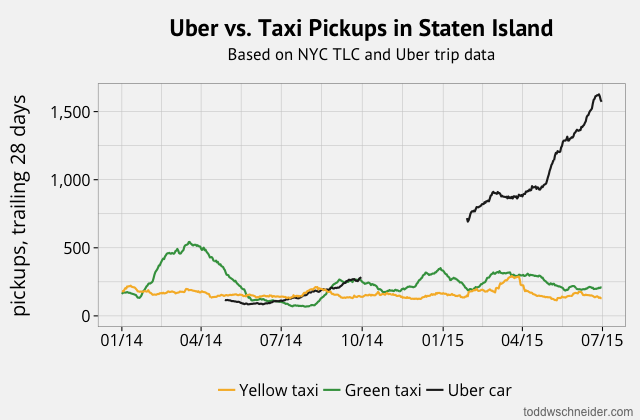
The Bronx and Staten Island have significantly lower taxi volume, but you can see graphs for both on GitHub. The most noteworthy observations are that almost no yellow taxis venture to the Bronx, and Uber is already more popular than taxis on Staten Island.
How Long does it Take to Get to an NYC Airport?
Most of these vehicles [heading to JFK Airport] would undoubtedly be using the Van Wyck Expressway; Moses’s stated purpose in proposing it was to provide a direct route to the airport from mid-Manhattan. But the Van Wyck Expressway was designed to carry—under “optimum” conditions (good weather, no accidents or other delays)—2,630 vehicles per hour. Even if the only traffic using the Van Wyck was JFK traffic, the expressway’s capacity would not be sufficient to handle it.
[…] The air age was just beginning: air traffic was obviously going to boom to immense dimensions. If the Van Wyck expressway could not come anywhere near handling JFK’s traffic when that traffic was 10,000 persons per hour, what was going to happen when that traffic increased to 15,000 persons per hour? To 20,000?
—Robert Caro, The Power Broker: Robert Moses and the Fall of New York (1974)
A subject near and dear to all New Yorkers’ hearts: how far in advance do you have to hail a cab in order to make your flight at one of the three area airports? Of course, this depends on many factors: is there bad rush hour traffic? Is the UN in session? Will your cab driver know a “secret” shortcut to avoid the day’s inevitable bottleneck on the Van Wyck?
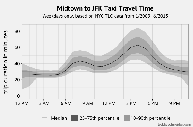
I took all weekday taxi trips to the airports and calculated the distribution of how long it took to travel from each neighborhood to the airports at each hour of the day. In most cases, the worst hour to travel to an airport is 4–5 PM. For example, the median taxi trip leaving Midtown headed for JFK Airport between 4 and 5 PM takes 64 minutes! 10% of trips during that hour take over 84 minutes—good luck making your flight in that case.
If you left Midtown heading for JFK between 10 and 11 AM, you’d face a median trip time of 38 minutes, with a 90% chance of getting there in less than 50 minutes. Google Maps estimates about an hour travel time on public transit from Bryant Park to JFK, so depending on the time of day and how close you are to a subway stop, your expected travel time might be better on public transit than in a cab, and you could save a bunch of money.
The stories are similar for traveling to LaGuardia and Newark airports, and from other neighborhoods. You can see the graphs for airport travel times from any neighborhood by selecting it in the dropdown below:

Travel time from Midtown, Manhattan to…
LaGuardia Airport

JFK Airport
Newark Airport

You can view airport graphs for other neighborhoods by selecting a neighborhood from the dropdown above.
Could Bruce Willis and Samuel L. Jackson have made it from the Upper West Side to Wall Street in 30 minutes?
Airports aren’t the only destinations that suffer from traffic congestion. In Die Hard: With a Vengeance, John McClane (Willis) and Zeus Carver (Jackson) have to make it from 72nd and Broadway to the Wall Street 2/3 subway station during morning rush hour in less than 30 minutes, or else a bomb will go off. They commandeer a taxi, drive it frantically through Central Park, tailgate an ambulance, and just barely make it in time (of course the bomb goes off anyway…). Thanks to the TLC’s publicly available data, we can finally address audience concerns about the realism of this sequence.
McClane and Carver leave the Upper West Side at 9:50 AM, so I took all taxi rides that:
- Picked up in the Upper West Side census tracts between West 70th and West 74th streets
- Dropped off in the downtown tract containing the Wall Street 2/3 subway stop
- Picked up on a weekday morning between 9:20 and 10:20 AM
And made a histogram of travel times:

There are 580 such taxi trips in the dataset, with a mean travel time of 29.8 minutes, and a median of 29 minutes. That means that half of such trips actually made it within the allotted time of 30 minutes! Now, our heroes might need a few minutes to commandeer a cab and get down to the subway platform on foot, so if we allot 3 minutes for those tasks and 27 minutes for driving, then only 39% of trips make it in 27 minutes or less. Still, in the movie they make it seem like a herculean task with almost zero probability of success, when in reality it’s just about average. This seems to be the rare action movie sequence which is actually easier to recreate in real life than in the movies!
How Does Weather Affect Taxi and Uber Ridership?
Since 2009, the days with the fewest city-wide taxi trips all have obvious relationships to the weather. The days with the fewest taxi trips were:
- Sunday, August 28, 2011, Hurricane Irene, 28,596 trips
- Monday, December 27, 2010, North American blizzard, 69,650 trips
- Monday, October 29, 2012, Hurricane Sandy, 111,605 trips
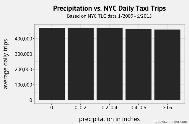
I downloaded daily Central Park weather data from the National Climatic Data Center, and joined it to the taxi data to see if we could learn anything else about the relationship between weather and taxi rides. There are lots of confounding variables, including seasonal trends, annual growth due to boro taxis, and whether weather events happen to fall on weekdays or weekends, but it would appear that snowfall has a significant negative impact on daily taxi ridership:
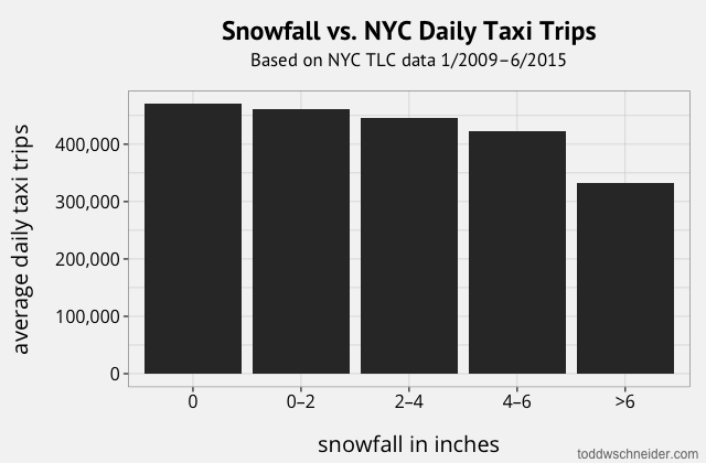
On the other hand, rain alone does not seem to affect total daily ridership:
Since Uber trip data is only available for a handful of months, it’s more difficult to measure the impact of weather on Uber ridership. Uber is well-known for its surge pricing during times of high demand, which often includes inclement weather. There were a handful of rainy and snowy days in the first half of 2015 when Uber data is available, so for each rain/snow day, I calculated the total number of trips made by taxis and Ubers, and compared that to each service’s daily average over the previous week. For example, Uber’s ratio of 69% on 1/26/15 means that there were 69% as many Uber trips made that day compared to Uber’s daily average from 1/19–1/25:
| Date | Snowfall in inches | Taxi trips vs. prev week | Uber trips vs. prev week |
|---|---|---|---|
| 1/26/15 | 5.5 | 55% | 69% |
| 1/27/15 | 4.3 | 33% | 41% |
| 2/2/15 | 5.0 | 91% | 107% |
| 3/1/15 | 4.8 | 85% | 88% |
| 3/5/15 | 7.5 | 83% | 100% |
| 3/20/15 | 4.5 | 105% | 134% |
| Date | Precipitation in inches | Taxi trips vs. prev week | Uber trips vs. prev week |
|---|---|---|---|
| 1/18/15 | 2.1 | 98% | 112% |
| 3/14/15 | 0.8 | 114% | 130% |
| 4/20/15 | 1.4 | 90% | 105% |
| 5/31/15 | 1.5 | 96% | 116% |
| 6/1/15 | 0.7 | 99% | 106% |
| 6/21/15 | 0.6 | 92% | 94% |
| 6/27/15 | 1.1 | 114% | 147% |
Although this data does not conclusively prove anything, on every single inclement weather day in 2015, in both rain and snow, Uber provided more trips relative to its previous week’s average than taxis did. Part of this is probably because the number of Uber cars is still growing, so all things held constant, we’d expect Uber to provide more trips on each successive day, while total taxi trips stay flat. But for Uber’s ratio to be higher every single day seems unlikely to be random chance, though again I have no justification to make any strong claims. Whether it’s surge pricing or something else, Uber’s capacity seems less negatively impacted by bad weather relative to taxi capacity.
NYC Late Night Taxi Index
Many real estate listings these days include information about the neighborhood: rankings of local schools, walkability scores, and types of local businesses. We can use the taxi data to draw some inferences about what parts of the city are popular for going out late at night by looking at the percentage of each census tract’s taxi pickups that occur between 10 PM and 5 AM—the time period I’ve deemed “late night.”
Some people want to live in a city that never sleeps, while others prefer their peace and quiet. According to the late night taxi index, if you’re looking for a neighborhood with vibrant nightlife, try Williamsburg, Greenpoint, or Bushwick in Brooklyn. The census tract with the highest late night taxi index is in East Williamsburg, where 76% of taxi pickups occur between 10 PM and 5 AM. If you insist on Manhattan, then your best bets are the Lower East Side or the Meatpacking District.
Conversely, if you want to avoid the nighttime commotion, head uptown to the Upper East or Upper West Side (if you’re not already there…). The stretch in the east 80s between 5th Avenue and Park Avenue has the lowest late night taxi index, with only 5% of all taxi pickups occurring during the nighttime hours.
Here’s a map of all census tracts that had at least 50,000 taxi pickups, where darker shading represents a higher score on the late night taxi index:

BK nights: 76% of the taxi pickups that occur in one of East Williamsburg’s census tracts happen between 10 PM and 5 AM, the highest rate in the city. A paltry 5% of taxi pickups in some Upper East Side tracts occur in the late night hours
Whither the Bridge and Tunnel Crowd?
The “bridge and tunnel” moniker applies, on a literal level, to anyone who travels onto the island of Manhattan via a bridge or tunnel, most often from New Jersey, Long Island, or the outer boroughs. Typically it’s considered an insult, though, with the emerging popularity of the outer boroughs, well, let’s just say the Times is on it.
In order to measure B&T destinations from the taxi data, I isolated all trips originating near Penn Station on Saturday evenings between 6 PM and midnight. Penn Station serves as the point of disembarkation for New Jersey Transit and Long Island Rail Road, so although not everyone hailing a taxi around Penn Station on a Saturday evening just took the train into the city, it should be at least a decent proxy for B&T trends. Here’s the map of the neighborhoods where these rides dropped off:
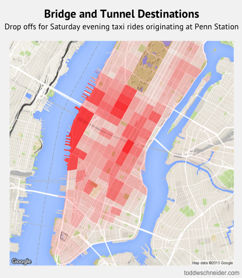
The most popular destinations for B&T trips are in Murray Hill, the Meatpacking District, Chelsea, and Midtown. We can even drill down to the individual trip level to see exactly where these trips wind up. Here’s a map of Murray Hill, the most popular B&T destination, where each dot represents a single Saturday evening taxi trip originating at Penn Station:
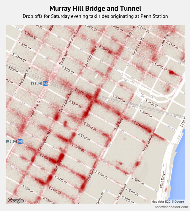
As reported, repeatedly, in the NYT, the heart of Murray Hill nightlife lies along 3rd Avenue, in particular the stretch from 32nd to 35th streets. Taxi data shows the plurality of Saturday evening taxi trips from Penn Station drop off in this area, with additional clusters in the high 20s on 3rd Avenue, further east along 34th Street, and a spot on East 39th Street between 1st and 2nd avenues. With a bit more work we might be able to reverse geocode these coordinates to actual bar names, perhaps putting a more scientific spin on this classic of the genre from Complex.
Northside Williamsburg
According to taxi activity, the most ascendant census tract in the entire city since 2009 lies on Williamsburg’s north side, bounded by North 14th St to the north, Berry St to the east, North 7th St to the south, and the East River to the west:

The Northside neighborhood is known for its nightlife: a full 72% of pickups occur during the late night hours. It’s difficult to compare 2009–2015 taxi growth across census tracts and boroughs because of the introduction of the green boro taxi program, but the Northside tract had a larger increase in total taxi pickups over that time period than any other tract in the city, with the exception of the airports:
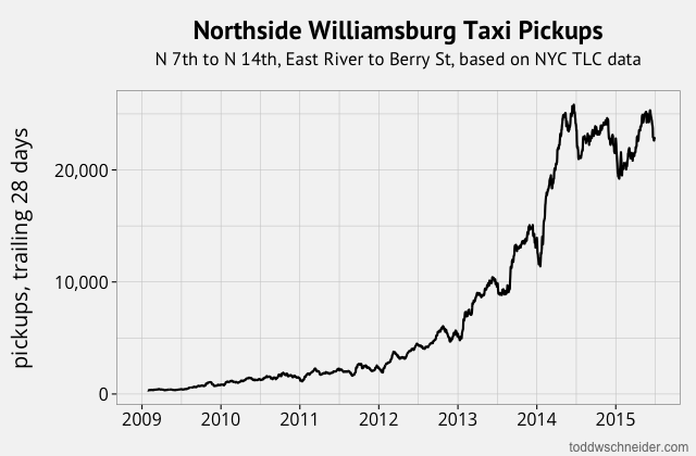
Even before the boro taxi program began in August 2013, Northside Williamsburg experienced a dramatic increase in taxi activity, growing from a mere 500 monthly pickups in June 2009, to 10,000 in June 2013, and 25,000 by June 2015. Let’s look at an animated map of taxi pickups to see if we can learn anything:
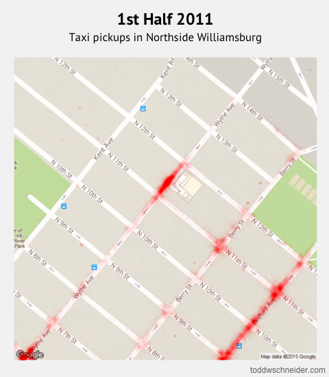
The cool thing about the animation is that it lets us pinpoint the exact locations of some of the more popular Northside businesses to open in the past few years, in particular along Wythe Avenue:
- May 2012: Wythe Hotel, Wythe and N 11th
- January 2013: Output nightclub, Wythe and N 12th
- March 2014: Verboten nightclub, N 11th between Wythe and Kent
Meanwhile, I’m sure the developers of the future William Vale and Hoxton hotels hope that the Northside’s inexorable rise continues, but at least according to taxi data, pickups have remained stable since mid-2014, perhaps indicating that the neighborhood’s popularity has plateaued?
Privacy Concerns, East Hampton Edition
The first time the TLC released public taxi data in 2013, following a FOIL request by Chris Whong, it included supposedly anonymized taxi medallion numbers for every trip. In fact it was possible to decode each trip’s actual medallion number, as described by Vijay Pandurangan. This led to many discussions about data privacy, and the TLC removed all information about medallion numbers from the more recent data releases.
But the data still contains precise latitude and longitude coordinates, which can potentially be used to determine where people live, work, socialize, and so on. This is all fun and games when we’re looking at the hottest new techno club in Northside Williamsburg, but when it’s people’s homes it gets a bit weird. NYC is of course very dense, and if you take a rush hour taxi ride from one populus area to another, say Grand Central Terminal to the Upper East Side, it’s unlikely that there’s anything unique about your trip that would let someone figure out where you live or work.
But what if you’re going somewhere a bit off the beaten path for taxis? In that case, your trip might well be unique, and it might reveal information about you. For example, I don’t know who owns one of theses beautiful oceanfront homes on East Hampton’s exclusive Further Lane (exact address redacted to protect the innocent):

But I do know the exact Brooklyn Heights location and time from which someone (not necessarily the owner) hailed a cab, rode 106.6 miles, and paid a $400 fare with a credit card, including a $110.50 tip. If the TLC truly wanted to remove potentially personal information, they would have to remove latitude and longitude coordinates from the dataset entirely. There’s a tension that public data is supposed to let people know how well the taxi system serves different parts of the city, so maybe the TLC should provide census tracts instead of coordinates, or perhaps only coordinates within busy parts of Manhattan, but providing coordinates that uniquely identify a rider’s home feels excessive.
Investment Bankers
While we’re on the topic of the Hamptons: we’ve already covered the hipsters of Williamsburg and the B&Ts of Murray Hill, why not see what the taxi data can tell us about investment bankers, yet another of New York’s distinctive subcultures?
Goldman Sachs lends itself nicely to analysis because its headquarters at 200 West Street has a dedicated driveway, just east of the path marked “Hudson River Greenway” on this Google Map:

We can isolate all taxi trips that dropped off in that driveway to get a sense of where Goldman Sachs employees—at least the ones who take taxis—come from in the mornings, and when they arrive. Here’s a histogram of weekday drop off times at 200 West Street:

The cabs start dropping off around 5 AM, then peak hours are 7–9 AM, before tapering off in the afternoon. Presumably most of the post-morning drop offs are visitors as opposed to employees. If we restrict to drop offs before 10 AM, the median drop off time is 7:59 AM, and 25% of drop offs happen before 7:08 AM.
A few blocks to the north is Citigroup’s headquarters at 388 Greenwich St, and although the building doesn’t appear to have a dedicated driveway the way Goldman does, we can still isolate taxis that drop off directly in front of the building to see what time Citigroup’s workers arrive in the morning:
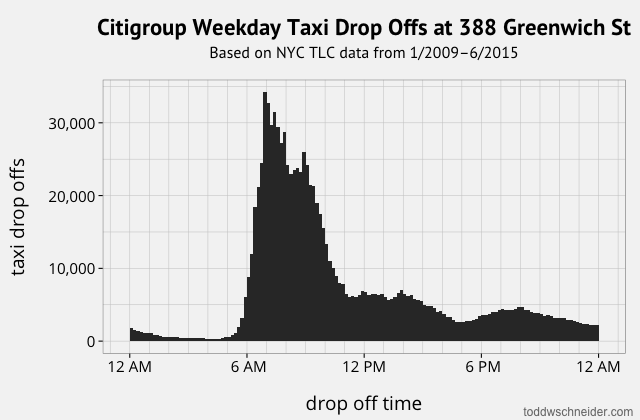
Some of the evening drop offs near Citigroup are probably for the bars and restaurants across the street, but again the morning drop offs are probably mostly Citigroup employees. Citigroup’s morning arrival stats are comparable to Goldman’s: a median arrival of 7:51 AM, and 25% of drop offs happen before 7:03 AM.
The top neighborhoods for taxi pickups that drop off at Goldman Sachs or Citigroup on weekday mornings are:
- West Village
- Chelsea-Flatiron-Union Square
- SoHo-Tribeca
So what’s the deal, do bankers not live above 14th St (or maybe 23rd St) anymore? Alas, there are still plenty of trips from the stodgier parts further uptown, and it’s certainly possible that people coming from uptown are more likely to take the subway, private cars, or other modes of transport, so the taxi data is by no means conclusive. But still, the cool kids have been living downtown for a while now, why should the bankers be any exception?
Parting Thoughts
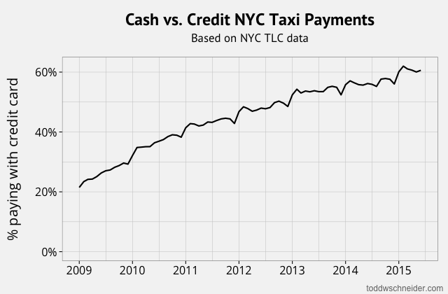
As I mentioned in the introduction, this post covers a lot. And even then, I feel like it barely scratches the surface of the information available in the full dataset. For example, did you know that in January 2009, just over 20% of taxi fares were paid with a credit card, but as of June 2015, that number has grown to over 60% of all fares?
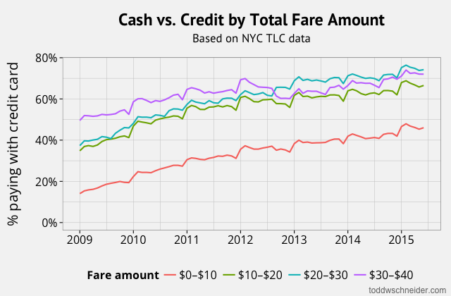
And for more expensive taxi trips, riders now pay via credit card more than 75% of the time:
There are endless analyses to be done, and more datasets that could be merged with the taxi data for further investigation. The Citi Bike program releases public ride data; I wonder if the introduction of a bike-share system had a material impact on taxi ridership? [Update: I did some analysis of the Citi Bike system, and also an analysis of when Citi Bikes are faster than taxis and vice versa] And maybe we could quantify fairweather fandom by measuring how taxi volume to Yankee Stadium and Citi Field fluctuates based on the Yankees’ and Mets’ records?
There are investors out there who use satellite imagery to make investment decisions, e.g. if there are lots of cars in a department store’s parking lots this holiday season, maybe it’s time to buy. You might be able to do something similar with the taxi data: is airline market share shifting, based on traffic through JetBlue’s terminal at JFK vs. Delta’s terminal at LaGuardia? Is demand for lumber at all correlated to how many people are loading up on IKEA furniture in Red Hook?
I’d imagine that people will continue to obtain Uber data via FOIL requests, so it will be interesting to see how that unfolds amidst increased tension with city government and constant media speculation about a possible IPO.
Lastly, I mentioned the “medium data revolution” in my previous post about Fannie Mae and Freddie Mac, and the same ethos applies here. Not too long ago, the idea of downloading, processing, and analyzing 267 GB of raw data containing 1.1 billion rows on a commodity laptop would have been almost laughably naive. Today, not only is it possible on a MacBook Air, but there are increasingly more open-source software tools available to aid in the process. I’m partial to PostgreSQL and R, but those are implementation details: increasingly, the limiting factor of data analysis is not computational horsepower, but human curiosity and creativity.
GitHub
If you’re interested in getting the data and doing your own analysis, or just want to read a bit about the more technical details, head over to the GitHub repository.
Update September 2016
The NYC Taxi & Limousine Commission has released an additional year of data, covering taxis, Uber, and other for-hire vehicle (FHV) trips through June 2016. The complete dataset now includes over 1.3 billion trips, and the GitHub repo has been updated to process everything, including the new FHV file formats.
In Brooklyn, Uber is now bigger than taxis
October 12, 2015 marked the first day that Uber made more pickups in Brooklyn than yellow and green taxis combined. As of June 2016, Uber makes 60% more pickups per day than taxis do, and the gap appears to be growing. Lyft has also surpassed yellow taxis in Brooklyn, but still makes fewer pickups than green boro taxis.
Taxis still rule Manhattan and the airports, for now
In Manhattan, taxis still make more than three times as many pickups per day than Ubers do. But taxi activity shrank by 10% from June 2015 to June 2016, while Uber grew by 63% over the same time period. That’s a 1.1 million trips per month loss for taxis, coupled with a 1.2 million trips per month increase for Uber.
Uber has also increased its share of pickups at LaGuardia and JFK airports. Uber’s airport pickups doubled in the past year while taxi activity remained flat, and Uber now makes 40% as many pickups at NYC airports compared to taxis.

Will Uber overtake taxis in New York City?
Uber’s growth rate in NYC is slowing, which is not terriby surprising since intuitively it should be harder for a company to grow as it serves a larger percentage of the population. That said, Uber’s NYC year-over-year growth was still +90% as of June 2016, down from +325% one year earlier.
Taxi losses accelerated slightly over the same time period: year-over-year pickups declined 10% as of June 2016, compared to a loss of 7% the year before.
If taxi trips average an 8% annual decline over the next two years, then Uber would have to average a 40% annual growth rate in order to equal taxi activity by June 2018.
If we consider ridesharing services as a group—specifically Uber, Lyft, Via, Juno, and Gett—then that aggregate cohort would have to average a 22% annual growth rate over the next two years, again assuming 8% annual taxi decline (note that Via, Juno, and Gett do not yet appear in the trip-level TLC data, but they do report aggregate trip counts).
There are enough unknowns—in particular, I wonder if ridesharing fares are unsustainably low due to intense competition—that it’s impossible to say if or when the lines will cross, but at least for now, the overall trend is unmistakable.
You can continue to see monthly live-updating TLC aggregate data here, and the open-source code to process and analyze everything is here.
Update March 2018
Ride-hailing’s NYC dominance, and the impact of #DeleteUber
It’s been 18 months since I last updated this post, and the dataset through December 2017 has grown to over 1.4 billion taxi trips and another 400 million for-hire vehicle trips, including ride-hailing apps Uber, Lyft, Juno, and Via.
The Taxi & Limousine Commission’s monthly aggregate reports have shown for some time that ride-hailing apps have surpassed taxis in total popularity, but the granular trip-level dataset paints a more complete picture, allowing us to explore geographic trends, and the fallout from the January 2017 protest at JFK airport and the ensuing #DeleteUber social media campaign.
The GitHub repository has been updated to process the latest data, including additional analysis scripts covering the contents of this update.
Ride-hailing apps are now 65% bigger than taxis in New York City
February 2017 marked the first month that ride-hailing services collectively made more trips than yellow and green taxis combined, and by December 2017, ride-hailing services made 65% more pickups than taxis did. The ride-hailing cohort now makes more pickups per month than taxis did in any month since the dataset began 2009.
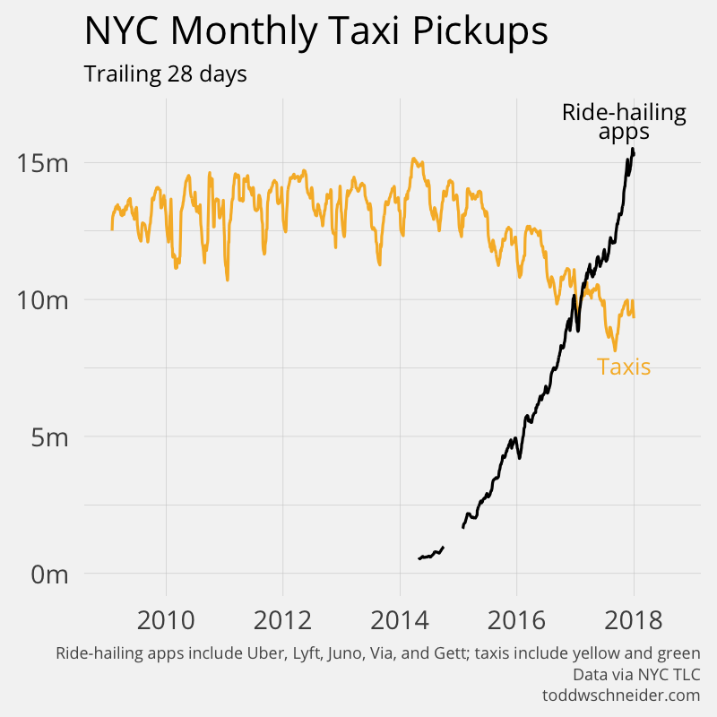
Uber alone is now bigger than yellow and green taxis combined, first achieving that milestone in November 2017.
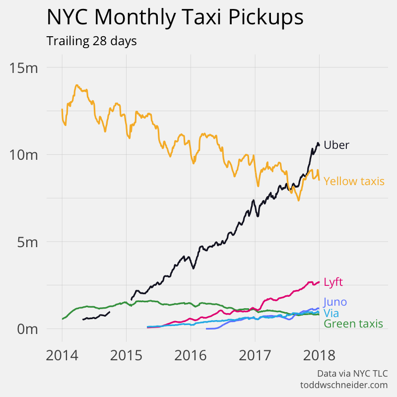
Over the past 4 years, ride-hailing apps have grown from 0 to 15 million trips per month, while taxi usage has only declined by around 5 million trips per month. The TLC dataset also contains some information about non-app FHVs, what you might call traditional “black cars”, whose usage has declined by just under 1 million trips per month since the end of 2015. It’s possible this net increase in taxi/FHV trips has been at least partially offset by a decline in private or other vehicle usage, but the TLC dataset doesn’t tell us anything about that.
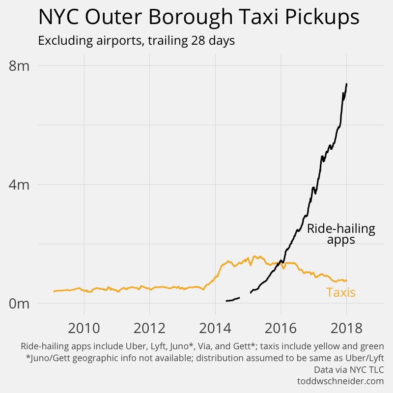
Ride-hailing apps are 10 times bigger than taxis in the outer boroughs
Ride-hailing services have been more popular than taxis in the outer boroughs since the beginning of 2016, but it’s still impressive to see how dramatically the gap has widened. In the outer boroughs, Uber and Lyft are each bigger than yellow and green taxis combined.
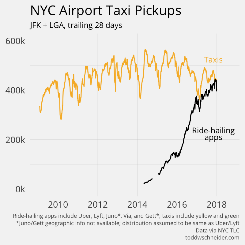
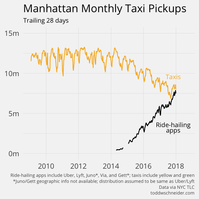
Taxis are losing their edge in Manhattan and at the airports
In fact there’s a very good chance that ride-hailing apps have already surpassed taxis in Manhattan as I write this in March 2018, but it’ll be a few more months before the data can confirm. A similar result holds at JFK and LaGuardia airports.
If we restrict to Manhattan south of 60th Street, the proposed congestion pricing zone in the Fix NYC plan, then ride-hailing services are already more popular than taxis. This surprised me; I would have guessed that ride-hailing’s Manhattan market share would be higher above 60th Street than below it, but it turns out that the Upper East Side is one of the areas with the highest taxi market share.
The #DeleteUber campaign probably had a noticeable, if short-lived, effect
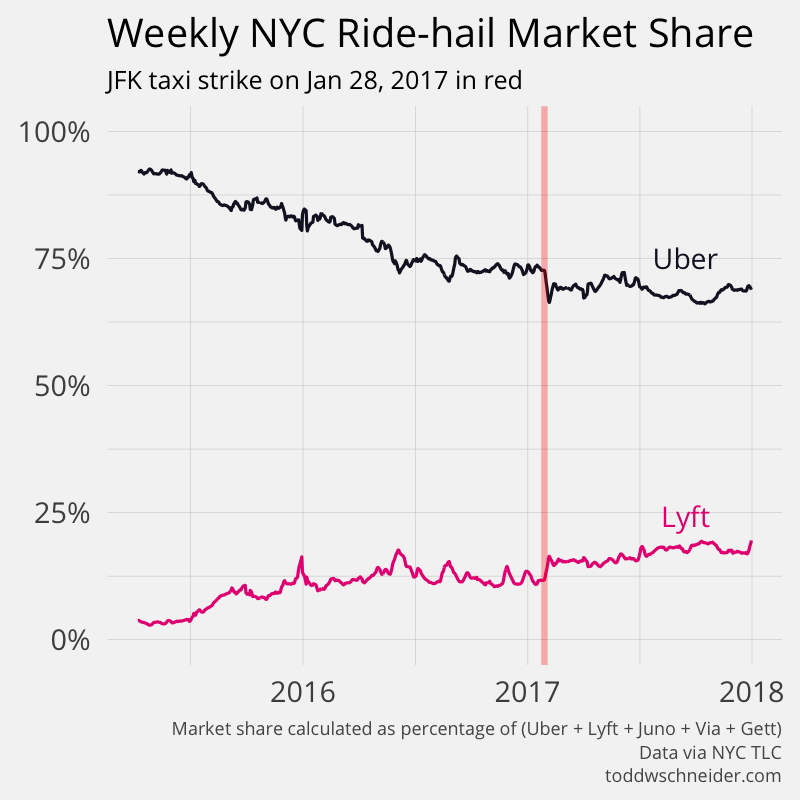
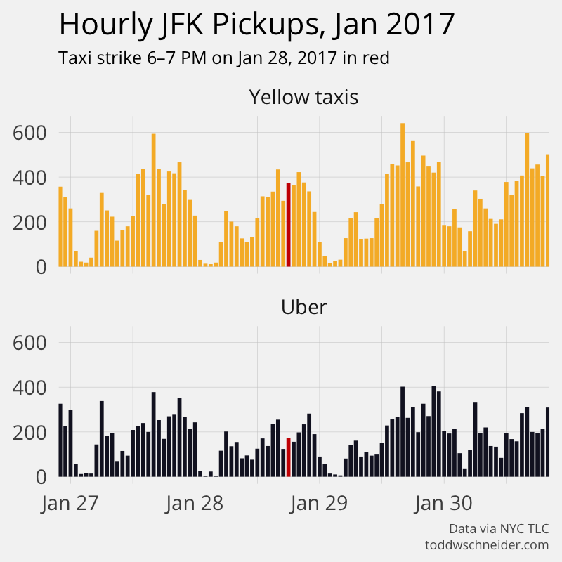
On January 28, 2017, the New York Taxi Workers Alliance called for a work stoppage at JFK airport from 6 PM to 7 PM as a protest against the Trump administration’s proposed travel ban on Muslim-majority countries. Uber later suspended surge pricing at JFK, which some people perceived as an attempt to undermine the taxi strike—a claim that Uber denied. Regardless of intentions, the #DeleteUber hashtag trended on social media, and was widely reported in many news outlets.
The week after the JFK taxi strike, Uber suffered it’s largest week-over-week market share decline since mid-2015, while rival Lyft enjoyed its largest weekly market share increase over the same period. But viewed against the longer-term trend of Uber’s declining market share, the bigger-than-normal decline the week after the JFK taxi strike doesn’t look all that significant, especially considering that 2 weeks after the strike, Uber rebounded with its largest weekly market share increase of 2017.
Uber’s share of all ride-hailing trips has generally declined since 2015 as more competitors entered the NYC market, even as its total number of trips has increased dramatically.
Plenty of caveats apply; Uber’s dip and Lyft’s bump might have been due to factors other than political protests. The NYT reported that “[a]bout half a million people requested deleting their Uber accounts over the course of that week”, but we don’t know how many trips those people would typically account for, and we don’t know if they switched from Uber to other ride-hailing apps.
It’s also possible that Lyft started running aggressive pricing promotions in February 2017, and it was those promotions that drove Lyft’s market share increase. Similarly, Uber’s recovery bump 2 weeks after the taxi strike might have been motivated by returning users who were convinced by the company’s apology, or maybe Uber ran pricing promotions as a form of damage control. To be clear, I don’t know if any of the above things happened, but they all sound plausible. And again, don’t lose sight of the fact that even as Uber’s share of all ride-hailing trips has declined, its total number of trips has grown, as has the total number of ride-hailing trips across the city.
Lyft saw its biggest gains in “Gentrified Brooklyn”
I was curious how Uber vs. Lyft market share varied by neighborhood in the immediate wake of the #DeleteUber campaign, so I calculated Lyft’s change in market share from the month before the JFK taxi strike (1/1–1/28) to the week after the strike (1/29–2/4) for every neighborhood in the city.
The map shows that the neighborhoods where Lyft gained the most market share are mostly concentrated in what I’d call, for lack of a better term, “Gentrified Brooklyn.” In Gowanus, Greenpoint, and Prospect Heights, Lyft doubled its market share from around 15% before the strike to 30% after it, and maintained that elevated market share throughout the rest of 2017.
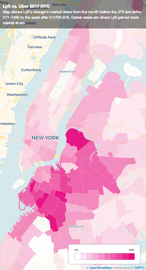
Lyft has developed a bit of a reputation as a more liberal-minded company than Uber, once even adopting the unconventional corporate tactic of calling itself “woke”. Sure enough, the neighborhoods of northern and northwestern Brooklyn—where Lyft gained the most—have among the more liberal reputations in the city. On the flip side, some sections of southern Brooklyn and Staten Island that supported Donald Trump in the 2016 general election are also where Lyft gained the least market share.
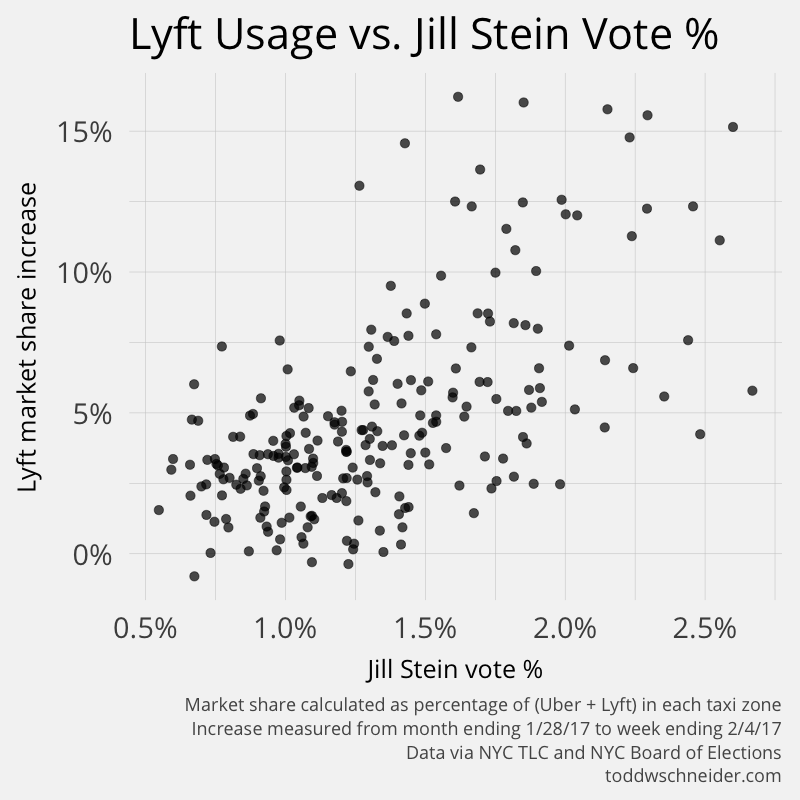
I gathered the 2016 presidential election results for every neighborhood in the city, then compared Lyft’s market share gain in each neighborhood to the neighborhood’s voting patterns. The data shows that, on average, Lyft gained more market share from Uber in neighborhoods that voted more heavily for Hillary Clinton.
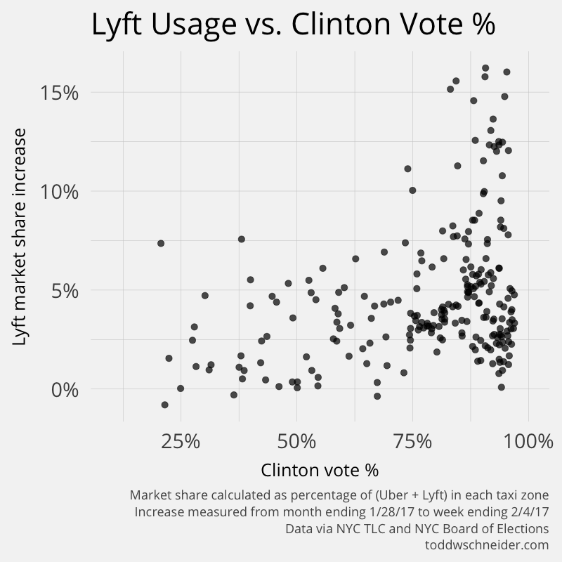
The correlation is not terribly strong, and the relationship says nothing about causality; there could be many confounding factors that are correlated to both political and ride-hailing app preferences. In many cases, ride-hailers are not local voters, especially in commercial areas like Midtown, Manhattan. Maybe most damning to the analysis, if we extend beyond the time period surrounding the JFK taxi strike and consider Lyft’s market share increase by neighborhood for all of 2017 vs. 2016, then the correlation to voting patterns disappears almost entirely. Still, given everything I know, I would guess that liberal voters were in fact more likely to switch from Uber to Lyft in the immediate wake of the incident (and for what it’s worth, Lyft’s market share increase was more correlated with voting preference for Green Party candidate Jill Stein than it was for Hillary Clinton).
What about the taxi strike itself?
Perhaps lost in the commotion, but neither the taxi strike nor Uber’s surge pricing suspension looks to have had much impact on the number of pickups at JFK on the afternoon/evening of January 28, 2017.
As a reminder, the code used for this update is available here on GitHub, along with some of the aggregated data.